19 Kitchen Island Ideas for Minimal Style Homes That Feel Effortlessly Calm
A minimalist kitchen island isn’t about having less it’s about making everything you keep work harder. Here are 19 kitchen island ideas built specifically for minimal style homes, from waterfall stone to sculptural single pendants.
There’s a stillness to a well-designed island that no amount of styling can fake. Morning light pools across a bare stone waterfall edge, one ceramic bowl catching all the attention it needs. Nothing shouts. Everything just sits exactly where it should. Let’s get into it.
Jump To
- Why Minimalist Kitchen Islands Work So Well
- 19 Kitchen Island Ideas for Minimal Style Homes
- How to Start Your Minimalist Kitchen Island Transformation
- Ready to Create Your Dream Minimalist Kitchen?
Why Minimalist Kitchen Islands Work So Well
Minimalist kitchen design pulls from a mid-century and Japanese-influenced lineage that values function over ornament every material earns its place, nothing sits purely for decoration. Expect warm white oak, honed quartz, matte black steel, and unlacquered brass in tones like warm white, soft greige, and muted sage rather than stark, cold white.
It’s having a real resurgence right now as a counter to over-decorated maximalist kitchens. It works in small kitchens too prioritize one material moment on the countertop before adding color or texture anywhere else.
| Element | Warm Minimal | Cool Minimal |
|---|---|---|
| Philosophy | Function first, natural warmth | Function first, restrained coolness |
| Materials | White oak, brass, linen | Quartz, blackened steel, concrete |
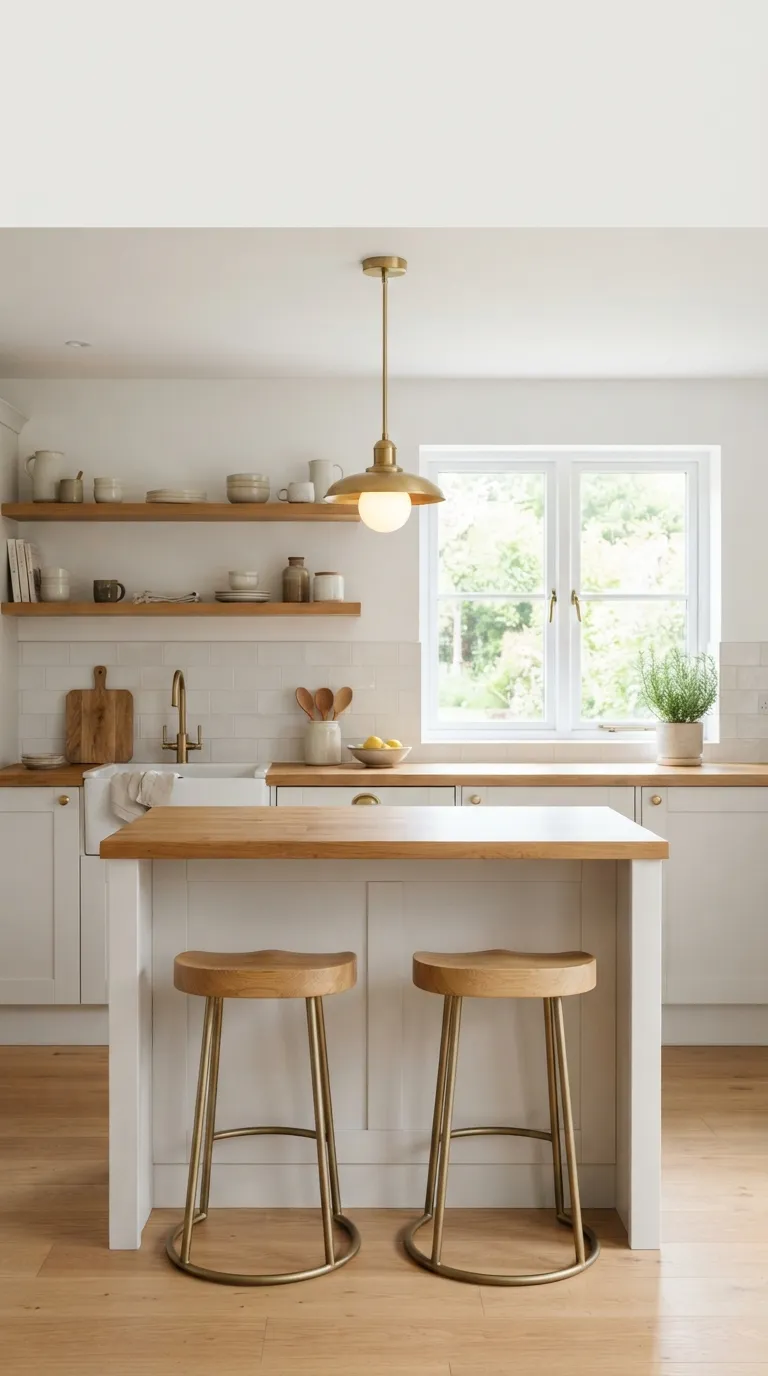
| Color palette | Warm white, greige, sage | Cool white, charcoal, soft grey |
19 Kitchen Island Ideas for Minimal Style Homes
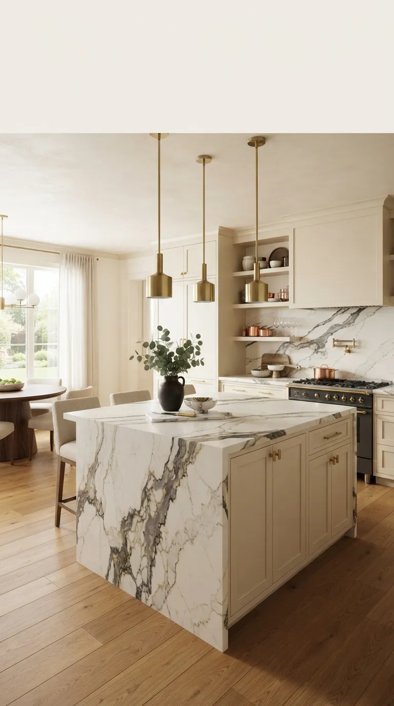
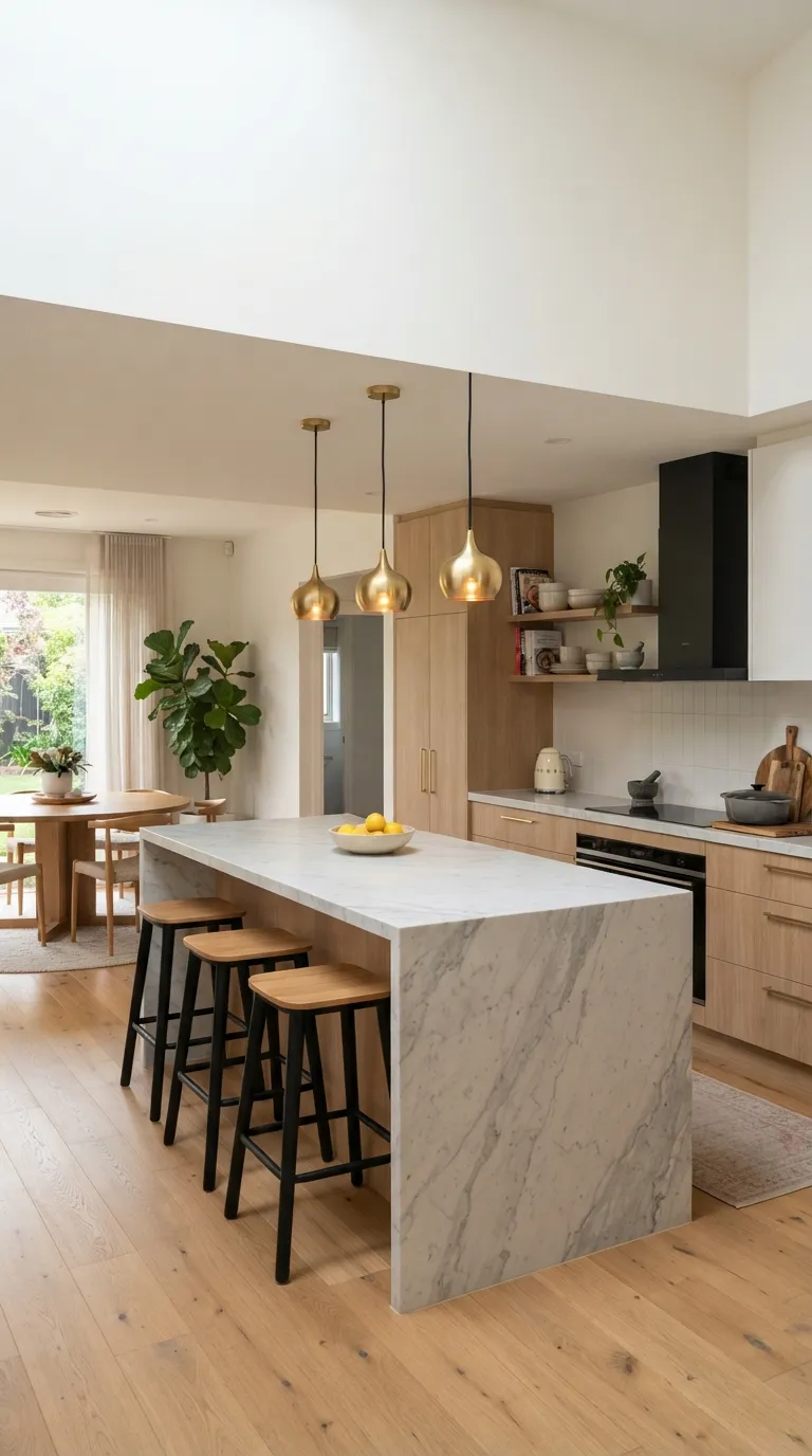
1. A Waterfall Edge in Honed Quartz
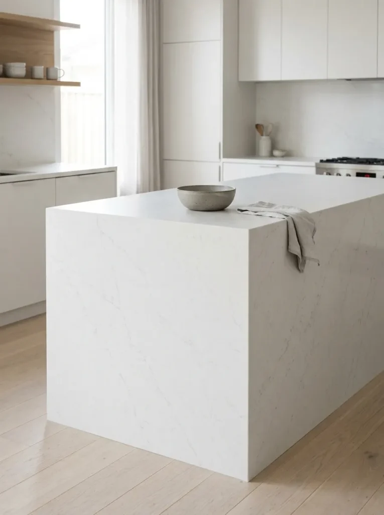
What it looks like: The stone drops straight from countertop to floor in one hushed, unbroken sheet, with no visible seam to interrupt the eye.
Why it works: Continuity is the principle at work when a material runs uninterrupted across a plane, the brain reads it as calm rather than busy, and a honed, not polished, finish keeps light from bouncing around the room in distracting flashes.
How to copy it: Ask your fabricator for a mitered waterfall edge in honed quartz, and keep the vein pattern bookmatched at the corner seam so it reads as one continuous slab rather than three separate pieces.
Best for: Homeowners doing a full renovation who want one dramatic material moment instead of several competing finishes.
Pro Tip: Order your quartz slab in person rather than from a swatch vein movement varies significantly between slabs, and a swatch never shows how the pattern will bookmatch at the waterfall corner.
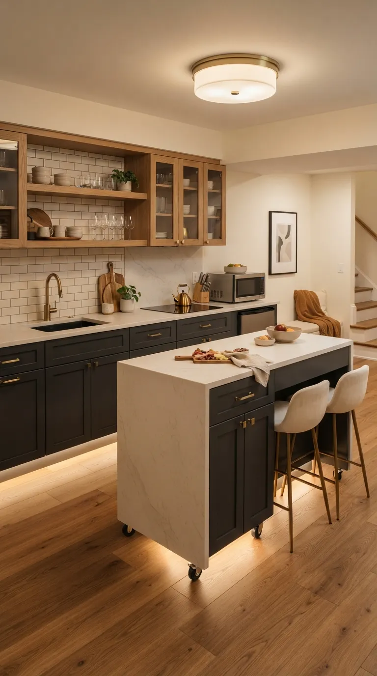
2. Two-Tone Cabinetry in Matte Black and Warm White
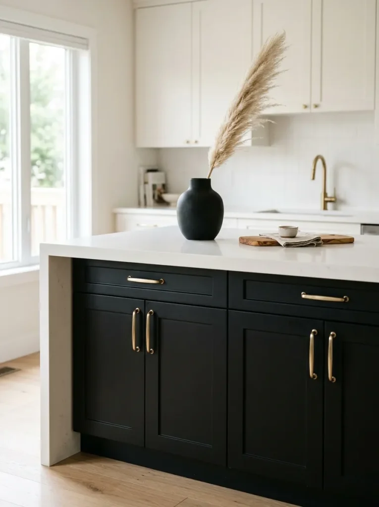
What it looks like: Low, grounded matte black cabinetry sits beneath a pale, light countertop, so the whole piece feels anchored instead of heavy.
Why it works: Contrast in value, not just color, gives an island visual weight without darkening the room the dark base pulls the eye down while the pale top keeps the sightline open.
How to copy it: Paint the lower cabinets in a true matte black like Farrow & Ball’s Off-Black, and keep the countertop light Calacatta-look quartz or painted white oak both work as long as the sheen stays low.
Best for: Anyone nervous about committing to an all-dark kitchen but still wanting real contrast. The same bold-against-plain balance shows up in our small powder room wallpaper ideas if you want to push contrast further in a smaller room.
Styling Note: Keep hardware finish consistent across the whole kitchen, not just the island mixing brass on the island with chrome elsewhere breaks the two-tone effect instantly.
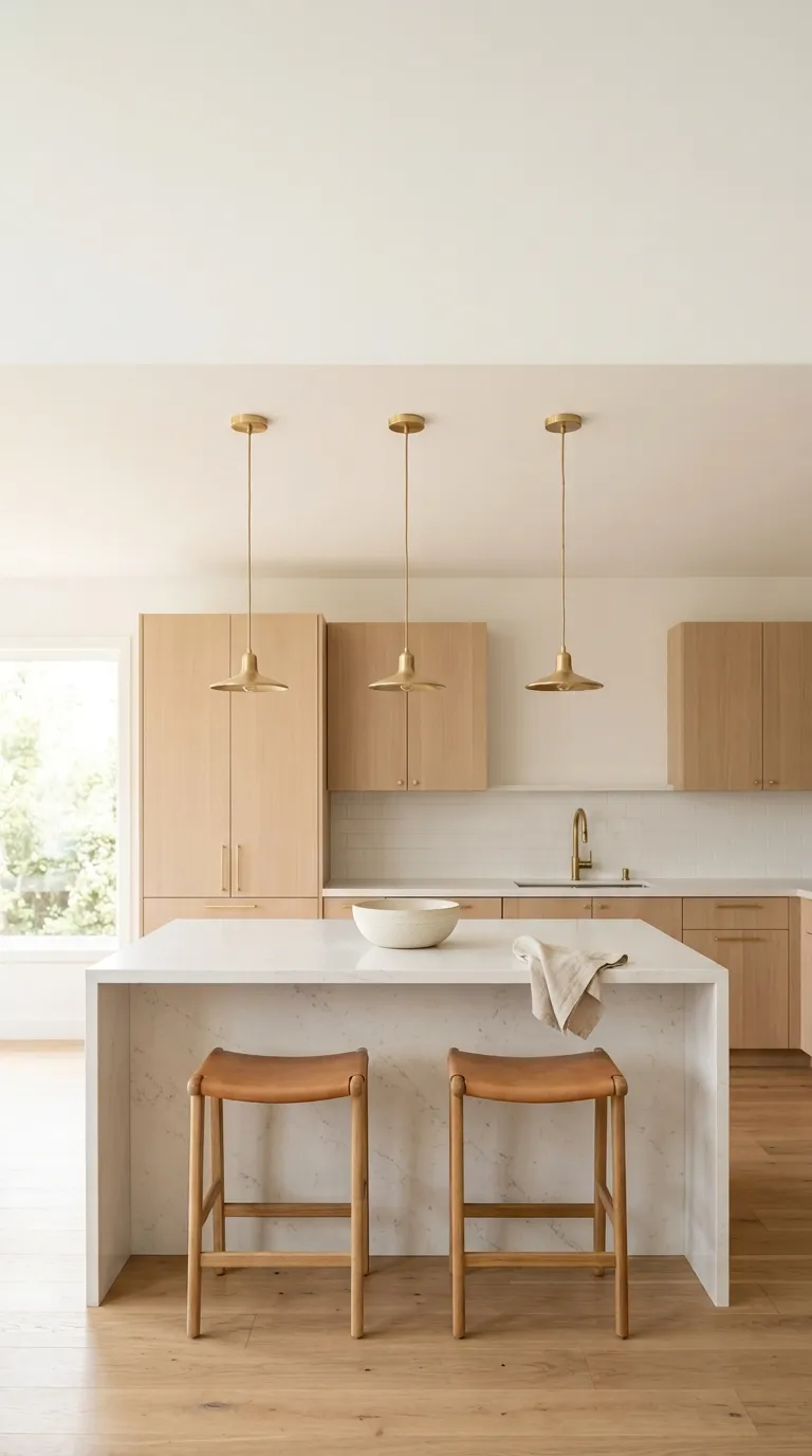
3. A Row of Three Slim Linear Pendants
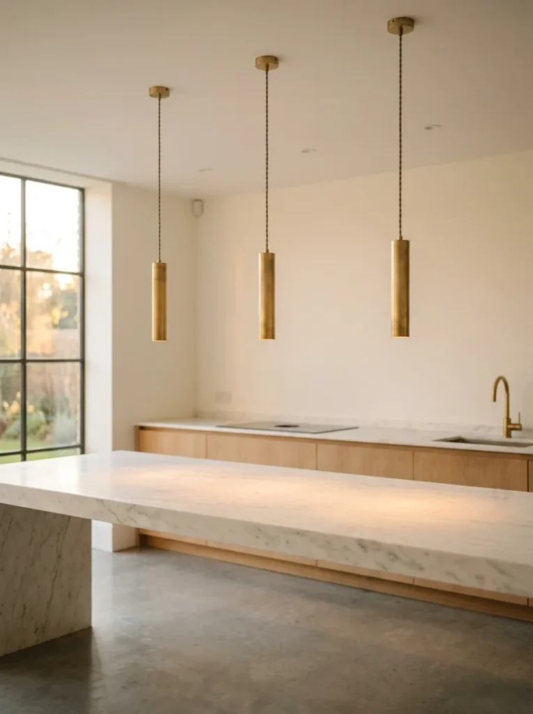
What it looks like: Three identical pendants hang in a clean row, spaced with almost mathematical precision above the island’s centerline.
Why it works: Repetition does the work here one pendant reads as a fixture, but three in a row reads as rhythm, exactly the kind of quiet structure minimalist kitchens rely on instead of ornamentation.
How to copy it: Space pendants so the outer two sit roughly a third of the way in from each end of the island, and hang them 30–32 inches above the counter so they don’t block sightlines.
Best for: Longer islands anything under 6 feet usually only needs two pendants, not three.
Quick Win: Swap in a warm 2700K bulb instead of daylight-white it makes the biggest visual difference for the least effort of anything on this list.
Get the Look
| Product |
|---|
| Slim brass cylinder pendant light |
| Adjustable ceiling canopy light kit |
| Warm 2700K dimmable LED bulb |
| Matte brass pendant cord cover |
| In-line dimmer switch kit |
Up next: the seating choice that quietly determines how long people linger at the island.
4. Slim Leather Counter Stools With No Back
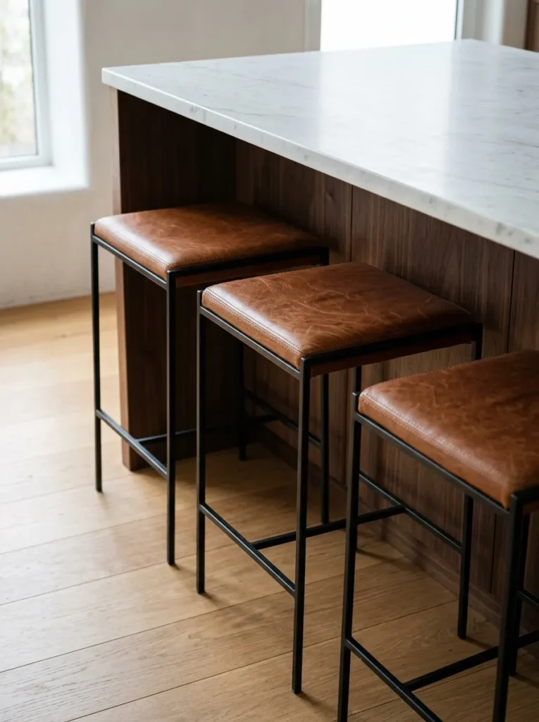
What it looks like: The stools disappear almost entirely under the counter overhang, leaving a low, uninterrupted line along the island’s edge.
Why it works: Proportion is doing the work backless stools keep the sightline open above counter height, which matters more here than in busier kitchens where the eye has other places to rest.
How to copy it: Choose stools 24–26 inches tall for a standard 36-inch counter, and leave 12 inches of overhang per seat so knees clear the cabinetry underneath.
Best for: Open-plan kitchens where the island is visible from the living room and needs to stay visually low. For more on picking seating that reads calm rather than heavy, our tan sofa living room guide covers the same low-contrast furniture logic.
Important: Most people assume backless stools are less comfortable, but for meals under 20 minutes they’re fine only long dinner-party seating is where a low backrest starts to matter.
Get the Look
| Product |
|---|
| Backless leather counter stool, cognac |
| Blackened steel counter stool frame |
| Felt floor protector pads for stool legs |
| Stackable leather counter stool |
5. Unlacquered Brass Hardware in a Single Finish
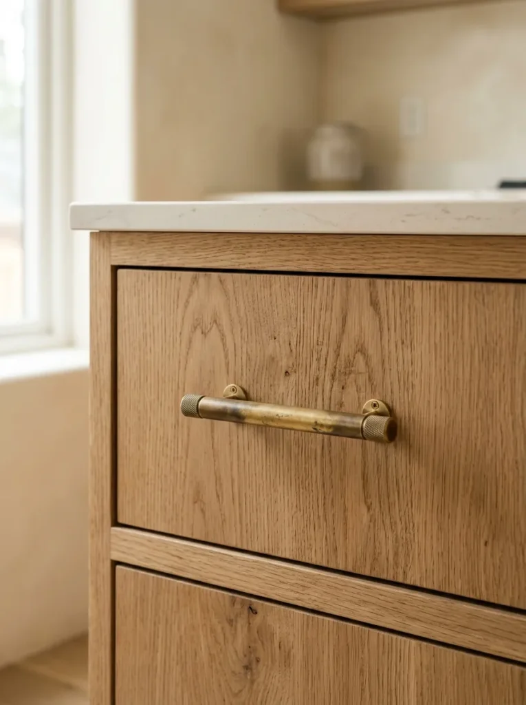
What it looks like: Thin brass pulls run in an unbroken line across every drawer front, catching light differently depending on where you stand.
Why it works: Unlacquered brass develops a living patina over time fingerprints, slight tarnish which reads as intentional rather than worn in a minimalist context, where materials are expected to age honestly.
How to copy it: Order unlacquered, not lacquered, brass pulls in a slim bar profile, roughly 5–6 inches for standard drawers, and skip matching lacquered knobs, since mixing finishes within brass breaks the effect.
Best for: Anyone who wants warmth without adding another color into the kitchen.
Small-Space Tip: In a narrow galley kitchen, thin brass bar pulls read less bulky than knobs and won’t catch on clothing as you pass the island.
Get the Look
| Product |
|---|
| Unlacquered brass bar pull, 5-inch |
| Unlacquered brass cabinet knob |
| Brass drawer pull installation template |
| Soft-close drawer slide hardware |
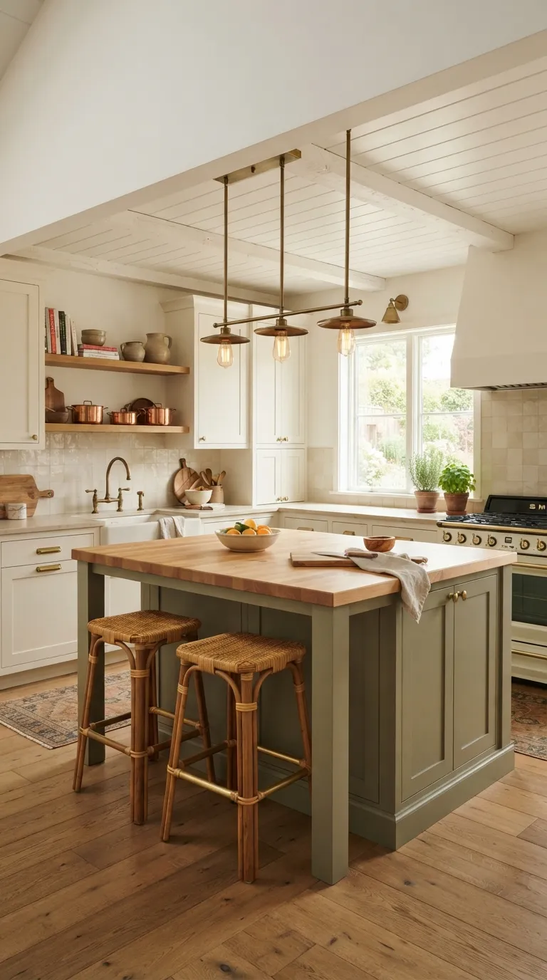
6. A Single Sage Green Island Against White Cabinetry
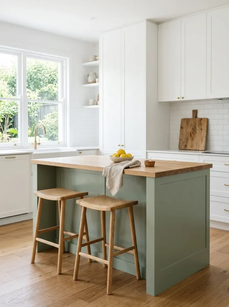
What it looks like: One muted, grey-leaning sage sits alone against a field of white, doing all the color work for the entire room.
Why it works: Restraint is the governing principle minimalist kitchens can hold exactly one saturated color choice before it stops feeling calm, so isolating color to the island keeps the rest of the room quiet.
How to copy it: Paint the island in a muted, grey-based sage like Farrow & Ball’s Pigeon rather than a true green, and keep every surrounding surface in white or off-white with zero competing color.
Best for: Renters or first-timers testing color who aren’t ready to commit to a fully painted kitchen. If sage feels right indoors, it’s worth browsing our exterior house paint colors guide too the same restrained, single-accent approach works on a front door or trim.
Warning: Skipping a bonding primer before painting cabinetry is the single most common mistake here without it, paint chips at the edges within months, especially on an island that gets bumped constantly.
This next idea rarely gets much attention and it costs almost nothing to plan for.
7. A White Oak Island Left Raw
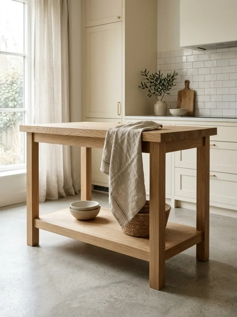
What it looks like: Wood grain stays open and visible under a matte finish, so the island reads raw rather than polished.
Why it works: Texture contrast against flat painted or laminate cabinetry gives the eye somewhere to land layering one solid wood piece against flat-panel surfaces keeps a minimal kitchen from feeling sterile.
How to copy it: Finish white oak with a matte hardwax oil like Rubio Monocoat rather than polyurethane it keeps the grain visible and matte, and it’s repairable in patches if scratched.
Best for: Kitchens that otherwise use a lot of painted surfaces and need one warm textural anchor.
Budget Version: Under $100, achieve a similar effect on a laminate island by adding a solid white oak butcher-block top panel instead of replacing the whole cabinet base.
8. A Narrow Rolling Cart Instead of a Fixed Island
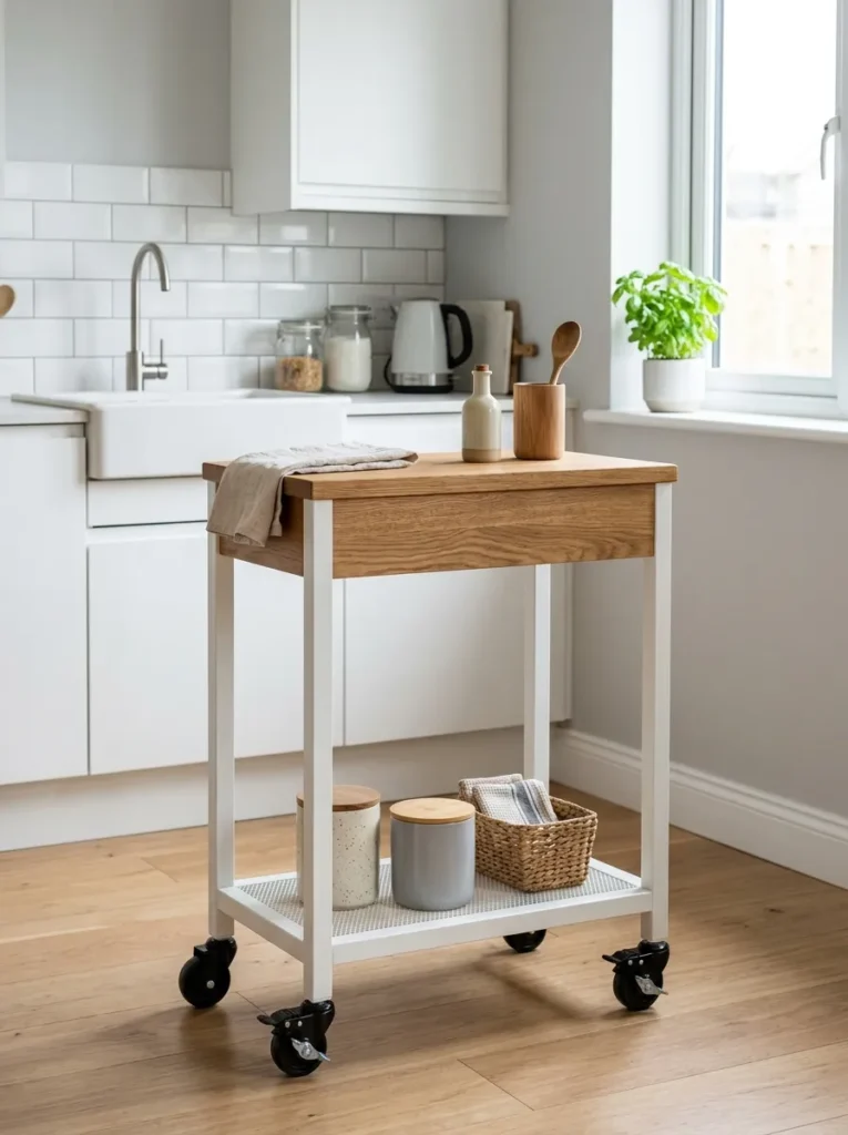
What it looks like: A slim cart on locking wheels stands in for a full island, narrow enough to roll aside when the space needs to open up.
Why it works: Flexibility replaces permanence as the guiding principle in tight kitchens a fixed island under 42 inches wide often makes walkways feel cramped, while a cart on wheels lets the same footprint serve double duty.
How to copy it: Choose a cart no wider than 24 inches with locking caster wheels, and keep the top surface clear enough to double as extra counter space during meal prep, then roll it away afterward.
Best for: Apartment kitchens and rentals where a built-in island isn’t possible. The same space-saving mindset runs through our craft closet ideas for anyone maximizing a small footprint elsewhere in the home.
9. A Curved Edge on One End of the Island
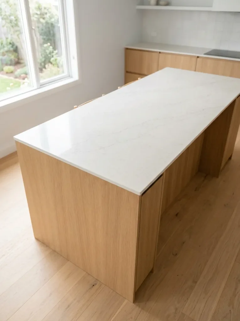
What it looks like: One end of the island curves into a soft radius instead of ending in a sharp 90-degree corner.
Why it works: Traffic flow and negative space both benefit a curved end softens the path around the island in tighter kitchens, and in a minimalist space where every line is already clean, one curve becomes the single unexpected detail.
How to copy it: Ask your fabricator for a quarter-round radius on just one end, typically 12–18 inches, rather than curving the entire island, since a full curve on both ends can look indecisive next to straight cabinetry.
Best for: Kitchens where the island sits close to a walkway or doorway people pass on that side. Curved silhouettes show up elsewhere too our bathroom mirror ideas roundup has more on how a single rounded shape can soften an otherwise angular room.
Pro Tip: A curved edge typically adds 15–20% to fabrication cost over a straight cut, so budget for it separately rather than assuming it’s included in a standard quartz quote.
This next one surprised even experienced designers the first time they saw it done well.
10. Woven Rattan Stools for Texture Without Color
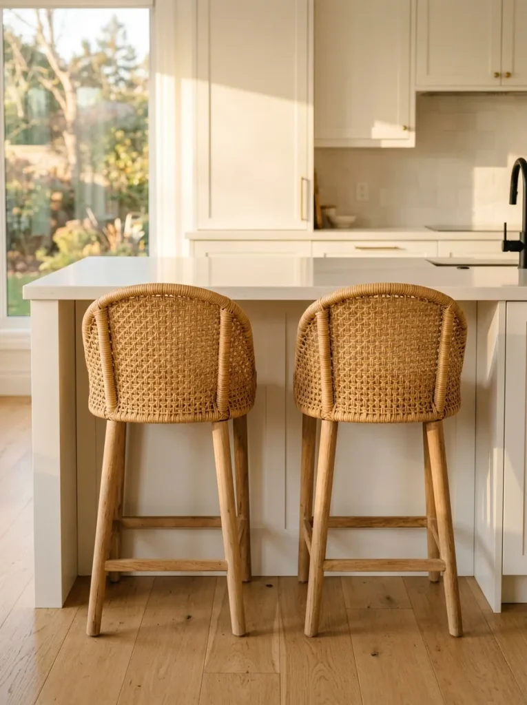
What it looks like: Open, hand-woven rattan seats sit low against an all-white island, adding texture without introducing a single new color.
Why it works: Texture layering does the visual work color usually does in a monochrome kitchen, rattan’s woven pattern reads as detail and warmth without breaking the restrained palette.
How to copy it: Choose stools with fully woven, not just accented, rattan seats, and keep the legs in a natural, unstained wood tone so nothing competes with the weave.
Best for: All-white or all-grey kitchens that feel a little cold and need warmth without adding color.
Quick Win: Rattan needs almost no maintenance beyond an occasional wipe-down it’s one of the lowest-effort texture upgrades on this entire list.
Get the Look
| Product |
|---|
| Woven rattan counter stool, natural |
| Rattan stool with backrest |
| Felt stool leg glides |
| Woven rattan stool cushion, neutral |
11. A Poured Concrete Island Top
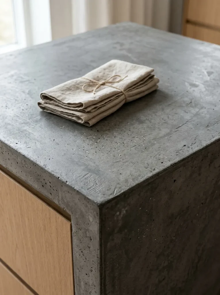
What it looks like: The surface holds faint trowel marks and tiny aggregate flecks, proof it was poured rather than manufactured to a perfect finish.
Why it works: Honest materiality is the principle at play concrete’s small imperfections read as intentional in a minimalist space, since a flawless factory finish would feel less considered here.
How to copy it: Work with a fabricator experienced specifically in concrete countertops, not just concrete flooring, since curing and sealing technique differs and affects long-term stain resistance.
Best for: Industrial-leaning minimalist kitchens that already favor raw, unfinished materials elsewhere. For another durable, textural surface option, our bathroom wall panel guide covers a similar honest-material approach for wet areas.
✅ Before You Choose Concrete:
- [ ] Confirm your fabricator has countertop-specific, not flooring, concrete experience
- [ ] Ask for a cured sample to test staining with oil, wine, and lemon juice
- [ ] Budget for resealing every 12–18 months to maintain stain resistance
- [ ] Reinforce cabinetry to support concrete’s added weight before installation
12. One Oversized Sculptural Pendant Instead of Several
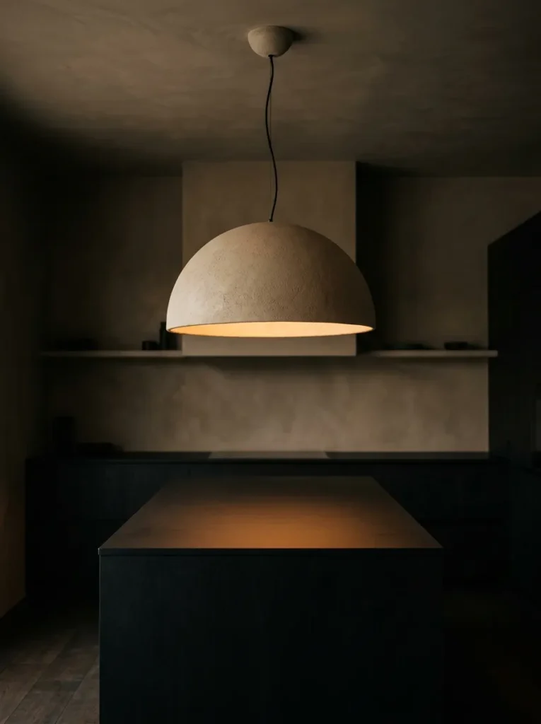
What it looks like: One oversized dome pendant hangs dead-center over the island, with nothing else competing for attention above it.
Why it works: Visual weight concentrates into a single focal point rather than distributing across several fixtures a cluster of small pendants asks the eye to scan, while one large piece lets it rest.
How to copy it: Size the pendant to roughly a third of the island’s length, and hang it 28–30 inches above the counter, since oversized fixtures need slightly more clearance than a row of small pendants.
Best for: Square or nearly-square islands, where a row of multiple pendants would look cramped anyway.
Budget Version: Under $100, a large paper or plaster-look pendant shade paired with a basic cord kit gets a similar oversized silhouette without a designer price tag.
13. Warm Greige Instead of Pure White
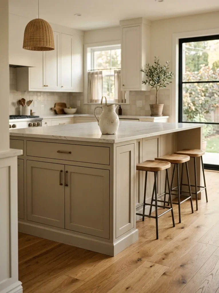
What it looks like: The island sits in a warm, slightly taupe-leaning grey that softens against the cooler white trim around it rather than matching it exactly.
Why it works: Undertone management is the real skill here pure white next to warm wood flooring often reads cold or clinical, while a warm greige bridges the temperature gap already present in the room.
How to copy it: Test greige swatches against your actual flooring sample in natural daylight before committing, since undertones that look neutral in a paint chip can read pink, green, or purple at full scale.
Best for: Kitchens with warm wood flooring that keep looking slightly off no matter what white gets used. The same undertone-testing advice applies in our green bathroom decor guide, where lighting shifts a color just as easily.
Mistake to Avoid: Choosing a greige under artificial store lighting is a common error the undertone can shift completely under warm bulbs at home, so always test a physical sample on-site.
14. Three Ceramic Vessels, Nothing Else
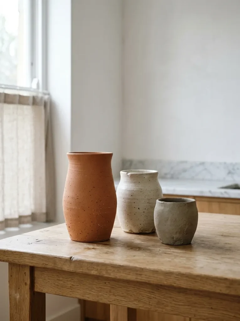
What it looks like: Three vessels of different heights sit grouped at one end of an otherwise completely bare island.
Why it works: Odd-number grouping and varied height are classic styling principles three objects read as intentional in a way two or four rarely do, and staggered heights keep the eye moving through the grouping.
How to copy it: Group vessels in odd numbers only, three or five, varying height by at least two inches between each piece, and leave at least 70% of the island surface completely empty around them.
Best for: Anyone who tends to over-decorate and needs a hard rule to stop at.
Important: Most people assume more objects means more styled the opposite is true on a minimalist island, where restraint is what actually reads as curated rather than cluttered.
15. A Butcher Block Top on an Otherwise White Island
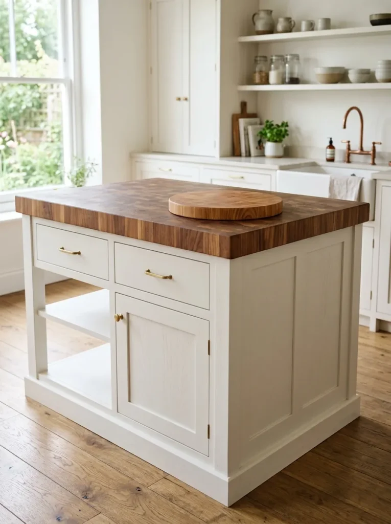
What it looks like: A thick slab of end-grain wood sits atop an otherwise plain white cabinet base, doing all the textural work by itself.
Why it works: Isolating warmth to a single surface, rather than spreading wood tones across cabinetry, flooring, and countertop, keeps a minimalist kitchen from tipping fully rustic while still avoiding a sterile, all-white result.
How to copy it: Choose end-grain, not edge-grain, butcher block for the island top specifically, since it holds up better to direct knife use, and oil it monthly with food-safe mineral oil to prevent cracking.
Best for: Anyone who preps a lot of food directly on the island and wants a durable, forgiving surface.
Small-Space Tip: In a compact kitchen, butcher block on just the island, rather than full counters, keeps the rest of the kitchen visually quiet while still adding one warm material moment.
The next idea is a small fix that most guides skip entirely and it changes how the whole kitchen reads at night.
My Views:
In my experience, the biggest mistake happens with island length, not finish a lot of homeowners size their island to the room instead of to the walkway, and end up with only 28 inches of clearance on each side. Anything under 36 inches makes the space feel tight the moment two people are in the kitchen at once, no matter how well the materials were chosen.
16. Recessed LED Strip Lighting Along the Toe-Kick
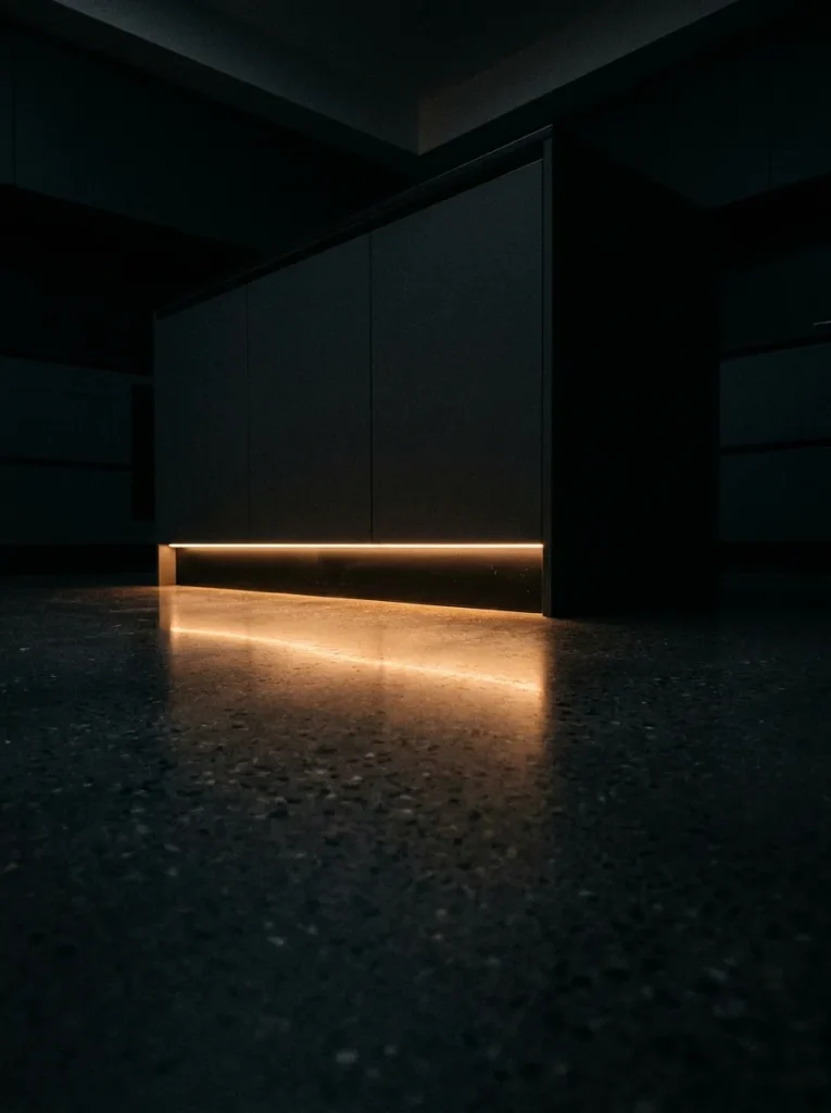
What it looks like: A thin strip of warm light glows along the base of the island at floor level, barely visible by day but softly lighting the kitchen at night.
Why it works: Layered lighting, rather than a single overhead source, is what makes a minimalist kitchen feel considered after dark toe-kick lighting adds a low horizontal glow that pendants alone can’t provide.
How to copy it: Install a warm 2700K LED strip inside a recessed aluminum channel along the toe-kick, on its own dimmer switch separate from the main kitchen lighting.
Best for: Kitchens used at night for quick trips water, snacks where full overhead lighting feels like overkill.
Quick Win: This is one of the cheapest upgrades on the entire list and usually installs in under an hour if you already have accessible wiring nearby.
17. A Built-In Bench Along One Side
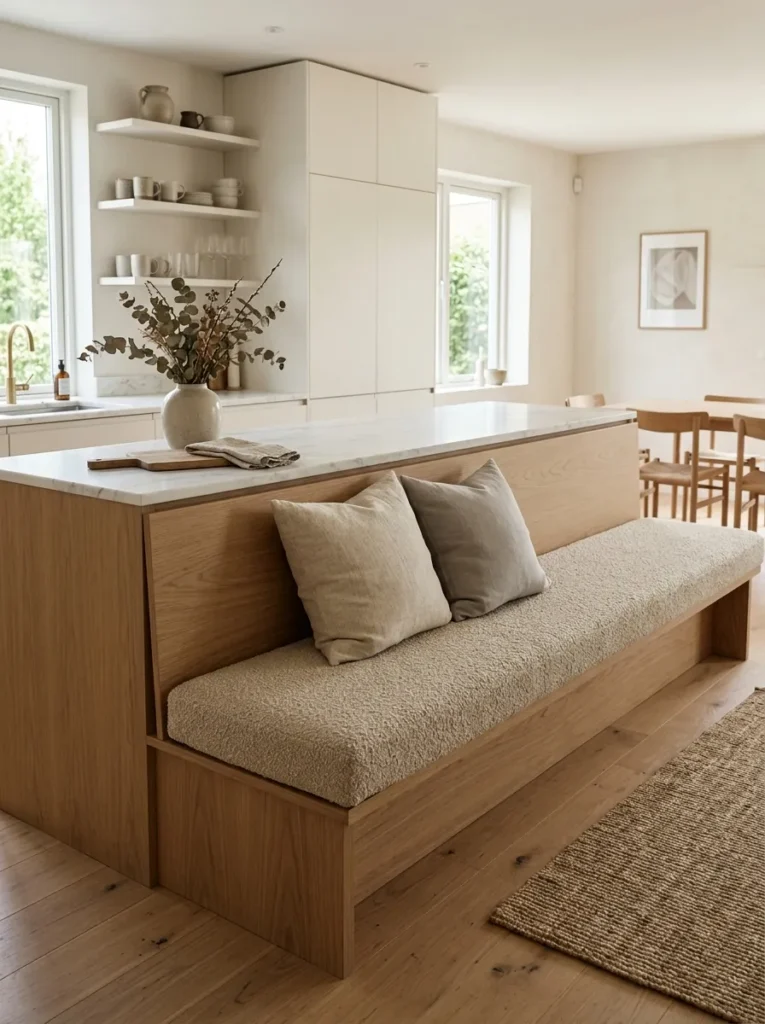
What it looks like: A low upholstered bench runs the full length of one side, replacing stools entirely and facing outward into the room.
Why it works: This swaps vertical visual weight, stool legs and backs, for a single horizontal line, which reads calmer in a room already built around clean lines the same contrast principle as a low sofa versus tall armchairs.
How to copy it: Build the bench seat to match standard counter-stool height, 24–26 inches, if paired with a counter-height island, and upholster in a low-pile, textured fabric like bouclé rather than a patterned print.
Best for: Families with young kids, since a bench is easier and safer to climb onto than a stool. If you like the idea of built-in seating, our pallet furniture ideas for garden and patio style post has more DIY-friendly bench builds worth adapting.
Pro Tip: Build in at least 2 inches of clearance between the bench seat and the island edge for knees most DIY builds skip this and end up with an uncomfortably tight fit.
18. A Soft Terracotta Blush Instead of Pastel Pink
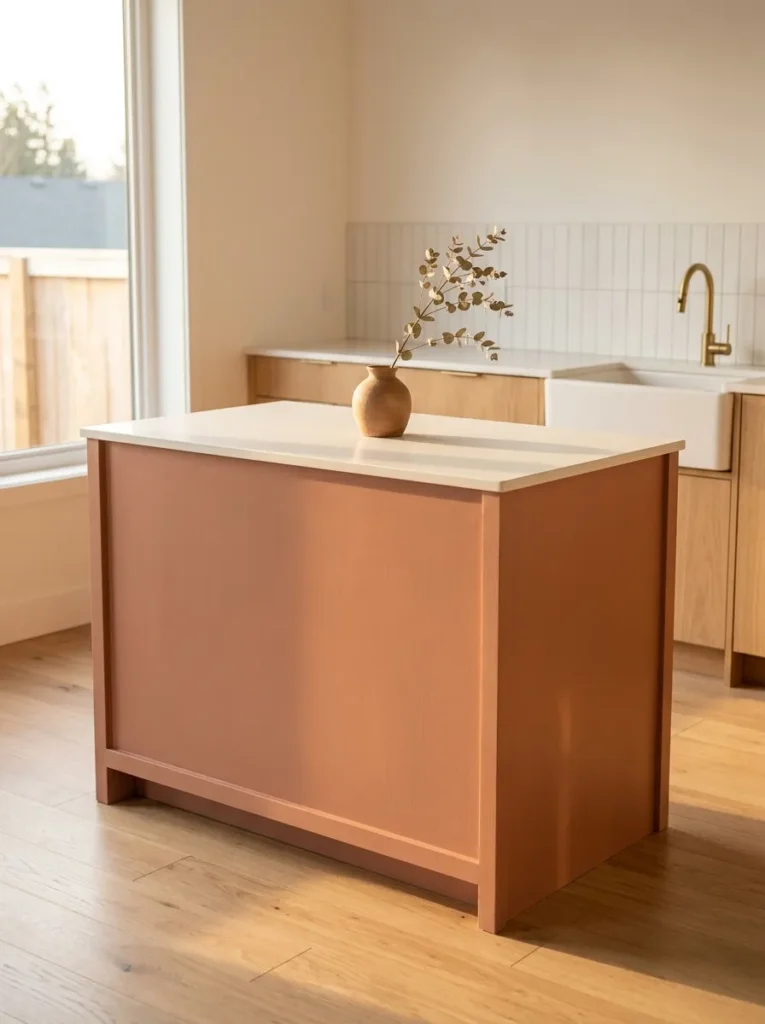
What it looks like: The color sits somewhere between clay and blush, warm enough to avoid reading as pastel or overtly pink.
Why it works: Undertone precision matters again here a true pastel pink can feel decorative in a way that clashes with minimalist restraint, while a muted, earth-based terracotta reads as a neutral with warmth, closer to clay than paint-store pink.
How to copy it: Choose a paint described as “terracotta” or “clay” rather than “blush” or “pink” the naming convention usually signals a more muted, earth-toned base that fits a minimalist palette better.
Best for: Anyone who wants color but is wary of anything that reads too sweet or trend-driven. For another take on a confident, single accent color, our blue bathroom decor guide walks through the same one-color-does-the-work approach.
Mistake to Avoid: Pairing terracotta with cool grey undertones elsewhere in the kitchen creates visible clash keep surrounding tones warm, like oak, brass, and cream, rather than cool, like chrome or blue-grey, for this one to work.
One idea left and it’s the finishing touch most people add last, if they add it at all.
19. Open Floating Shelves Styled With Restraint
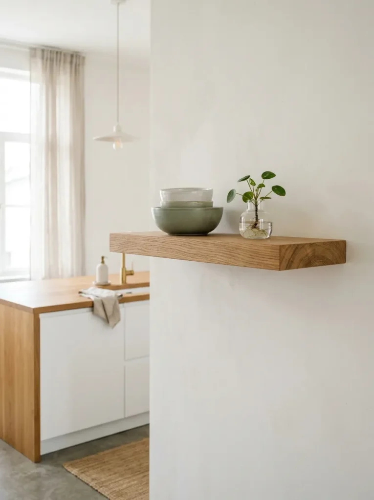
What it looks like: One thick oak shelf holds just a few pieces, spaced with visible gaps between each one rather than lined up edge to edge.
Why it works: Negative space around each object closes the list on the same note it opened with the same idea that ran through the vessel styling and the pendant lighting, applied one more time to prove restraint is the thread holding the kitchen together.
How to copy it: Mount a single shelf in solid wood, not a thin floating ledge, and style it with no more than four objects total, leaving visible empty space between each one.
Best for: The wall directly beside or across from the island, where it stays in view without competing with it. Open shelf styling deserves its own deep dive too see our Kallax styling ideas for more on keeping a shelf curated rather than cluttered.
Styling Note: Rotate what’s on the shelf seasonally a single change, like swapping in a stem of dried branches, keeps a minimal kitchen from feeling static without adding permanent clutter.
Common mistake to avoid: Ignoring the space around the island. Walkways need room for people to pass and for appliance and cabinet doors to open, so measure the clearances before choosing a size.
Frequently Asked Questions
How much space do I need around a kitchen island?
Commonly cited guidance is around 36 inches as a minimum walkway, with 42 to 48 inches more comfortable where two people cook. Measure your own room and door swings.
Can a small kitchen have an island?
Often, yes, if you choose a slim or mobile one and keep the clearances workable. If it blocks the walkway, a rolling cart is a safer compromise.
Does a kitchen island need electrical outlets?
Local building rules may require outlets or restrict how they are installed, so check the requirements and use a licensed electrician for any wiring.
How to Start Your Minimalist Kitchen Island Transformation
In practice, the smartest place to start isn’t paint or hardware it’s the countertop material, since everything else gets chosen to match it rather than the other way around. Pick your waterfall quartz, butcher block, or concrete first, and the cabinet color, pendant style, and stool finish all fall into place faster.
The most common fixable mistake is undersizing the island for the room. A lot of people choose dimensions based on what looks proportional on paper, then end up with under 36 inches of walkway clearance once appliances and cabinet doors are factored in measure the full swing radius of your dishwasher and oven doors before finalizing island size.
Three items under $50 that make an immediate difference: a single stem of dried pampas grass in a matte black ceramic vase, a set of unlacquered brass drawer pulls to swap in on just the island, and a warm 2700K bulb swap for whatever pendant or overhead light already exists above it.
A full island transformation new cabinetry, countertop, lighting, and stools realistically takes 6 to 10 weeks once materials are ordered, with most of that time spent waiting on stone fabrication rather than installation. Budget $3,000–$8,000 for a mid-range full rebuild, or under $500 for a styling-only refresh using paint, hardware, and lighting changes on an island that’s already structurally sound.
Ready to Create Your Dream Minimalist Kitchen?
Nineteen ideas is a lot to take in at once, and what stands out looking back across all of them the waterfall stone, the sage paint, the curved edge, the single pendant is how much variety exists inside a style that gets called plain. None of this has to happen at once, and honestly, it shouldn’t swap the hardware first, live with it a month, then decide if the paint color is next.
Tonight, take five minutes and clear everything off your island counter, then look at what you’d choose to put back that alone tells you more about your starting point than any mood board. A minimal island isn’t about having an empty kitchen; it’s about walking in and feeling like nothing is asking for your attention before you’ve had your coffee. Save this one before you start ripping anything out you’ll want the waterfall edge and the ceramic vessel styling side by side when it’s time to actually choose.
Read Next
- 12 Minimalist Kitchen Cabinet Ideas That Still Feel Warm
- 15 Japandi Living Room Ideas for a Calm, Layered Space
- 10 Small-Space Kitchen Storage Ideas for Minimalist Homes