21 IKEA Kallax Styling Ideas That Actually Look Intentional
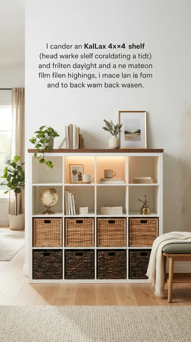
A Kallax shelf is IKEA’s boxy, budget storage unit the one everyone owns and almost nobody styles on purpose. Here are 21 ways to make it look intentional, whether it’s holding books, hiding toys, or standing in for a console table.
There’s a specific kind of relief that comes from a shelf that finally holds everything without looking like storage. Empty cubbies stop swallowing the room and start doing actual work sorting, framing, softening hard edges. Get the styling right and a $60 shelf reads like it was built into the wall. Cheap doesn’t have to look cheap it just needs a plan.
Jump To
- Why Kallax Styling Makes Such a Difference
- 21 Ways to Style an IKEA Kallax Shelf
- How to Start Your Kallax Transformation
- Ready to Style Your Kallax Shelf?
Why Kallax Styling Makes Such a Difference
IKEA’s Kallax the grid of square cubbies in 2×2, 2×4, and 4×4 sizes is everywhere because it’s cheap, sturdy, and fits almost any wall. Raw white or black-brown melamine reads flat until contrast gets added: walnut-toned baskets, matte black hardware, one unfinished-oak accent box.
It matters now because so many first apartments lean on the same IKEA basics, and styling is the fastest way to make a shared piece feel less rented. Plenty of these units end up doing double duty as a media console if that’s your setup, our Kallax TV unit styling guide covers that specific layout. In small rooms, start with the top surface and one row of cubbies that’s where the eye lands first.
| Best starting point | Style the top surface and top row of cubbies first |
| Biggest impact area | Swapping in matching baskets or bins |
| Budget to start | $40–$120 |
| Time to complete | A weekend afternoon |
21 Ways to Style an IKEA Kallax Shelf
1. Swap Solid Drawers for Woven Storage Baskets
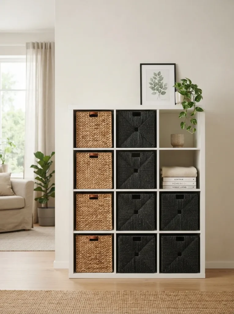
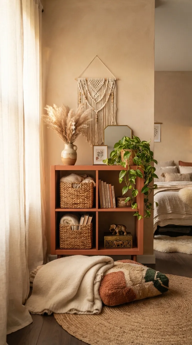
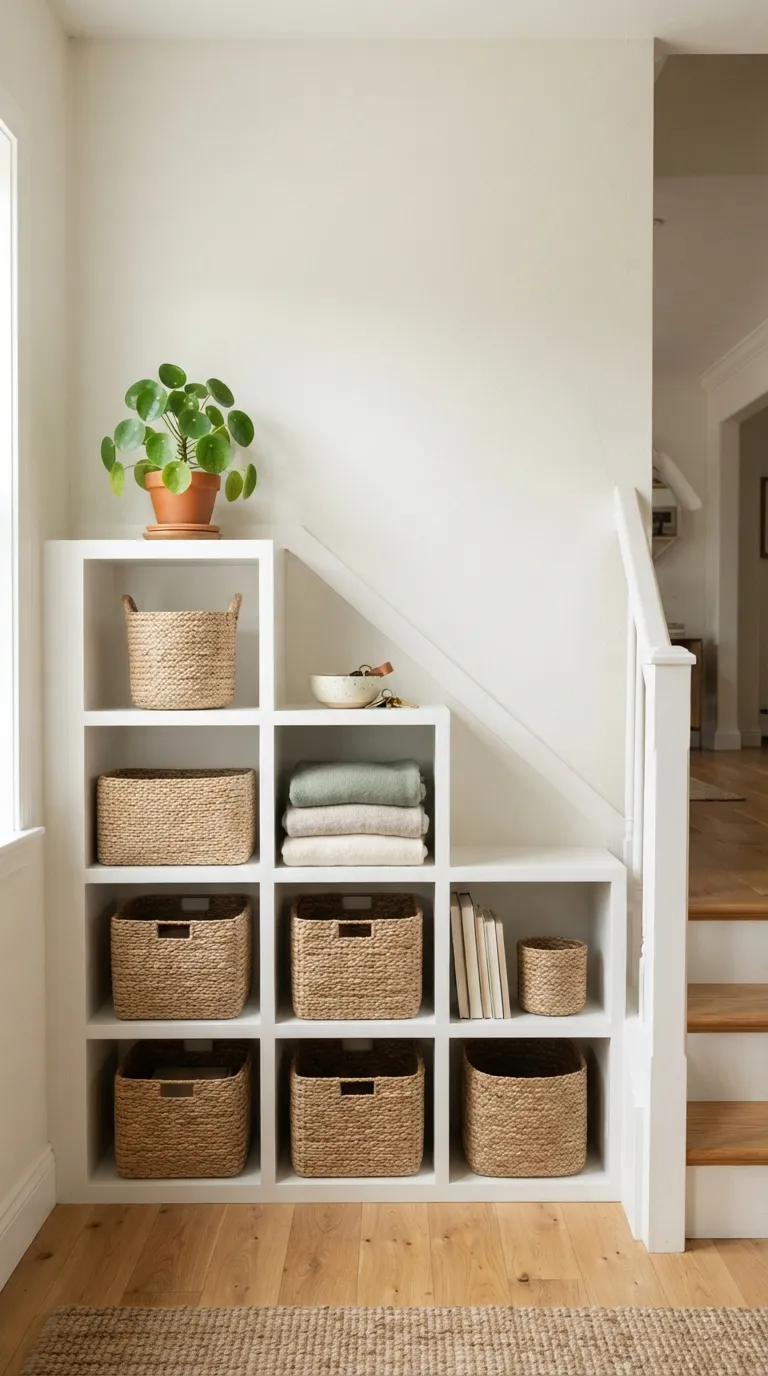
What it looks like: Textured, warm, and instantly less flat baskets swallow the visual noise the open cubbies used to expose.
Why it works: Woven baskets add texture contrast against smooth melamine, which is the fastest fix for a shelf that reads sterile; the eye reads texture variation as intentional design rather than storage.
How to copy it: Measure your cubby opening first Kallax squares run roughly 13×13 inches — and buy baskets sized to sit flush, not floating with gaps on every side. Mix two basket materials, like rattan plus a darker seagrass or fabric bin, instead of one uniform set.
Best for: Renters and anyone who wants a five-minute fix with zero tools.
Quick Win: Don’t buy a full matching set one odd basket in a contrasting tone, like a black wire bin among tan rattan, reads more curated than a uniform row.
Shop This Look
| Product |
|---|
| Natural rattan storage baskets, 13-inch cube size |
| Dark seagrass woven bin with cutout handles |
| Black wire mesh storage cube |
| Canvas fabric storage bin with leather pull tab |
| Felt storage basket in charcoal |
2. Wrap the Side Panels in Bold Peel-and-Stick Vinyl
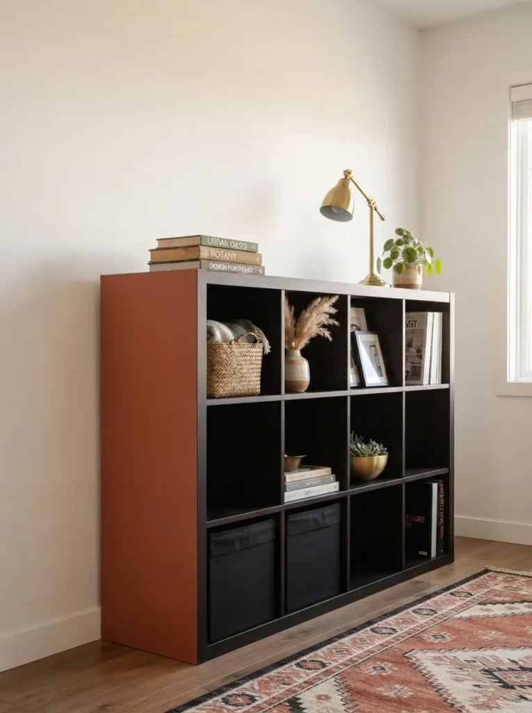
What it looks like: Blunt in the best way one wrapped panel turns a plain box into a piece with an actual color story.
Why it works: Kallax units usually show at least one bare side panel to the room, and that flat surface is unused real estate. Contact paper adds color without touching the structure, keeping the visual weight low while still making a statement.
How to copy it: Pick a vinyl in a saturated tone terracotta, deep olive, or navy rather than a pattern, since a solid color reads more permanent-looking. Use a credit card to smooth bubbles from the center outward, and trim excess with a fresh blade instead of scissors for a clean edge.
Best for: Renters who can’t paint walls but want one bold color moment.
Pro Tip: Buy 20% more vinyl than the panel measurement a slightly misaligned first attempt is common, and having extra means you’re not stuck mid-project.
3. Style the Open Cubbies Using the Rule of Three
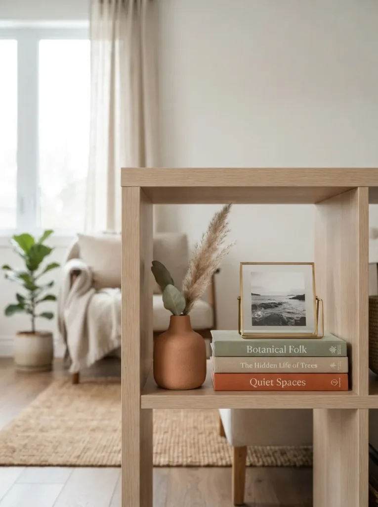
What it looks like: Deliberate, not staged each cubby reads like it was chosen, not just filled.
Why it works: Odd-numbered groupings create visual rhythm instead of a static, matched-pair feeling. Varying height between a tall vase, a low book stack, and a small frame builds a mini triangle shape the eye naturally follows.
How to copy it: Style only every third or fourth cubby this way and leave the rest simpler books stacked flat, a single object, or empty so the styled cubbies actually stand out instead of competing with a dozen others doing the same thing.
Best for: Anyone who owns a full 4×4 or 4×2 unit and doesn’t want it to look like a display case.
Styling Note: Leave at least two cubbies completely empty on a 4×4 unit negative space is what makes the styled ones read as intentional instead of cluttered.
Up next: the lighting trick that makes even the cheapest baskets look expensive after dark.
4. Add LED Puck Lights Inside a Few Cubbies
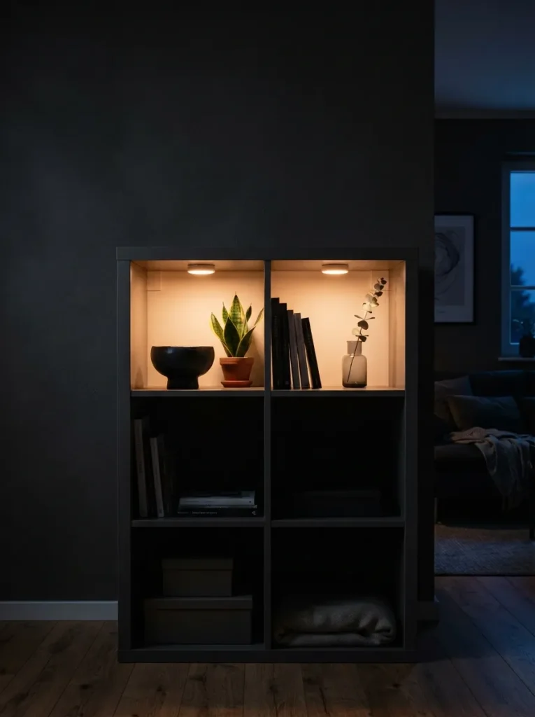
What it looks like: Gallery-lit, almost a couple of glowing cubbies turn flat shelving into something with actual depth after sunset.
Why it works: Backlighting creates depth and shadow that flat overhead lighting can’t, drawing the eye to specific objects instead of the whole shelf competing for attention at once the same principle museums use for display cases.
How to copy it: Stick battery-powered warm-white LED puck lights, around 2700K rather than a daylight tone, to the top interior corner of two or three cubbies max, angled slightly forward. Keep them on the same remote or timer so they turn on together instead of looking accidental.
Best for: Anyone who wants a nighttime mood-lighting upgrade without an electrician.
Important: Warm-white light (2700K–3000K) reads cozy; daylight LEDs at 5000K and up will make the same setup look clinical and cold the color temperature matters more than the brand.
5. Paint Just the Visible Frame Edges in a Contrast Trim Color
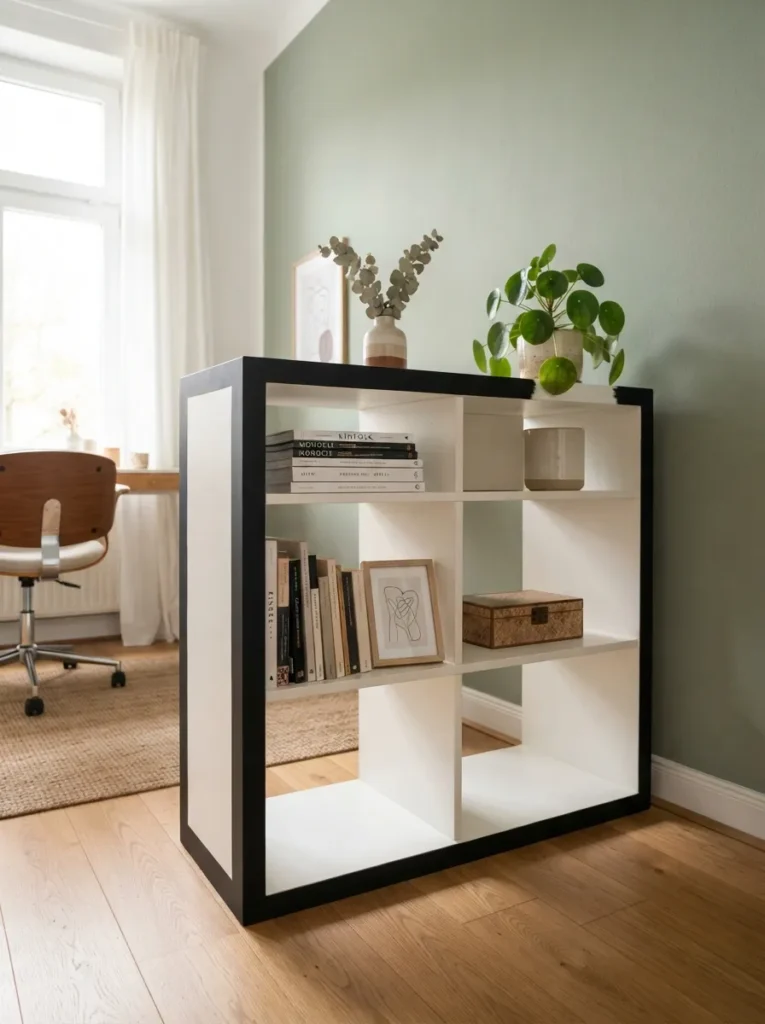
What it looks like: Graphic and a little architectural a thin black edge line does more than most people expect.
Why it works: Outlining the frame in a contrast color creates a defined silhouette against the wall, a trick borrowed from picture framing. The dark edge makes the whole piece read as deliberate furniture rather than a plain storage cube.
How to copy it: Tape off only the outer 1.5 to 2 inches of visible frame edge with painter’s tape, and use a satin or semi-gloss enamel paint rather than matte wall paint, which chips faster on furniture. Two thin coats beat one thick one.
Best for: People who like the melamine finish overall but want it to feel less like a big white block.
6. Add Curtain Rods and Fabric Panels to Hide Half the Cubbies
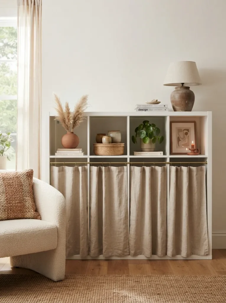
What it looks like: Softer instantly fabric breaks up all those hard right angles the shelf is built from.
Why it works: Curtains introduce a soft material against an otherwise all-hard-surface piece, and hiding the messiest row usually the bottom, where kids’ toys or cables live solves a real clutter problem while adding texture at the same time.
How to copy it: Use a slim spring-tension rod cut to the width of one row, not the full shelf, so styled cubbies above stay visible. Choose an unlined linen or cotton in a color that matches your baskets rather than the wall, so the shelf reads as one cohesive object.
Best for: Parents hiding toy chaos or anyone storing items they don’t want on display.
Pro Tip: Hem the fabric an inch shorter than the cubby height floor-length curtain panels on furniture look like an afterthought, not a design choice.
Shop This Look
| Product |
|---|
| Slim spring tension curtain rod, adjustable |
| Unlined linen curtain panel, half-width |
| Curtain rings with clips |
| Fabric weight bar for hem |
The next idea sounds like a small detail, but it’s the one that gets copied most from real rooms.
7. Color-Code Kids’ Bins by Category, Not Just Color
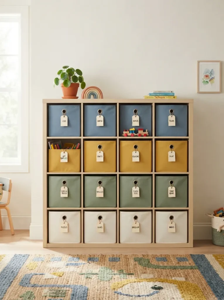
What it looks like: Cheerful but still calm color-coding keeps a playroom shelf from tipping into visual chaos.
Why it works: Assigning one color per category, like blue for blocks and yellow for art supplies, works because kids and adults both sort by color faster than by reading labels, which keeps the put-away process actually happening instead of becoming a pile on the floor.
How to copy it: Pick three to four bin colors max and stick to them more than that and the color-coding stops functioning as a system. Add a small printed or laminated label on each bin’s front edge as backup, since color alone fades from memory faster than you’d think.
Best for: Families with kids old enough to help with cleanup but not yet reading fluently.
Mistake to Avoid: Buying bins that don’t match the cubby depth wastes the back three inches of every cube measure depth, Kallax cubbies run about 13 inches, before ordering online.
8. Top a Kallax Row with a Cushion to Create Instant Bench Seating
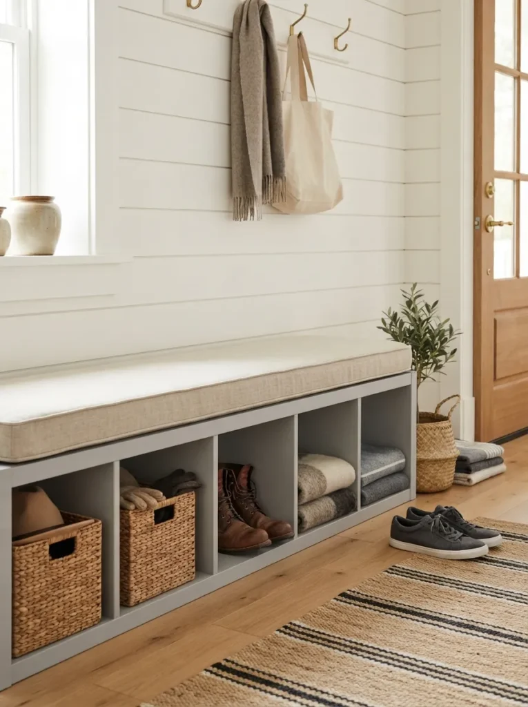
What it looks like: Grounded and useful a shelf that used to just hold things now gives you somewhere to sit while you put your shoes on.
Why it works: A Kallax turned on its side at bench height (roughly 16–17 inches for a 2×4 laid horizontal) hits standard seating proportions, and a fitted cushion signals “furniture,” not “storage unit repurposed.” Weight distribution also matters here melamine holds up fine under sitting weight when the unit rests flat on all four corners.
How to copy it: Order a custom-cut foam cushion at 2–3 inches thick sized to your exact shelf length, then have it upholstered in a durable fabric like cotton canvas rather than a delicate linen if it’s getting daily use. Foam suppliers online will cut to spec for under $60 on most 2×4 units.
Best for: Entryways, mudrooms, or anyone short on seating near a window.
✅ Bench Conversion Checklist:
- [ ] Lay the Kallax unit horizontally and confirm it sits flush on all four corners
- [ ] Measure the exact top surface length and width before ordering foam
- [ ] Order 2–3 inch foam cut to size, plus batting for rounded edges
- [ ] Upholster or order a pre-made cushion cover in a durable fabric
- [ ] Secure the unit to the wall with an anti-tip bracket before use as seating
9. Mount a Picture Light Above the Shelf to Frame It Like Art
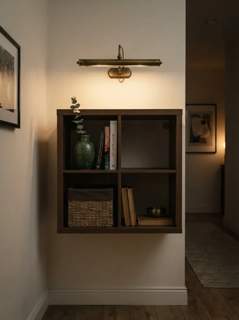
What it looks like: Framed, almost formal a single light fixture turns a shelf into something worth pausing in front of.
Why it works: Picture lights direct light downward onto a defined area rather than washing the whole wall, the same technique used in galleries to draw focus to one object. On a Kallax, it signals “this is the display shelf” and visually separates it from ordinary storage nearby.
How to copy it: Choose a battery-powered or plug-in picture light rather than a hardwired one if you’re renting, and mount it 6–8 inches above the top edge of the unit, angled down at roughly 30 degrees. Keep the styled top surface simple one or two objects so the light has something specific to highlight.
Best for: Hallway or entryway Kallax units used as a focal display rather than bulk storage.
Important: Most picture lights are rated for a specific wattage range check before buying a warm LED bulb, since the wrong wattage can overheat a fixture rated for lower output.
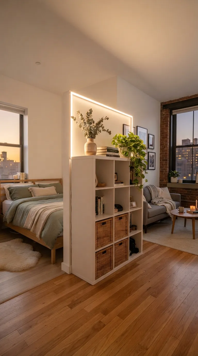
10. Turn a Kallax on Casters into a Rolling Room Divider
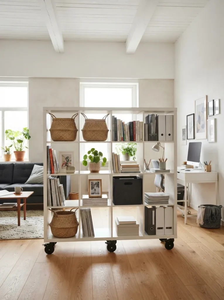
What it looks like: Flexible, almost architectural a shelf on wheels does double duty as storage and a soft wall.
Why it works: Open shelving used as a divider keeps sightlines and light moving through a room, unlike a solid partition, which is why studio apartments lean on this trick constantly. Storing items on both sides means the “wall” earns its footprint twice over.
How to copy it: Attach locking caster wheels rated for at least 100 lbs total, and style both sides differently so each zone still feels distinct baskets facing the living area, open books and decor facing the desk side. Lock the wheels once positioned; this isn’t meant to move daily.
Best for: Studio apartments and open-plan layouts that need a soft boundary without construction.
Small-Space Tip: A 2×4 unit divider reads far less bulky than a 4×4 go narrow and let the wheels do the flexibility work instead of the footprint.
Next up: the paint trick that makes a $50 shelf stop looking like a $50 shelf.
11. Paint the Entire Unit One Saturated Color Instead of Leaving It White
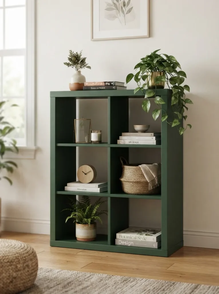
What it looks like: Confident, not fussy one full color swap does more for the room than any amount of accessorizing.
Why it works: A saturated color like forest green or deep navy gives the piece enough visual weight to function as a statement rather than a background object, especially against a neutral wall in a living room styled around a tan sofa, where a plain white Kallax can otherwise disappear.
How to copy it: Sand the melamine lightly with 220-grit paper first this is the step most people skip, and paint without it peels within months. Use a bonding primer made for laminate surfaces, then two coats of furniture-grade enamel in satin or semi-gloss.
Best for: Anyone whose Kallax is the largest visible object in the room and needs to earn its space.
Shop This Look
| Product |
|---|
| Bonding primer for laminate and melamine surfaces |
| Furniture-grade enamel paint, satin finish |
| Foam mini roller for smooth furniture coverage |
| Fine-grit sanding sponge, 220-grit |
Styling Note: Stick to one saturated color rather than mixing two a single bold tone reads intentional, while two competing colors on the same small unit starts to look accidental.
12. Wrap the Top Surface in Wood Veneer Contact Paper for a Built-In Look
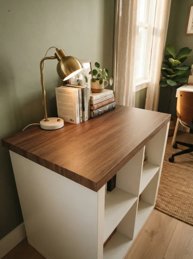
What it looks like: Warmer immediately the flat white top disappears and something that reads like real wood takes over.
Why it works: The top surface gets the most direct light and eye contact of any part of the unit, so wrapping just that one plane in a wood-grain finish tricks the eye into reading the whole piece as higher-end, without touching the cheaper-looking cubby fronts at all.
How to copy it: Clean the surface with rubbing alcohol before applying anything leftover dust under the vinyl shows through as bubbles. Cut the veneer sheet an inch oversized on all edges, apply from one end using a squeegee to push out air, then trim flush with a sharp blade once fully adhered.
Best for: Anyone who wants a built-in look without the built-in price.
Pro Tip: Work in a room above 65°F if possible cold contact paper adhesive grips unevenly and is far more likely to bubble than the same sheet applied at room temperature.
13. Add Locking Casters for a Shelf That Moves When You Need It To
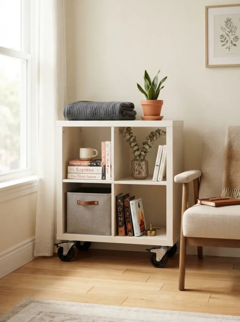
What it looks like: Small but genuinely useful a shelf that rolls out of the way for cleaning day and rolls right back.
Why it works: A single Kallax cube or 2×2 unit is light enough to move easily once it’s on wheels, which solves the real annoyance of vacuuming behind fixed furniture. Locking casters mean it still reads as stable, stationary furniture the rest of the time.
How to copy it: Choose casters with a visible lock lever rather than a friction-only brake, and match the wheel finish matte black or brushed brass to your other hardware in the room so it doesn’t read like an add-on.
Best for: Renters and anyone who rearranges furniture more than twice a year.
Quick Win: Attach felt pads to the caster locking mechanism contact point it stops the wheel from marking hardwood floors when locked in one spot for months.
14. Style the Top Surface as a Standalone Vignette
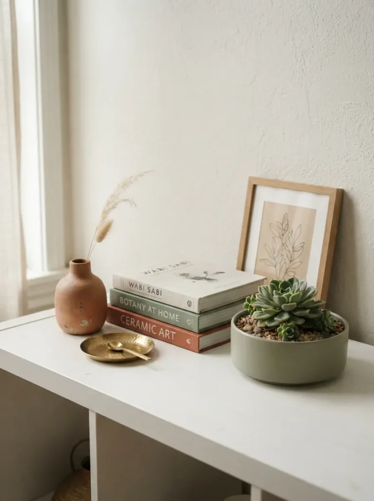
What it looks like: Composed like a still life three or four objects at different heights do more work than a crowded shelf full of things.
Why it works: The top surface of a Kallax is the one plane visible from across the room, so treating it like a console table vignette varied heights, a tray to ground smaller objects, one plant reads as far more finished than styling the cubbies alone.
How to copy it: Anchor the arrangement with a tray first, then build height in odd numbers one tall item, one medium, and one low and wide, where a modern succulent planter works especially well. Keep the palette to three colors max so the vignette doesn’t compete with what’s happening inside the cubbies below.
Best for: Living room or entryway units where the top surface is the main visual moment.
Shop This Look
| Product |
|---|
| Small brass or wood catchall tray |
| Low ceramic bud vase, matte finish |
| Compact succulent planter, 4-inch |
| Small framed art print, leaning style |
| Stack of 2–3 hardcover decorative books |
This next one is the trick most people skip because it sounds small until they see the difference.
15. Add a Warm LED Strip Under the Top Overhang
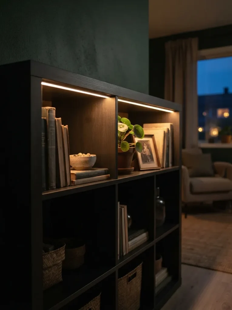
What it looks like: Subtle but dramatic once the sun goes down a thin glow line does more for ambiance than any lamp on top could.
Why it works: Under-lighting the top overhang throws light downward across the cubby fronts rather than up at the ceiling, creating a soft wash that makes the whole piece look considered after dark, not just functional during the day.
How to copy it: Use an adhesive-backed warm-white LED strip rated 2700K, run along the underside of the top panel, and hide the wiring by routing it down the back edge rather than the visible side. A remote dimmer means you can turn it down for evenings without touching a switch.
Best for: Living rooms and bedrooms where the shelf doubles as ambient lighting.
Pro Tip: Buy a strip with a built-in dimmer remote rather than a fixed-brightness one full brightness under a shelf reads more like a display case than a cozy glow.
16. Flank a Doorway With Two Matching Units
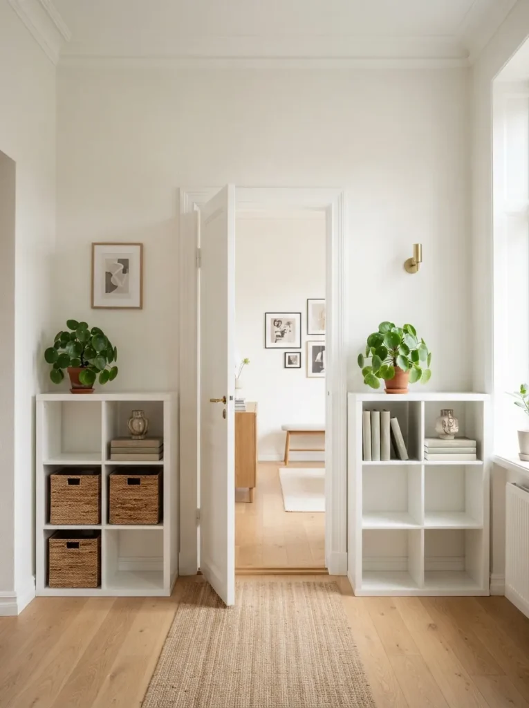
What it looks like: Framed and deliberate a doorway suddenly looks like it was designed around the shelving, not the other way around.
Why it works: Symmetry reads as intentional architecture even when the underlying furniture is inexpensive. Two identical units styled the same way on each side trick the eye into treating the whole doorway as one designed feature rather than two separate storage pieces.
How to copy it: Style both units close to identically same plant type, same book count, same color baskets since near-symmetry looks like a mistake in a way full asymmetry never does. Leave equal negative space on both sides so neither unit feels heavier.
Best for: Open-concept homes with a defined doorway or archway between rooms.
Styling Note: Use real, not faux, plants if possible on this one specifically matched pairs draw close inspection, and a faux plant’s uniformity next to its twin can look artificial fast.
17. Two-Tone the Cubbies in a Checkerboard Color Block
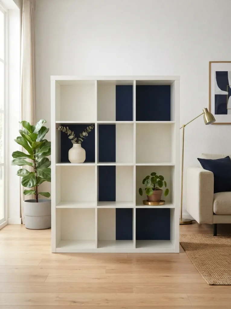
What it looks like: Graphic and a little playful alternating painted cubby backs turn a grid of squares into an actual pattern.
Why it works: Painting only the interior back panel of alternating cubbies in a second color creates a checkerboard rhythm without touching the frame or drawer fronts, so the pattern reads as a deliberate design choice rather than a full repaint commitment.
How to copy it: Mask off every other cubby’s back panel only not the sides using painter’s tape, and use a contrasting satin enamel like deep navy or terracotta against the existing white. Keep styled objects minimal in the painted cubbies so the color stays the focal point.
Best for: Anyone with a 4×4 or larger unit who wants pattern without full-unit commitment.
Warning: Painting cubby backs without removing the back panel first traps wet paint against particleboard and can warp it pull the panel off if your unit has one, and let paint cure fully before reattaching.
18. Stand One Kallax Cube Vertically as a Slim Corner Nightstand
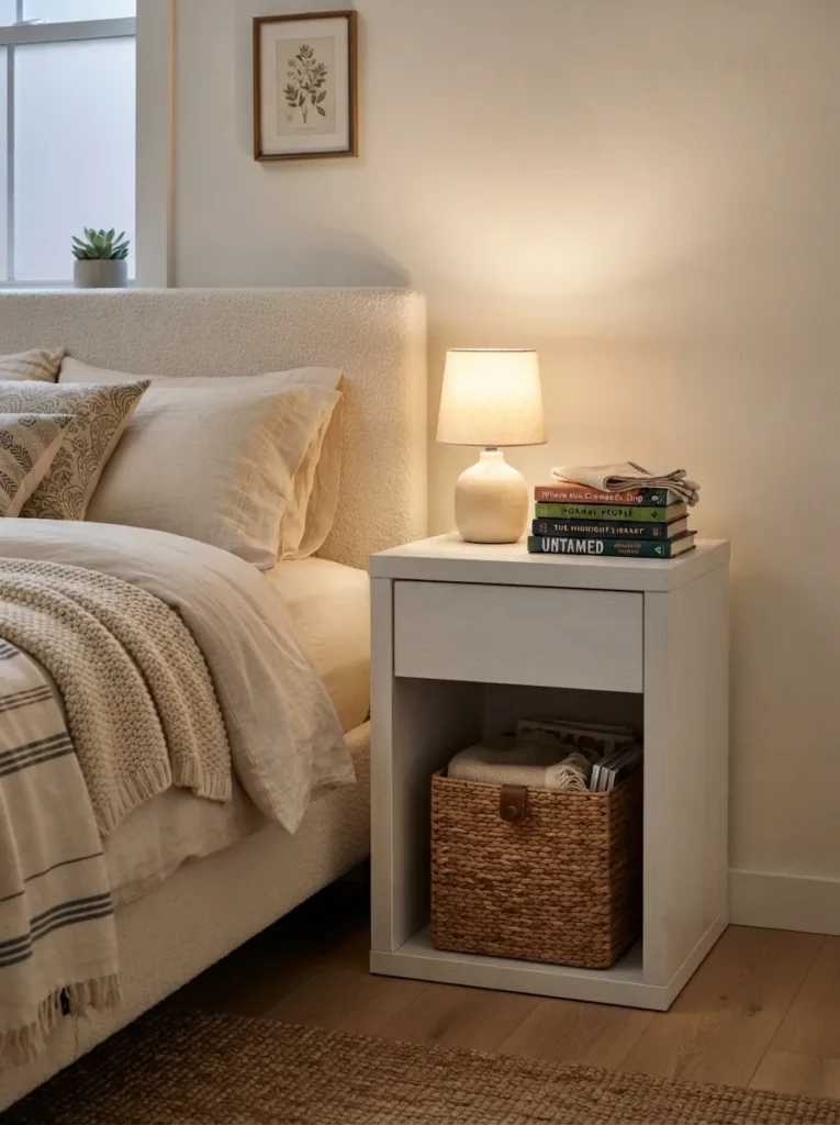
What it looks like: Compact and purposeful a single cube does the job of a nightstand without eating up floor space a full unit would need.
Why it works: A single Kallax insert cube measures roughly 15×15 inches, narrower than most standalone nightstands, making it a genuine space-saver in a tight bedroom layout. Standing it on end keeps the footprint to one small square instead of a long horizontal run.
How to copy it: Buy just the single insert unit, not a full 2×2 or 4×4, and add a small felt-lined basket inside to keep the open cube from looking like unused storage. Top it with a lamp sized so its base doesn’t overhang the 15-inch surface.
Best for: Small bedrooms, guest rooms, or anyone furnishing on a tight footprint.
Small-Space Tip: Skip a full nightstand lamp and use a small clip-on or wall-mounted sconce instead it frees the entire top surface for a book and a glass of water, which matters more on a 15-inch square than it sounds.
Every idea from here on solves a slightly bigger space or storage problem starting with the one that adds real texture for almost nothing.
My Views:
What I’ve found with real client spaces: people almost always paint or wrap the parts of a Kallax that are least visible and leave the most-seen surface the top completely bare. Flip that logic. On a 4×2 unit against a living room wall, the top surface gets more direct eye contact in a normal seated sightline than any single cubby does, so a plain, unwrapped top on an otherwise-painted unit ends up looking unfinished rather than intentional.
19. Line a Few Cubbies with Cork or Acoustic Felt Panels
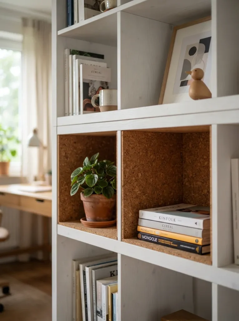
What it looks like: Tactile and a little unexpected cork lining adds texture depth most Kallax shelves never get near.
Why it works: Lining just two or three cubby interiors in cork or acoustic felt panel breaks up the flat melamine surface with genuine texture, and in a home office setup it softens sound bounce off the hard cubby walls a functional bonus most purely decorative fixes don’t offer.
How to copy it: Cut adhesive-backed cork panel sheets to the exact interior dimensions of the cubby using a straightedge and sharp blade, and apply to the back panel only, not the sides, so the texture reads without shrinking the usable space. Two or three lined cubbies out of a 4×4 grid is enough lining all sixteen flattens the effect.
Best for: Home offices or anyone who wants texture without a big material investment.
Important: Cork panel and cork shelf liner are not interchangeable in feel liner is thinner and flexes, while true panel has rigidity and a deeper texture; both work, but they read differently up close.
20. Add a Fabric-Front Drawer Insert for Concealed Storage
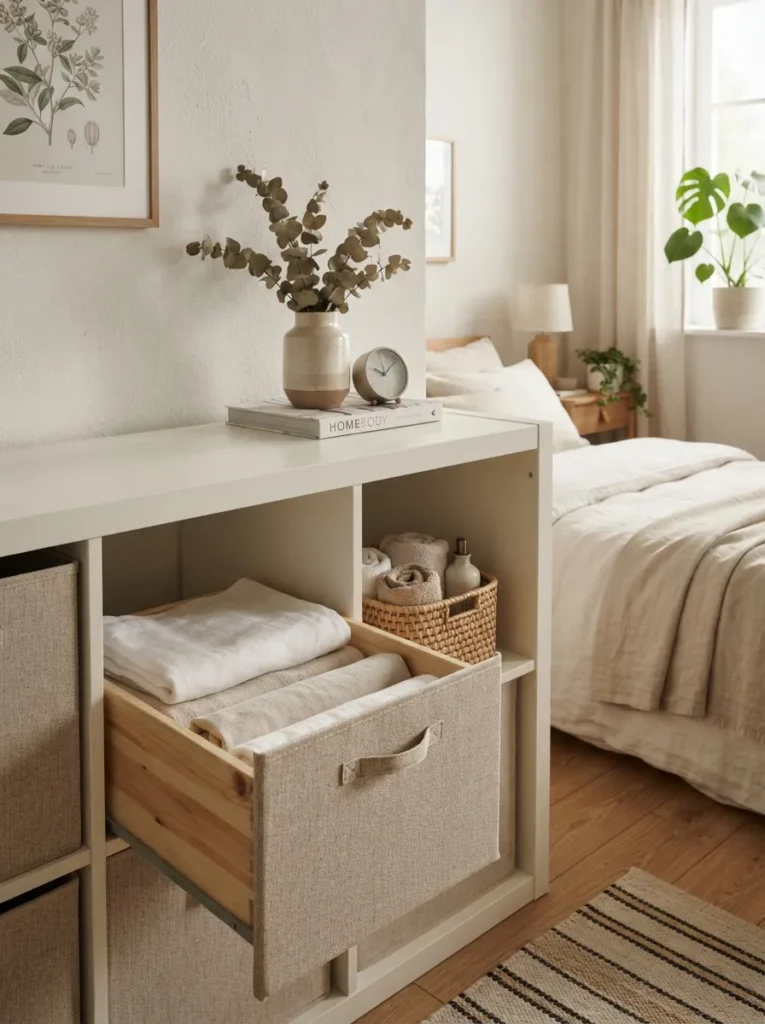
What it looks like: Cleaner than an open basket a drawer front hides contents completely instead of just softening the view of them.
Why it works: A fabric-front drawer insert closes fully, unlike a basket, which matters for items you’d rather not see even partially cables, medications, mismatched socks. It also adds a furniture-like drawer element to a piece that’s otherwise all open cubes.
How to copy it: Measure the cubby opening before ordering most drawer inserts are sold specifically sized for Kallax cubes at roughly 13×13 inches, so a generic drawer won’t slide in flush. Choose a fabric front in a tone that matches your baskets elsewhere on the unit so it reads as one system.
Best for: Bedrooms, entryways, or anyone storing items they’d rather fully conceal.
Styling Note: Position the drawer insert at eye level or just below it, not on the bottom row a closed drawer at floor level reads like an afterthought, while one at eye level looks like it was planned into the piece from the start.
21. Finish the Top with a Leaning Gallery Ledge
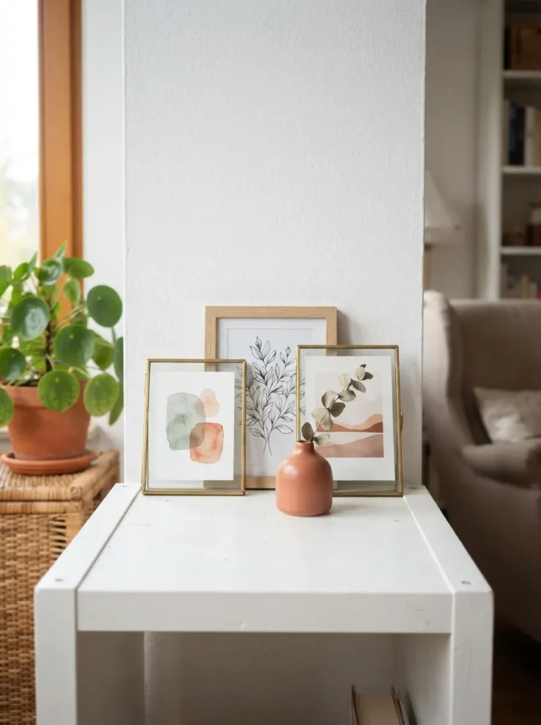
What it looks like: Layered and gallery-like leaning frames on the top edge do more visual work than anything mounted flat on the wall above.
Why it works: Overlapping leaning frames create depth through layering, a technique borrowed straight from gallery walls, and because nothing is nailed to the wall, the whole arrangement can be rearranged in minutes when the mood changes unlike a fixed wall grid.
How to copy it: Use three frames in slightly different heights and widths, never identical sizes, and overlap the front edge of the tallest one about a third of the way across the next. Add one small object, like a bud vase, in front of the frames at the base to anchor the arrangement instead of letting it float.
Best for: Renters who want a gallery-wall look without a single nail hole.
Pro Tip: Use museum putty on the back bottom corner of each leaning frame it’s nearly invisible and stops frames from sliding forward off the shelf edge without any visible hardware.
If frames feel too formal for the room, a crochet wall hanging leaned against the same ledge creates a similar layered effect with more texture and less structure.
How to Start Your Kallax Transformation
What I’ve found with real spaces: start with baskets, not paint. Swapping in a matched set of woven or fabric bins across just the most-visible row solves the cluttered look faster than any color or hardware change, and it’s the one move that doesn’t require tools, drying time, or measuring twice.
In practice, the most common fixable error is buying baskets that don’t match cubby depth Kallax cubbies run close to 13 inches deep, and a basket that’s even an inch short leaves a visible gap of shadow behind it that reads as unfinished no matter how nice the basket looks up front. The same measure-first approach is worth applying to closet storage too our craft closet organization guide walks through that version of the fix.
Three items under $50 that create real impact fast: a set of two matte black wire storage cubes for around $25, a roll of walnut wood-grain contact paper for the top surface at under $15, and a battery-powered warm-white LED puck light two-pack for about $20.
A full styling pass baskets, one paint or vinyl treatment, top surface vignette realistically takes one weekend afternoon and runs $80 to $200 depending on how many cubbies get treated. A single fix, like the top surface wrap or one row of baskets, is a same-day project under $50.
Ready to Style Your Kallax Shelf?
Twenty-one ideas is a lot to take in at once, and the ones that’ll actually change how the shelf feels aren’t the biggest they’re the color, texture, and lighting choices working together. Nobody transforms an entire unit in one sitting, and starting with just the top surface or one row of baskets is still real progress.
Pick one idea today a basket swap or the wood veneer top wrap both take under an hour. However it’s styled, the goal is a shelf you stop noticing as “the IKEA thing” and start using like it was built for the room. Save this one before you start; you’ll want to scroll back to the checkerboard cubbies and the bench-seat conversion once you’re mid-project.
Read Next
- 15 IKEA Kallax Hacks for Small Apartments That Don’t Sacrifice Storage
- 12 Modern Bookshelf Styling Ideas Beyond the Kallax
- 9 Budget Console Table Alternatives Anyone Can DIY This Weekend