21 Blue Bathroom Decor Ideas That Feel Like a Coastal Retreat
Blue bathroom decor means using a single hue from chalky sky blue to inky navy as the anchor for tile, paint, and finishes instead of an afterthought. This guide walks through 21 ideas, covering everything from full color washes to small styling swaps that take an afternoon.
Done right, a blue bathroom feels less like a room you clean and more like a place you’d actually linger steam curling off the tub, light bouncing softly off tile, towels stacked in a color that never looks dated. It’s a shade that shifts with the light: moody at night, almost coastal by morning. Twenty-one ideas in, and you’ll never look at a plain white bathroom the same way again.
Quick Navigation
- Why Blue Bathroom Decor Works So Well
- 21 Blue Bathroom Decor Ideas
- How to Start Your Blue Bathroom Transformation
- Ready to Create Your Dream Blue Bathroom?
Why Blue Bathroom Decor Works So Well
Blue bathroom decor pulls from coastal and traditional English bath design, back when color not tile pattern did most of the visual work. The palette runs from dusty slate blue and soft powder blue to marine navy, paired with materials like glazed ceramic tile, brushed brass or unlacquered brass hardware, and honed marble or engineered quartz.
It’s having a real moment right now because it reads as calm instead of trendy unlike greige, it doesn’t feel like it’s already aging out. It works fine in small bathrooms too, as long as the ceiling and upper walls stay lighter and the deepest tones sit lower, at tub or vanity level. You’ll see the same coastal-leaning palette carry through kitchens, mudrooms, and even a full pool house makeover it’s not a bathroom-only color story.
| Element | Soft & Airy | Deep & Moody |
|---|---|---|
| Philosophy | Calm, light-filled, spa-like | Rich, cocooning, dramatic |
| Materials | White oak, glazed tile, brushed nickel | Marble, unlacquered brass, matte tile |
| Color palette | Powder blue, seafoam, chalk white | Navy, indigo, ink blue |
21 Blue Bathroom Decor Ideas
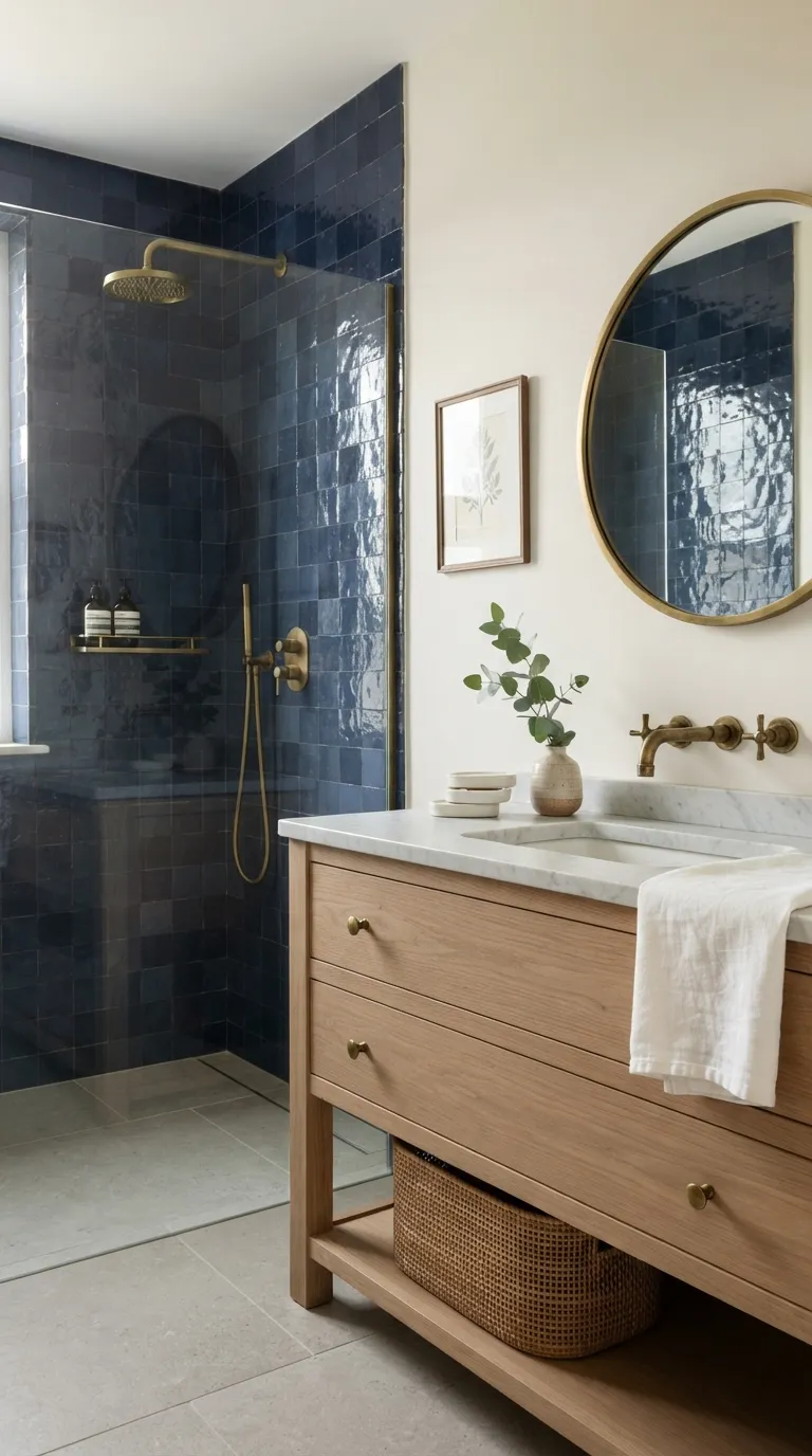
1. The Two-Tone Blue Vanity
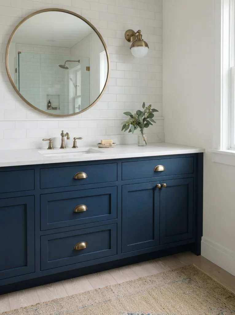
What it looks like: Grounded a dark lower half anchors the room while the wood top keeps it warm instead of heavy.
Why it works: Color-blocking a vanity uses contrast and visual weight on purpose; painting only the base keeps the eye low, which makes ceilings read taller.
How to copy it: Paint just the lower cabinet doors in a navy like Benjamin Moore’s Hale Navy, leave the counter and mirror surround untouched, and swap hardware to unlacquered brass for warmth.
Best for: Anyone with a builder-grade vanity who isn’t ready for a full replacement.
Quick Win: Cabinet paint alone no new vanity, no plumbing can transform the whole room in a single weekend.
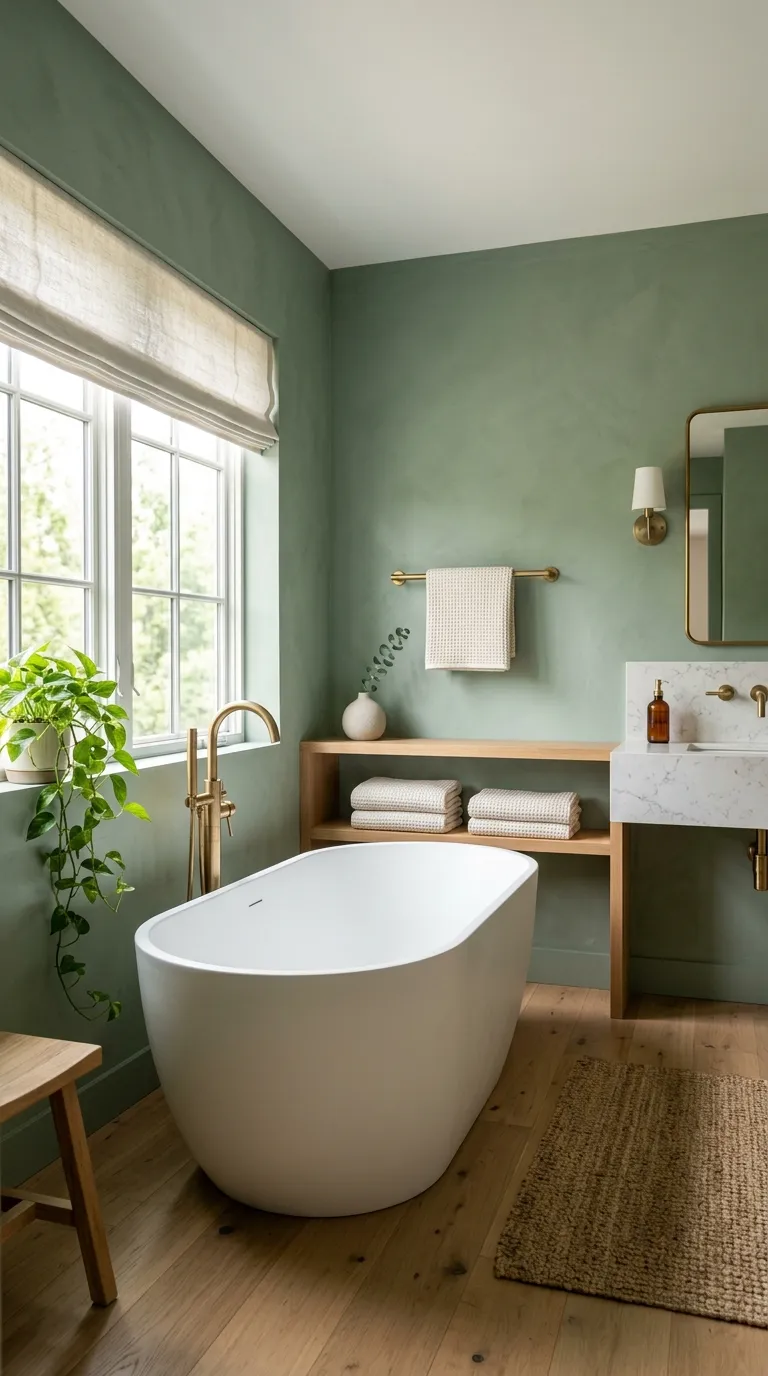
2. Navy Shiplap Accent Wall
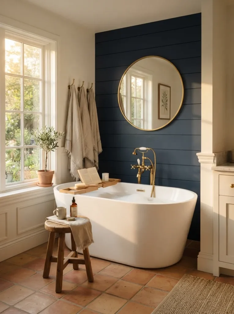
What it looks like: Textured and still the plank lines add shadow and rhythm without adding pattern.
Why it works: Shiplap introduces texture layering on a single wall, so the navy reads architectural instead of like paint, and it hides minor drywall imperfections other finishes would show.
How to copy it: Install shiplap or MDF plank boards behind the tub only, prime, then paint everything boards and grooves in one matte navy so the color feels intentional, not patchy.
Best for: People who want drama in one contained area without committing the whole room.
Pro Tip: Paint the shiplap after installation, in place, rather than pre-painting boards nail holes and seams need filling and touch-ups the pre-painted route always misses.
Shop This Look
| Product |
|---|
| Pre-primed shiplap wall plank kit |
| Brass wall-mounted tub filler |
| Matte navy interior paint sample set |
| Waffle-weave linen bath towel set |
| Round wood step stool |
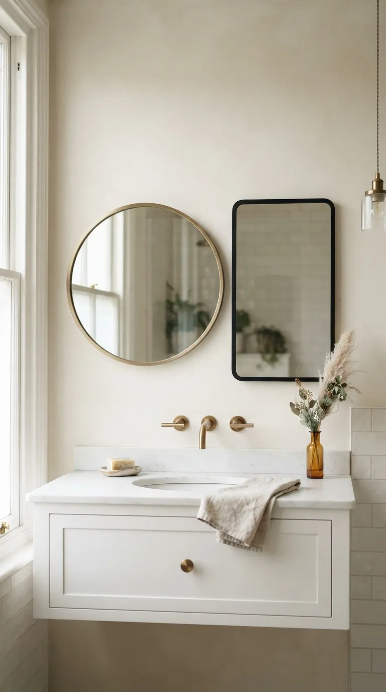
3. Brass Sconces Flanking the Mirror
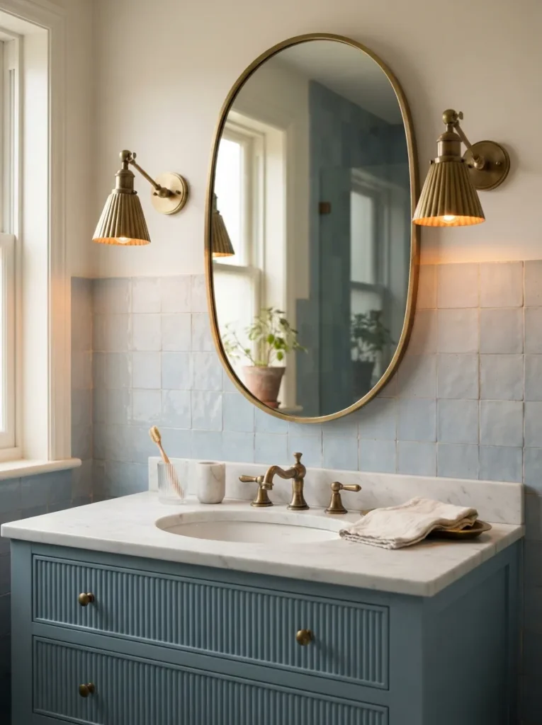
What it looks like: Flattering light hits at face height instead of straight down, which is the whole point.
Why it works: Overhead vanity lights cast shadows under the eyes and chin; sconces at mirror height distribute light evenly across the face, a basic principle of good bathroom lighting most builders skip.
How to copy it: Mount sconces at roughly 66 inches from the floor, spaced about 28 to 36 inches apart, centered on the mirror rather than the sink. Once the lighting’s right, the mirror shape and frame do the rest of the work worth browsing a few more bathroom mirror ideas if you’re rethinking the whole vanity wall.
Best for: Anyone doing a light refresh who wants a real functional upgrade, not just decor.
Styling Note: Choose sconces with an exposed bulb or fluted glass shade a fully enclosed drum shade mutes too much light for grooming tasks.
Up next: the tub that turns an ordinary bathroom into the room people photograph.
4. A Freestanding Blue Clawfoot Tub

What it looks like: Luminous inside, moody outside the two-tone paint job is the whole trick.
Why it works: Painting only the tub’s exterior in a saturated blue while keeping the interior white uses contrast as a focal point; it draws the eye without darkening the actual bathing surface.
How to copy it: Use an exterior-grade enamel paint rated for cast iron, tape off the interior basin completely, and apply at least two coats for even coverage.
Best for: Homeowners with an existing clawfoot tub who want impact without buying a new one.
Mistake to Avoid: Using standard wall paint instead of enamel it chips within months from water exposure and daily cleaning.
5. Woven Baskets and Blue Towels
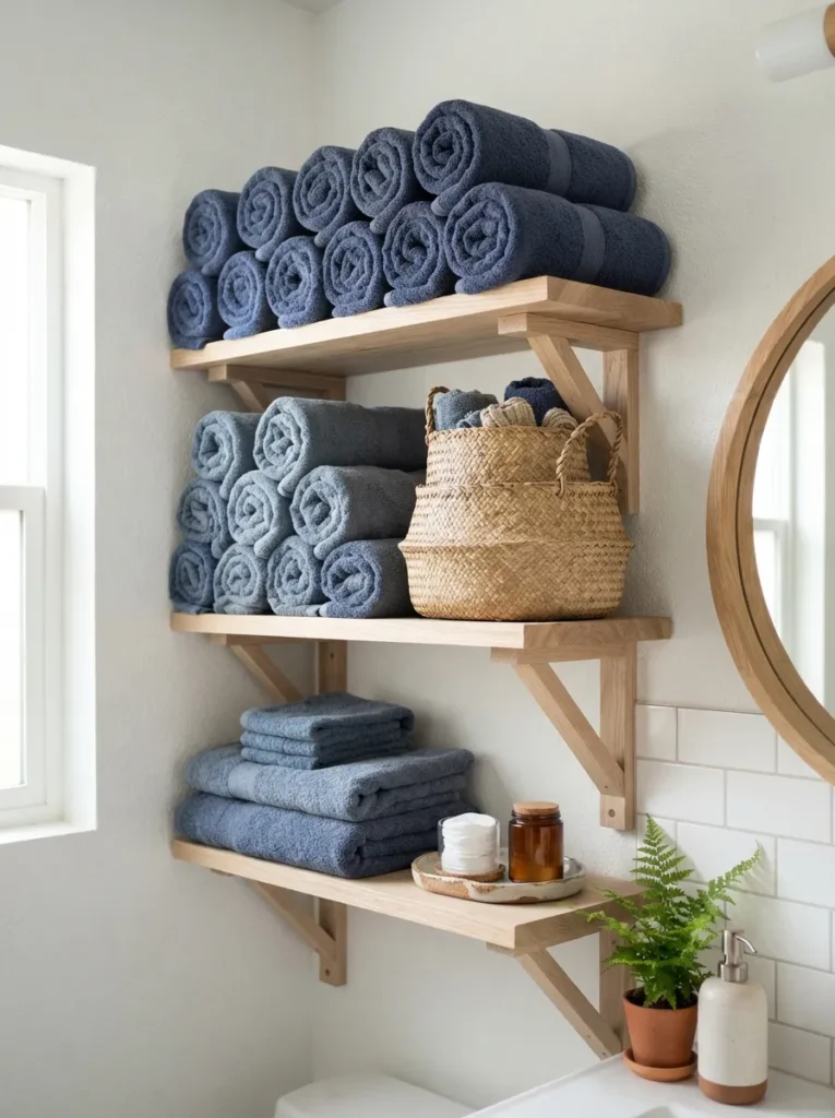
What it looks like: Layered texture does as much work here as the color does.
Why it works: Pairing a cool tone like indigo with a warm natural material like seagrass keeps the palette from feeling cold, a basic warm-cool balancing principle.
How to copy it: Roll towels instead of folding them flat, stack by shade from darkest at the bottom to lightest on top, and use baskets to hide everyday clutter like extra toilet paper.
Best for: Renters and small-space decorators who can’t paint or retile.
Warning: Cheap dyed towels bleed color in the wash within a few cycles check for a colorfast or “dye-locked” label before buying a full set.
The next idea works even in bathrooms with zero natural light it’s the easiest fix on this whole list.
6. An Ombre Blue Paint Wash
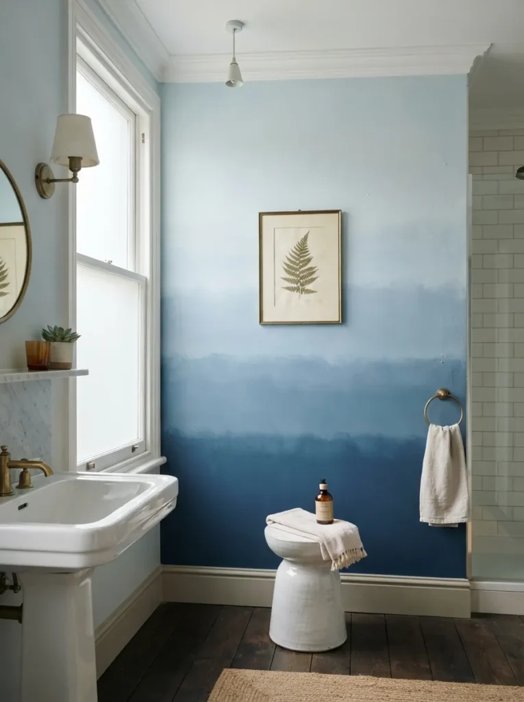
What it looks like: Dreamlike the wall shifts color as your eye moves down it, almost like weather.
Why it works: Gradients use value shift instead of a single flat hue, which adds depth to a wall that would otherwise read as one plane.
How to copy it: Pick three tones from the same paint strip, tape off horizontal bands, and blend the seams with a dry brush while each coat is still wet.
Best for: Confident DIYers who want a statement wall without wallpaper or tile.
Budget Version: Three sample-size paint pots run under $30 total and cover a single accent wall no need to buy full gallons of each shade.
7. A Deep Indigo Powder Room
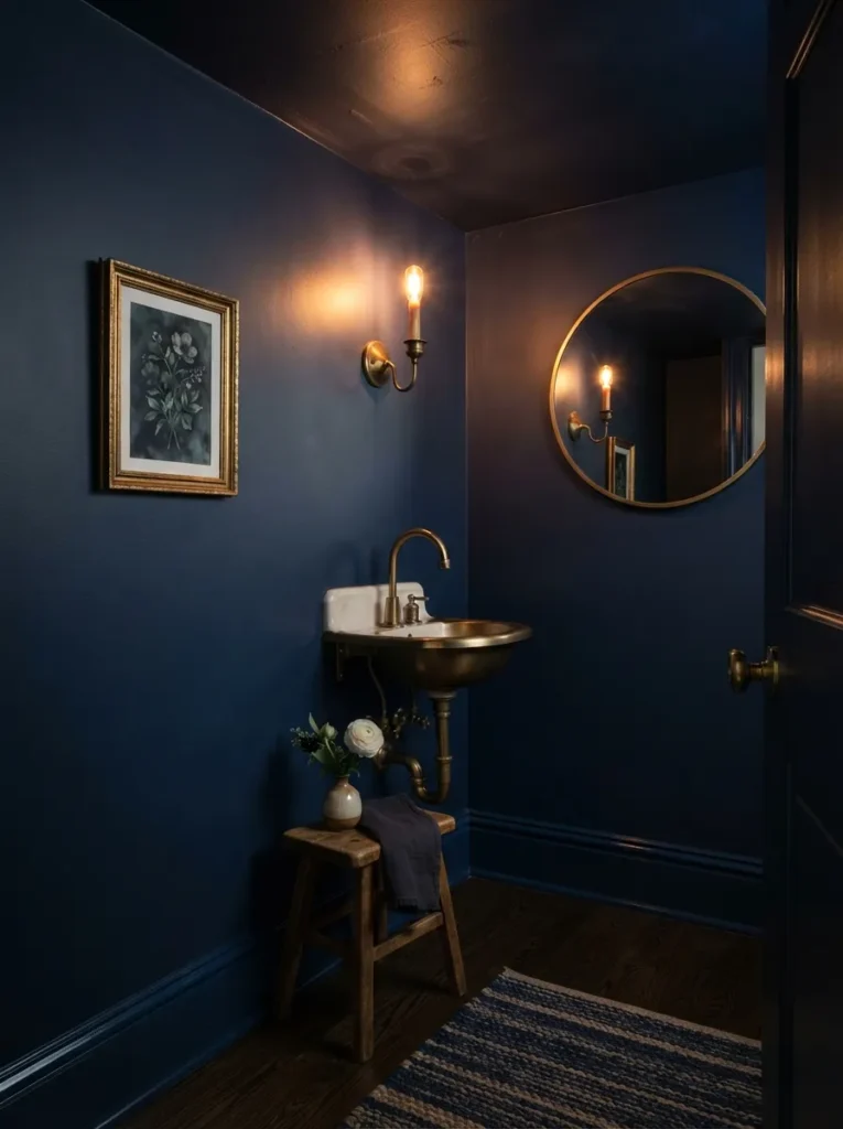
What it looks like: Enveloping painting the ceiling to match erases the corners entirely, so the room feels bigger, not smaller.
Why it works: A small room painted one saturated color edge-to-edge removes visual boundaries; the brain stops registering where the wall ends and the ceiling starts.
How to copy it: Use the same paint sheen and color on walls, trim, and ceiling a satin finish hides imperfections better than gloss in a tight space.
Best for: Small-space decorators tired of “make it feel bigger” advice that means painting everything white.
Small-Space Tip: Skip curtains entirely in a powder room this size a simple frosted window film gives privacy without adding visual clutter.
Up next: the tile pattern that’s been in bathrooms for over a century for a reason.
8. Classic Blue and White Tile for a Timeless Blue Bathroom
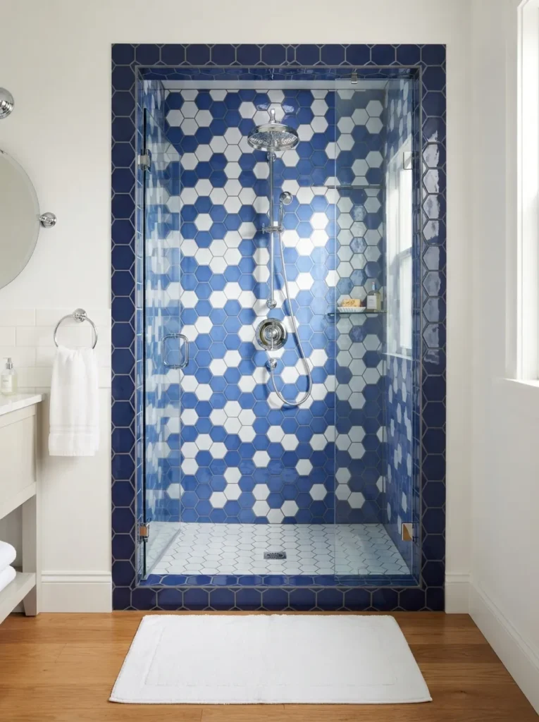
What it looks like: Crisp the pattern reads graphic from across the room and detailed up close.
Why it works: A repeating geometric pattern like hexagon tile relies on scale and repetition; keeping the field tile small and the border tile larger creates a frame effect that most builder-grade bathrooms skip.
How to copy it: Use white hex tile for the main field, then run a single row of solid cobalt tile at chair-rail height as a border, grouted in a matching dark tone.
Best for: Traditional and transitional homes where a full navy wall would feel too modern.
Mistake to Avoid: Grouting the border row in white to match the field it erases the whole effect. The border needs dark grout to read as a line, not a smudge.
9. A Floating Blue Vanity
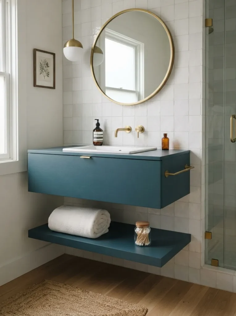
What it looks like: Weightless visible floor beneath the cabinet does more for the room’s sense of size than any paint color could.
Why it works: Floating furniture lets sightlines run under the piece uninterrupted, a proportion trick that makes even a small footprint bathroom register as more open.
How to copy it: Mount the vanity at 32 to 34 inches from the floor and leave the wall behind it in a lighter tile so the cabinet color pops by contrast.
Best for: Small bathrooms where every inch of visible floor matters.
✅ Quick Setup Checklist:
- [ ] Locate wall studs and confirm they align with the vanity’s mounting bracket
- [ ] Turn off water supply and disconnect existing plumbing
- [ ] Mount the wall bracket level, then hang the cabinet body
- [ ] Reconnect supply lines and P-trap, checking for leaks before use
Shop This Look
| Product |
|---|
| Floating bathroom vanity with integrated shelf |
| Vessel or undermount sink to fit vanity width |
| Wall-mounted single-hole faucet |
| Concealed floating vanity mounting bracket kit |
| Slim profile P-trap for wall-mount plumbing |
This next one surprised even experienced designers the first time they saw it done well.
10. Pendant Lighting Over the Vanity
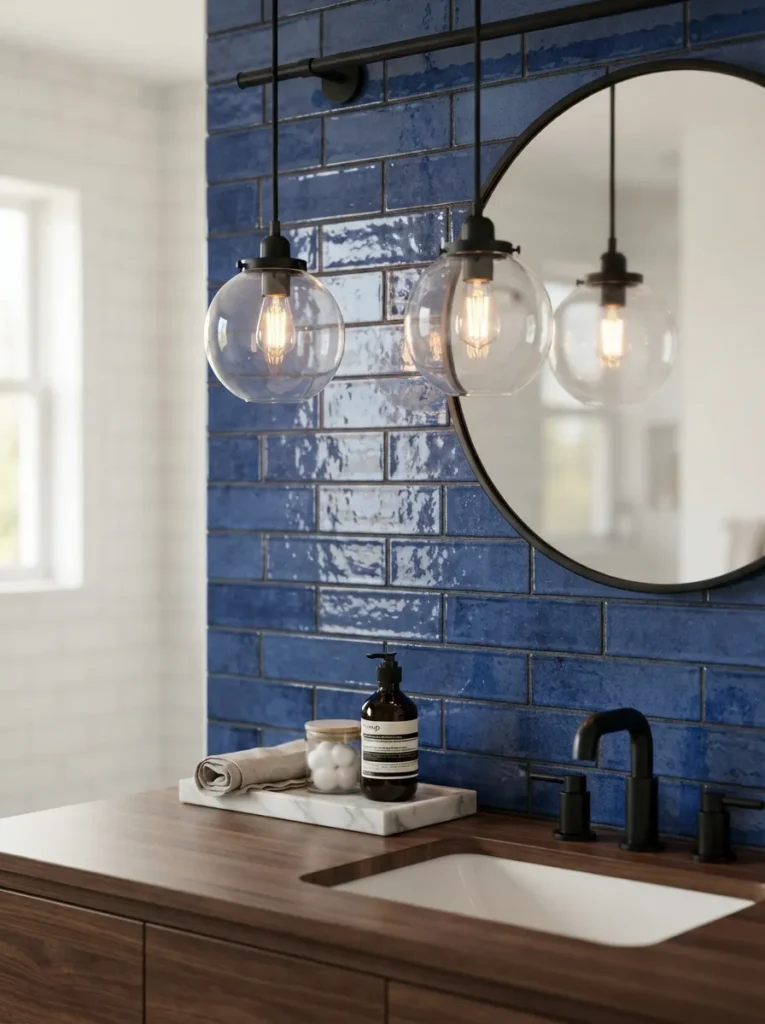
What it looks like: Elevated pendants read as a lighting fixture, not a bathroom fixture, which changes the whole feel of the room.
Why it works: Hanging fixtures introduce vertical visual weight above the mirror line, breaking up a room where every other line vanity, tile, mirror tends to run horizontal.
How to copy it: Hang pendants roughly 65 to 70 inches from the floor, spaced to align with the outer edges of the sink basin below, not the mirror.
Best for: Anyone renovating a vanity wall who wants a lighting upgrade that reads custom.
Quick Win: Swap a boring vanity light bar for two plug-in pendants with a cord cover kit no electrician required if there’s already an outlet nearby.
11. A Ceramic Blue and White Vessel Sink
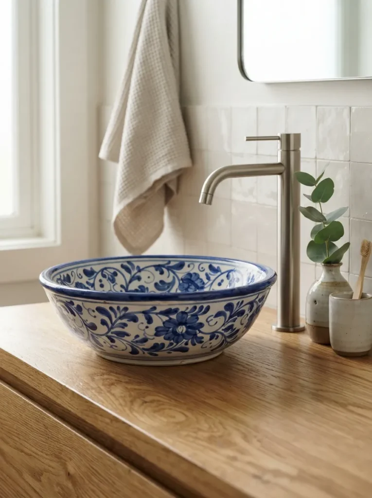
What it looks like: Handmade the visible pattern variation is the point, not a flaw.
Why it works: A vessel sink acts as a sculptural object sitting on the counter rather than disappearing into it, so a patterned one functions as the room’s focal point instead of the mirror.
How to copy it: Choose a gooseneck faucet tall enough to clear the vessel’s rim by at least 4 inches, and keep the surrounding counter and walls plain so the sink stays the star.
Best for: Statement-seekers doing a vanity swap without a full remodel.
Pro Tip: Vessel sinks sit higher than undermount ones plan for a slightly shorter vanity height, especially in households with kids.
12. A Wet Room Layout with Blue Tile Zoning
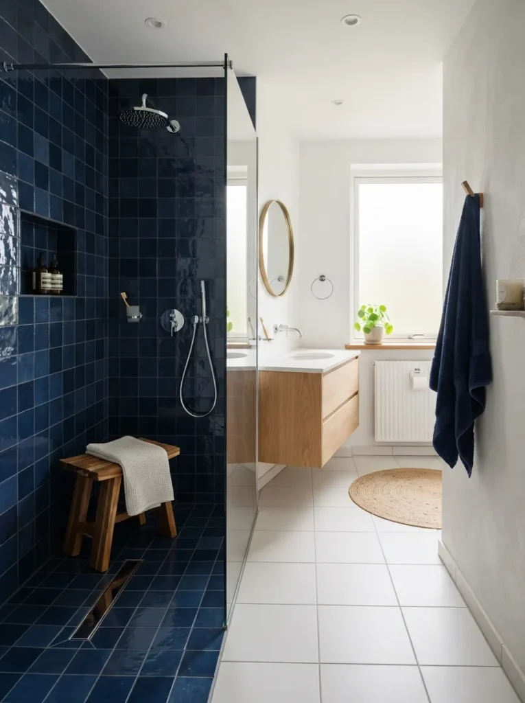
What it looks like: Zoned without walls the tile color does the job a shower door usually does.
Why it works: Using color to define zones instead of physical barriers is a layout principle that keeps sightlines open while still signaling “wet area starts here.”
How to copy it: Run the navy tile continuously from shower floor up the walls to ceiling height, and keep grout color consistent within each zone so the transition reads deliberate.
Best for: Larger bathrooms undergoing a full layout renovation.
Styling Note: A frameless glass partition (rather than a full door) keeps the color transition visible from across the room instead of hiding it behind hardware.
Up next: the smallest, cheapest idea on this list and one of the most effective.
13. A Cobalt Statement Door
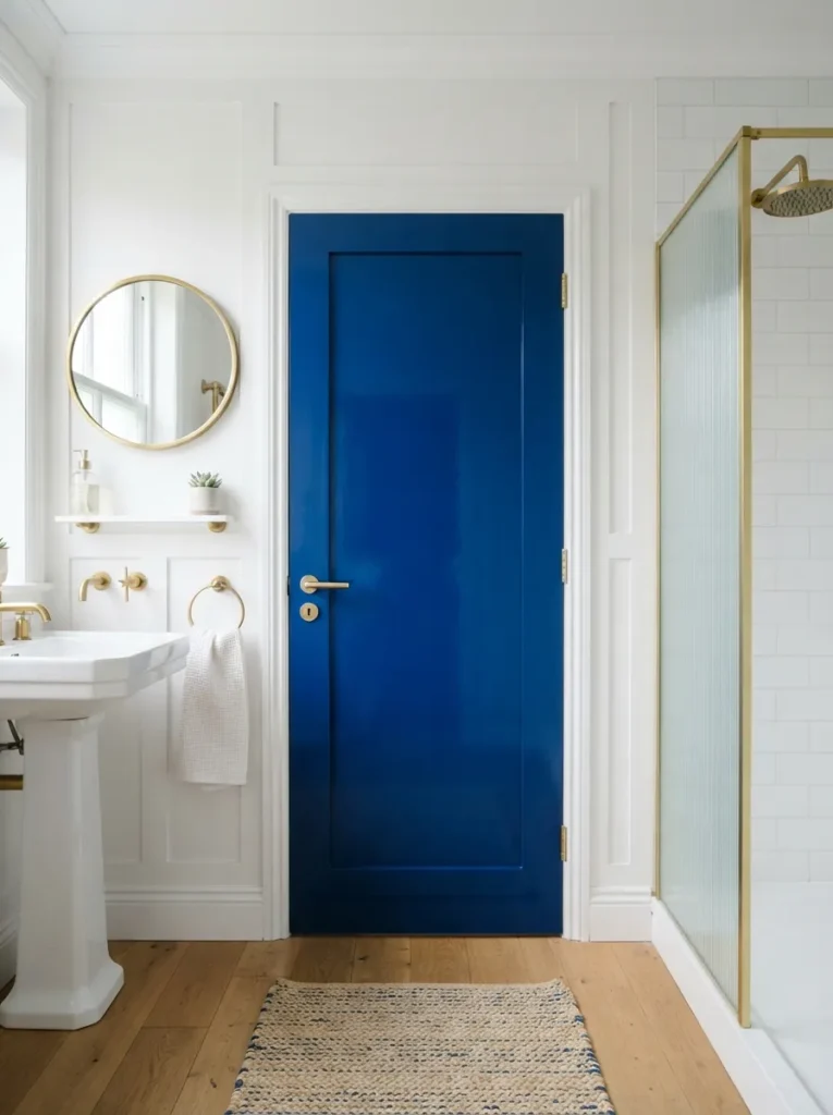
What it looks like: Punchy one glossy door does more than most people expect from a whole wall of paint.
Why it works: Isolating color to a single architectural element uses restraint as a design tool; the eye reads it as intentional rather than half-finished, the way a fully painted wall in the wrong light can.
How to copy it: Paint both sides and the door frame in the same high-gloss cobalt, and swap hardware to brass or matte black for contrast.
Best for: Renters and budget decorators who want maximum visual return for minimum cost.
Budget Version: A single quart of gloss paint covers a standard door twice over, for well under $40 including primer.
14. Blue Grasscloth Wallpaper
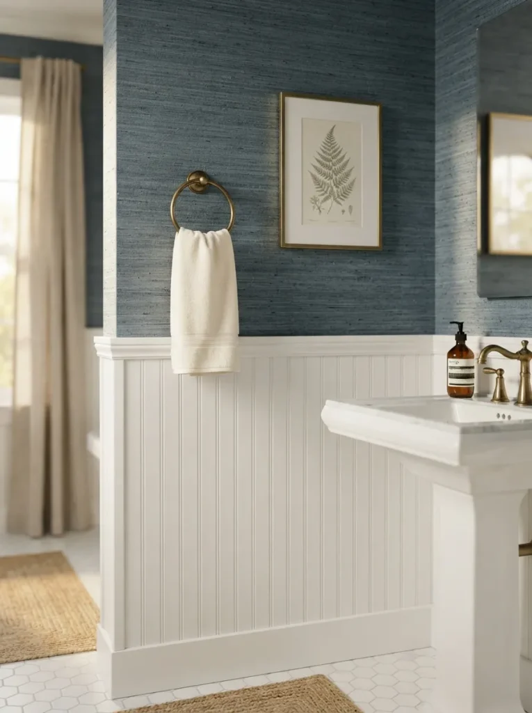
What it looks like: Woven the texture catches light differently than flat paint ever could.
Why it works: Natural-fiber wallpaper adds texture layering above a hard-surfaced wainscot, splitting the wall visually and keeping a small room from feeling like one flat box of color.
How to copy it: Install wainscot at 36 to 42 inches, then paper only above it grasscloth needs a moisture-resistant room with good ventilation, so pair it with an exhaust fan upgrade if the bathroom doesn’t already have one.
Best for: Powder rooms and low-moisture guest baths rather than daily-use showers.
Important: Grasscloth isn’t vinyl it can’t be scrubbed or exposed to constant steam, which is why it belongs above the wainscot line, not inside a shower zone.
Shop This Look
| Product |
|---|
| Slate-blue grasscloth wallpaper roll |
| Beadboard wainscot paneling kit |
| Brass towel ring |
| Wallpaper adhesive and smoothing tool set |
| Framed botanical print, blue and white |
The next idea is the one small-apartment renters ask about most.
15. A Compact Blue Vanity for Small Apartments
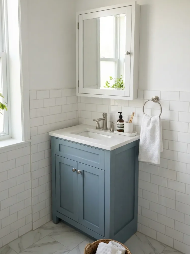
What it looks like: Efficient every inch is doing double duty, and it still looks finished.
Why it works: A mirrored medicine cabinet adds storage without adding footprint, and a recessed (rather than surface-mounted) install keeps it flush with the wall in tight quarters.
How to copy it: Choose a vanity no wider than 24 to 30 inches, and recess the medicine cabinet into the wall between studs if the wall isn’t load-bearing.
Best for: Apartment renters and anyone working with under 35 square feet.
Small-Space Tip: Choose a vanity with an open shelf underneath instead of closed doors visible floor and storage both read as more space than a solid cabinet front.
16. A Built-In Blue Shelving Niche
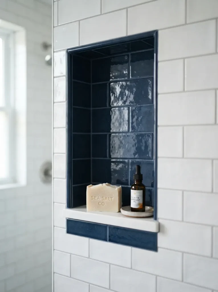
What it looks like: Still a small, contained pop of color inside an otherwise plain shower wall.
Why it works: A recessed niche uses negative space as its frame; lining just the interior in a contrasting tile draws the eye to one controlled spot rather than competing with the whole wall.
How to copy it: Build the niche between studs during a shower renovation, and use mitered tile edges (not metal trim) at the corners for a seamless, built-in look.
Best for: Full shower remodels where the tile work is already being planned from scratch.
17. A Skylight with Sheer Blue-Trimmed Curtains
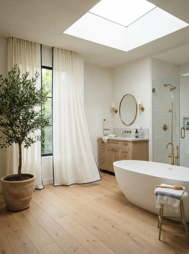
What it looks like: Luminous natural light does most of the work; the blue trim just frames it.
Why it works: Light behavior changes color perception throughout the day, so a small amount of blue as trim (rather than a full curtain) lets the room shift from crisp at noon to softer at dusk without repainting anything.
How to copy it: Hem a plain sheer curtain panel with a 2-inch navy grosgrain ribbon border, hung on a tension rod for a no-drill install.
Best for: South- or east-facing bathrooms with strong natural light to work with.
Pro Tip: Skip blackout or heavy fabric here entirely the whole idea depends on light passing through, not being blocked.
Up next: the accessory swap people underestimate the most.
18. A Blue and White Striped Shower Curtain
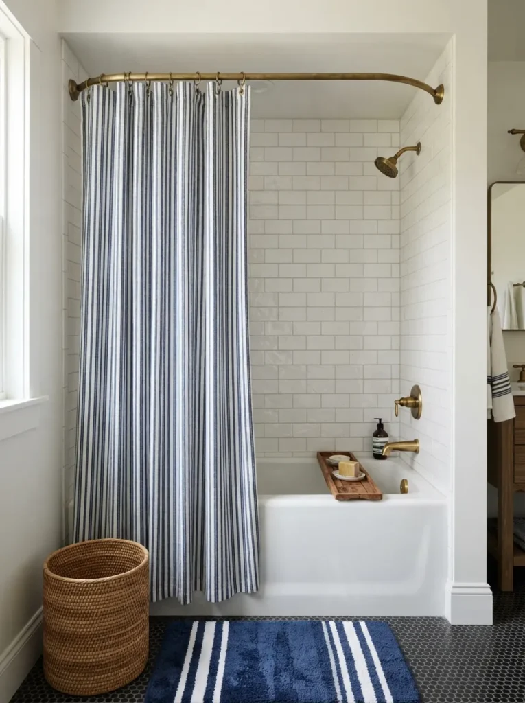
What it looks like: Classic stripes read timeless in a way that trend-driven prints usually don’t.
Why it works: A curved shower rod adds roughly 4 to 6 extra inches of interior space over a straight rod, a proportion trick that makes the whole tub area feel larger without any construction.
How to copy it: Pair a cotton (not vinyl) striped curtain with a separate clear liner, and switch to a curved rod it’s a 10-minute swap with the same mounting holes.
Best for: Renters wanting the single fastest visual upgrade on this entire list.
Styling Note: Iron or steam the curtain before hanging stripe patterns show shipping creases far more obviously than solid colors do.
In my experience, the mistake almost every first-time blue bathroom renovator makes is choosing tile and paint under store lighting, then installing it under a totally different bulb temperature at home. A navy that looks near-black under warm 2700K bulbs can read almost teal under daylight 5000K LEDs always test a sample tile or paint swatch on the actual wall, under the actual bulbs, morning and night, before ordering anything by the box.
The last few ideas are the ones that tie the whole room together.
19. A Blue Penny Tile Floor
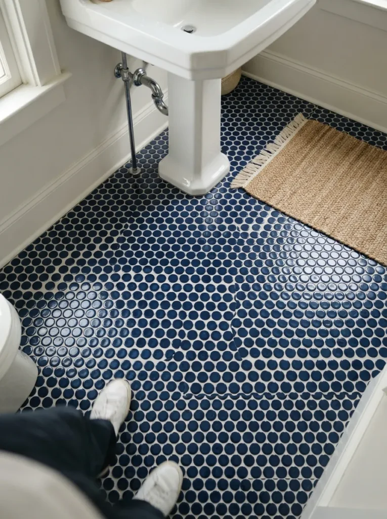
What it looks like: Graphic small-format tile turns the entire floor into a pattern instead of a backdrop.
Why it works: Penny tile’s small scale increases grout-line density underfoot, which adds slip resistance a practical benefit alongside the visual one, and worth mentioning since most statement floors trade function for looks.
How to copy it: Use white grout for contrast definition, or match-tone grout for a more blended, monochrome look decide based on whether the floor or the walls should lead the room.
Best for: Bathrooms getting a full floor replacement, especially period-style homes.
Mistake to Avoid: Skipping a grout sealer on floor tile specifically floors take more foot traffic and moisture than walls, and unsealed grout stains within the first year.
Shop This Look
| Product |
|---|
| Navy penny round mosaic tile sheets |
| Waterproof tile grout sealer |
| White pedestal sink |
| Chrome floor drain cover |
| Woven cotton bath mat |
20. A Reorganized Linen and Towel Zone
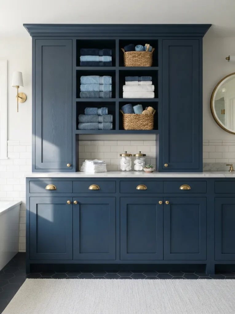
What it looks like: Organized everything visible has a place, which is rarer in bathrooms than any other room.
Why it works: Zoning storage by function (towels, toiletries, linens each in their own cubby) reduces visual clutter more effectively than adding more baskets to an already disorganized shelf.
How to copy it: Build or buy cabinetry with at least one open cubby section for daily-use items and closed doors for anything you don’t want on display. It’s the same zone-based logic behind a well-run craft closet group by function first, then make it look good.
Best for: Families and anyone sharing one bathroom who’s tired of counter clutter.
Important: Open cubbies only stay tidy if towels are folded to a uniform size first inconsistent folding is usually why open storage gets abandoned within a month.
21. Dusty Blue and Warm Wood, Paired
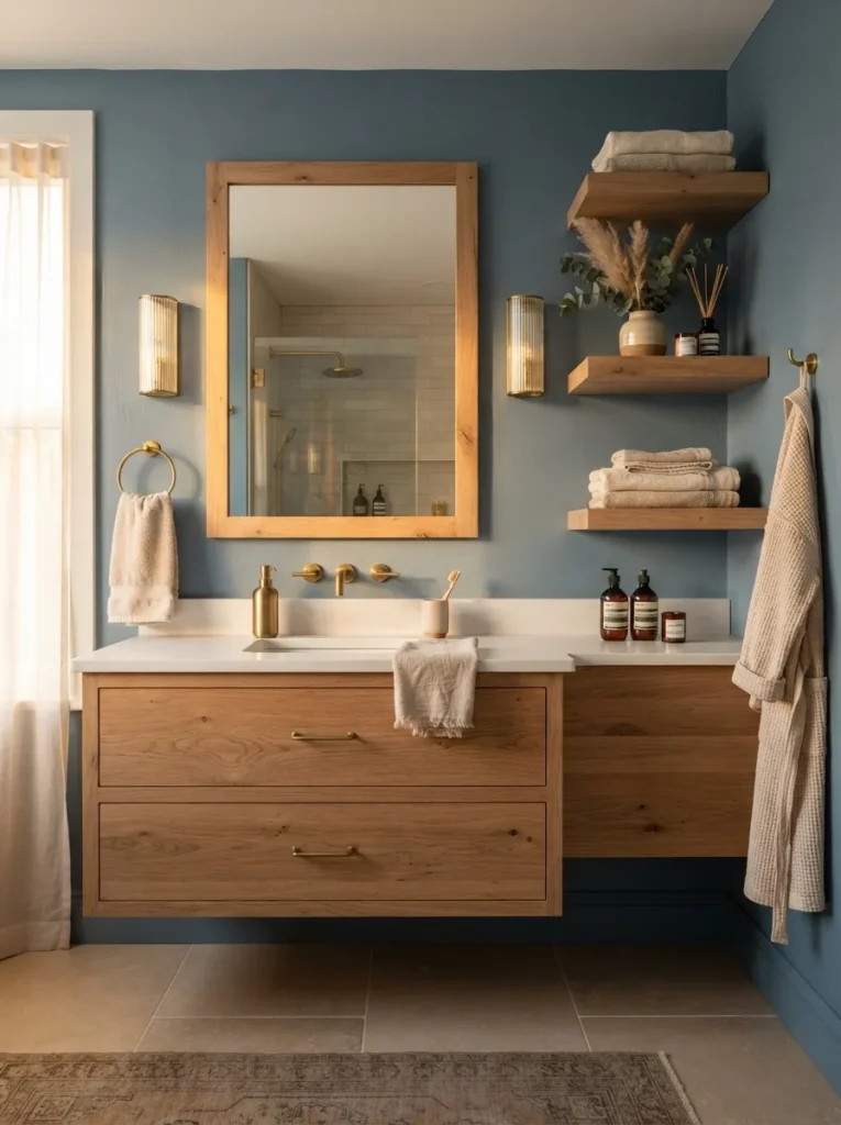
What it looks like: Sun-warmed the wood keeps a cool color from ever feeling clinical.
Why it works: Pairing a cool hue with a warm material is a basic color-temperature balancing principle; it’s the single biggest reason some blue bathrooms feel spa-like while others feel cold and sterile.
How to copy it: Match dusty blue walls (something like a muted Farrow & Ball chalky blue) with unfinished or lightly oiled white oak avoid dark walnut, which pulls the room moody instead of warm.
Best for: Anyone who loves blue but has hesitated because past attempts felt too cold.
Quick Win: Swap just the mirror frame and one shelf to warm wood it’s often enough to fix a blue bathroom that’s already reading too clinical.
How to Start Your Blue Bathroom Transformation
In practice, the fastest way to commit to a blue bathroom is choosing your undertone before anything else tape a large swatch of something like Farrow & Ball’s Stiffkey Blue or Sherwin-Williams’ Naval directly on the wall and check it morning and night.
Every other decision, from tile to towels, reads correctly once that undertone is locked in first. It’s the same commit-to-a-color-first approach that works when styling something like a tan sofa living room pick the anchor, then build out from there.
The most common mistake is pairing blue tile or paint with a cool-white ceiling and trim the contrast reads sterile instead of calm. A warm white trim color keeps a blue room feeling inhabited rather than clinical, and it’s a five-minute fix if you’ve already made this mistake.
Three items under $50 that punch above their price: a ribbed ceramic soap dispenser in matte cobalt, a set of Turkish cotton hand towels in an indigo stripe, and a brass hook rail. Small, but each one does real visual work in a room this size.
A styling-only refresh paint, textiles, hardware takes a weekend and runs somewhere between $150 and $400. A full tile-and-vanity overhaul is closer to a 2 to 4 week project, typically landing between $3,500 and $9,000 depending on tile choice and whether plumbing needs to move.
Ready to Create Your Dream Blue Bathroom?
Twenty-one ideas in, and the throughline is clear blue bathroom decor works whether it’s arriving through a full tile wall, a single painted door, or just the towels on the rail. None of this needs to happen all at once; even one idea, done well, changes how the whole room feels. If you’re starting today, paint one wall or swap your towels before touching anything structural.
The right blue doesn’t shout for attention it just makes the room feel like somewhere you’d actually want to be at 7am. Save your favorites now, especially the ones using tile or paint you can actually recreate this weekend.
You Might Also Like
- 15 Small Bathroom Storage Ideas That Actually Work
- 12 Coastal Living Room Ideas for a Calm, Airy Home
- 10 Bathroom Mirror Ideas to Instantly Upgrade Any Space