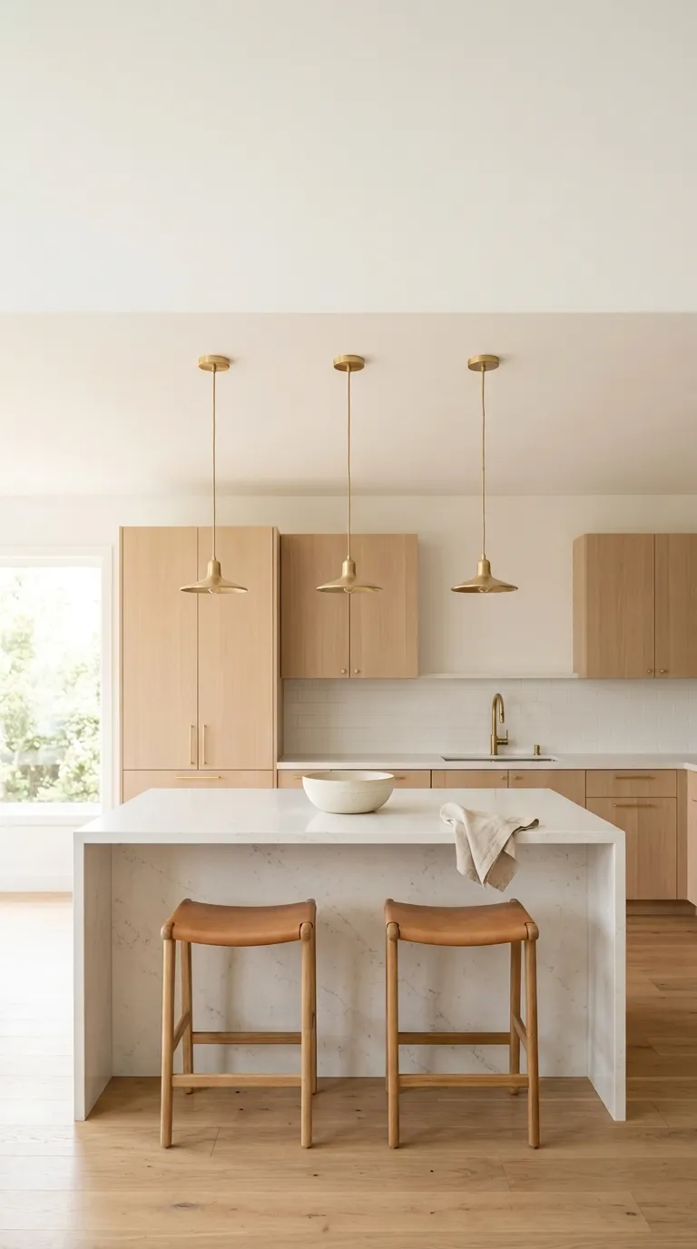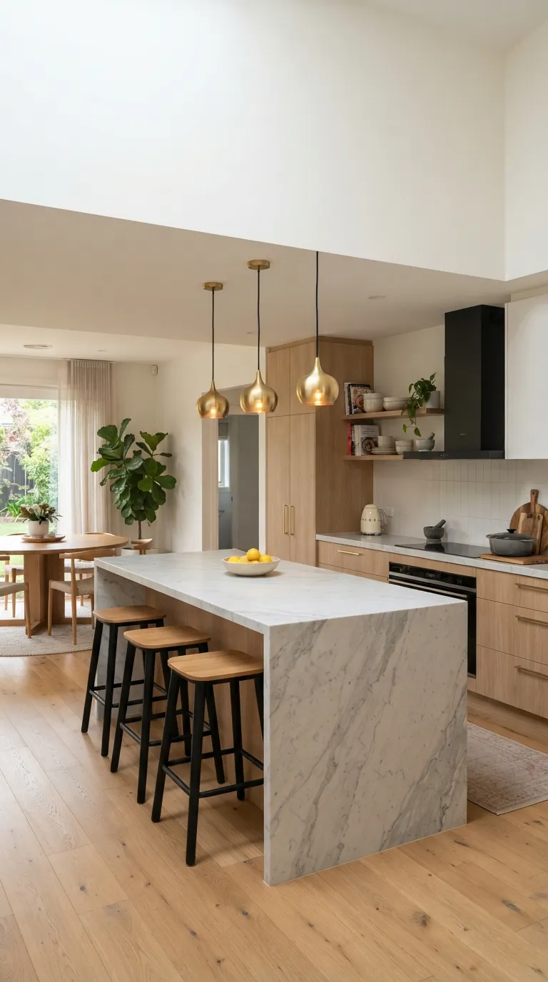
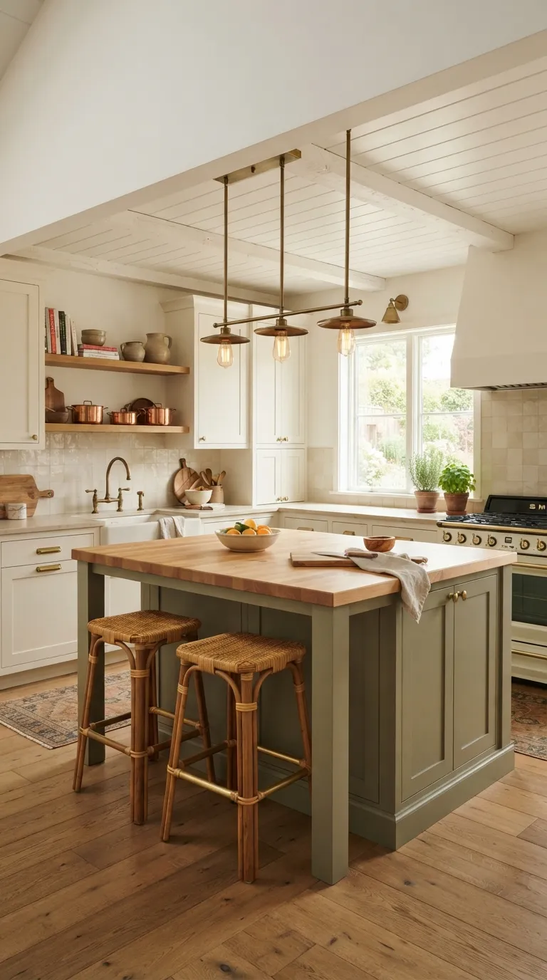
16 Butcher Block Kitchen Island Ideas for a Warm, Natural Look
A butcher block top does something paint and tile can’t it makes a kitchen feel lived-in from the day it’s installed, not just decorated. Here are 16 butcher block kitchen island ideas built around that warmth: real wood grain, honest material pairings, and enough variety in cabinet colors, lighting, and layout that at least a few will fit your kitchen exactly as it is.
Picture the light catching on oiled maple in the late afternoon, the faint smell of walnut oil after a fresh coat, the way a scarred cutting surface looks better with use instead of worse. This isn’t about a single “look” it’s about a material that gets more character every year you own it. Rustic doesn’t have to mean rough, either.
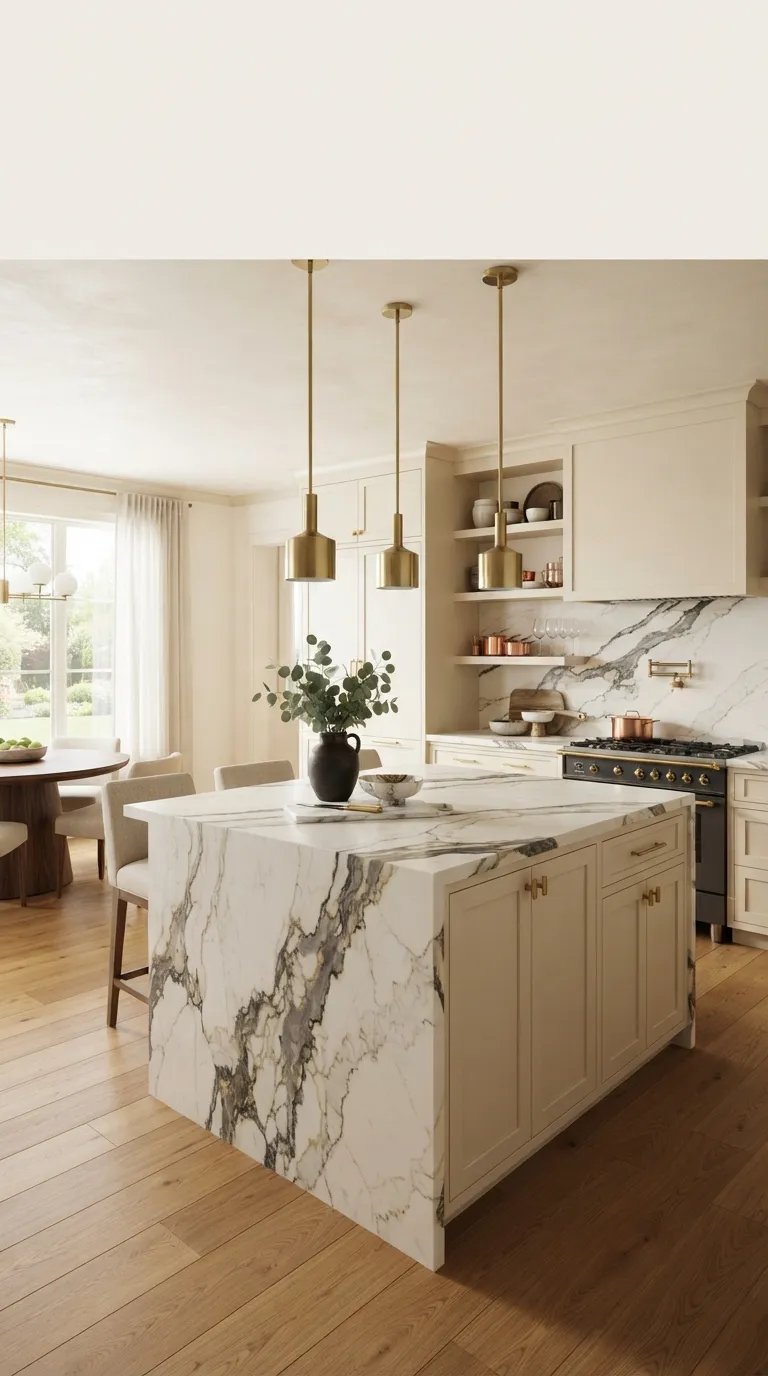
Quick Navigation
- Why Butcher Block Works So Well
- The Ideas, Starting With the Simplest Swaps
- How to Start Your Butcher Block Transformation
- Ready to Create Your Dream Warm, Natural Kitchen?
Why Butcher Block Works So Well
Butcher block started as a workhorse surface in professional kitchens, valued for being tough enough to chop directly on and easy to refinish when it wore down. That practical history is exactly why it feels so at home in a warm, natural kitchen real wood grain, visible knots, and a surface that ages instead of aging out.
It pairs with almost any cabinet color, works in kitchens both large and small, and the single biggest priority when choosing it is sealing it properly for how you’ll use it: light styling surface or daily chopping station.
Style at a Glance
| Element | Core Trait 1 | Core Trait 2 |
|---|---|---|
| Philosophy | Function first, character over perfection | Wood that improves with visible use |
| Materials | Solid maple, walnut, or acacia butcher block | Paired with painted wood, iron, brass, or stone |
| Color palette | Honey, amber, and deep walnut wood tones | Warm white, sage, charcoal, or matte black bases |
The Ideas, Starting With the Simplest Swaps
1. A Painted Base with a Natural Wood Top
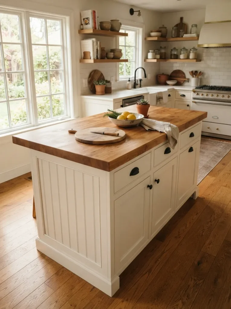
A two-tone island painted lower cabinets, unfinished wood on top reads as the anchor of the room the moment you walk in, because it’s the only surface doing double duty as color AND texture. The contrast works because paint and wood grain occupy different visual categories: one flat, one variable, so your eye naturally rests on the seam between them instead of scanning past it.
Stick to a 1½-inch-thick block minimum; anything thinner reads as a countertop overlay rather than a genuine island top, even with the right color contrast. Semi-gloss or satin cabinet paint holds up better against daily bumps than a flat finish, and it echoes the sheen of an oiled wood surface instead of fighting it.
This works whether your cabinets are painted navy, sage, or classic white the wood does the warming, the paint does the anchoring. It’s an easy first step if you’re not ready to commit to an all-wood island yet.
Warning: Don’t run a butcher block top flush against an undermount sink without a sealed gap or raised lip. Standing water at that seam is the fastest way to warp a wood top reseal the edge with food-safe mineral oil or beeswax finish every one to two months near any water source.
2. Matte Black Cabinets Against a Honey-Toned Top
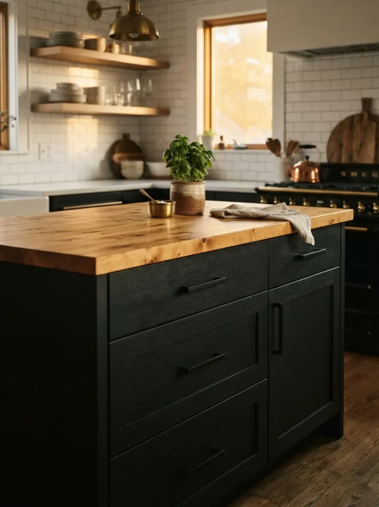
Most matte black kitchens lean cold and industrial add a butcher block top and that changes almost instantly. Where black cabinetry alone can feel severe, warm wood grain sitting on top of it acts like a buffer, pulling amber and gold into the room without softening the black itself.
Match undertones deliberately: a cooler black (true black, slight blue undertone) reads sharper against honey-toned maple, while a warmer black (soft black, slight brown undertone) blends closer to walnut or acacia. Carry whichever pairing you pick through the hardware too brushed black knobs with a maple top look intentional; brass with the same top looks accidental unless brass shows up elsewhere in the room.
This combination suits kitchens with a lot of white wall space that need one strong, grounding element without going fully dark.
Styling Note: Keep open shelving near a black-and-wood island in the same wood tone as the island top mismatched wood tones in the same sightline read as unplanned, even when everything else works.
3. A Cluster of Linear Pendants Set at Eye Level
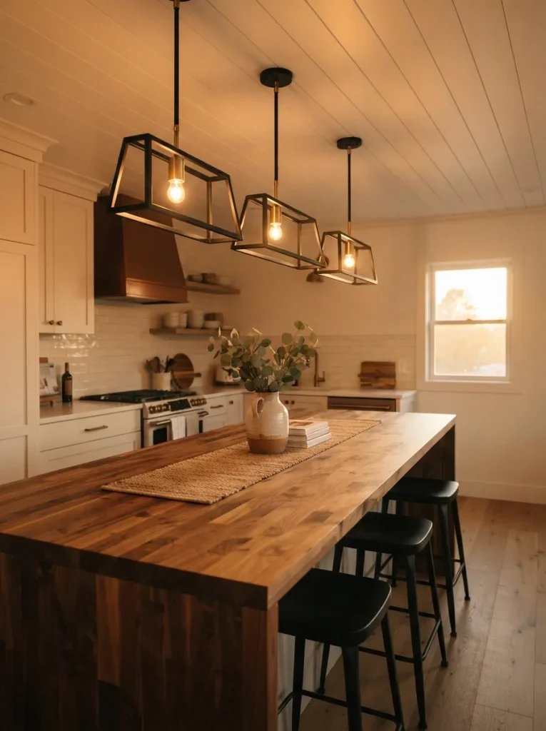
Light temperature does more for a butcher block island than almost any other design choice warm-toned wood reads dramatically differently under a cool white bulb than under a warm one, and it’s the detail most kitchens get wrong without realizing why the space feels slightly off.
Three matching pendants, hung in a row rather than one central fixture, spread light evenly across the whole work surface instead of leaving the ends in shadow. Space them 24 to 30 inches apart, center to center, and hang the bottom of each fixture about 30 inches above the counter low enough to define the island as its own zone, high enough that nobody’s ducking around it.
This suits islands over six feet long, where a single pendant would leave visible dead zones on either end. Shorter islands do better with two pendants instead of three.
Pro Tip: Choose bulbs rated 2700K to 3000K. Anything higher (4000K and up) casts a blue-white light that flattens wood grain and makes even a beautiful walnut top look artificially orange in photos.
Shop This Look
| Product |
|---|
| 3-light linear pendant fixture |
| Dimmer switch for pendant circuit |
| Brass ceiling canopy conversion kit |
Next up is the detail most seating plans skip entirely the exact overhang that decides whether anyone sits down.
4. Counter-Height Stools with Real Elbow Room
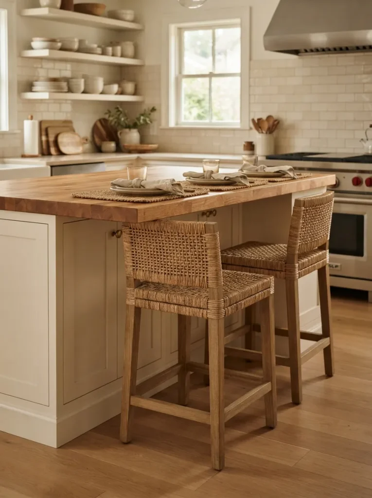
An island built for seating needs more overhang than most people plan for this idea is for anyone who wants people to actually gather at the island instead of just passing through. Aim for 12 to 15 inches of counter overhang on the seating side; anything under 10 inches means knees hit the cabinet face before the meal’s even served.
Pick stools with a seat height that matches your counter (roughly 24 to 26 inches for a 36-inch counter, or 28 to 30 inches for a taller 42-inch island), and leave at least 24 inches of width per person so elbows don’t collide. Wood or rattan seats echo the butcher block top without matching it exactly the identical wood tone on stools usually looks more matched-set than intentional.
This idea is for households that eat breakfast at the island, not just set mail down on it.
Quick Win: If your current island only has 8 to 10 inches of overhang, a bracket-mounted overhang extension can add the missing inches without replacing the whole top.
Shop This Look
| Product |
|---|
| Counter-height rattan-seat bar stools |
| Swivel counter stools with footrest |
| Woven seat cushion pads |
5. End-Grain Butcher Block for a True Chopping Surface
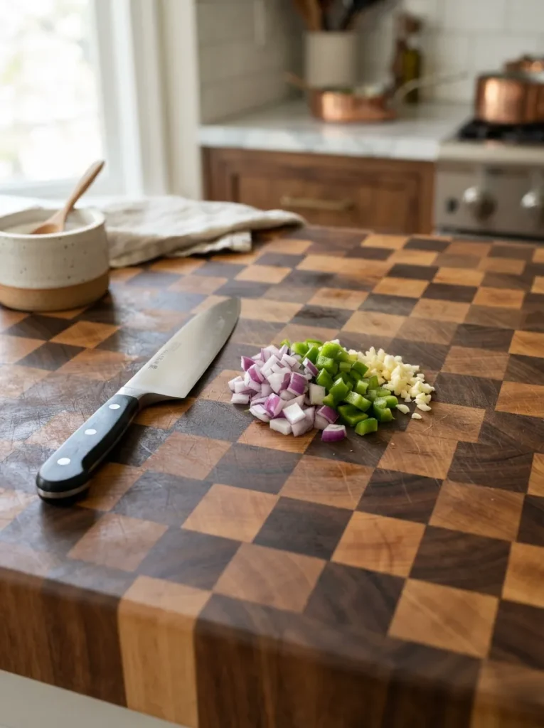
Start by knowing the difference: end-grain butcher block is made from short wood blocks stood on end, like a true butcher’s chopping block, while edge-grain is made from long strips laid flat the more common, more affordable option sold as most “butcher block” countertops. End-grain self-heals slightly under a knife blade because you’re cutting with the wood fibers instead of across them, which also means it dulls knives more slowly.
Edge-grain still works beautifully as a look-alike surface, but if you’re planning to chop directly on the island daily rather than using cutting boards, end-grain is worth the higher cost and the extra structural weight it adds underneath. Either option needs a fresh coat of food-safe oil before first use, not just after.
✅ Seasoning a New Butcher Block Top:
- [ ] Sand lightly with 220-grit if the surface feels rough from shipping
- [ ] Wipe down completely with a dry cloth to remove dust
- [ ] Apply food-safe mineral oil generously with the grain, let it absorb 20 minutes
- [ ] Wipe off excess oil and repeat daily for the first week
6. Open Shelving Below, Styled with Woven Baskets
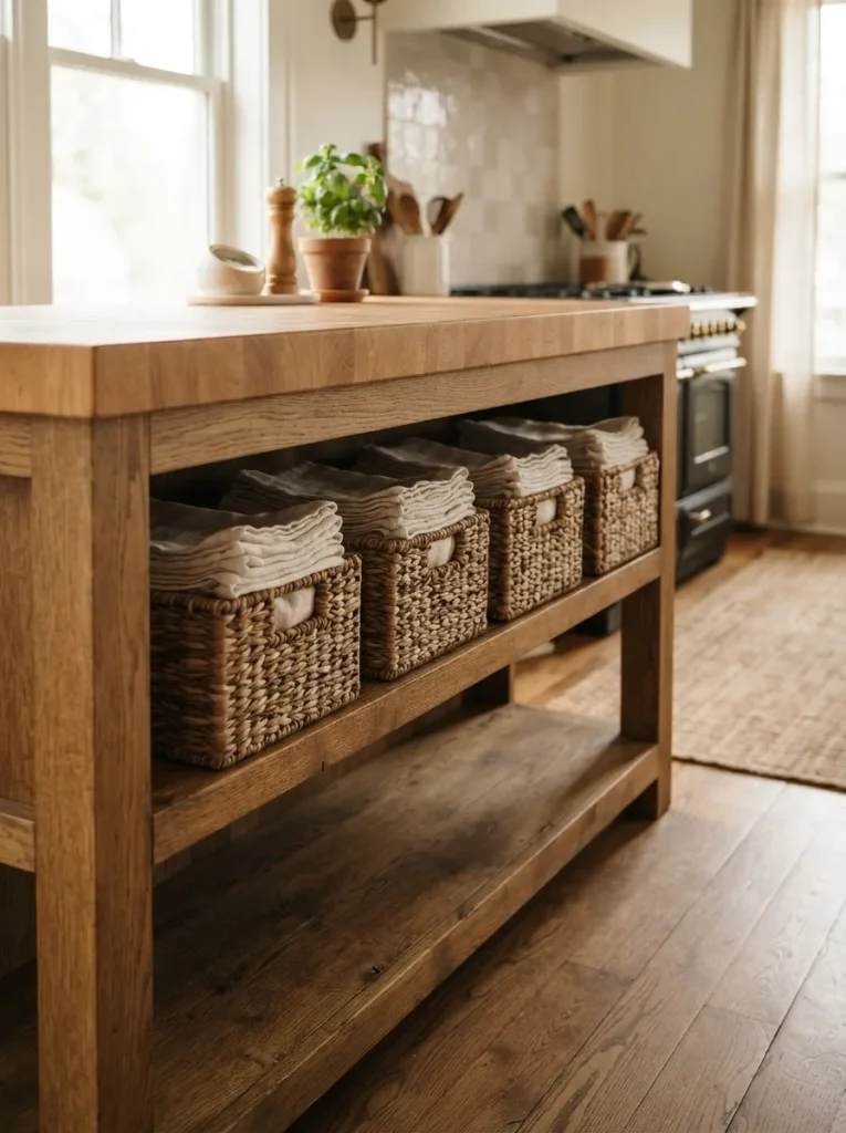
Skip lower cabinet doors on at least one side of the island and swap in open shelving lined with woven baskets a small structural change that adds warmth two ways at once: the exposed wood shelf itself, and the texture of natural fiber baskets sitting on it.
Reserve the baskets for actual daily-use items napkins, dish towels, produce rather than styling props alone, since an island this visible reads more authentic when the storage is doing real work. Match the basket’s fiber tone to your butcher block top rather than your cabinet color; seagrass and rattan both lean into the same honey range as most butcher block finishes, so they blend instead of competing.
This works especially well on islands that back onto a dining or living space, where the open shelving becomes visible styling rather than hidden storage.
Shop This Look
| Product |
|---|
| Seagrass storage baskets, set of 3 |
| Woven rattan bread basket |
| Linen-lined storage bin |
The next idea trades wood-on-wood matching for something bolder: a cabinet color most people are afraid will clash.
7. A Sage or Olive Green Base Cabinet
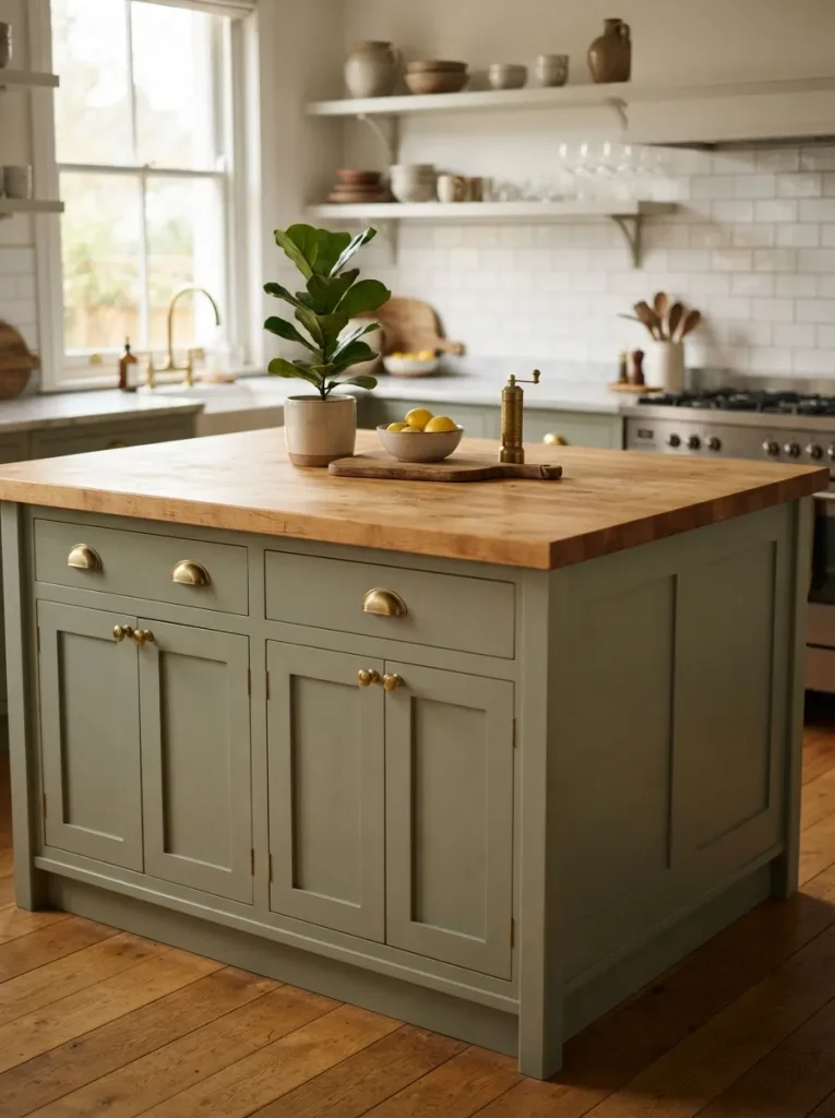
Most people default to white or navy for a painted island and skip green entirely, assuming it’ll clash with warm wood it’s usually the opposite. Sage and olive both sit close to wood’s natural undertones on the color wheel, so a green base cabinet reads as an extension of the wood tone rather than a competing color.
Go a shade or two more muted than you think you want; a true, saturated green reads more like an accent wall than cabinetry and can overwhelm an island’s full surface area. Pair it with brass or unlacquered brass hardware rather than chrome or nickel cool-toned metals fight the warmth this pairing is built on.
This suits kitchens that already lean traditional or farmhouse and want one confident color choice without going as bold as navy or black.
Important: Most people assume any green works with wood tones cooler, blue-based greens (mint or teal-green) clash with warm wood the same way navy does. Stick to greens with visible yellow or gray undertones.
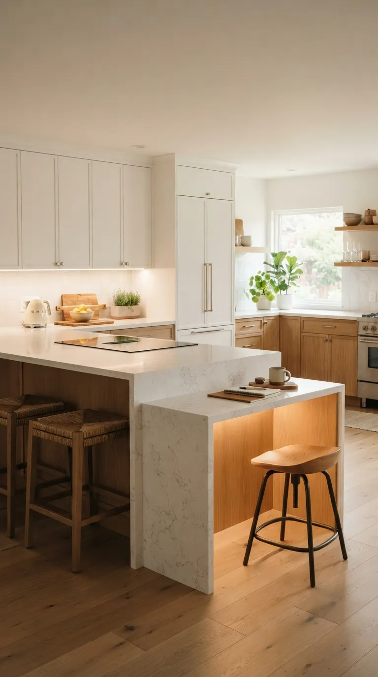
8. A Waterfall Edge That Wraps to the Floor
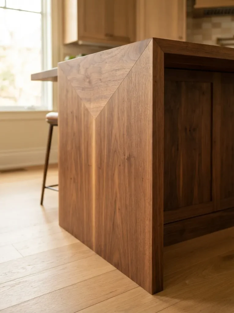
A waterfall edge where the butcher block top continues down the side panel of the island in one continuous piece, grain lining up at the corner turns the island into a single sculptural object instead of a countertop sitting on a box. The principle is continuity: your eye reads it as one material because the grain direction carries around the corner without an obvious seam.
This is a harder build than a standard overhang top, since it usually requires mitering the corner joint and bookmatching the grain from the same board, which most local millwork shops can do but general contractors often can’t without specifying it. It also uses noticeably more wood than a flat top alone, which affects both cost and weight.
If you like the effect but want to see it worked out in a harder material first, our guide to luxury waterfall quartz kitchen islands walks through the same grain-matching principle in stone. Reserve this idea for islands that are a genuine focal point, not tucked against a wall.
Mistake to Avoid: Ordering the top and side panel from different boards. Even same-species wood varies enough in grain pattern that a waterfall edge cut from two different boards is visibly mismatched at the corner one board, one continuous piece, is non-negotiable for this look to work.
9. Choosing Between Maple, Walnut, and Acacia
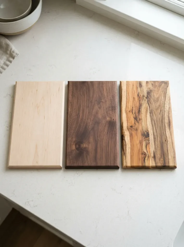
This idea is for anyone still deciding which wood species to commit to, because the choice affects more than color. Maple is pale, tight-grained, and the hardest of the three (about 1450 on the Janka hardness scale), making it the most forgiving surface for daily knife use and heavy traffic. Walnut runs darker and softer (roughly 1010 Janka), scratches a little more visibly, but hides water spots and stains better than pale maple does. Acacia sits in between tonally, with more dramatic grain variation board to board, so no two acacia islands ever look quite the same.
If your kitchen gets hard daily use kids, frequent cooking, minimal babying of surfaces maple’s hardness matters more than its lighter tone might suggest. If the island is mostly a gathering spot and occasional prep surface, walnut or acacia’s character and depth of color usually wins out.
Pro Tip: Ask for a Janka hardness rating before buying an unfamiliar or exotic wood species it’s the actual number that predicts how the surface holds up, not the price point or how “premium” it’s marketed as.
Up next: the lighting swap that adds texture instead of just brightness.
10. A Single Woven Pendant Instead of Metal
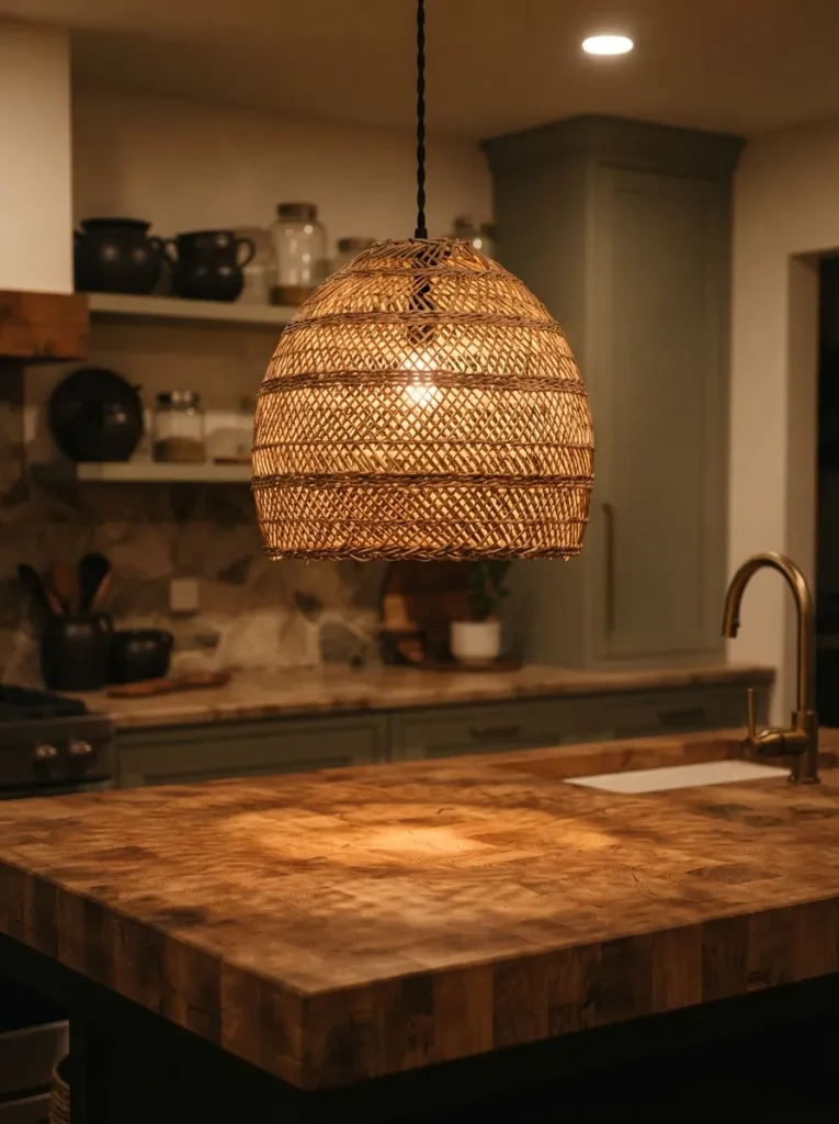
Swap a standard metal or glass pendant for one woven from rattan, seagrass, or bamboo, and the light itself becomes a texture layer instead of just a fixture. Hang it slightly lower than you would a metal pendant closer to 28 inches above the counter rather than 30 to 32 since woven shades read visually heavier and benefit from sitting nearer eye level.
Light that filters through a woven shade is naturally diffused and warm-toned even under a standard bulb, which softens task lighting into something closer to ambient glow. That makes it a better fit over an island used mostly for gathering and casual meals than one doing heavy daily food prep, where a brighter, more direct pendant style still serves the work better.
One woven pendant is often enough as a statement piece; a full cluster of them can start to feel more boho than warm-natural.
11. A Rolling Butcher Block Cart Instead of a Fixed Island
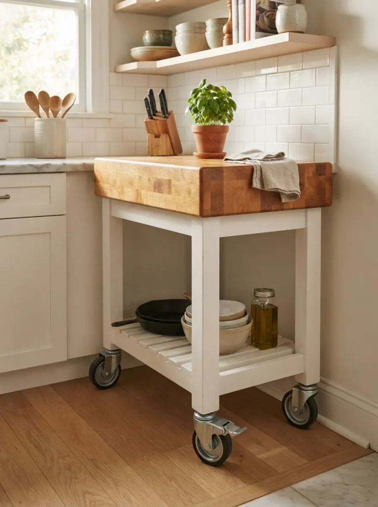
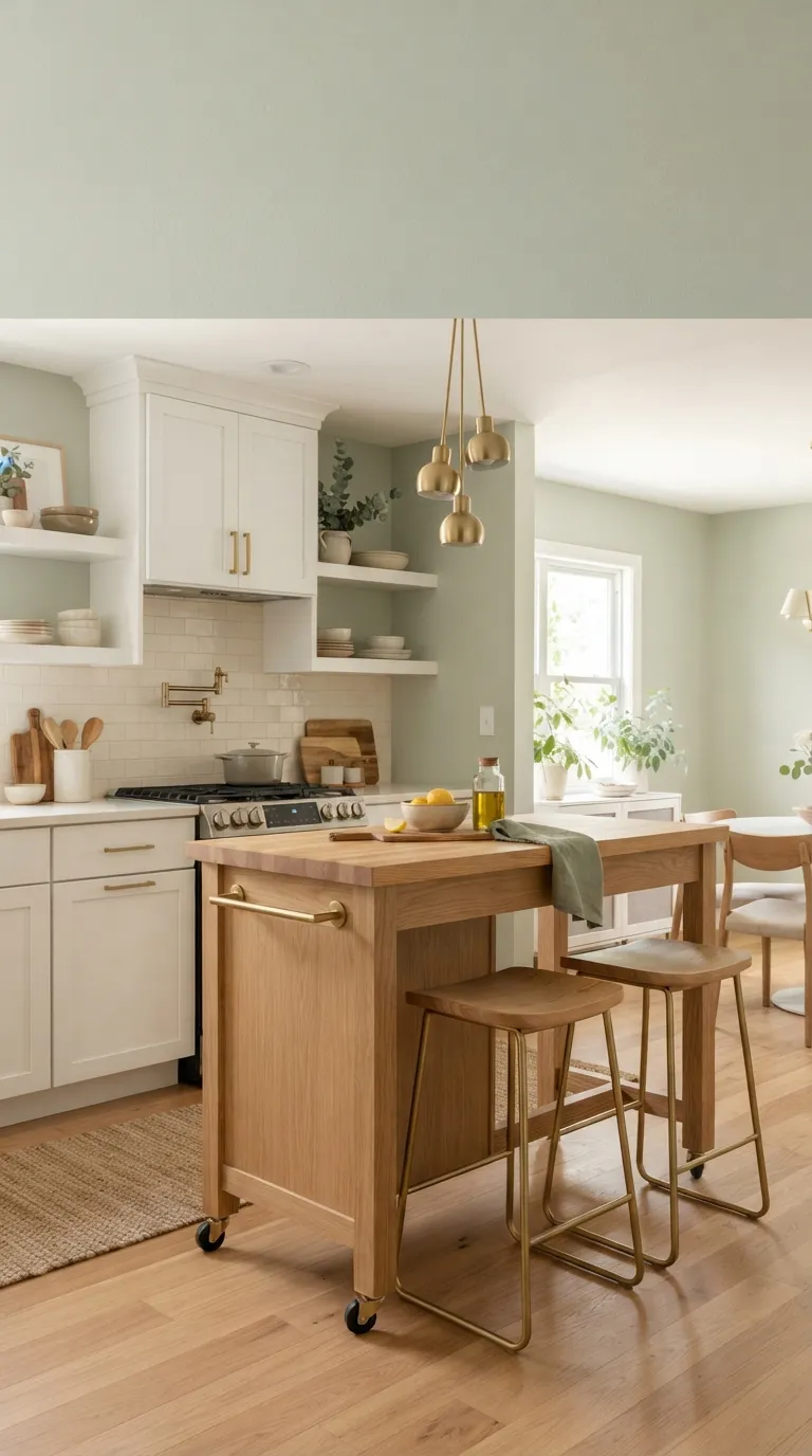
Not every small kitchen has the floor space for a permanent island, and a rolling butcher block cart solves that without giving up the material entirely. Look for a cart on locking casters with a solid wood top at least 1 inch thick thinner tops flex and eventually crack under regular chopping pressure, especially on a cart that gets rolled and bumped more than a fixed island would.
Most carts run 24 to 30 inches wide, small enough to tuck into a corner or against a wall when not in use, then roll out to become extra counter space during meal prep or extra serving surface when guests are over. Our small kitchen island roundup has more layout-specific options if a cart still feels like too much commitment for your space.
This is the easiest, lowest-cost way into the butcher block look for anyone renting or working with a tight kitchen footprint.
Important: Confirm the casters lock individually, not just as a set a cart that only locks two of four wheels will still pivot in place during heavy chopping, which is both annoying and a real safety issue with a knife in hand.
12. Mixing One Vintage Stool Into a Matched Set
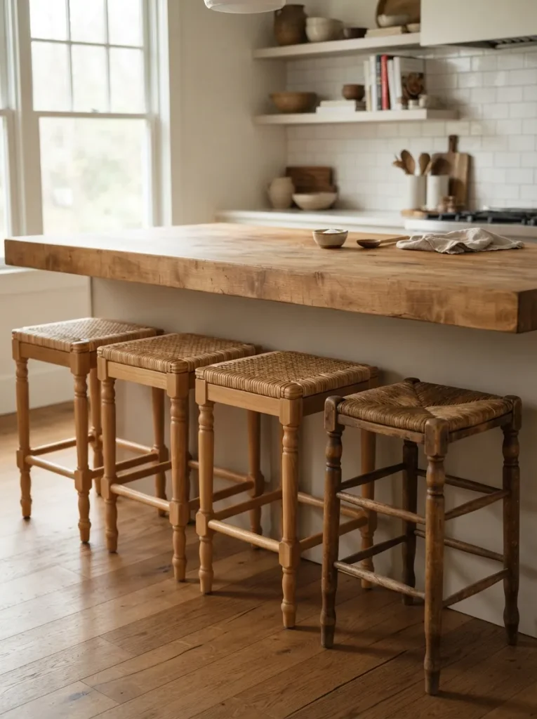
Instead of buying four identical stools, use three matching new ones and one genuine vintage or secondhand piece a stool with turned wood legs, a woven rush seat, or visible age. The contrast keeps a butcher block island from reading as a single showroom purchase, which matters more here than in most kitchen zones because the island is already the room’s visual anchor.
The vintage piece doesn’t need to match your island’s wood tone exactly; a slightly different wood color reinforces that it’s an intentional mix rather than an accident, the same way a single antique chair works at an otherwise modern dining table. Keep the seat heights consistent across all four, even if the styles differ, so the mismatch reads as curated rather than furniture you never got around to replacing.
This idea is for kitchens that already lean collected-over-time rather than newly renovated in one pass.
Budget Version: Skip buying a true vintage stool and refinish one budget stool differently from the other three instead a different stain color or a painted seat gets a similar mixed-set effect for a fraction of the cost.
The next idea swaps in a color that most matched-set kitchens skip entirely pale, warm white.
13. A Warm White Base, Not a Stark White
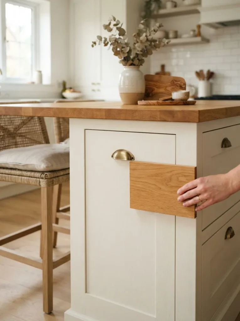
The principle here is undertone matching, and it’s the detail that makes or breaks this pairing: a stark, cool white cabinet (often labeled “bright white” or “pure white”) sits at odds with the warm amber and gold tones in most butcher block wood, creating a subtle but noticeable clash even though white and wood theoretically go with everything.
Look for cabinet paints labeled warm white, cream, or off-white instead ones with a hint of yellow or beige in the base rather than a blue-gray undertone. Held next to a wood sample, a true warm white should look like it belongs in the same color family as the wood, not like it’s correcting for it. This pairing works particularly well in kitchens aiming for a minimal, uncluttered look, since minimal-style kitchen islands still read warm rather than clinical when the white is chosen correctly.
Pro Tip: Test cabinet paint swatches directly against your actual wood sample in the room’s real lighting before committing the same white can look warm under one bulb and stark under another.
14. Unlacquered Brass Hardware and Fixtures
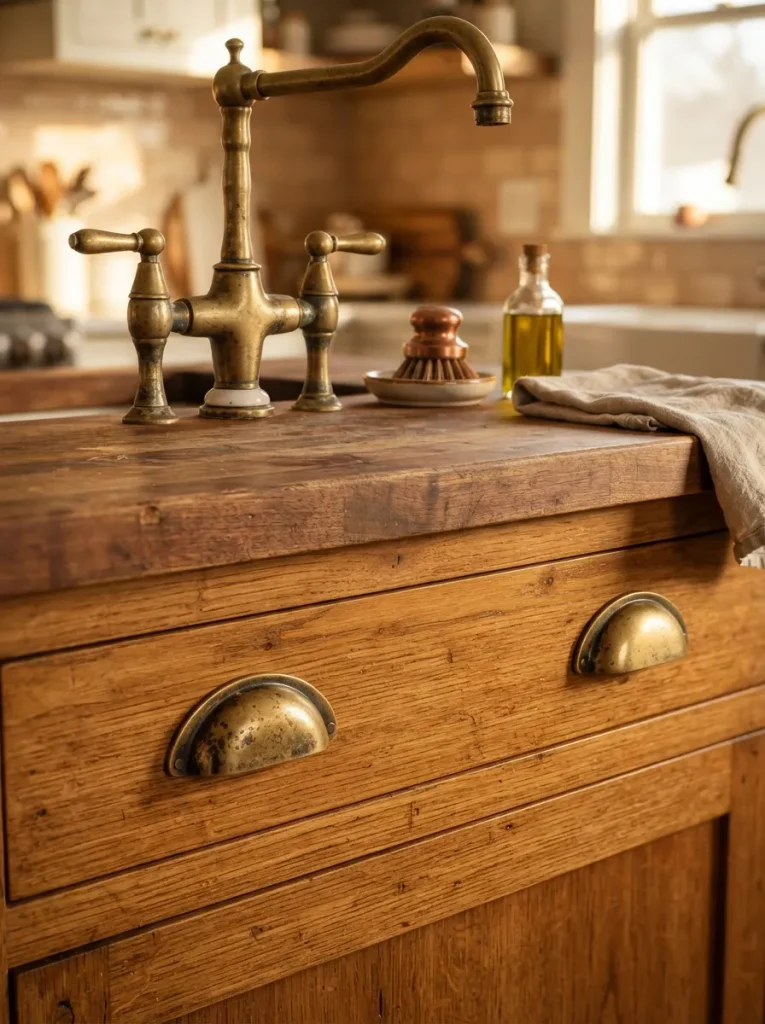
This idea is for anyone who already has a butcher block island and wants a lower-cost refresh rather than a rebuild. Swapping cabinet pulls and any nearby fixtures to unlacquered brass brass designed to tarnish and darken naturally over time rather than staying mirror-bright adds warmth that develops alongside the wood instead of staying frozen in a single finish.
Unlacquered brass shows fingerprints and develops a living patina within the first few months of regular use; that’s the intended effect, not a defect, but it’s worth knowing before you commit if you’d rather it stay shiny. Lacquered or brushed brass stays consistent instead, at the cost of that same slow-aging character.
Either way, keep the metal consistent across pulls, faucet, and any nearby pendant hardware mixing brass with chrome or nickel in the same sightline undercuts the cohesive, aged-in warmth this whole look is built around.
Styling Note: A small amount of tarnish concentrated where hands actually touch the hardware most looks authentic; a uniformly dark, evenly tarnished finish straight out of the box looks artificial by comparison.
Shop This Look
| Product |
|---|
| Unlacquered brass cabinet pulls |
| Unlacquered brass bridge faucet |
| Brass cabinet hinges |
Observation
The counterintuitive part: a butcher block top that’s too perfectly uniform in color often looks more artificial than one with visible color variation board to board. Manufacturers sand and stain some budget butcher block tops to hide natural variation, and the result reads flatter and more “printed” than a top that shows the wood’s actual range of honey, amber, and darker knot marks. If you’re choosing between two similar tops, the one with slightly more visible variation is usually the more natural-looking choice, even though it looks less “finished” on the showroom floor.
Last up is the idea with the most character of any on this list and the one that needs the most patience before you commit to it.
15. An Island That Doubles as a Room Divider
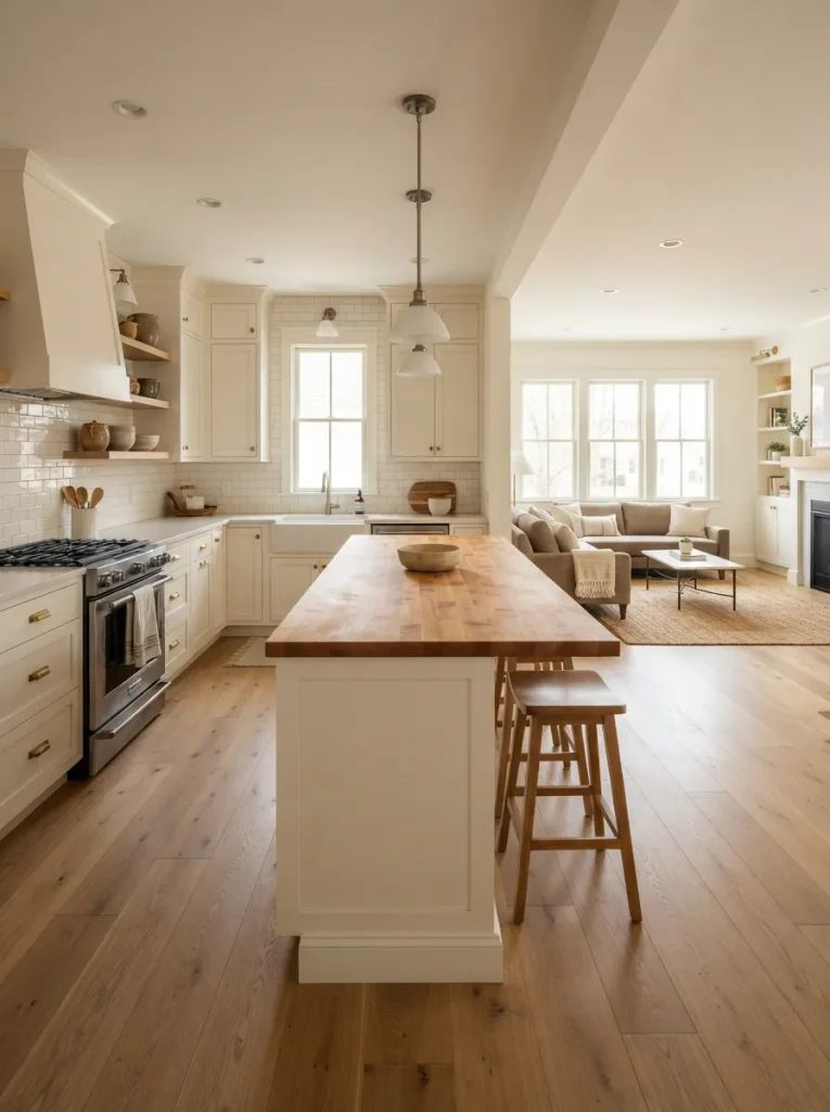
In a more open floor plan, position the island perpendicular to the kitchen’s main sightline rather than parallel to the cabinets it visually separates the cooking zone from the living or dining space without adding a wall. Keep at least 42 inches of clearance on the walkway side and 36 inches on the working side; anything tighter starts to feel like an obstacle rather than a boundary.
Run the butcher block top the full length of the island on this layout, since it’s likely to be seen from multiple angles in an open-plan room, not just from the kitchen side. Our kitchen island layout guide breaks down clearance requirements in more depth if you’re working through the full floor plan rather than just the island itself.
This suits open-concept homes specifically; in a fully enclosed kitchen, a perpendicular island usually just blocks the room instead of dividing it.
Important: The 36-inch minimum is a general kitchen guideline, not a fixed code requirement everywhere check your local building code if you’re doing a full renovation, since some jurisdictions require more.
16. Reclaimed Wood with Visible History
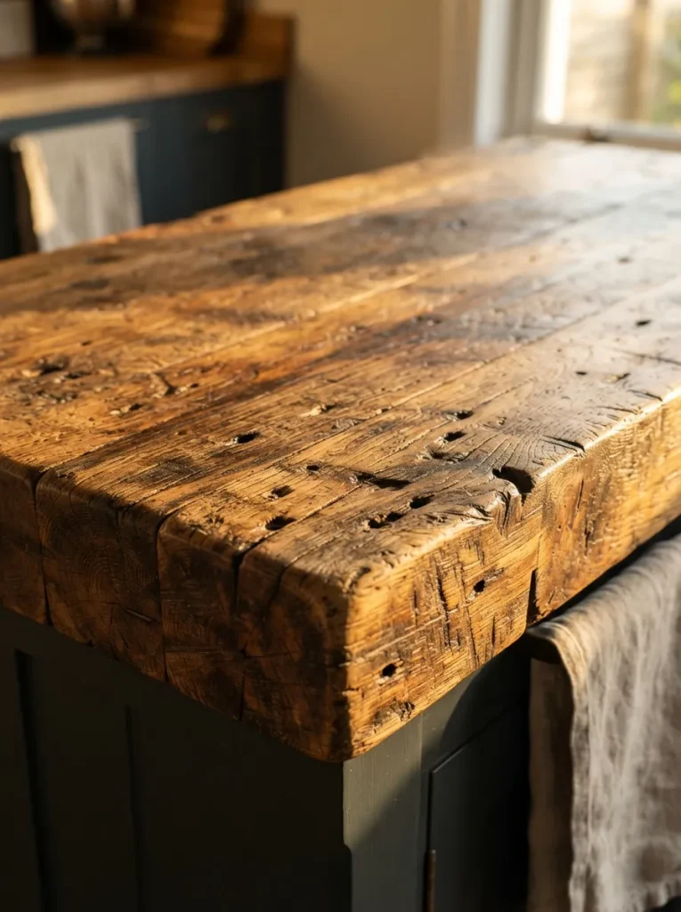
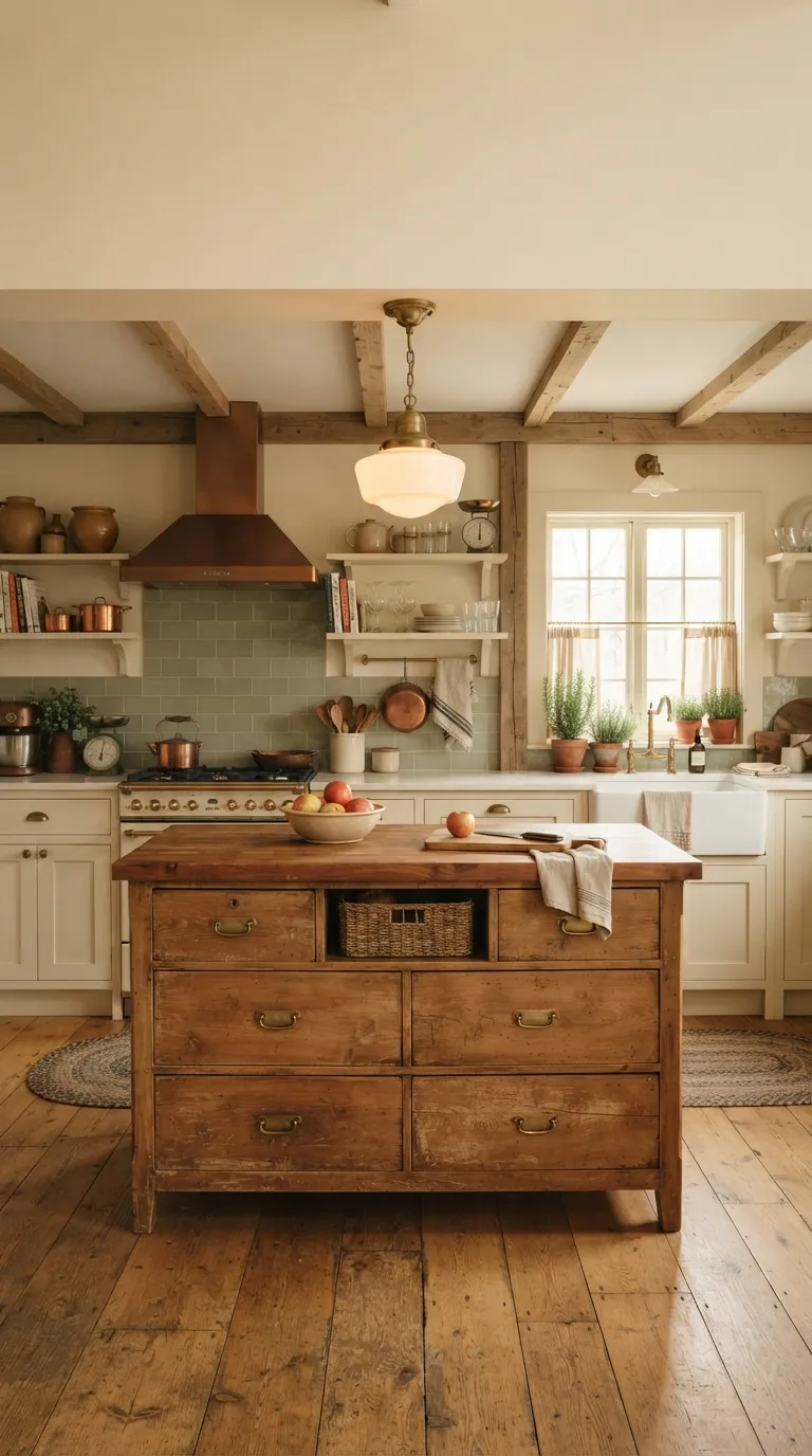
A reclaimed butcher block top built from old barn wood, salvaged flooring, or retired factory beams carries nail holes, saw marks, and color variation that no new wood can fake convincingly. It’s the most authentically “warm and natural” option on this list precisely because the wear is real, not distressed-to-order in a factory finish.
Ask specifically whether the wood has been kiln-dried after reclaiming, not just cleaned and cut. Reclaimed wood that hasn’t been properly dried can still be holding moisture from decades of outdoor exposure, which means it can keep shrinking and shifting for months after installation even once it looks finished. A reputable reclaimed lumber supplier will confirm this without you having to ask twice.
This idea works best as a genuine statement piece an island you build the rest of the kitchen’s palette around, not one you’re trying to match to cabinets you’ve already chosen.
Mistake to Avoid: Skipping metal detection before milling. Reclaimed wood sometimes still holds old nails or staples buried in the grain a supplier who mills reclaimed lumber regularly will run it through a metal detector first; one who doesn’t do this routinely is a red flag.
How to Start Your Butcher Block Transformation
The right first move is almost always the wood itself, not the cabinets around it. Pick your butcher block species and finish level before you choose paint colors or hardware it’s far easier to match cabinetry to a wood tone you already love than to hunt for the one wood that matches a paint color you picked first. A single oiled maple or walnut sample board, viewed in your kitchen’s actual light, tells you more than any online photo will.
The most common beginner mistake is skipping the initial oil seasoning and treating a new butcher block top like a finished countertop from day one. Most tops ship with a single thin protective coat meant to survive transit, not years of water and knife contact skip a proper seasoning routine in the first week and the wood absorbs stains and moisture unevenly, starting to look patchy within months. Oil it before you use it, not after you notice a problem.
Three low-cost items make the biggest early difference: a bottle of food-safe mineral oil or butcher block conditioner for ongoing maintenance, a set of felt or cork pads for any exposed wood-on-wood contact points, and a simple wood-safe cutting board to protect high-traffic prep zones from constant direct knife contact. None of them cost more than a coffee run, and together they add years to a top’s finish.
A cabinet-and-hardware refresh alone can happen over a long weekend; a full custom island with a waterfall-edge or end-grain top typically takes several weeks between ordering and installation. Budget a few hundred dollars for a paint-and-hardware refresh on an existing island, and expect a custom solid wood top alone to run well into four figures depending on species and size a rolling butcher block cart remains the lowest-cost entry point by a wide margin if budget is the main constraint.
Ready to Create Your Dream Warm, Natural Kitchen?
Sixteen ideas, one material, and enough range color, wood species, layout, lighting that almost any kitchen can work butcher block in without a full renovation. None of this has to happen at once, either; swapping hardware to brass or adding one vintage stool is a legitimate starting point, not a compromise. If you’re doing just one thing today, order a wood sample in the species you’re leaning toward and hold it against your actual cabinets before committing to anything bigger.
Get it right and the island stops looking decorated and starts looking like the room simply grew around it worn in, warm, and a little more honest than a kitchen that matches too perfectly. Save the ideas that fit your space so you can find them again when you’re ready to start.
Keep Exploring
- 15 Small Kitchen Island Ideas That Don’t Sacrifice Storage
- 12 Reclaimed Wood Dining Table Ideas for a Warm Farmhouse Look
- 10 Kitchen Island Layout Ideas for Better Traffic Flow