20 Green Bathroom Decor Ideas That Feel Fresh, Grounded, and Nothing Like a Trend
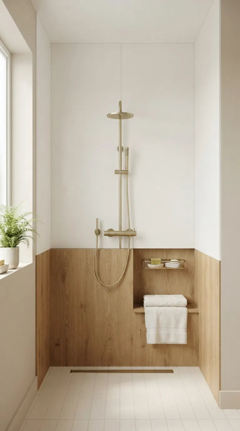
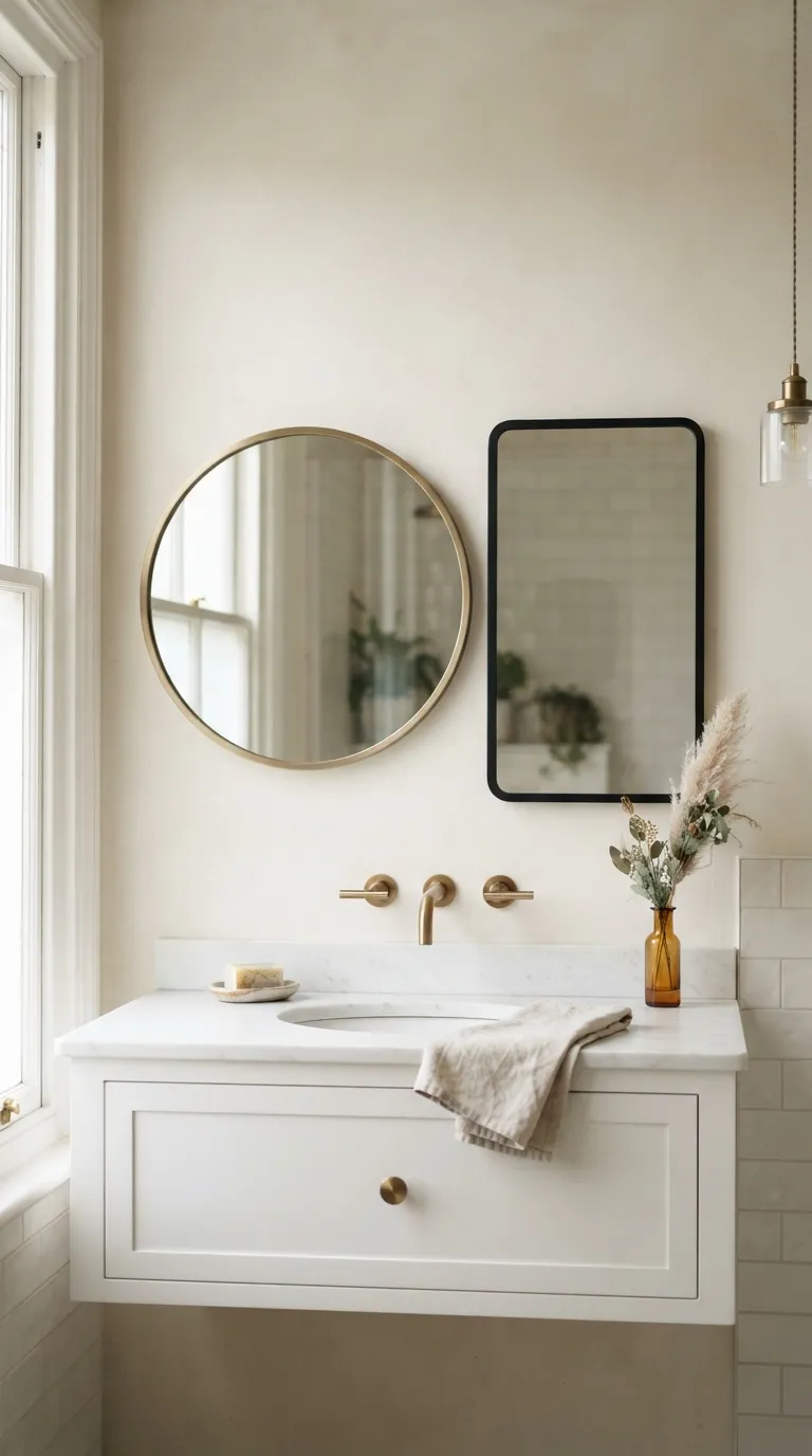
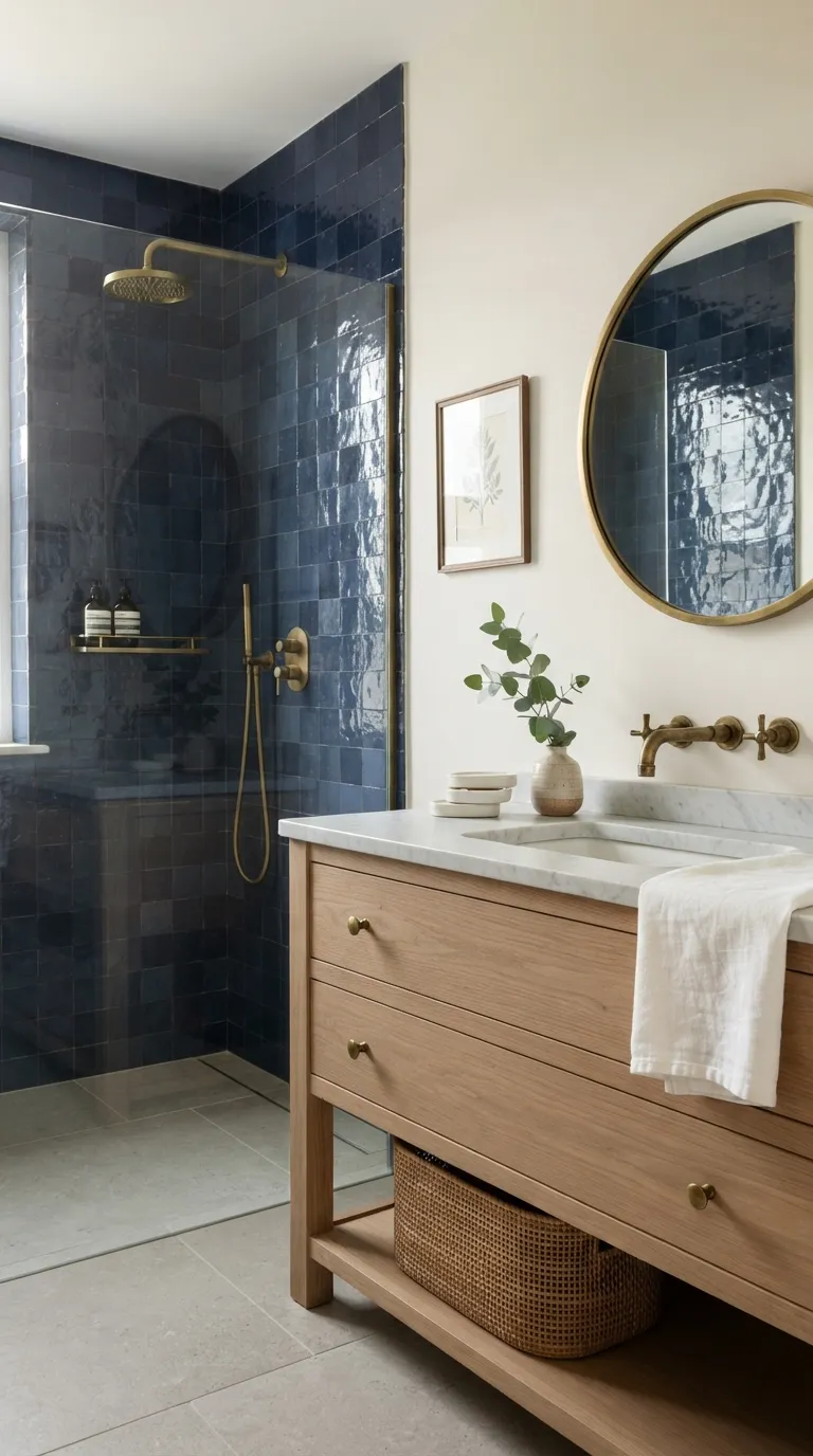
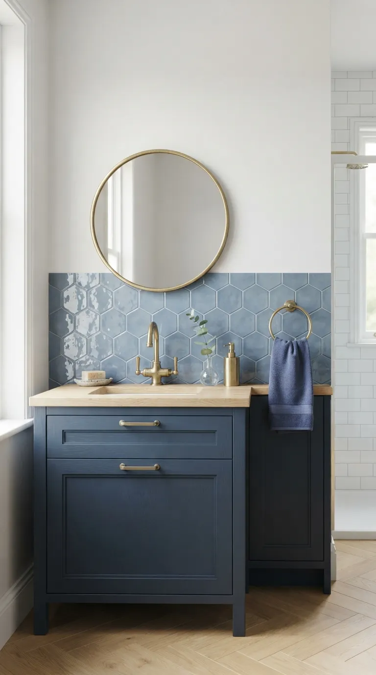
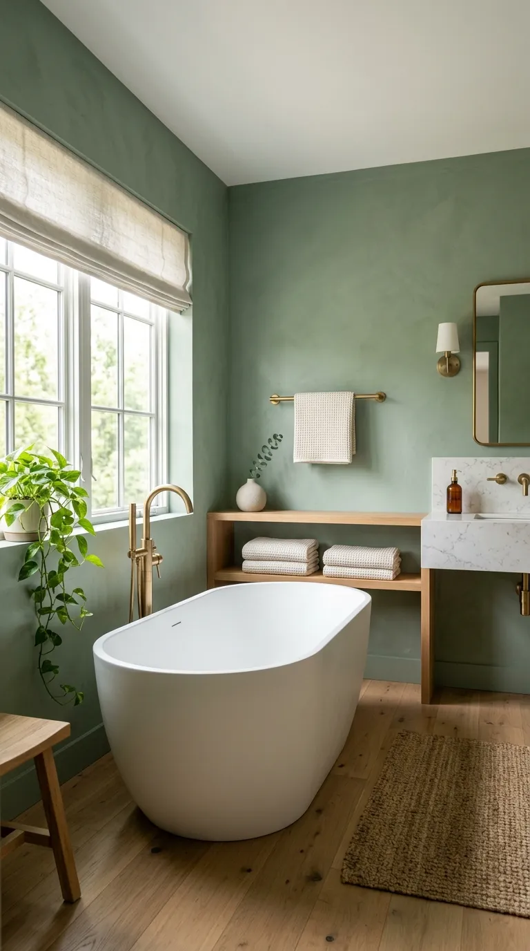
Green bathroom decor is the trick of taking a color usually reserved for gardens and letting it live somewhere you shower, brush your teeth, and start every single day. Here are 20 green bathroom decor ideas covering paint, tile, fixtures, and the small styling moves nobody talks about that actually hold up in a room full of steam and water spots.
There’s a particular kind of quiet a green bathroom has, even a small one. Light hits sage or moss tones differently than it hits white softer, almost outdoorsy, like the room remembers it used to be a greenhouse. Ceramic catches a green undertone and glows instead of just sitting there. This is a palette that asks for texture, not perfection. Green doesn’t ask permission. It just works.
Quick Navigation
- Why Green Bathroom Decor Makes Such a Difference
- Sage Green Walls That Set a Calm, Grounded Tone
- Layering Real and Dried Botanicals Where Steam Won’t Kill Them
- Warm Brass Fixtures That Make Green Walls Glow Instead of Flatten
- A Green Subway Tile Shower Surround as the Room’s Main Event
- Swapping the Vanity for a Painted or Refinished Green Cabinet
- Going Fully Saturated in a Small Powder Room
- A Single Deep Forest Green Accent Wall Behind the Tub
- Green Glazed Ceramic in the Small Details
- A Green-Veined Marble Countertop for the Statement Surface
- A Green Board-and-Batten Half Wall for Texture Without Tile
- Trailing Plants Styled Into a Window or Skylight Ledge
- Rattan and Wicker Storage That Softens a Tiled Room
- Mint Green as the Fresh, Lighter Alternative to Sage
- Green Mosaic Floor Tile for a Grounded, Old-World Feel
- A Statement Pendant Light Hung Over the Vanity
- A Green Upholstered Vanity Stool for a Furnished Feel
- A Floating Shelf Styled With Live Plants Instead of Décor
- Green Striped Wallpaper for a Small Powder Room
- A Green Shower Curtain That Fakes a Full Renovation
- Olive Green Textiles as the Final Layer That Ties It Together
- How to Start Your Green Bathroom Transformation
Why Green Bathroom Decor Works So Well
Green bathroom decor pulls from the same instinct that put ferns on Victorian tile and moss-colored ceramic in mid-century powder rooms a palette borrowed from the outdoors and brought somewhere private.
It’s having a real moment right now because sage, olive, and deep forest tones read as calming rather than trendy, and they photograph beautifully against warm brass or matte black hardware.
The materials that carry it best: glazed ceramic tile, honed marble, rattan, and unlacquered brass. In a small bathroom, prioritize one strong green surface usually the vanity or lower third of the wall before adding pattern anywhere else.
| Element | Grounded & Natural | Calm & Current |
|---|---|---|
| Philosophy | Bring the outdoors into the most private room in the house | Let one saturated surface do the work, keep the rest quiet |
| Materials | Glazed ceramic tile, honed marble, rattan, brass | Linen, matte ceramic, unlacquered metal |
| Color palette | Sage, moss, forest, olive | Warm white, dusty terracotta, brass |
20 Green Bathroom Decor Ideas
1. Sage Green Walls That Set a Calm, Grounded Tone
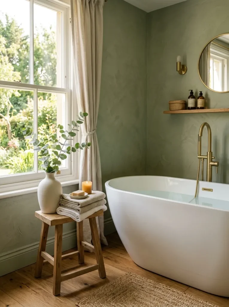
What it looks like: Muted and grounded, almost mossy like the walls absorbed the light instead of reflecting it.
Why it works: Sage sits at the point where green tips toward gray, which is why it reads as calming instead of bold. That gray undertone also keeps skin tones and white fixtures looking clean under warm bulbs instead of sallow.
How to copy it: Paint just the lower two-thirds with a shade like Sherwin-Williams “Svelte Sage” or Farrow & Ball “Pigeon,” keep trim and ceiling in a warm white, and finish in eggshell so steam wipes clean without flattening the color.
Best for: Anyone repainting a full bath who wants one confident move without redoing tile or fixtures.
Pro Tip: Test the paint swatch on the wall opposite your main window, not the one under it that’s the wall you’ll actually see standing at the sink, and it usually reads a shade or two darker than the sample card suggests.
Shop This Look
| Product |
|---|
| Sage green interior paint sample set |
| Matte ceramic bud vase |
| Unlacquered brass towel bar |
| Waffle-weave cotton bath towels, ivory |
| Round mirror with brass frame |
2. Layering Real and Dried Botanicals Where Steam Won’t Kill Them
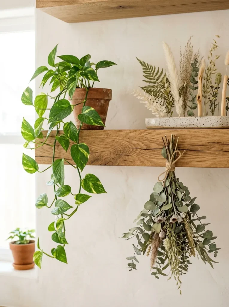
What it looks like: Loose and a little wild, like a windowsill that grew that way on its own.
Why it works: Grouping plants in odd numbers with varied heights builds visual rhythm without needing pattern anywhere else, and it reinforces the green palette through texture rather than more paint or tile.
How to copy it: Keep true tropical plants like pothos or ferns near the window where humidity actually helps them, and save dried eucalyptus or pampas grass for spots away from direct shower spray so they don’t go limp.
Best for: Renters, or anyone who wants the look without committing to paint.
Styling Note: Uneven leaf heights read as intentional a perfectly trimmed plant actually looks more artificial under bathroom lighting than a slightly wild one left alone.
Shop This Look
| Product |
|---|
| Live or faux pothos in ceramic planter |
| Dried eucalyptus bundle |
| Floating oak wall shelf |
| Small terracotta planter set |
| Woven seagrass wall basket |
3. Warm Brass Fixtures That Make Green Walls Glow Instead of Flatten
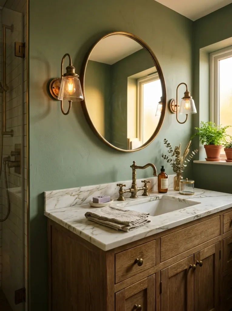
What it looks like: Warm and a little glowy the kind of light that makes green look expensive instead of institutional.
Why it works: Green and brass share a yellow undertone, so the metal doesn’t fight the wall color the way chrome or nickel can. Unlacquered brass also develops a soft patina over time that deepens the look rather than dating it.
How to copy it: Swap one fixture at a time start with the faucet or sconces and choose unlacquered or “living finish” brass over polished, since the matte surface hides water spots better in a humid room.
Best for: Homeowners doing a phased renovation who can’t replace everything at once.
Important: Most people assume brass and gold-tone chrome look interchangeable in photos they don’t in person. True brass carries a warmer, slightly pink cast that chrome-based “gold” finishes lack, and that warmth is what actually flatters green.
Up next: the shower surface that quietly does most of the heavy lifting in a green bathroom.
4. A Green Subway Tile Shower Surround as the Room’s Main Event
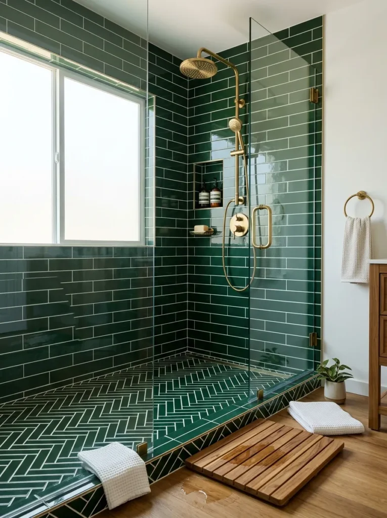
What it looks like: Deep and glossy, like the shower is wearing its own coat of paint.
Why it works: Glazed tile reflects light in a way flat paint can’t, so a darker green stays bright instead of feeling like a cave. Running it floor-to-ceiling also removes the stopping point that would otherwise chop up a small room.
How to copy it: Choose a glossy, not matte, glaze in a 3×6 subway format, run it to the ceiling instead of stopping at the standard 6-foot line, and pair it with bright white grout to keep the pattern crisp instead of muddy.
Best for: Anyone doing a full shower renovation who wants one dramatic, durable surface.
Budget Version: A full green tile shower can run well past $2,000 in materials alone. For under $100, tile just the alcove behind the showerhead with peel-and-stick ceramic-look panels rated for wet areas, and leave the rest of the shower white.
Shop This Look
| Product |
|---|
| Glossy green ceramic subway tile |
| White sanded grout |
| Brass rainfall showerhead |
| Teak bath mat |
| Green-glazed soap dish |
5. Swapping the Vanity for a Painted or Refinished Green Cabinet
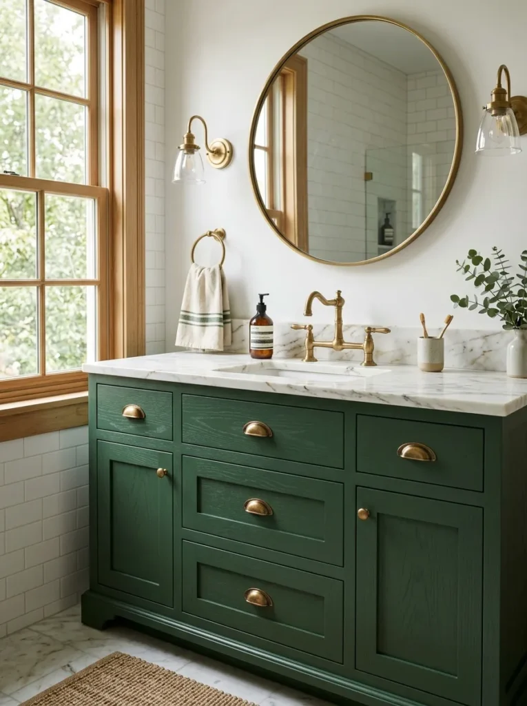
What it looks like: Solid and furniture-like less “bathroom cabinet,” more a piece someone chose on purpose.
Why it works: A vanity is the single largest object in most bathrooms, so painting or replacing it does more visual work per square foot than almost any other change. A Shaker panel door also holds paint color better than a flat slab door, since the recessed panel catches shadow.
How to copy it: If refinishing an existing cabinet, sand, prime with a bonding primer made for cabinetry, and finish in a durable cabinet-and-trim enamel regular wall paint will chip within months in a humid bathroom.
Best for: Homeowners who want the biggest visual change for the lowest material cost.
Pro Tip: Order hardware before paint, not after cup pulls and knobs come in wildly different projection depths, and it’s far easier to pick a green that flatters brass you already own than to hunt for brass to match a green you’ve already committed to.
Shop This Look
| Product |
|---|
| Cabinet-and-trim bonding primer |
| Green cabinet enamel paint |
| Brass cup pulls |
| Round brass-framed mirror |
| White marble-look vanity top |
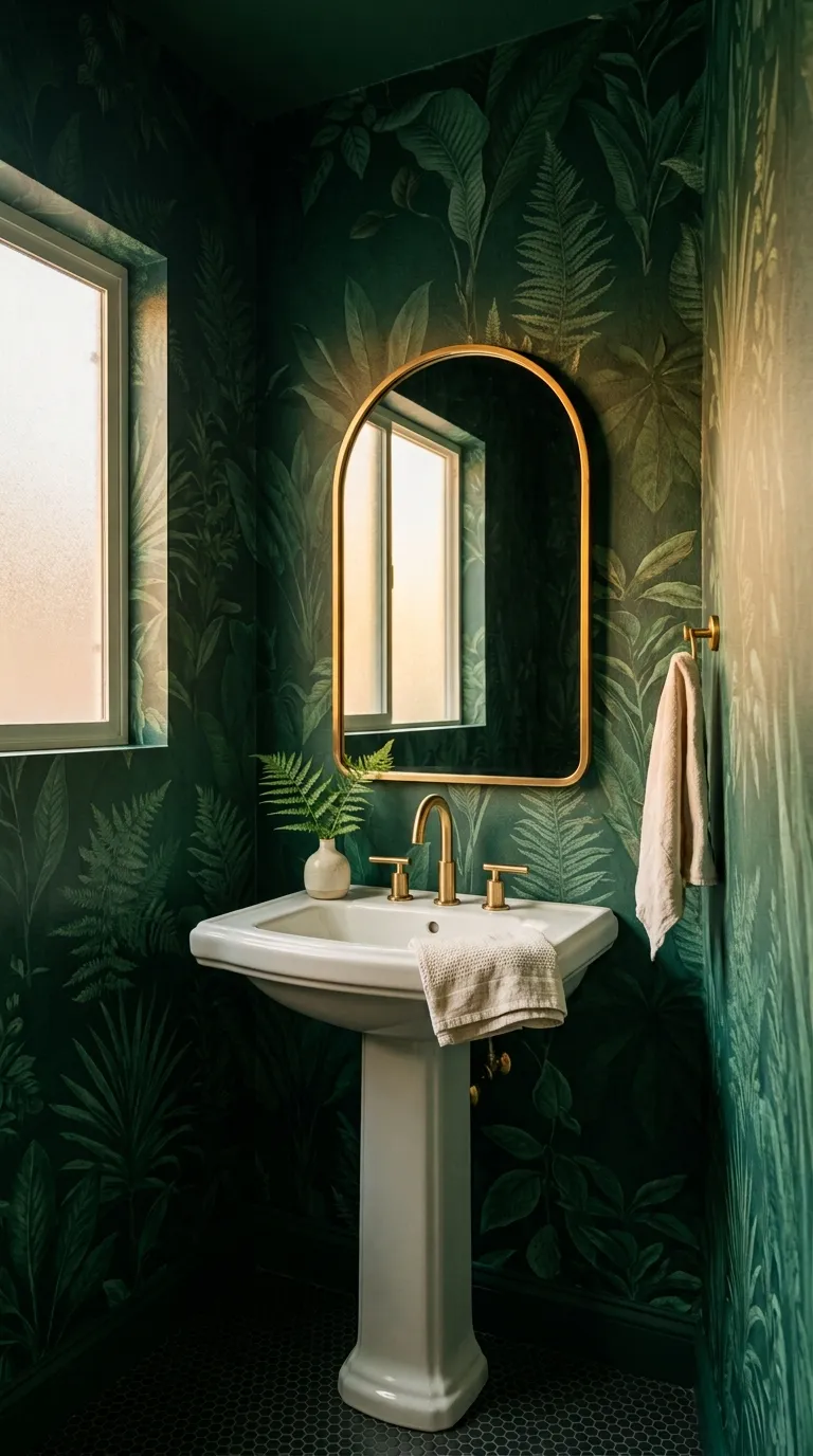
6. Going Fully Saturated in a Small Powder Room
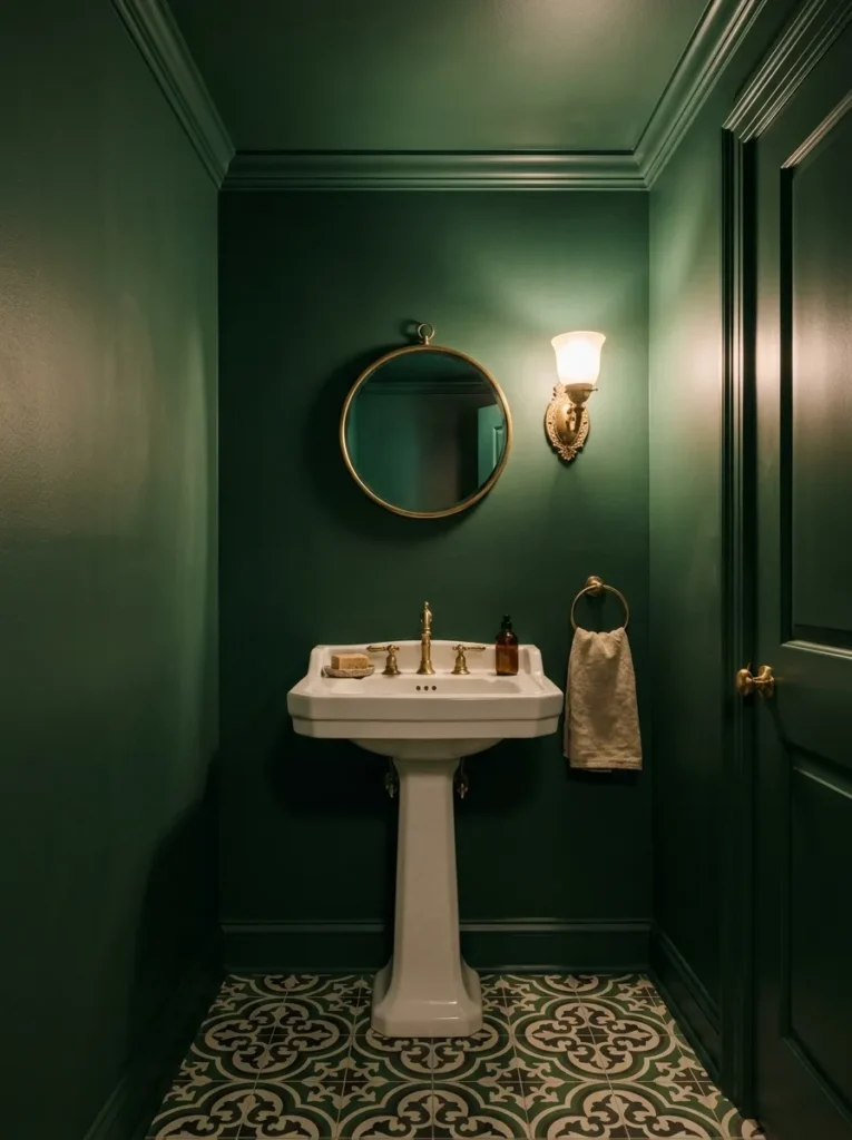
What it looks like: Enveloping, almost like a jewel box the kind of room that surprises guests.
Why it works: A powder room has no shower and gets used for minutes at a time, so a bold, saturated color that would feel heavy in a full bath instead feels intentional and dramatic. Painting the ceiling the same color also removes the visual “lid” that makes small rooms feel cramped.
How to copy it: Work top to bottom ceiling, walls, and trim in the same sheen and color and skip patterned wallpaper here. A fully saturated single color, not a print, is what actually makes tiny rooms feel bigger.
Best for: Anyone with a guest bathroom or half bath under 25 square feet.
Powder Room Green Makeover Checklist:
- [ ] Measure square footage to confirm one gallon covers walls, trim, and ceiling
- [ ] Choose a durable eggshell or satin finish, not flat, for easy wipe-downs
- [ ] Paint ceiling and trim in the same color before cutting in the walls
- [ ] Add one warm metal fixture, like a sconce or mirror frame, to break up the color
- [ ] Install a small round mirror to bounce light back into the room
The next idea trades paint for stone and it changes how the whole room photographs.
7. A Single Deep Forest Green Accent Wall Behind the Tub
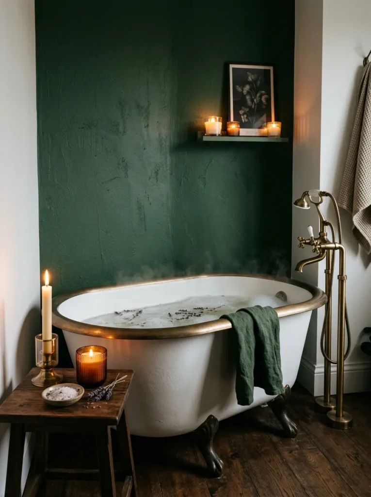
What it looks like: Anchored and a little dramatic, without swallowing the whole room.
Why it works: Isolating deep green to one wall usually the one behind the tub or vanity creates a focal point through contrast rather than repetition, which lets you use a genuinely dark, saturated shade without the room feeling cave-like.
How to copy it: Choose the wall with the least window interruption so the color reads as one solid block, and keep every other wall in a warm white to maximize contrast instead of splitting the difference with a mid-tone.
Best for: People nervous about commitment who still want real drama.
Mistake to Avoid: Painting a deep accent wall but leaving the trim in a bright, cool white makes the green look like an afterthought. Swap the trim to a warm off-white instead so it frames the color rather than competing with it.
8. Green Glazed Ceramic in the Small Details
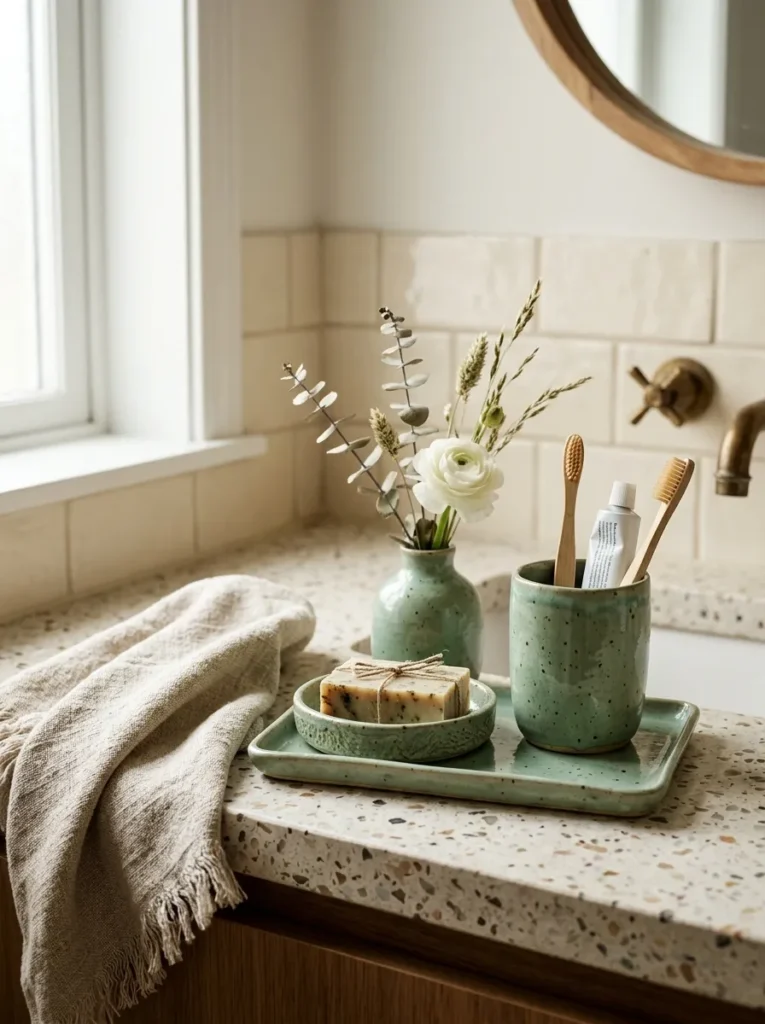
What it looks like: Small and considered the kind of detail people notice on their second visit, not their first.
Why it works: A hand-glazed ceramic finish carries natural variation, since no two pieces glaze exactly alike, and that reads as more expensive than uniform plastic. Repeating one glaze color across several small objects ties a neutral room together without any wall color at all.
How to copy it: Pick one glaze family celadon, moss, or bottle green and buy the soap dish, tumbler, and tray from it as a set rather than matching pieces individually. Mismatched greens read as clutter; matched greens read as styled.
Best for: Renters, or anyone testing the color before painting anything.
Pro Tip: Buy one extra tumbler in the same glaze specifically for a toothbrush holder matching the “boring” items is what actually makes a countertop look curated instead of just tidy.
9. A Green-Veined Marble Countertop for the Statement Surface
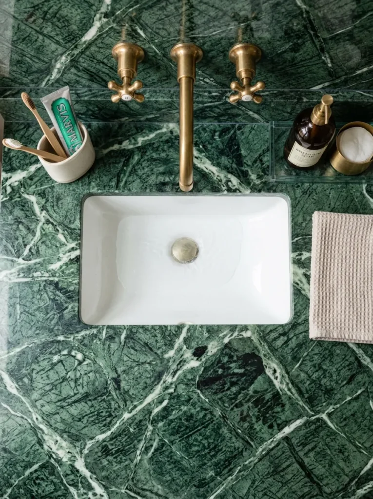
What it looks like: Dramatic and cool to the touch, with veining that looks almost painted on.
Why it works: Marble’s veining creates natural, non-repeating pattern, so a single slab does the visual job that tile pattern or wallpaper would otherwise handle. Keeping the vanity below it simple a plain painted cabinet lets the stone stay the obvious focal point.
How to copy it: If full marble is out of budget, look for a quartz composite in a green-veined pattern. It mimics the look at a fraction of the cost and, unlike real marble, doesn’t need periodic resealing.
Best for: People building a higher-budget primary bathroom who want one true showstopper surface.
Warning: Real marble is porous and etches from anything acidic toothpaste, mouthwash, and even lemon-scented cleaners can leave permanent dull spots within days. Seal it before first use and reseal every 6–12 months, or choose a quartz composite if you don’t want the maintenance.
Shop This Look
| Product |
|---|
| Stone sealer for natural marble |
| Undermount porcelain sink |
| Brass single-hole faucet |
| Small glass vanity tray |
| Green-veined quartz countertop sample |
10. A Green Board-and-Batten Half Wall for Texture Without Tile
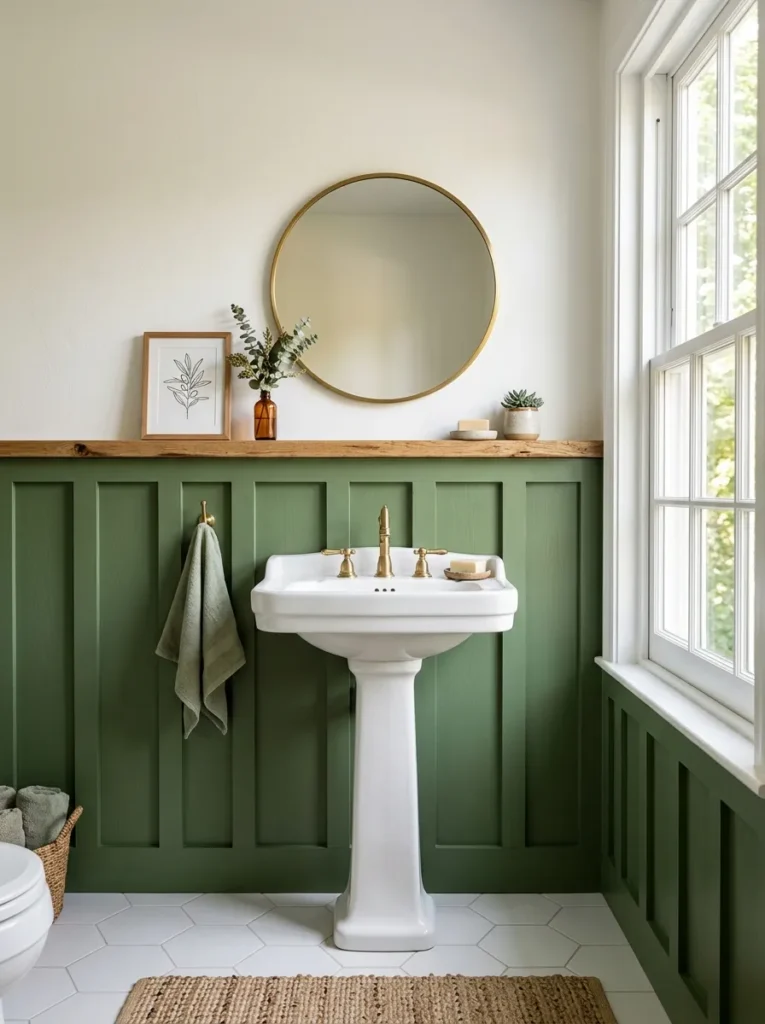
What it looks like: Structured and a little architectural, like the wall grew its own trim.
Why it works: Board-and-batten adds dimensional shadow lines that flat tile or paint can’t fake, and stopping it at chair-rail height creates a natural break for the eye a trick painters call “visual weight distribution,” keeping the room from feeling top-heavy.
How to copy it: Install pre-primed MDF battens at 12–16 inch spacing, caulk every seam before painting, and finish in a semi-gloss enamel so it survives splashes near the sink without needing tile’s cost or labor.
Best for: DIYers comfortable with basic trim work who want texture without a full retile.
11. Trailing Plants Styled Into a Window or Skylight Ledge
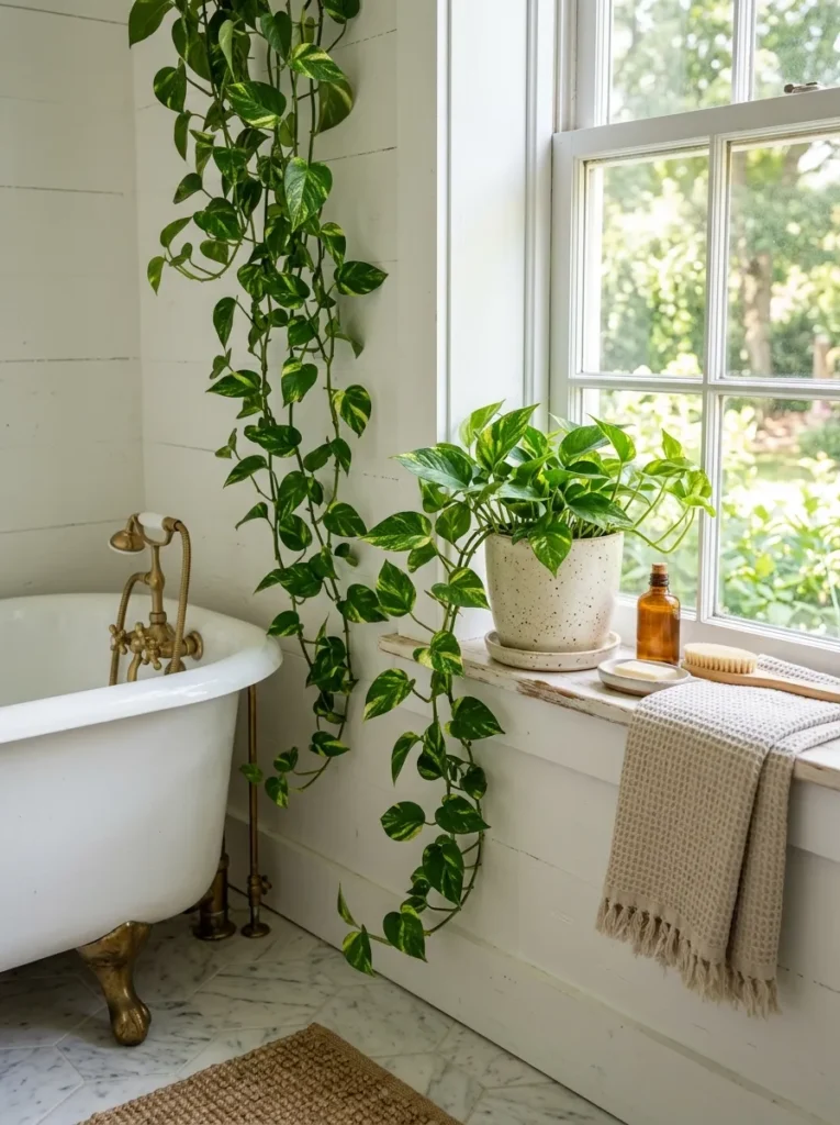
What it looks like: Loose and cascading the one spot in the room that looks alive.
Why it works: A trailing plant draws the eye vertically, which makes a low ceiling or small window feel taller than it is. It’s also the cheapest way to introduce green into a room you’re not ready to paint.
How to copy it: Choose pothos or philodendron over ferns for a windowsill they tolerate the temperature swings of a bathroom far better and let the vines hang instead of trimming them back every few weeks.
Best for: Small-space decorators and renters who can’t alter walls or fixtures.
Small-Space Tip: In a bathroom under 40 square feet, skip the floor planter entirely and mount plants at eye level or above. Floor-level greenery reads as clutter in tight rooms; ledge and shelf height reads as styling.
12. Rattan and Wicker Storage That Softens a Tiled Room
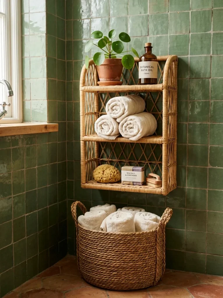
What it looks like: Warm and woven it takes the edge off a room full of hard, cold surfaces.
Why it works: Tile, marble, and glass are all reflective, rigid materials, and a bathroom built entirely from them can feel clinical. Rattan’s irregular, organic texture creates contrast that softens the room without adding another color.
How to copy it: Use a rattan or seagrass hamper for towels instead of a plastic bin, and choose one with an open weave solid rattan panels look heavier and read more like furniture than storage.
Best for: People with an all-tile or all-marble bathroom that feels a little too polished.
Pro Tip: Seal untreated rattan with a light coat of clear polyurethane before placing it in a bathroom untreated fiber absorbs humidity over months and starts to sag or discolor near the shower.
The next idea swaps sage for something lighter and it’s the easiest way to soften a bold green room.
13. Mint Green as the Fresh, Lighter Alternative to Sage
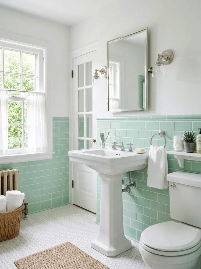
What it looks like: Fresh and pale closer to a vintage soda fountain than a moody forest.
Why it works: Mint sits at a much higher value on the color wheel than sage or forest green, meaning it reflects more light instead of absorbing it a real advantage in a windowless or north-facing bathroom that needs to feel bright, not cozy.
How to copy it: Pair mint with chrome or nickel fixtures instead of brass; the cooler metal tone matches mint’s lighter, slightly blue-leaning undertone better than warm brass does. If you want to push further into cool tones altogether, blue bathroom decor hits a similar airy effect without any green undertone at all.
Best for: Small or dark bathrooms that need brightness more than drama.
14. Green Mosaic Floor Tile for a Grounded, Old-World Feel
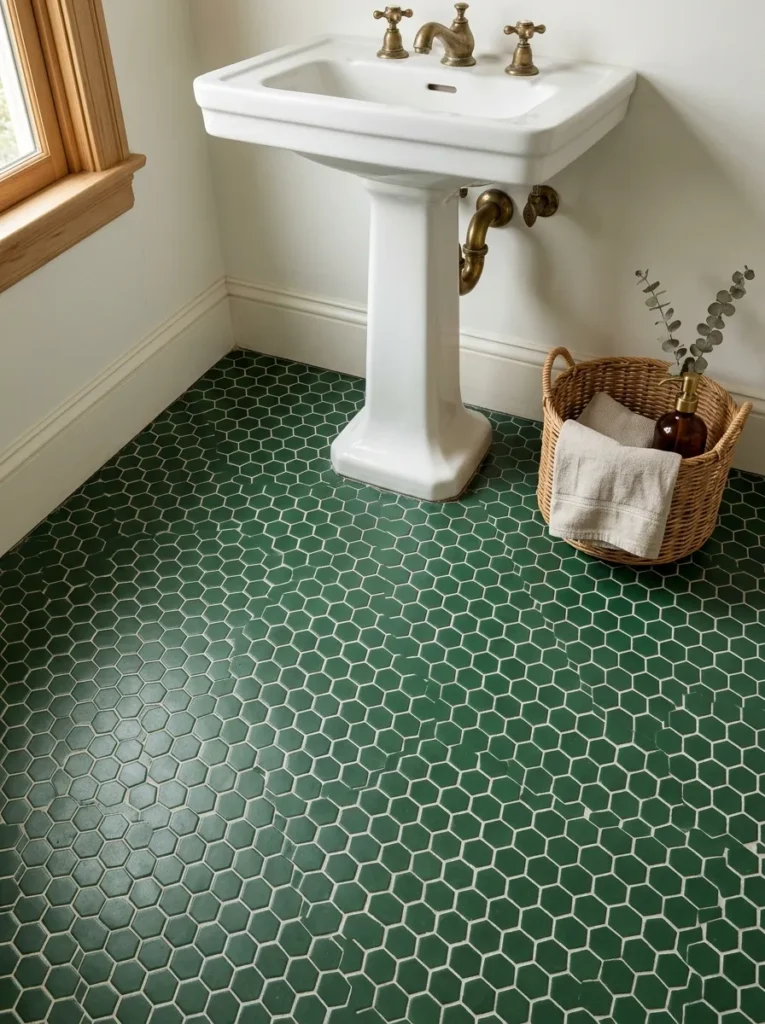
What it looks like: Grounded and a little nostalgic, like a floor that’s been there for decades.
Why it works: Putting the boldest color choice on the floor instead of the walls keeps sightlines clear and the room from feeling closed in, while the small hexagon scale creates enough pattern density to read as intentional rather than busy.
How to copy it: Use a 1-inch hexagon mosaic in a solid bottle green rather than a mixed pattern, and keep grout light so the individual tile shapes stay visible instead of blurring into one dark mass.
Best for: Anyone doing a full floor replacement who wants a vintage, collected feel.
15. A Statement Pendant Light Hung Over the Vanity
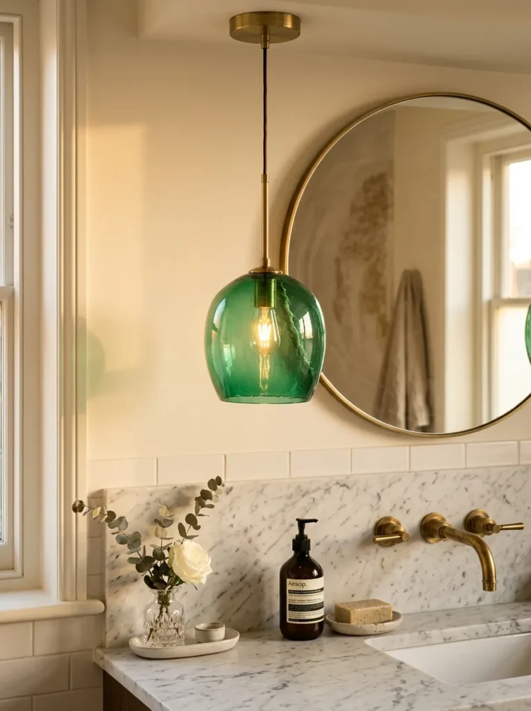
What it looks like: Glowing and a little jewel-toned once the bulb is on.
Why it works: A single pendant creates a focal light source instead of the flat, shadowless glow of overhead recessed lighting, and colored glass tints the light itself a detail most people never think to change.
How to copy it: Hang the pendant 28–32 inches above the counter, centered over the sink rather than the bathroom mirror, and choose a warm 2700K bulb so the green glass doesn’t cast a cold, clinical tint.
Best for: Anyone replacing a builder-grade vanity light fixture.
Important: Most people assume any pendant can hang over a vanity building code in many areas requires wet-rated or damp-rated fixtures within a set distance of the sink or tub. Check the fixture’s rating before buying, not after installation.
Two more ideas, then the styling trick that ties the whole room together without touching a single wall.
My Views:
Here’s something most guides won’t tell you: dark green grout lines look incredible in photos and terrible in person within about six months.
I’ve seen clients choose a forest-green grout to match their tile, only to watch it fade unevenly in high-splash zones near the faucet the color holds fine on the floor, patchy at the sink.
Stick with a neutral warm white or light gray grout on any green tile that gets direct daily water contact, and save the colored grout for a floor or an accent wall that stays dry.
16. A Green Upholstered Vanity Stool for a Furnished Feel
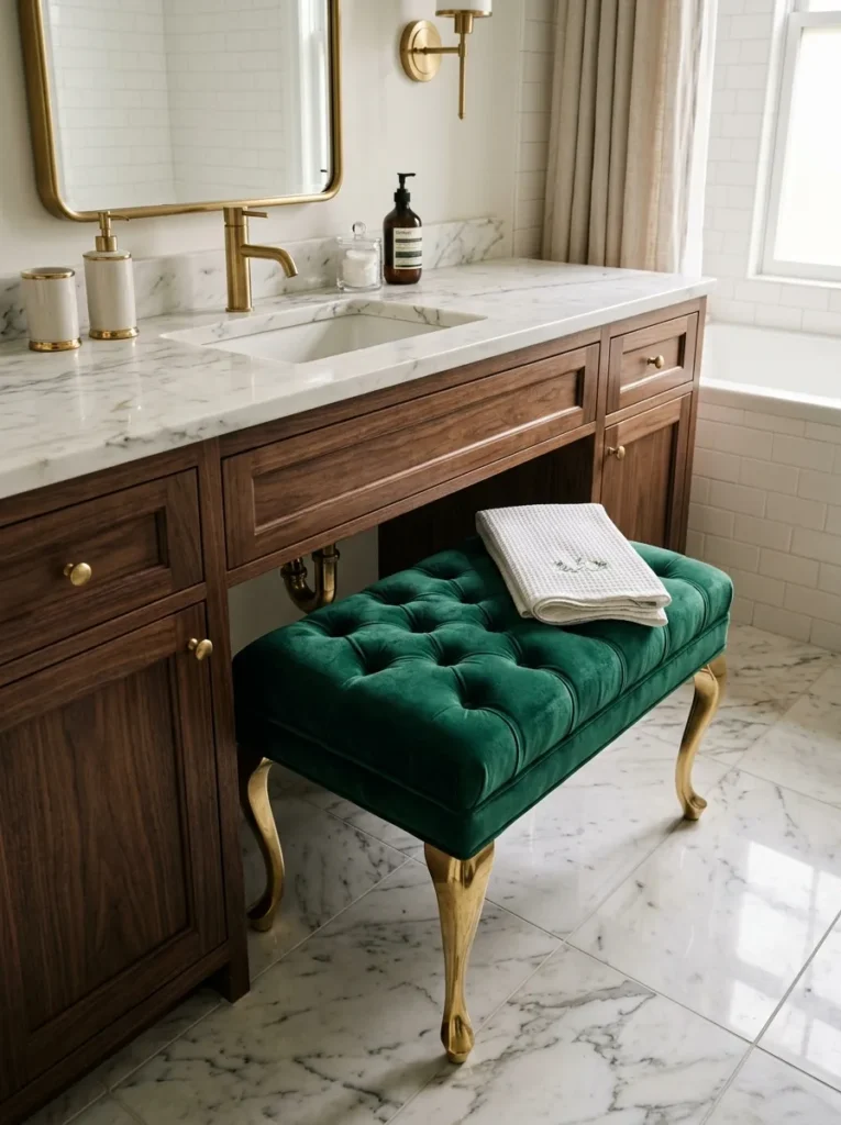
What it looks like: Plush and furnished, like a piece that wandered in from a bedroom.
Why it works: Most bathrooms contain zero soft, upholstered surfaces, so a single velvet stool introduces a texture contrast that reads as “designed” rather than “installed.” It also breaks up the hard-edge rhythm of cabinetry and tile.
How to copy it: Choose a performance velvet rated for high-moisture rooms, not standard upholstery fabric, and keep the stool tucked under the vanity overhang when not in use so it isn’t sitting in direct shower spray.
Best for: People styling a primary bathroom that doubles as a getting-ready space.
17. A Floating Shelf Styled With Live Plants Instead of Décor
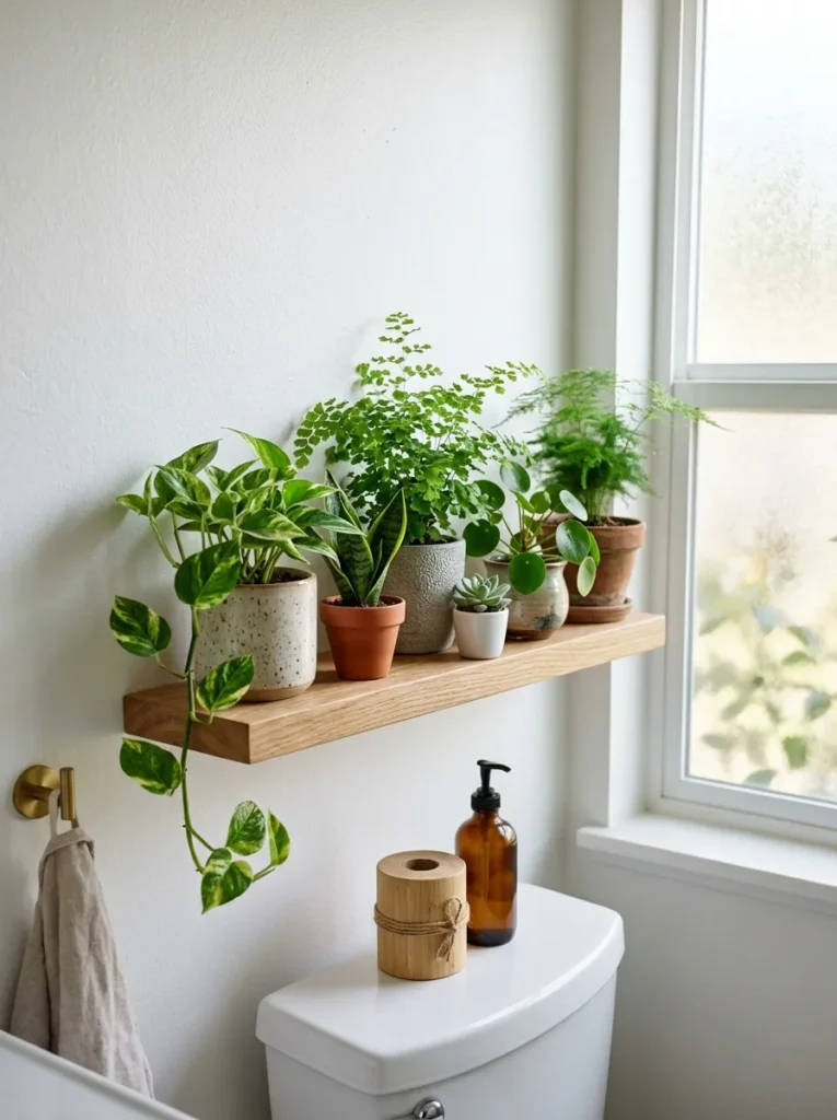
What it looks like: Layered and unfussy a shelf that skipped decorative objects entirely.
Why it works: Filling a shelf with plants instead of framed art or trinkets means every piece is a slightly different shape and shade of green, which builds natural variation without any styling skill required.
How to copy it: Group three plants of different heights tall, medium, low rather than three the same size, and leave 6–8 inches of open shelf space at one end so the arrangement doesn’t look crammed.
Best for: Beginners who find styling decorative objects intimidating.
Quick Win: No floating shelf yet? A simple tension rod mounted low across a window recess holds three or four small potted plants just as well and takes under ten minutes to install.
The last three ideas are the fastest and cheapest on this whole list.
18. Green Striped Wallpaper for a Small Powder Room
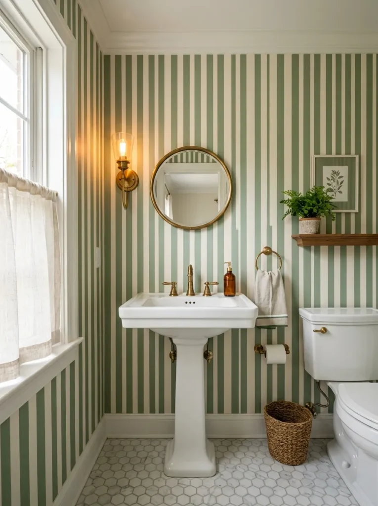
What it looks like: Crisp and a touch playful, with stripes that pull the eye upward.
Why it works: Vertical stripes are one of the only patterns that reliably make a low ceiling feel taller, and a powder room’s small footprint means even a bold, saturated wallpaper won’t overwhelm a budget the way papering an entire primary bath would.
How to copy it: Choose a pre-pasted, moisture-resistant wallpaper made for bathrooms specifically standard wallpaper will bubble and peel near humidity within a year and paper just the powder room rather than a full bath with a shower.
Best for: Small powder room renovators on a tighter material budget than a full tiled bath would require.
19. A Green Shower Curtain That Fakes a Full Renovation
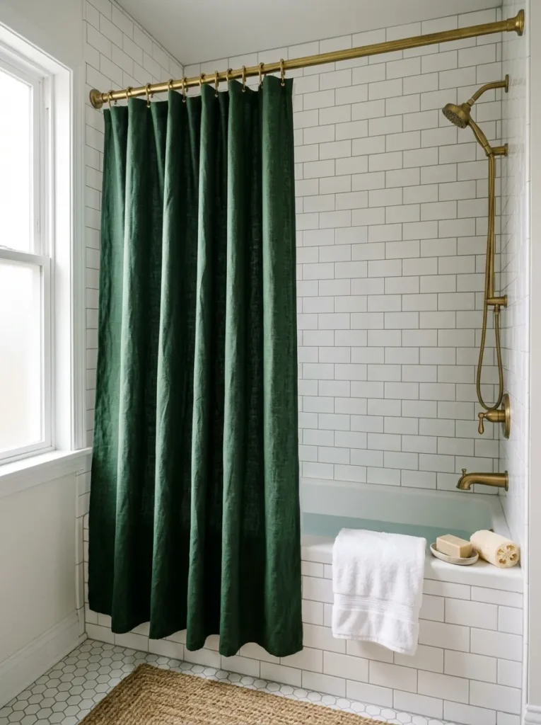
What it looks like: Substantial and grounded heavier fabric reads as intentional, not like an afterthought purchase.
Why it works: A shower curtain covers more visible surface area than almost any other single object in a rented bathroom, and a solid deep color creates the same anchoring effect as an accent wall without a single coat of paint.
How to copy it: Choose a heavyweight cotton or linen-blend curtain over thin polyester, and swap plastic rings for brass or matte black ones the small hardware detail is what actually sells the “renovated” look in photos.
Best for: Renters who want maximum visual change with zero permanent alteration.
20. Olive Green Textiles as the Final Layer That Ties It Together
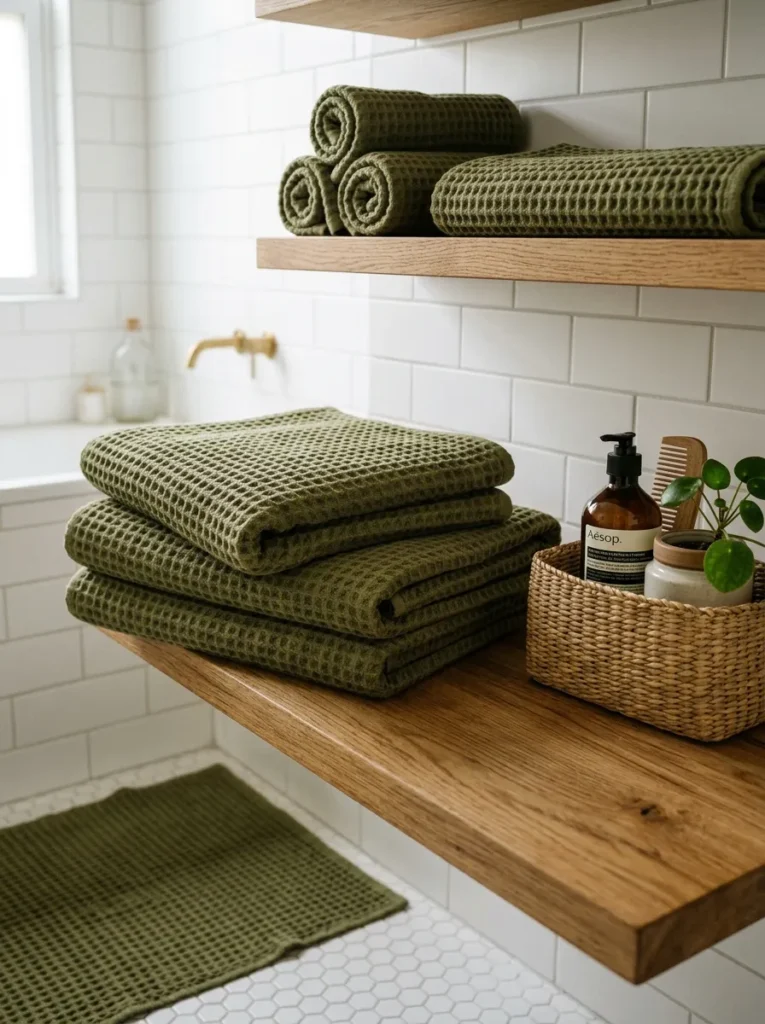
What it looks like: Warm and finished the layer that makes a plain white bathroom look pulled together in an afternoon.
Why it works: Textiles are the fastest, lowest-risk way to test a green palette before committing to paint or tile, and olive specifically reads as earthy rather than minty, which pairs naturally with the brass and wood tones already common in bathrooms.
How to copy it: Buy towels, bath mat, and a small hand towel in the same olive shade rather than mixing green tones even a slight mismatch between yellow-leaning and blue-leaning greens reads as accidental instead of styled.
Best for: Anyone who rents, or simply isn’t ready to commit to a permanent change yet.
How to Start Your Green Bathroom Transformation
What I’ve found with real spaces: start with paint, not tile or fixtures. A single accent wall or a full sage repaint costs under $75 in materials, takes one weekend, and tells you immediately whether you actually want to live with green daily something a Pinterest board can’t answer for you.
The most common fixable mistake is choosing a green with too much blue undertone for a room with warm brass or wood tones already in it. That mismatch reads as slightly “off” without most people knowing why. Fix it by holding your paint swatch directly against your existing hardware or flooring before buying not just under store lighting.
Three items under $50 that create immediate impact: a matte ceramic bud vase with a single eucalyptus stem, a set of olive waffle-weave hand towels, and an unlacquered brass soap dispenser. None require tools or installation.
A full green bathroom renovation tile, vanity, fixtures realistically takes 3–6 weeks and runs $3,000–$8,000 depending on tile choice and labor. A styling-only refresh using paint and textiles takes a single weekend and typically costs under $200.
Ready to Create Your Dream Green Bathroom?
From bold tiled showers to a single eucalyptus stem on the counter, these 20 ideas cover color, stone, lighting, and the small textile choices that quietly hold a room together.
None of this needs to happen at once pick one wall, one shelf, or one towel set and let the rest follow when you’re ready.
Today, the easiest place to start is painting a single swatch on your least-lit wall and living with it for a week before deciding. Green has a way of making a bathroom feel less like a fixture and more like a room you actually want to spend time in.
Save your favorites now that mossy tile or brass pendant will be much harder to track down later than it is to pin today.
Keep Exploring
- 15 Small Bathroom Storage Ideas That Actually Work in Under 40 Square Feet
- 12 Sage Green Kitchen Ideas for a Calm, Grounded Cook Space
- 18 Budget Bathroom Refresh Ideas You Can Finish in One Weekend