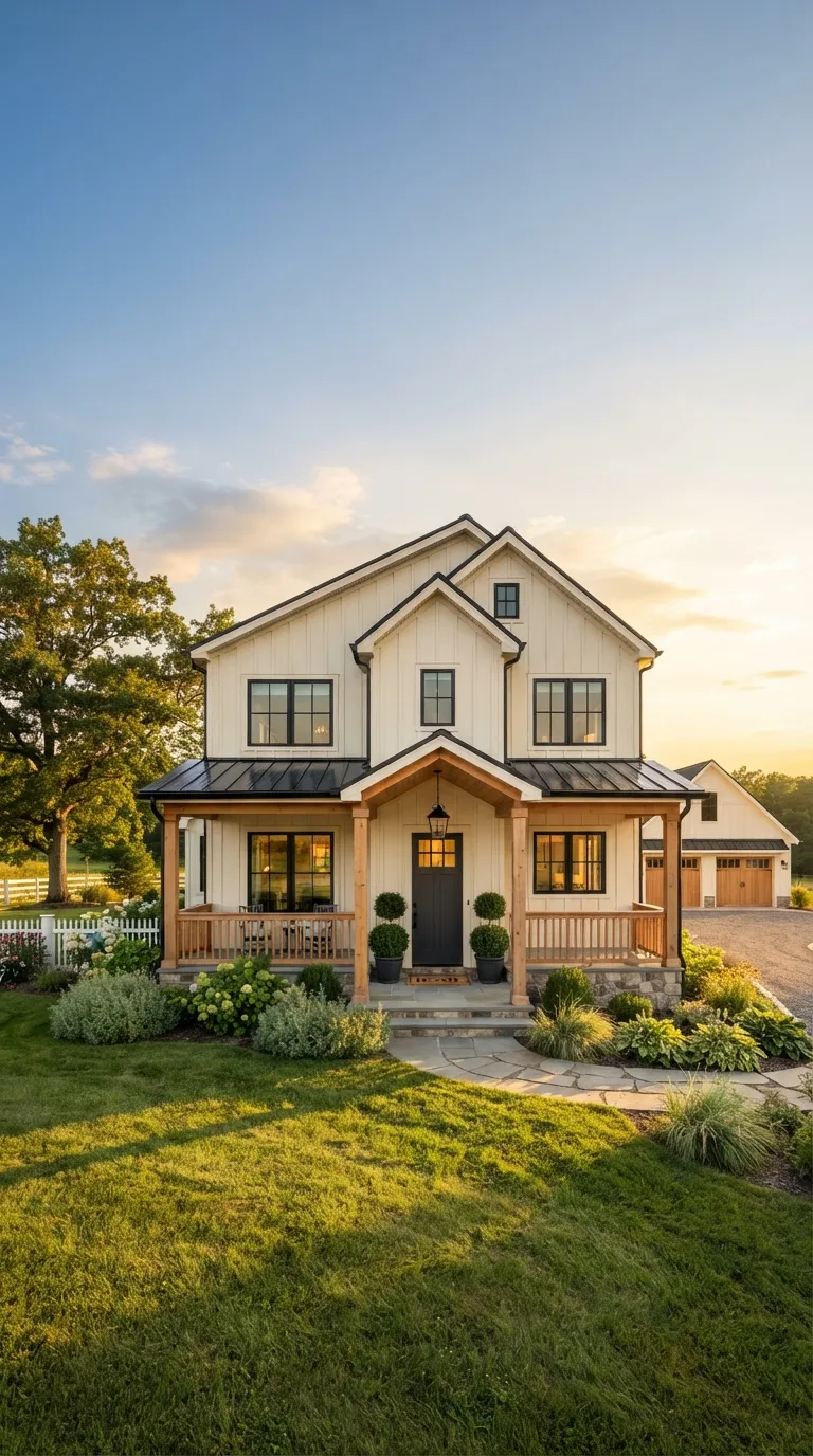
21 Exterior House Paint Colors That Actually Hold Up in Real Light
Exterior paint color is the one decision that decides whether your house reads as updated or overdue for work and unlike a renovation, it’s reversible for the cost of a few gallons. Here are 21 exterior house paint colors, pulled from real, buyable paint lines, organized by lot size, siding material, and light exposure, so you pick one that still looks right in the harsh light of August, not just on the sample card.
A good exterior color doesn’t try to do everything. It settles into the architecture instead of fighting it, holds its undertone from morning to dusk, and makes the trim, roofline, and landscaping look like they were planned together instead of accumulated over time. Get it wrong and even a well-built house looks slightly off like a photo where the white balance is a touch too warm. Get it right, and nobody notices the paint at all. They just notice the house.
Quick Navigation
- Why Exterior House Paint Colors Make Such a Difference
- 21 Exterior House Paint Colors to Try
- How to Start Your Exterior Paint Color Transformation
- Ready to Choose Your Exterior House Paint Color?
Why Exterior House Paint Colors Make Such a Difference
Exterior color reads differently than interior color it’s judged in direct sun, shade, and weather, and an undertone that looks neutral on a cloudy sample card can turn distinctly green, purple, or pink once it’s covering a full wall.
Warm off-whites, charcoals, and earthy greens are outperforming the cool “greige” wave right now because they read as intentional rather than trend-driven. On a small or narrow lot, trim contrast not body color does most of the visual work.
| Best starting point | Order 3–4 physical sample cards and view them against your siding at 8am, noon, and dusk |
| Biggest impact area | Front door and trim, not the full body |
| Budget to start | $40–$120 for samples plus one gallon of trim paint |
| Time to complete | A weekend for door and trim; 2–4 days for a full body repaint |
21 Exterior House Paint Colors to Try
1. Warm Greige That Doesn’t Read Cold (Sherwin-Williams Agreeable Gray)
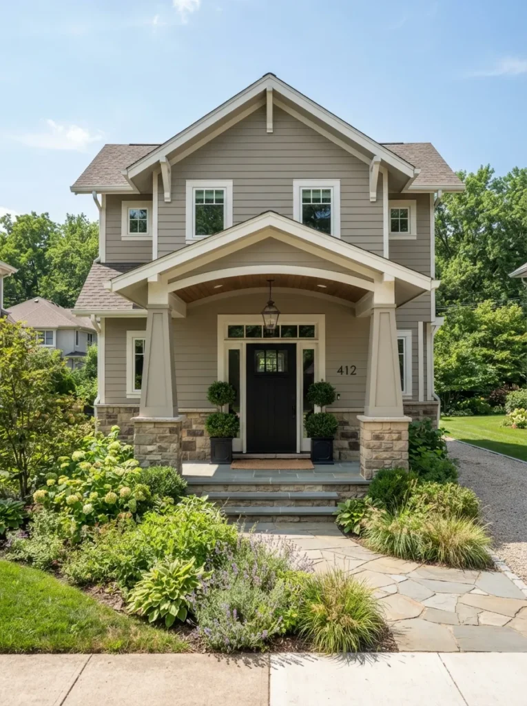
Settled, warm, and slightly sun-bleached never stark. Greige splits the difference between beige’s warmth and gray’s coolness, so it reads neutral in every light instead of shifting pink or blue depending on the hour. The warm undertone keeps it from looking cold against green landscaping.
Pull Sherwin-Williams Agreeable Gray or Benjamin Moore Balboa Mist for the body, then pair with a bright white trim like SW Extra White to keep window and door lines crisp. Skip a gray-based trim it flattens the contrast that makes greige read intentional. This one suits homeowners who want a resale-safe color that won’t look dated in five years.
Quick Win: Test greige against your actual brick, roof shingle, or stone accents before buying a full gallon this single undertone check prevents most exterior repaint regrets.
2. The Trim Palette That Actually Works With Unpainted Brick
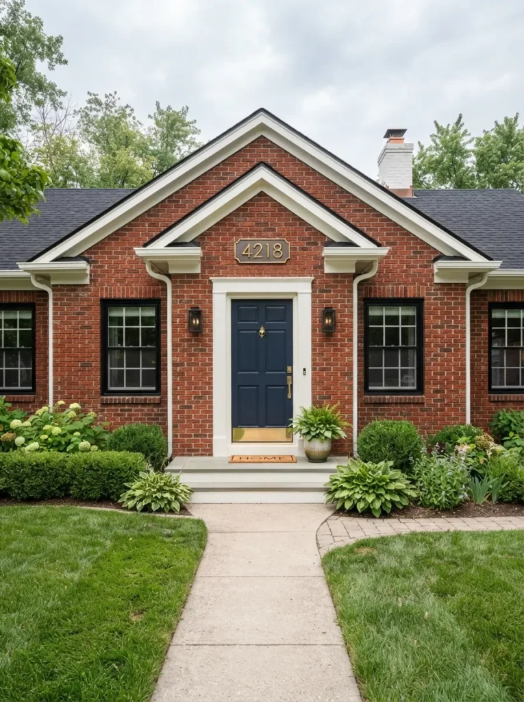
Sharp and deliberate the brick finally looks chosen instead of default. Brick has a fixed undertone you can’t change, so the trim has to answer to it rather than compete with it. Warm-toned brick needs a warm white trim; cooler pinkish brick needs a whiter trim with a touch more gray, or the two will clash.
Hold trim swatches directly against your brick in daylight not indoors and pick the white that disappears into the brick’s undertone rather than fighting it. Add one dark accent, like a black door or window frames, to modernize the pairing. This one suits owners of brick homes who can’t or don’t want to paint the brick itself.
Budget Version: Repainting just the trim and shutters against existing brick costs a fraction of a full repaint and delivers most of the visual update.
3. Charcoal Black for a Modern Exterior (Benjamin Moore Onyx)
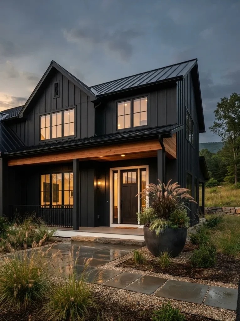
Sharp-edged and deliberate the house looks like it was drawn, not just painted. A near-black body color removes visual noise, so architectural lines window grids, roofline, porch posts become the entire story instead of competing with color variation. It’s a proportion trick as much as a color choice.
Use Benjamin Moore Onyx or Sherwin-Williams Tricorn Black on the body, and break it up with one warm material cedar, stained wood, or warm-toned stone or the whole facade can feel flat. This one suits modern and modern-farmhouse homes with strong architectural lines worth showing off.
Pro Tip: Black exteriors absorb noticeably more heat than lighter colors in full-sun climates, ask about a solar-reflective tint of the black to reduce siding expansion and fading.
Up next: the color correction most homeowners don’t know they need until the paint’s already dry.
4. The Undertone Fix for Overcast Climates
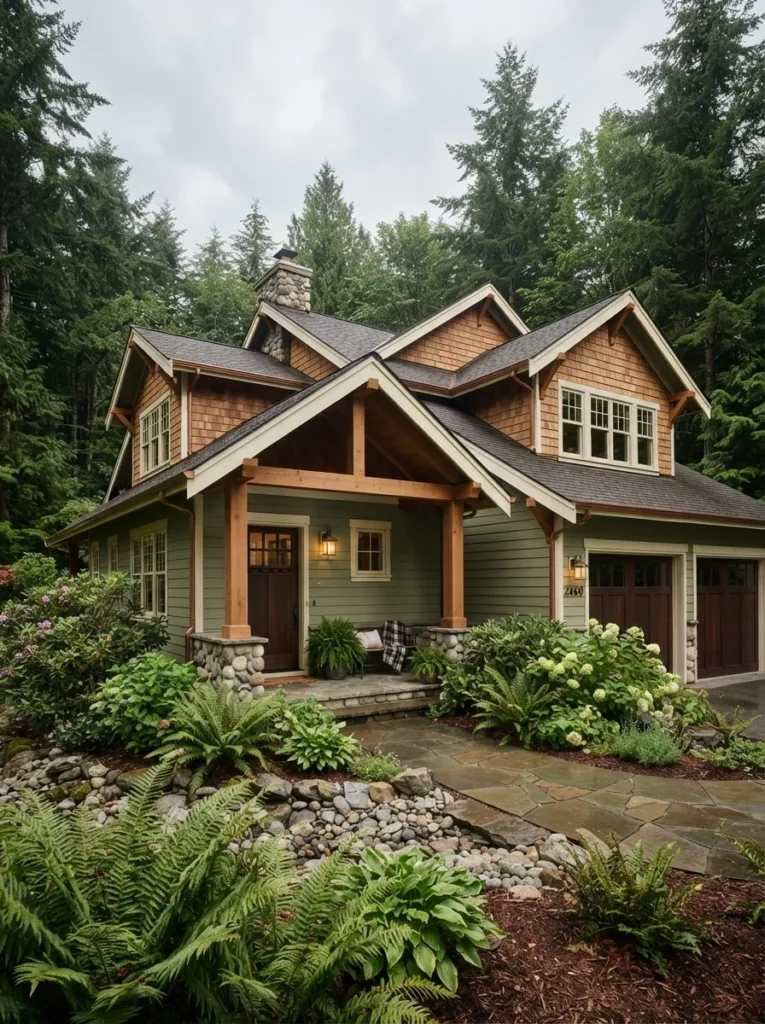
Steady and warm-leaning, even under gray sky. Overcast light strips warmth out of every color, so a shade that looks balanced on a sunny sample card can read cold or flat once it’s on a house in a cloudy climate. A built-in warm undertone corrects for that in advance.
In low-sun climates, size up one step warmer than you think you want — a “greige” becomes a true warm taupe, a cool sage becomes a warmer olive-sage. Test the sample outdoors on the actual siding, never through a window. This one suits homeowners in the Pacific Northwest, New England, or anywhere with more cloudy days than sunny ones.
5. Sage Green for Cottage Warmth Without Going Full Farmhouse
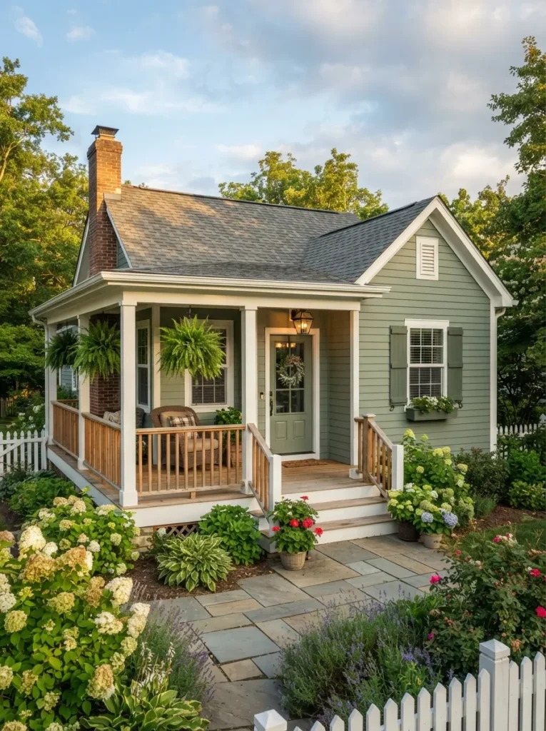
Muted and a little dusty closer to eucalyptus than mint. A gray-based sage sits between green and neutral, so it reads as sophisticated rather than themed, and flatters nearly every landscaping palette because it’s already halfway to the color of leaves.
Try Sherwin-Williams Evergreen Fog or Clary Sage, and keep trim a true white rather than cream cream pushes the sage toward yellow-green, which reads dated faster. This one suits cottage and bungalow-style homes that want warmth without leaning fully into farmhouse white.
Where to Shop
| Product |
|---|
| Solid brass exterior house numbers |
| Black wrought-iron porch light sconce |
| Woven natural-fiber doormat |
| Wood porch rocking chair |
6. The Two-Tone Trick That Makes a Boxy House Look Custom
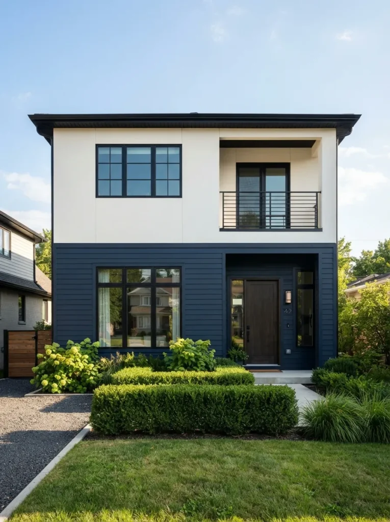
Deliberate, almost architectural a plain box starts to look designed. Splitting a flat facade into two color zones creates a horizontal line the eye follows, which breaks up height and mass on homes that otherwise read as one tall block.
Break the color at a natural architectural line a porch roof, a bay window ledge, a material change never at an arbitrary height, or the split will look like a mistake instead of a plan. This one suits boxy two-story homes, especially newer builds without much architectural detail to begin with.
Important: Most homeowners assume darker should go on top for “grounding,” but the opposite reads better on tall, narrow facades dark on the lower level visually anchors the house instead of making it look top-heavy.
This next one is the single most googled exterior color question and the answer isn’t what most guides say.
7. Deep Navy With Crisp White Trim, Done Right
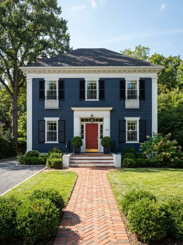
Crisp and formal, closer to a uniform than a mood. Navy has enough black in it to photograph as a near-neutral from a distance, while still reading as color up close it gets the drama of black without the heat absorption or the severity.
Use a true navy like Benjamin Moore Hale Navy rather than a blue-gray blue-grays fade toward slate and lose the richness that makes navy exteriors feel intentional. Keep trim pure white, not warm white, for the sharpest contrast. This one suits colonial, traditional, and symmetrical homes where crisp contrast reads as classic rather than trendy.
8. Warm Terracotta Tones Built for Stucco
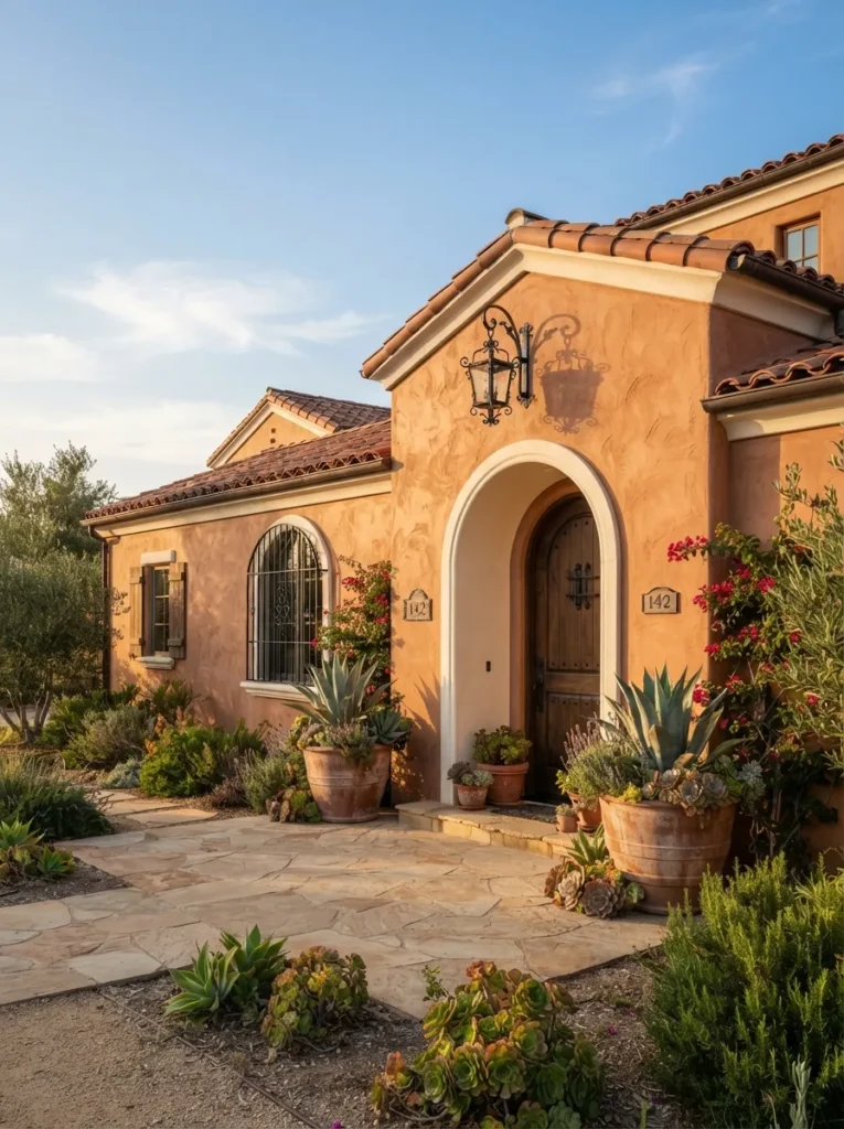
Sun-warmed and textural the color and the material work as one thing. Stucco’s rough texture scatters light differently than smooth siding, so warm, earthy tones read as rich rather than flat, while cool grays and blues can look chalky and washed out on the same surface.
Choose a terracotta or clay tone that echoes your roof tile if you have one matching temperature, not matching color exactly, is what makes the pairing feel unified rather than matchy. This one suits southwestern, Mediterranean, and Spanish Revival homes with stucco exteriors.
9. A Statement Front Door Color That Actually Gets Noticed
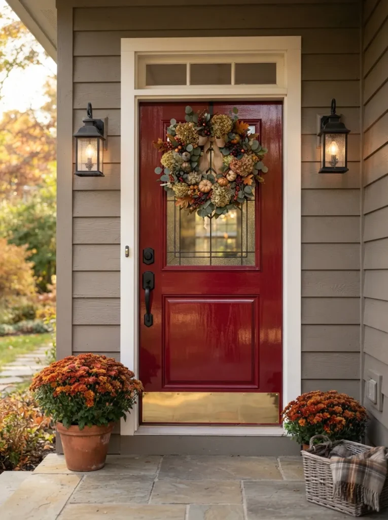
Glossy and confident the one spot of real saturation on an otherwise neutral house. A door only needs to cover a few square feet to make an impact, so it’s the lowest-cost, lowest-risk place to use a bold color you’d never commit to on the full body.
Pick a color that’s a genuine departure from the body not a slightly darker shade of the same hue and finish it in a satin or gloss sheen, which reads richer than matte on a small surface. This one suits renters, budget decorators, and anyone testing a bold color before a full commitment.
Warning: A flat or matte sheen on a front door tends to look chalky and cheap in direct sun doors specifically benefit from at least a satin finish, and most paint mistakes on this idea come from matching the body’s matte sheen out of habit.
Where to Shop
| Product |
|---|
| Matte black door lever and deadbolt set |
| Brass kickplate |
| Black exterior lantern sconces (pair) |
| Year-round faux boxwood wreath |
The next idea solves a problem nobody mentions until they’ve already repainted once.
10. Sun-Baked Terracotta Clay as a Full-Body Color
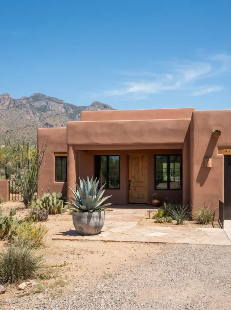
Dusty and warm, closer to sun-faded brick than a true orange. A muted, grayed-down terracotta avoids the “too orange” trap of a saturated clay color, so it reads as a sophisticated earth tone rather than a costume-y desert theme, even at full body coverage.
Test the color specifically at midday desert sun bleaches out saturation, so a swatch that looks perfect at golden hour can look washed out by noon. Bump saturation up half a shade from what feels right on the card. This one suits southwestern and desert-modern homes that want warmth without literal clay-tile styling.
11. Natural Wood Siding Stained, Not Painted, With a Black Accent
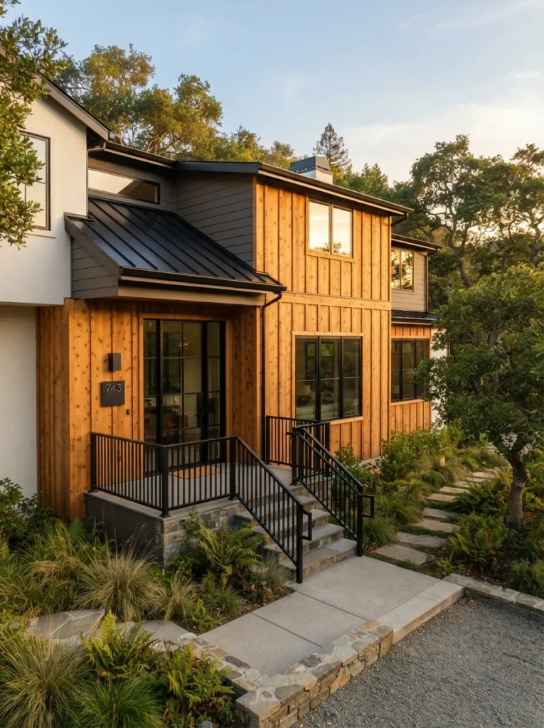
Textural and warm the grain does the work paint never could. Stain lets wood grain show through instead of hiding it, so the material itself becomes the visual interest, and pairing it with a hard black accent gives it enough contrast to read as modern rather than rustic.
Use a semi-transparent exterior stain rather than solid solid stain behaves like paint and hides the grain you’re paying for. Limit black to window frames, railings, or a single wall plane so the wood stays the star. This one suits modern and modern-farmhouse homes with real wood siding worth showing, not hiding.
Pro Tip: Semi-transparent stain needs reapplication every 3–5 years depending on sun exposure factor that into your decision if you’re choosing wood specifically to avoid repainting.
12. North-Facing Homes Need a Warmer Color Than You Think
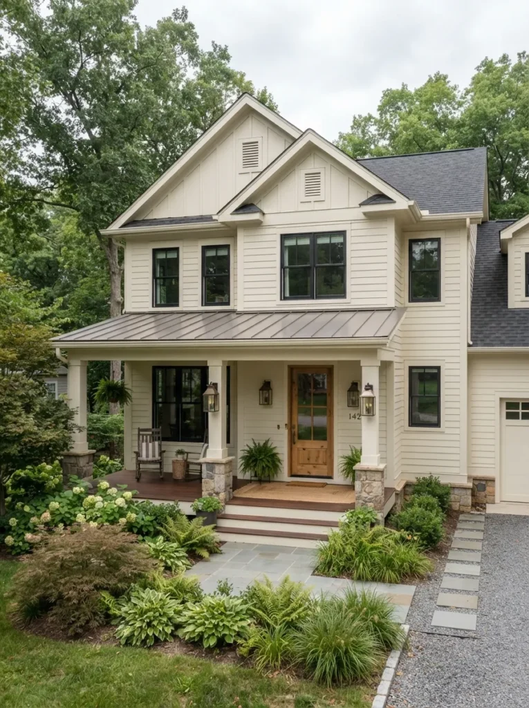
Softly warm even without direct sun ever touching it. North-facing facades receive only indirect, cool-toned light all day, which pulls any color toward gray and blue a shade that reads perfectly neutral on a south wall can look dingy or flat on a north one.
Choose a color one full step warmer than your instinct a “true white” becomes a warm white, a neutral gray becomes a warm greige and always test the swatch specifically on the north-facing wall. This one suits homes with a north-facing front elevation, which is a large share of standard suburban lots.
Important: Most homeowners test paint swatches wherever it’s convenient often a south or west wall then are confused when the color looks completely different once applied to the north-facing front of the house.
A quick one next, but it might be the highest-value idea on this list for older homes.
13. Classic Black Shutters, Paired Correctly
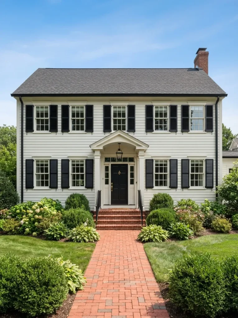
Sharp and symmetrical the shutters do more work than the paint color itself. Shutters create a repeating vertical rhythm across the facade, and matching them to gutters, the door, or window frames in the same black ties disconnected elements into one cohesive dark accent system.
Size shutters to match the window a shutter narrower than half the window width reads as decorative rather than functional and looks slightly off even if viewers can’t say why. Match black finish across shutters, gutters, and light fixtures. This one suits colonial, traditional, and farmhouse-style homes with regularly spaced windows.
14. Creamy Farmhouse White That Isn’t Stark
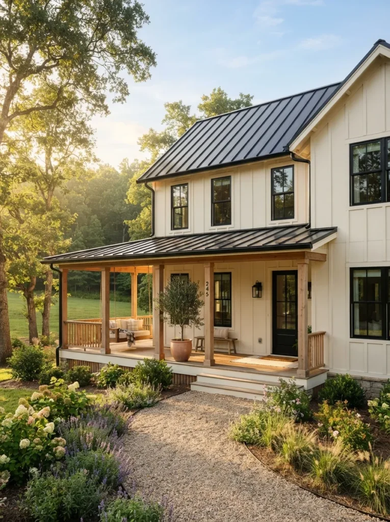
Soft and warm, never the bright white of a hospital wall. A true white can look sterile and glaring against green landscaping, while a cream-based white keeps enough warmth to feel inviting without giving up the clean, updated look white is chosen for in the first place.
Try Benjamin Moore Simply White or Swiss Coffee over a stark white like Chantilly Lace, and let black window frames or a black roof carry the contrast the paint color no longer needs to. This one suits modern farmhouse homes and anyone who wants “white house” without it reading cold.
15. Warm Taupe Paired With Matte Black Windows
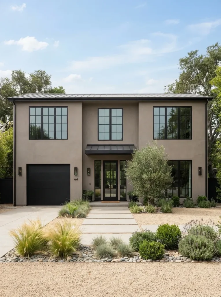
Clean and current, without tipping into cold minimalism. Black window frames have become the modern equivalent of white trim a hard, graphic outline and pairing them with a warm rather than cool body color keeps the whole facade from reading sterile.
If you’re replacing windows anyway, matte black frames cost roughly the same as standard white or bronze but do significantly more visual work. If not, black window film or trim paint achieves a similar effect for less. This one suits contemporary and transitional homes doing a window replacement or major renovation.
Where to Shop
| Product |
|---|
| Matte black exterior window film |
| Black flat-panel garage door hardware kit |
| Modern black house numbers |
| Ornamental grass planter set |
Before the last stretch of ideas, here’s something worth knowing from real repaint jobs.
My Views:
Here’s something most guides won’t tell you: the paint chip that looks perfect at the store is tested under fluorescent light, which flattens undertones almost completely. On an actual house, that same chip can swing warm or cool by a visible margin depending on whether your siding faces east or west a “greige” can turn distinctly lavender by 4pm on a west-facing wall. Always test a sample patch at least 2 feet square, directly on the house, and check it at three points in the day before ordering the full gallon.
16. The Small-Lot Trick That Makes a Narrow Home Look Bigger
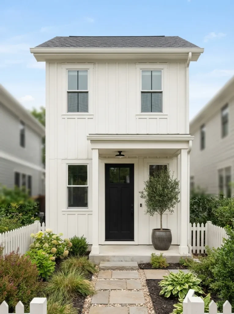
Continuous and open the eye never stops to register a boundary. High trim contrast chops a small facade into visual segments, making it look busier and smaller. Letting body, trim, and porch ceiling flow into one continuous low-contrast color removes those stopping points and reads as more square footage than exists.
Keep trim within one or two shades of the body color instead of full white-on-dark contrast, and paint the porch ceiling to match the walls rather than the traditional pale blue or white. This one suits narrow lots, small starter homes, and townhomes where every visual inch matters.
Small-Lot Paint Checklist:
- [ ] Choose a single low-contrast color family for body and trim
- [ ] Paint the porch ceiling and posts to match the body, not a contrasting white
- [ ] Save contrast for one small element only the door or house numbers
- [ ] Skip a two-tone or color-blocked scheme, which visually shortens a narrow facade
Almost there the last few ideas are the ones with the most personality.
17. A Haint-Blue Porch Ceiling for Southern Curb Appeal
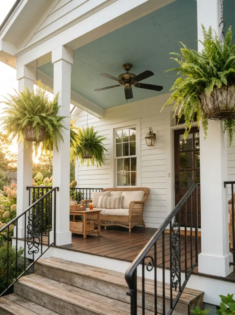
Soft and pale, almost the color of sky reflected in water. A colored porch ceiling is a Southern tradition originally meant to mimic sky and discourage nesting insects, and today it functions as a low-commitment way to add personality to a neutral exterior without repainting the whole house.
Use a true pale haint blue-green, not a saturated turquoise the traditional color is closer to a washed-out robin’s egg. Keep walls and trim neutral so the ceiling reads as intentional, not a mismatched afterthought. This one suits covered porches on cottage, coastal, or Southern-style homes.
18. A Muted Three-Color Historic Palette
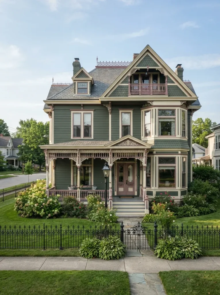
Layered and storied, like the house has history to prove. Historic and Victorian architecture was designed with ornamental trim specifically meant to be picked out in a third color a single flat body color hides detail the house was built to show off.
Choose three colors in the same value range so no single one shouts a deep body color, a light trim, and a mid-tone accent reserved only for raised architectural detail like brackets or gingerbread trim. This one suits Victorian, Queen Anne, and other historic homes with real architectural ornamentation.
Pro Tip: Most local historic preservation societies publish approved color palettes for landmark districts check before you buy, since some neighborhoods restrict exterior color choices by ordinance.
19. Matching Porch Railings and Furniture to Your Paint Color
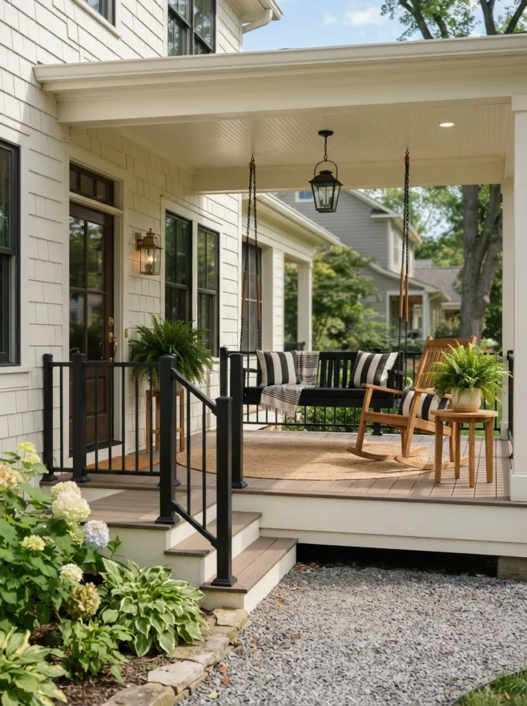
Finished and pulled-together, not just a painted box with furniture added after. Porch railings and furniture sit closest to eye level, so mismatched metals or finishes are more noticeable there than almost anywhere else on the house coordinating them makes the whole exterior feel planned.
Match railing color to your window frames or door hardware rather than the body color, and choose one furniture material teak, black metal, or white-painted wood instead of mixing finishes on the same porch. This one suits homes with a usable front porch where furniture is visible from the street. If you’re already rotating seasonal decor, this coordinated hardware is the base that fall porch ideas and other seasonal styling can layer on top of without ever clashing.
Where to Shop
| Product |
|---|
| Black powder-coated porch railing kit |
| Teak porch furniture set |
| Striped outdoor cushion set |
| Natural jute outdoor area rug |
20. Modern Matte Black Paired With Warm Wood
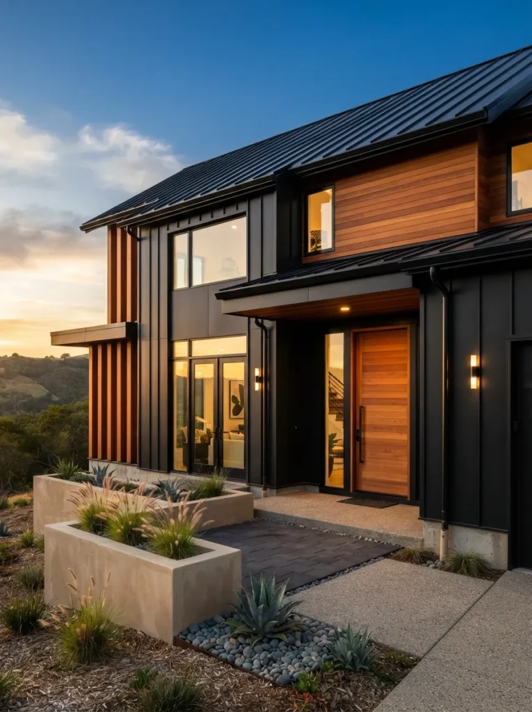
Bold but balanced black keeps it from feeling like a cabin, wood keeps it from feeling cold. Black alone on a full exterior can feel severe or heat-absorbent at scale, but breaking it up with a warm wood section on one plane an entry alcove, a garage face gives the eye somewhere to land and keeps the material palette from feeling one-note.
Reserve wood for a single architectural plane rather than scattering small wood accents across the facade, and choose a stain with enough pigment to resist UV graying for at least a few years. This one suits new builds and major renovations where siding material, not just paint color, is still up for choice.
21. South-Facing Homes Can Handle More Saturation Than You’d Guess
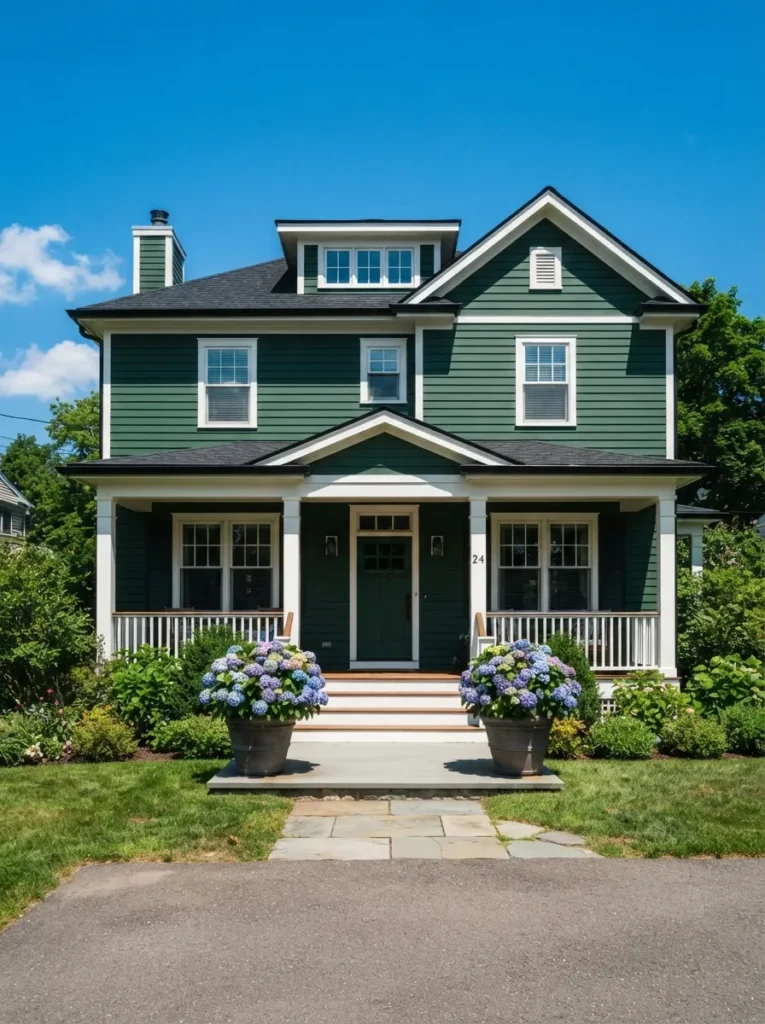
Rich and saturated without looking artificial, even at high noon. South-facing walls get the most direct, intense sunlight of any exposure, which washes out pale and mid-tone colors but lets deep, saturated colors hold their richness instead of fading into pastel.
Size up in saturation, not just depth a color that looks almost too bold on the sample card at the store will likely read as balanced once it’s facing full southern sun for eight hours a day. This one suits south-facing homes with strong sun exposure and homeowners who want a bolder color to actually read as bold.
Common mistake to avoid: Judging an exterior colour from a small indoor sample. Daylight, roofing, brick and landscaping all change how a colour reads outside, so test large swatches on the actual wall and view them at different times of day.
Frequently Asked Questions
How many colours should I use on a house exterior?
Three is the most common approach: a body colour, a trim colour and an accent for the front door or shutters.
Do dark exterior colours fade faster?
Dark colours absorb more heat and can show fading or wear sooner in strong sun, so choose a quality exterior paint made for the conditions where you live.
How do I match paint to a roof or brick?
Treat the roof and any brick or stone as fixed colours. Compare undertones in daylight, and test samples right next to them before you buy.
How to Start Your Exterior Paint Color Transformation
What I’ve found with real houses: the first move isn’t picking the body color it’s picking the trim white, because trim touches every other color decision you’ll make afterward. Nail down whether you’re using a warm or cool white first, and every subsequent choice gets easier because you’re matching against a fixed point instead of guessing twice.
The most common fixable mistake is choosing a color from a small sample card indoors and never testing it outside in real light. Undertones shift dramatically between fluorescent store lighting and direct sun, and a color that looked perfectly neutral at the paint counter can read distinctly blue, green, or pink once it’s covering an entire wall. Buy a sample pot and paint a two-foot square directly on your siding before committing to gallons.
Three items under $50 that shift curb appeal immediately: a set of matte black house numbers in a modern sans-serif font, a natural jute doormat sized to fit your entry, and a can of black or bronze spray paint for dated brass hardware like hinges and mailbox posts.
A full exterior repaint on an average single-family home typically runs $3,000–$8,000 professionally and takes 3–5 days depending on siding material and prep work. A DIY trim-and-door refresh can be done in a single weekend for under $150 in materials, and it’s the highest-impact, lowest-cost place to start if a full repaint isn’t in the budget yet.
Ready to Choose Your Exterior House Paint Color?
Between deep charcoal statements, warm terracotta full-body colors, and small details like a haint-blue porch ceiling, there’s a version of this list that fits a brick ranch, a Victorian, and a narrow modern build equally well.
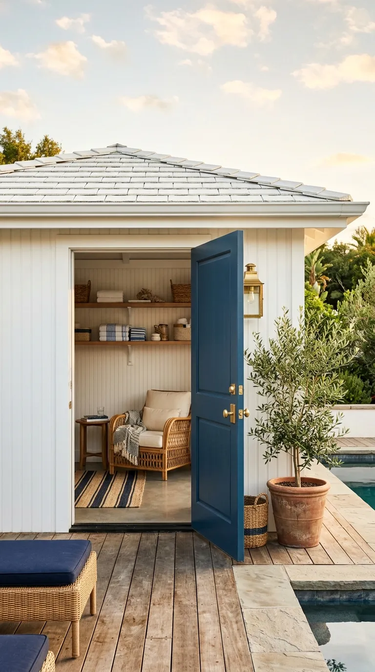
Nobody repaints an entire house in a weekend, and starting with the door or trim while you live with a sample patch for a few weeks is a smart way to test a direction before committing to gallons the same low-risk approach that works for a detached pool house makeover or a small she shed if you’re testing a bolder color there first.
Order two or three sample pots this week and paint test squares in at least two spots one in shade, one in direct sun. The right exterior color should make the architecture you already have look intentional, not disguise it. Pin your favorites now, because paint trends move fast enough that the shade you love today is worth locking in before it’s discontinued or reformulated.
You Might Also Like
- 15 Front Door Colors That Instantly Update Any House Exterior
- 12 Modern Farmhouse Exterior Ideas That Don’t Look Like Everyone Else’s
- 9 Budget Curb Appeal Upgrades You Can Finish in a Weekend