16 IKEA Kallax Scandinavian Styling Ideas for a Minimalist Home
A Kallax unit is IKEA’s boxy, endlessly stackable shelving system and in a Scandinavian home, it’s less “storage” and more the backbone the whole room leans on. Here are 16 styling ideas that turn that plain grid into something calm, functional, and genuinely good to look at, without hiding what it actually is.
A well-styled Kallax feels quiet rather than crowded negative space doing as much work as the objects inside it. Light catches raw oak edges, woven baskets soften every hard line, and nothing on the shelf fights for attention. Get it right and the room around it breathes a little easier. Let’s get into it.
Quick Navigation
- Why Scandinavian Kallax Styling Works So Well
- 16 Scandinavian Styling Ideas for Your Kallax
- How to Start Your Kallax Transformation
- Ready to Create Your Dream Scandinavian Space?
Why Scandinavian Kallax Styling Works So Well
Scandinavian design grew out of long, dark Nordic winters a practical answer to needing rooms that felt warm even with limited daylight. Applied to a Kallax, that means warm white or pale birch backing panels, jute and rattan textures, and a palette of soft greige, muted sage, and natural oak that never competes with the light.
It’s having a moment again because it does more with less genuinely useful for renters who can’t renovate but can restyle. It works in tight apartments too; the priority there is negative space first, decor second.
| Element | Warmth | Restraint |
|---|---|---|
| Philosophy | Function first, form follows | Nothing without a purpose |
| Materials | Light oak, birch, linen | Rattan, wool, matte ceramic |
| Color palette | Warm white, soft greige | Muted sage, natural wood tones |
16 Scandinavian Styling Ideas for Your Kallax
1. Paint the Backing Panels a Warm White
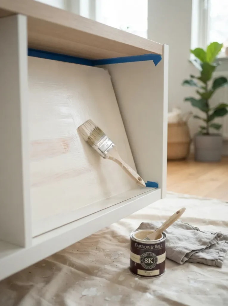
What it looks like: Luminous the factory white plastic warms up and stops looking like a big-box product.
Why it works: Kallax’s stock backing is a cool, slightly blue white; a warm white repaint shifts the undertone toward cream, which is what actually reads as “Scandinavian” rather than “office storage.” It’s a straightforward color-theory fix, not a redesign.
How to copy it: Sand lightly, then apply two thin coats of a warm-white furniture paint in an eggshell finish avoid anything glossy, which reads cheap under direct light. If you’d rather skip painting altogether, our no-drill Kallax hacks round up other tool-free ways to update the same panels.
Best for: Renters and budget decorators who own an older, cooler-toned Kallax already.
Quick Win: A quart of paint covers a full 4×4 unit twice over, so buy small this is a one-afternoon project, not a weekend one.
2. Swap Bins for Woven Rattan Baskets
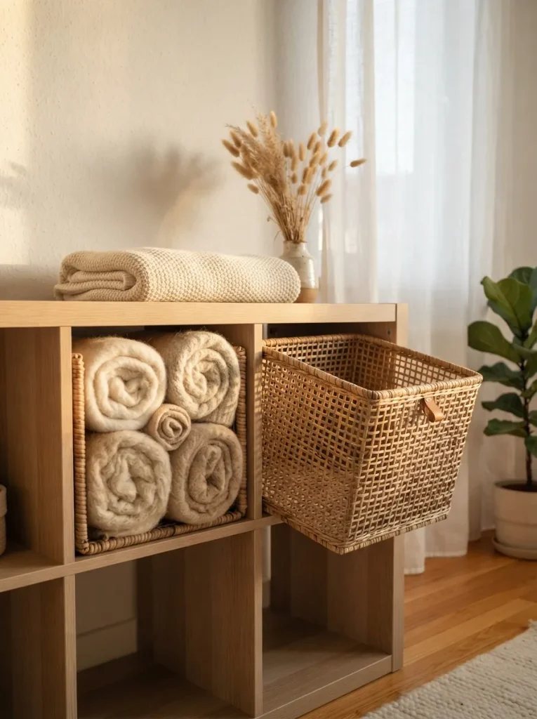
What it looks like: Textured hard plastic bins get replaced by something with actual grain and shadow.
Why it works: Kallax’s plastic and fabric bins are flat and matte in a way that reads mass-produced; rattan introduces texture layering and natural shadow lines, which is a core Scandinavian technique for adding visual interest without clutter.
How to copy it: Measure for the half-size 13×13-inch cube (most rattan baskets are sold to that spec) and mix two open-weave and one closed-lid basket per unit so storage doesn’t look uniform.
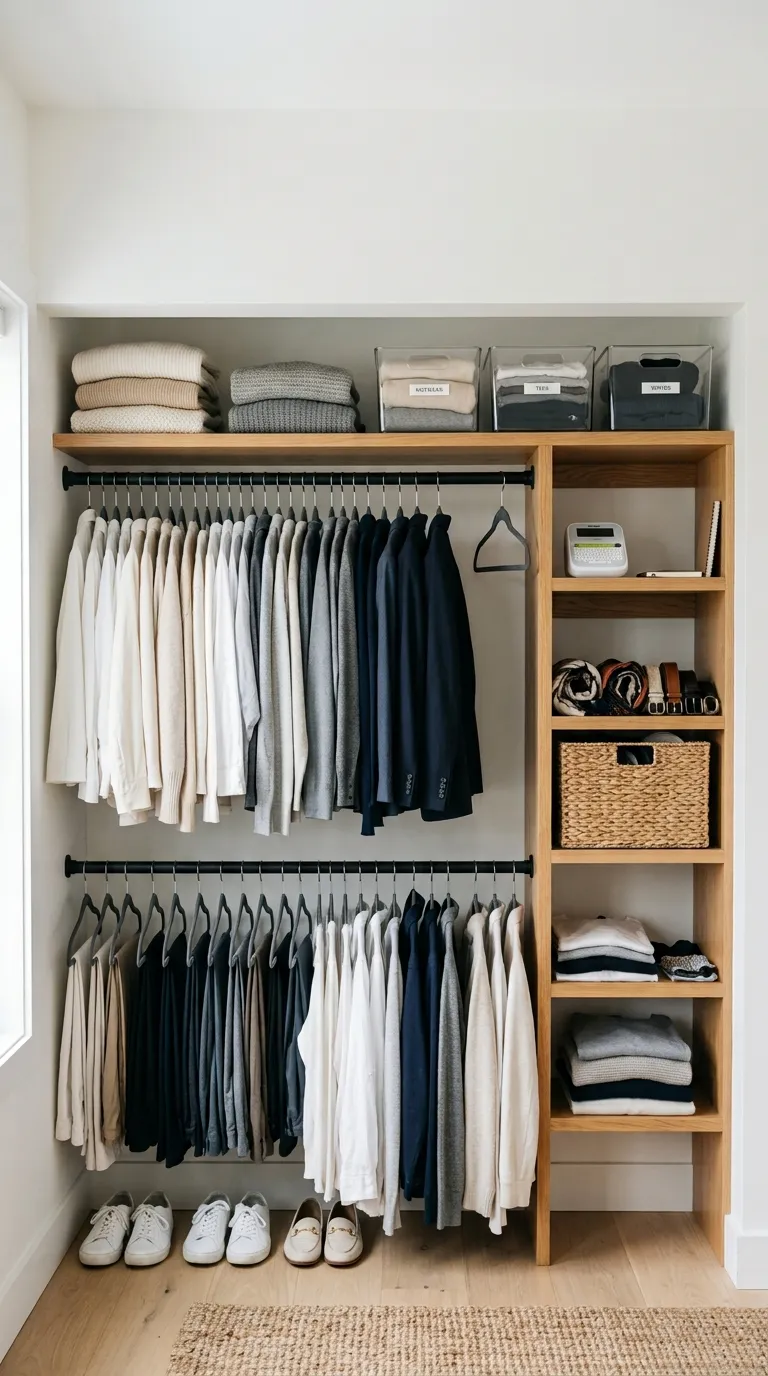
Best for: Anyone hiding cables, chargers, or mismatched odds and ends pair it with a broader pass through our closet organization ideas if the clutter extends past the shelf.
Shop This Look
Product Open-weave seagrass storage basket, half-cube size Closed-lid water hyacinth storage bin with handle Small woven wall hook for hanging a throw nearby Natural jute drawstring liner bag for loose items Round rattan tray for a top-shelf vignette
3. Leave One Row Completely Empty
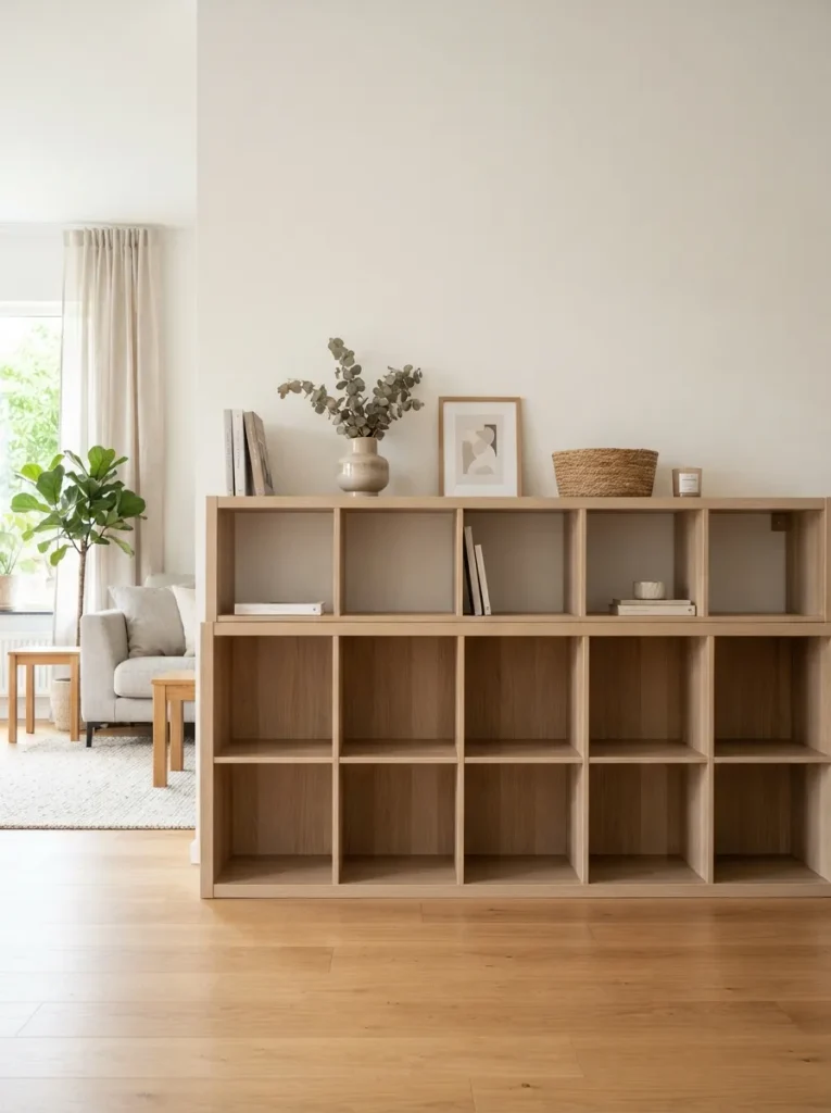
What it looks like: Hushed a whole row of nothing, which sounds wrong until you see it.
Why it works: Negative space is a design principle, not an accident. An empty row gives the eye somewhere to rest and makes the styled cubes above it read as intentional rather than crammed. Most people fill every cube; skipping one is the single fastest way to make a Kallax look designed.
How to copy it: Pick the row at eye level or just below it that’s where an empty cube reads as calm rather than unfinished and commit to leaving it bare for at least a season before second-guessing it. For more restraint-first techniques like this one, our general Kallax styling ideas roundup covers a few others.
Best for: Anyone whose shelf currently feels busy no matter what they try.
Small-Space Tip: In a studio or small apartment, an empty row does double duty it visually lowers the perceived height of a tall unit, making the ceiling feel higher.
The next idea costs nothing but a screwdriver and changes how the whole piece sits in the room.
4. Add Tapered Wood Legs to Lift It Off the Floor
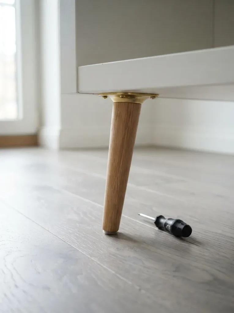
What it looks like: Lighter the same box, but suddenly it doesn’t look like it’s sitting directly on the ground.
Why it works: Furniture that touches the floor edge-to-edge reads heavy; legs introduce a gap of visible floor, which lowers the unit’s visual weight even though the physical footprint hasn’t changed. It’s the same principle behind mid-century sideboards.
How to copy it: Choose tapered legs around 4 to 6 inches tall in light oak or brass-tipped black, and use a mounting-plate kit rather than drilling directly into the particleboard base.
Best for: People using Kallax as a TV console, sideboard, or room divider rather than pure storage.
✅ Before You Attach the Legs:
- [ ] Measure and mark leg placement 2 inches in from each corner
- [ ] Pre-drill pilot holes to avoid splitting the particleboard
- [ ] Screw mounting plates flush against the base
- [ ] Twist legs in fully by hand before standing the unit upright
- [ ] Check level on a flat surface and adjust felt pads if needed
5. Color-Block Your Book Spines Inward
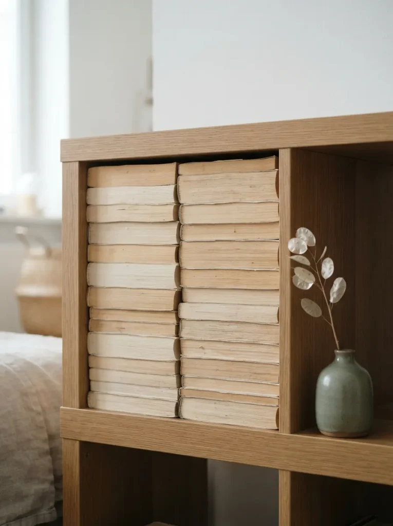
What it looks like: Uniform a wall of pale page edges instead of a mess of competing spine colors.
Why it works: Book spines are usually the loudest, most chaotic color source on any shelf. Turning them inward removes that noise entirely and lets the eye focus on shape and texture instead a favorite trick for anyone whose books don’t match their palette.
How to copy it: Reserve this for cubes you don’t need to browse often, and mark a favorite few with a slim leather bookmark peeking out so the shelf still stays functional.
Best for: Book lovers whose collections clash with a muted color scheme see our Kallax bookshelf styling ideas for more ways to handle a full collection.
Styling Note: Group by height rather than alphabetically when you turn spines inward a stepped page-edge silhouette reads far more intentional than a flat one.
6. Layer In Undyed Linen Storage Bins
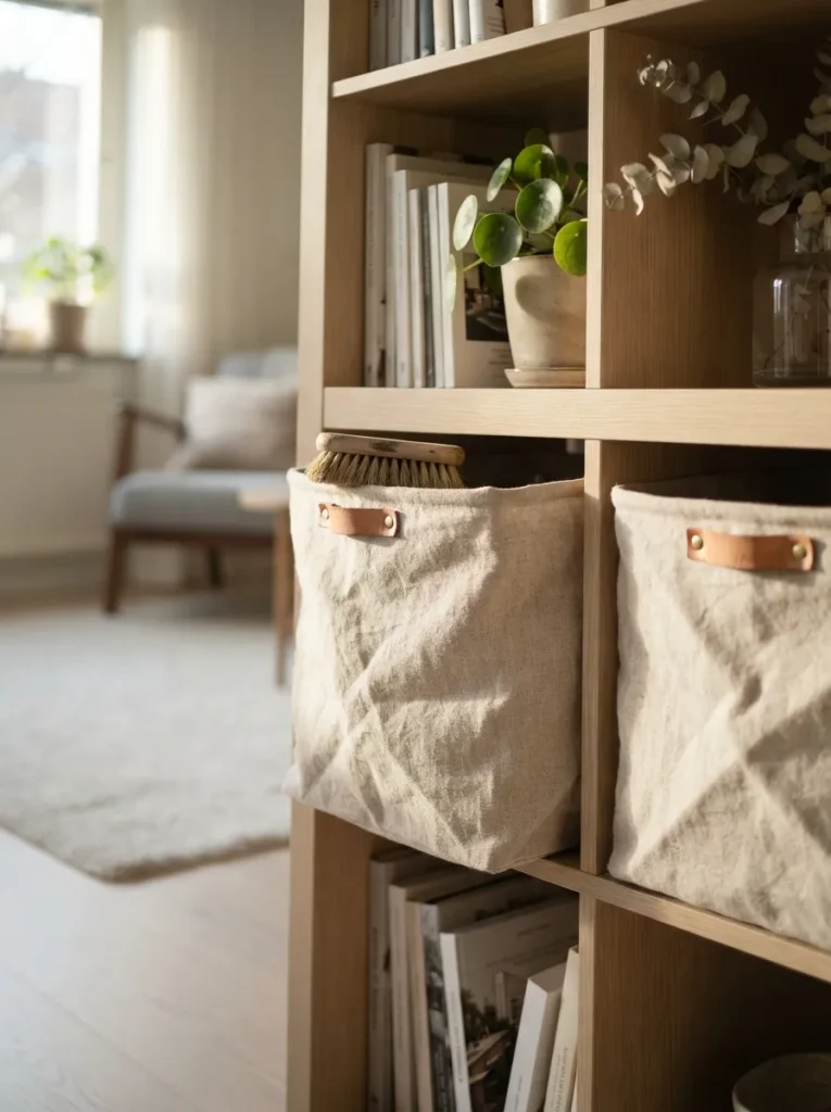
What it looks like: Soft fabric that slouches slightly instead of holding a rigid boxy shape.
Why it works: Kallax’s own fabric bins are stiff and geometric, which fights the organic softness Scandinavian rooms rely on. Undyed linen has drape and a visible weave, adding a textile layer that plastic and cardboard can’t fake.
How to copy it: Buy bins a half-size smaller than the cube opening so the fabric has room to slouch naturally rather than stretching tight against the frame.
Best for: Anyone storing linens, off-season clothing, or soft goods that don’t need to be seen the same bins work well in our Kallax laundry room storage ideas.
Shop This Look
Product Undyed linen storage bin with leather pull tabs Natural cotton canvas fold-top storage box Leather luggage-tag style label for bin fronts Wool felt storage basket with drawstring top Small wood-handled clothes brush for the bin top
Up next: the layout trick that turns a plain shelf into a functional room divider.
7. Use It as a Room Divider, Styled on Both Sides
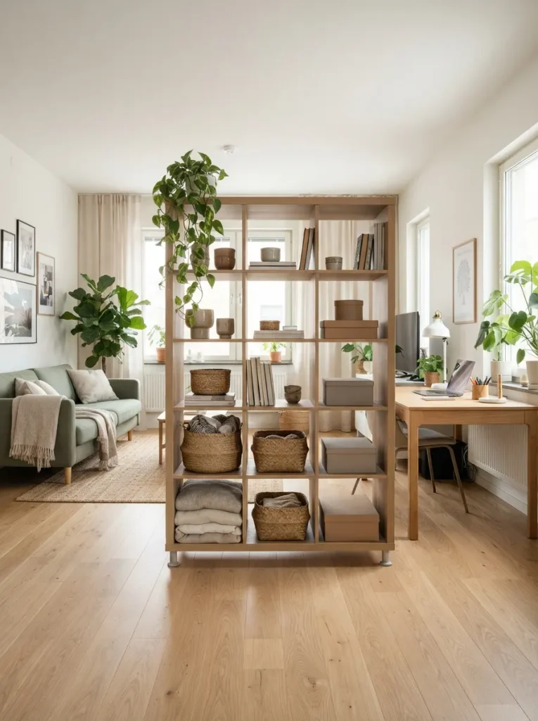
What it looks like: Open a wall that isn’t really a wall, since you can still see light and shape through it.
Why it works: A solid divider blocks light and makes a small space feel chopped up; a Kallax used this way keeps sightlines open through the empty cubes while still separating function zones. It’s a layout move, not just decor.
How to copy it: Leave roughly a third of the cubes empty on purpose so light and eye-line can pass through, and style each side to match the room it faces rather than treating it as one continuous look.
Best for: Studio and open-plan apartment dwellers who need a functional boundary without losing light it’s a favorite trick in our Kallax dorm room ideas too.
Warning: A freestanding Kallax used as a room divider must be anchored to the wall or floor with an anti-tip strap unsecured units are genuinely at risk of tipping, especially with kids in the house.
8. Tuck a Warm LED Strip Inside Two or Three Cubbies
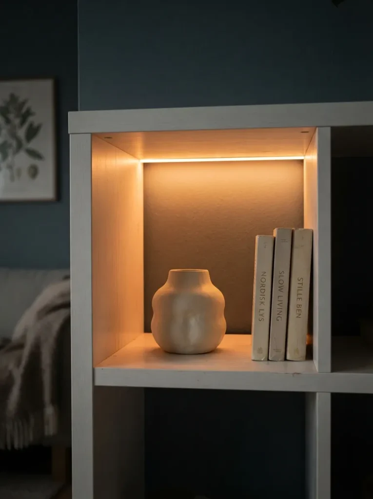
What it looks like: Warm a soft glow instead of flat daytime light, especially once the sun goes down.
Why it works: Overhead room lighting flattens everything on a shelf equally; a hidden LED strip inside just two or three cubes creates contrast and draws the eye to specific objects, the same way museum lighting directs attention.
How to copy it: Stick a battery or USB warm-white LED strip (2700K, not daylight-toned) along the top-back edge of the cube, angled slightly forward so it washes the back panel rather than shining straight out.
Best for: People who use their living room in the evening and want the shelf to still feel intentional after dark.
9. Build a Three-Object Vignette in One Cube
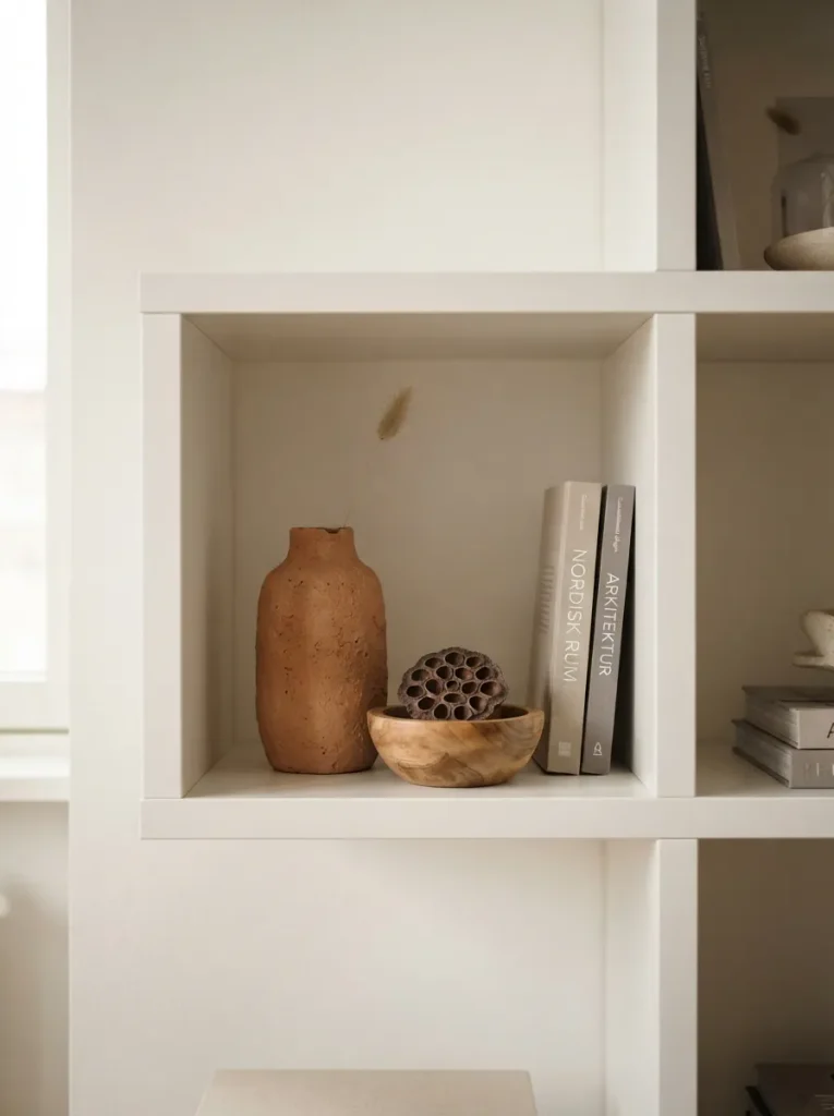
What it looks like: Considered three things, none of them fighting for the same visual weight.
Why it works: Odd-numbered groupings with varied height create asymmetrical balance, a principle designers rely on because the eye finds it more interesting than a matched pair. Two objects reads as accidental; three, arranged with intention, reads as styled.
How to copy it: Pick one tall, one medium, one low object, place the tallest slightly off-center rather than dead middle, and leave visible space between each piece crowding them undoes the whole effect.
Best for: Anyone with a handful of decorative objects and no idea how to arrange them.
Mistake to Avoid: Don’t group three objects of similar height the eye reads it as clutter rather than a vignette. Height contrast is the entire trick.
10. Mix Closed Doors and Open Cubes Irregularly
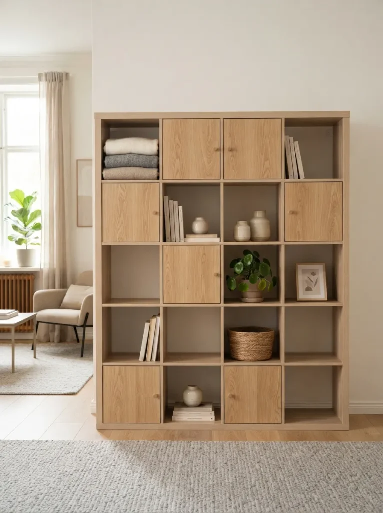
What it looks like: Layered some cubes reveal, some conceal, and the mix feels deliberate rather than random.
Why it works: A wall of identical doors looks like a cabinet; a wall of identical open cubes looks cluttered fast. Alternating concealment gives the eye variation to track, which is what keeps a large unit from reading as one flat block.
How to copy it: Aim for roughly 40 percent closed, 60 percent open, and avoid a strict checkerboard stagger the pattern so no two closed doors sit directly above or beside each other.
Best for: Larger 4×4 units where a full wall of open storage would feel like too much the same door-and-cube mix shows up in our Kallax closet conversion ideas.
Important: Most people assume door inserts have to match the unit exactly they don’t. A slightly different wood tone on the doors adds intentional contrast instead of looking mismatched.
This next one surprised even experienced decorators the first time they tried it.
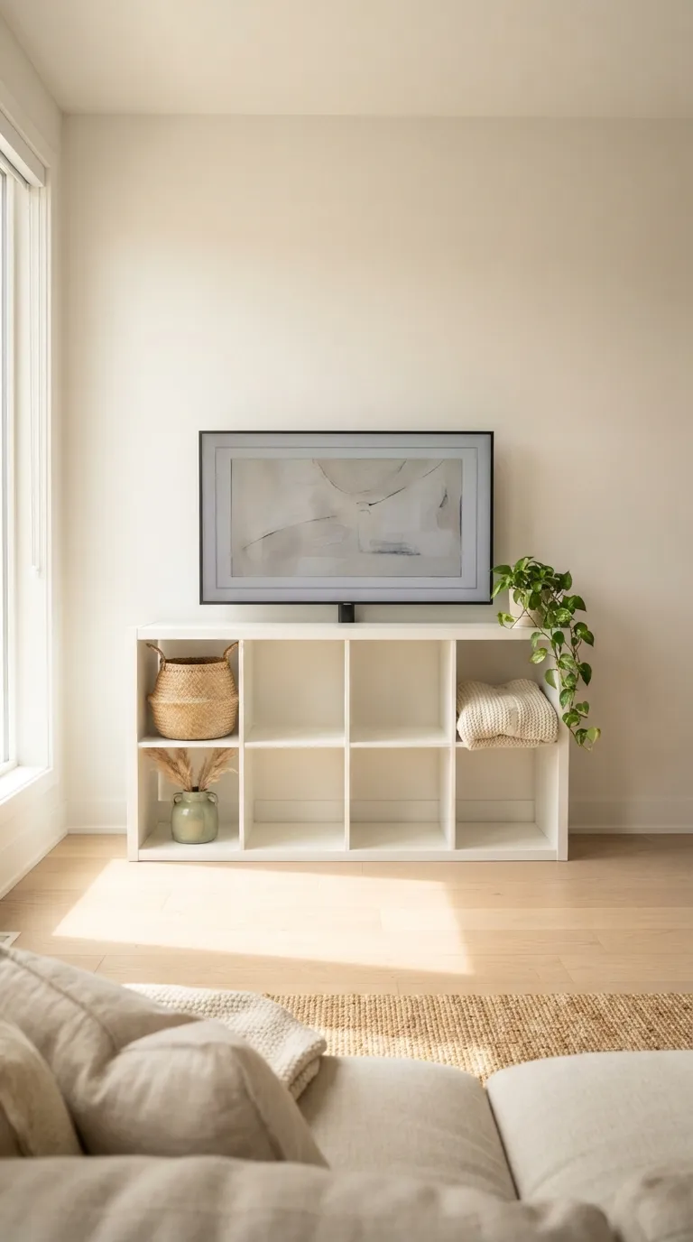
11. Turn It Into a Low Media Console
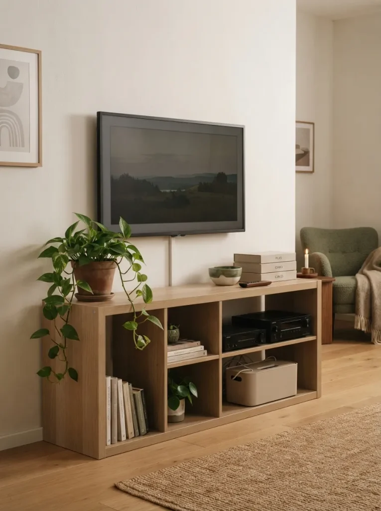
What it looks like: Functional a media unit that doesn’t advertise itself as flat-pack storage repurposed.
Why it works: A wide, low 2×4 or 4×2 Kallax sits at the right proportion for a wall-mounted TV, and using the closed cubes for media equipment removes visual clutter from the top surface leaving that surface free for actual styling.
How to copy it: Keep the top surface to three objects maximum, route cables through a single hidden cube with a cable-management box, and center the unit under the TV rather than offsetting it.
Best for: Living rooms where the media setup currently dominates the room visually for more layouts like this, see our Kallax TV console ideas.
Shop This Look
Product Cable management box with cord entry slots Low ceramic bowl for the top surface Trailing pothos or similar low-light plant Slim media remote organizer tray Felt cord sleeves for hidden cube wiring
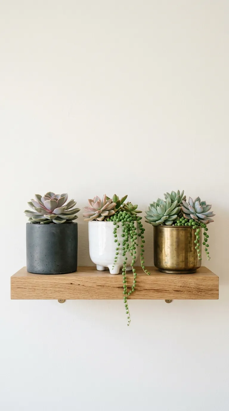
12. Mount a Single Floating Shelf Above It
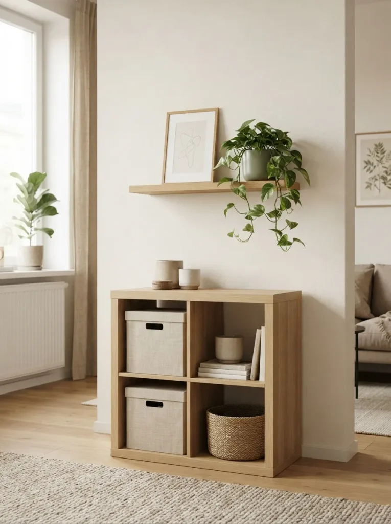
What it looks like: Composed the eye travels upward instead of stopping flat at the top of the unit.
Why it works: A Kallax alone has a hard, flat top edge that can make a wall feel visually cut off. One floating shelf above it extends the vertical line and creates a second, lighter styling zone without adding another bulky piece of furniture.
How to copy it: Leave 8 to 10 inches of visible wall between the Kallax top and the floating shelf, and keep the shelf styled with fewer objects than the unit below it so it reads as a lighter accent, not a second shelf competing for attention.
Best for: Rooms with tall ceilings where a Kallax alone leaves too much bare wall above.
Styling Note: Lean the frame slightly rather than hanging it flush a small tilt reads more natural and forgives an imperfectly centered shelf.
The next idea is one most people overlook entirely and it costs almost nothing.
In my experience, the single biggest thing people get wrong with a Kallax isn’t the styling it’s the anchoring. A 4×4 unit loaded with books can weigh more than most people expect, and I’ve seen units pulled forward simply from a toddler climbing the open cubes like a ladder. Anchor it to a wall stud before you style a single cube; everything else in this list assumes that part is already handled.
13. Let a Few Cubes Hold Only Ceramics
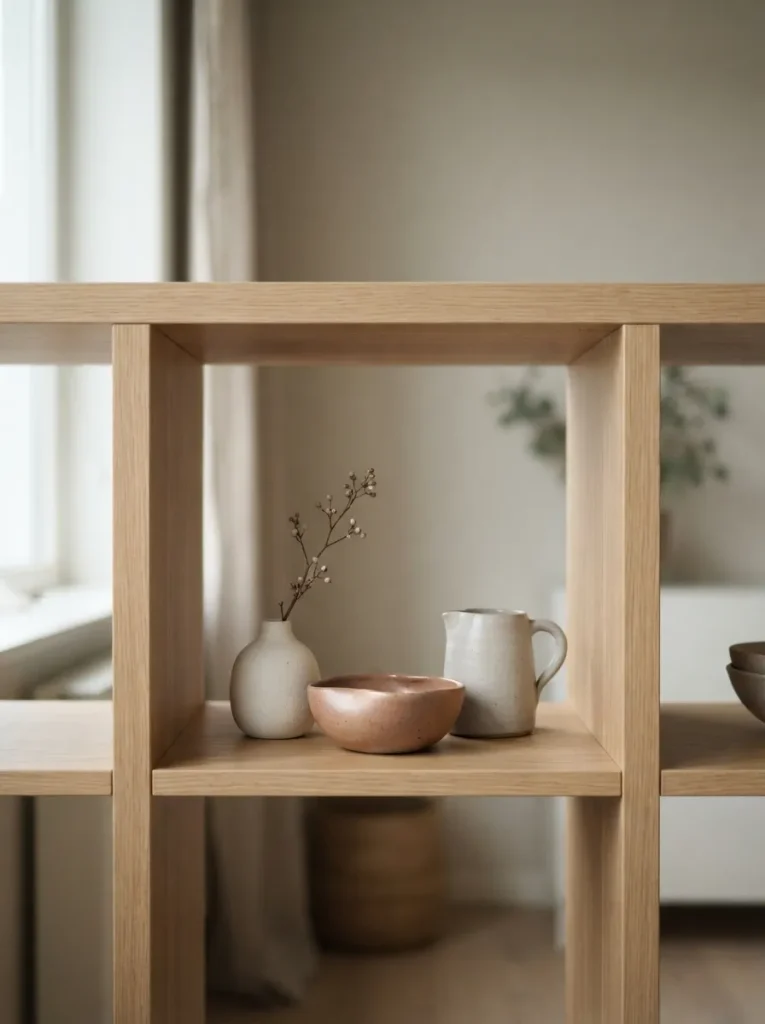
What it looks like: Quiet a single material family, nothing else competing for attention.
Why it works: Restricting a cube to one material here, matte ceramic creates visual cohesion through repetition, a technique curators use in gallery displays. Mixed materials in a small space read as busy; a single material reads as edited.
How to copy it: Choose pieces with slightly varied shapes but the same glaze finish and a tight color range, and resist the urge to add a plant or book to “fill it in” the restraint is the point.
Best for: Collectors of handmade or small-batch ceramics who want them to actually be seen.
14. Top It With a Cushion for Bench Seating
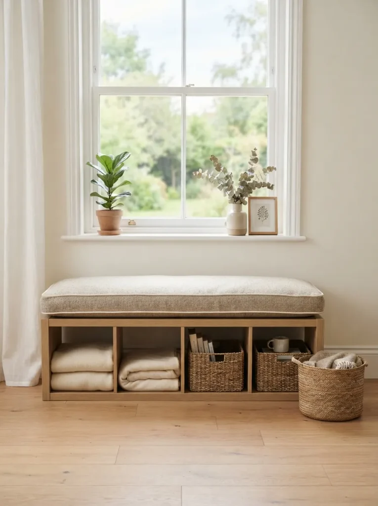
What it looks like: Cozy a shelf that quietly doubles as somewhere to sit.
Why it works: In a small apartment, furniture that serves two functions is worth more than furniture that serves one. A low 2×4 or 1×4 Kallax under a window is nearly bench height already, and the cubes underneath keep working as storage while the top becomes seating.
How to copy it: Have a fitted foam cushion custom-cut to the exact top dimensions rather than using a loose throw pillow, which will slide and bunch with regular use.
Best for: Small apartments or entryways that need seating but don’t have floor space for a bench our Kallax entryway ideas cover a few more entry-specific layouts.
Small-Space Tip: Position it under a window rather than against a blank wall the seat becomes a reading nook instead of just extra storage with a cushion on top.
15. Add a Wall Sconce Instead of a Lamp
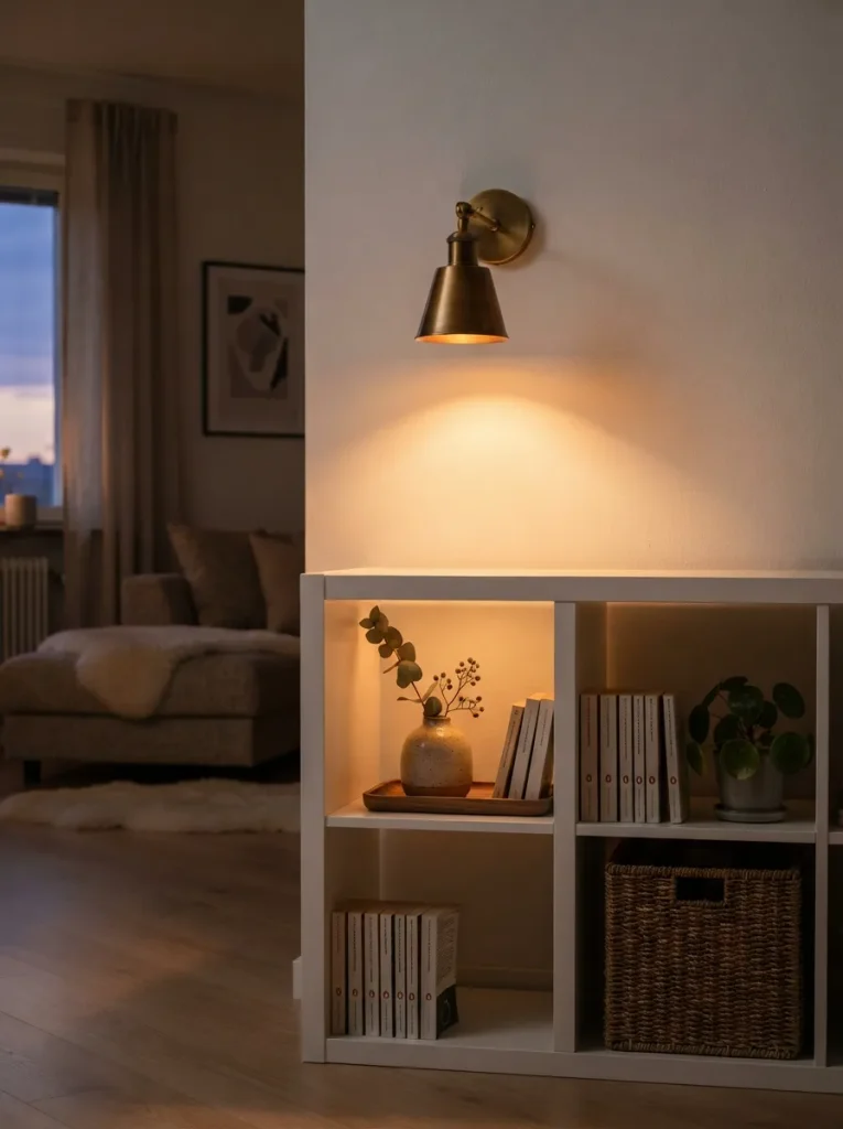
What it looks like: Romantic a small pool of warm light instead of a table lamp taking up cube space.
Why it works: A lamp eats a full cube’s worth of surface area and adds a cord to manage; a wall-mounted sconce frees that space entirely while still giving the unit directional, warm light in the evening a proportion trade that’s easy to miss.
How to copy it: Mount it roughly 12 inches above the top of the unit, centered over whichever cube holds your best vignette, and choose a warm 2700K bulb over anything cooler.
Best for: Anyone using their Kallax for display who’s tired of losing a whole cube to a lamp base.
Shop This Look
Product Brass swing-arm wall sconce, hardwired or plug-in Warm 2700K dimmable LED bulb Cord cover channel for a plug-in sconce Small ceramic vase sized for the light pool below Adhesive cord clips for discreet cable routing
The last idea is a small one but it’s the detail most guides skip entirely.
16. Lean a Single Art Print Against the Back Panel
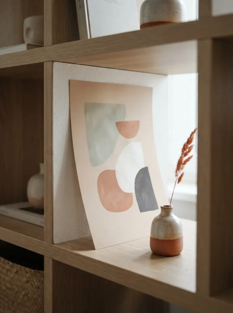
What it looks like: Layered a print that isn’t hung, isn’t framed, just resting.
Why it works: A leaning print reads as effortless in a way a perfectly hung, framed one doesn’t it introduces asymmetry and implies the room is still evolving, which is more inviting than a fully finished-looking display.
How to copy it: Let the print overlap the cube’s edge slightly rather than centering it flush, and pair it with one small object in front so it doesn’t look like it was simply forgotten there.
Best for: Renters who don’t want to put nail holes in a rented wall.
Important: Most people assume a leaning print needs a frame to look finished. It doesn’t a slightly curled, unframed print against a flat backing panel is the more Scandinavian choice of the two.
How to Start Your Kallax Transformation
What I’ve found with real spaces is that the backing panels are the one thing to fix before anything else repaint or reline them in a warm tone first, since every other idea on this list reads differently once that cool factory-white undertone is gone.
In practice, the most common mistake is filling every single cube at once. Over-decorating breaks the negative-space effect entirely; the fix is to style a third of the cubes, live with it for a week, and only add more if something genuinely feels missing.
Three items under $50 that make an immediate difference: a set of two open-weave seagrass half-cube baskets, a single ribbed matte-ceramic bud vase, and a roll of self-adhesive oak-look liner for the backing panels.
A basic restyle new baskets, one repainted panel, a vignette or two is a single weekend and roughly $50 to $150. A full transformation with legs, a floating shelf, and lighting stretches closer to $300 to $600 across a few weekends, since it involves actual installation rather than just swapping objects.
Ready to Create Your Dream Scandinavian Space?
Between the color shifts, the material swaps, and the layout changes covered here, there’s a version of this that fits almost any Kallax already in your home. Transformation doesn’t have to happen all at once starting with one row, one basket swap, or one repainted panel is a legitimate way to begin. Today, pick the smallest idea on this list and do just that one thing.
The Scandinavian philosophy underneath all of it is really about ease a room that asks less of you in the morning, not more. Save your favorites now, before you’re standing in a store trying to remember which basket size you needed.
You Might Also Like
- 12 Scandinavian Bedroom Ideas for a Calmer Morning Routine
- 9 Small Living Room Layout Ideas for Scandinavian Apartments
- 10 IKEA Billy Bookcase Hacks for a Minimalist Home Office