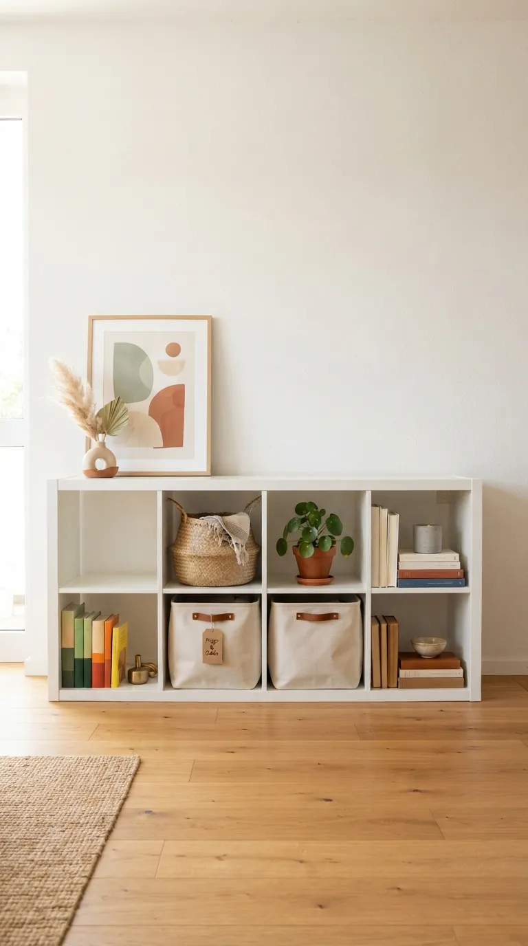
22 IKEA Kallax Bookshelf Styling Ideas for Book Lovers
A Kallax bookshelf is really just a grid of empty cubes until you decide what goes where the styling is what turns it into a place you actually want to keep books. This guide walks through 22 practical Kallax bookshelf styling ideas for organizing, decorating, and reworking that grid so it works as hard as your reading habit does.
Sunlight catching the spine of a favorite paperback. A cube stacked just messy enough to look lived-in, not staged. Book lovers know a shelf like that doesn’t happen by accident it’s built one small decision at a time. Here’s where to start.
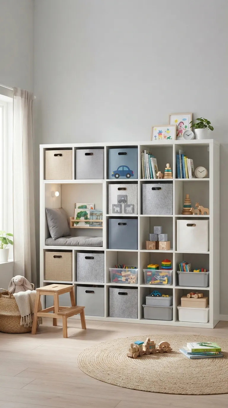
Quick Navigation
- Why IKEA Kallax Bookshelf Styling Makes Such a Difference
- 22 Ways to Style Your Kallax Bookshelf
- How to Start Your Kallax Bookshelf Transformation
- Ready to Create Your Dream Reading Space?
Why IKEA Kallax Bookshelf Styling Makes Such a Difference
The Kallax system started life as IKEA’s Expedit line and stuck around because the 13×13-inch cube module fits almost any wall, corner, or rental. It comes in a handful of honest finishes white melamine, black-brown, walnut-effect veneer, oak-effect veneer which means the styling has to do most of the work.
That matters more now, with more people renting and needing furniture that doesn’t require permanent commitment. It works fine in small spaces, but the first move should always be sorting your books by height before buying a single bin everything else builds on that.
| Best starting point | Sorting books by height before choosing cube inserts |
| Biggest impact area | The top surface and open cube fronts |
| Budget to start | $40–120 for bins, bookends, and paint |
| Time to complete | Under an hour for a quick pass, a weekend for a full transformation |
22 Ways to Style Your Kallax Bookshelf
1. Color-Block the Spines Into Rainbow Rows
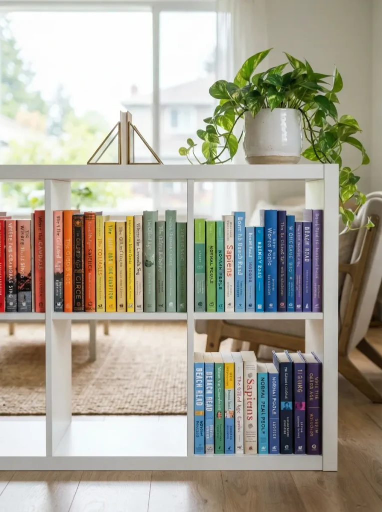
What it looks like: Loud in the best way full rows of spines sliding from warm reds into cool blues, cube by cube.
Why it works: Color-blocking uses repetition and gradient, a principle that turns visual noise into a pattern the eye can follow, even when the books themselves are a mismatched pile of paperbacks and hardcovers.
How to copy it: Pull every book off one cube at a time, sort loosely by dominant spine color, then reshelve left to right in gradient order light to dark within each hue reads cleanest. If you want more ways to rework the same unit, our broader Kallax styling ideas roundup covers other angles.
Best for: Book lovers with a big, varied collection and zero interest in color-coordinated decor shopping.
Quick Win: Don’t own enough colorful spines to fill a gradient? Turn the least colorful books backward, page-edges facing out, and let the remaining color do the work in fewer cubes.
2. Mix Upright Rows With a Few Stacked Piles
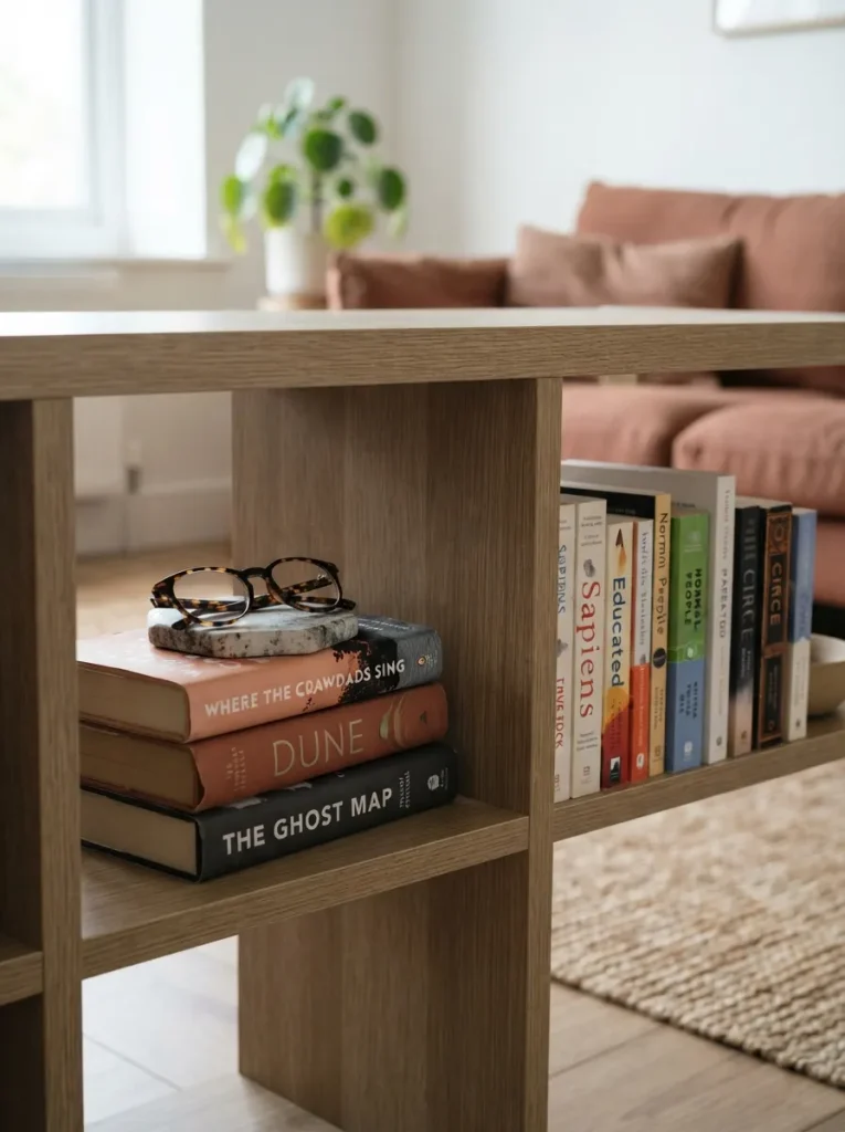
What it looks like: Uneven on purpose three books lying flat under a small object, next to a cube standing at full attention.
Why it works: Alternating orientation creates visual rhythm and breaks the monotony of a full grid of identical upright spines, a basic proportion trick that makes a mass-produced unit feel arranged by hand.
How to copy it: Pick every third or fourth cube and lay two to four books flat instead of upright, then top the stack with one object under six inches tall so it doesn’t compete with the books above it. The same flat-stack logic works well for other collections see how it plays out in our Kallax record storage setups.
Best for: Anyone whose shelf currently reads as one long, flat wall of spines.
Pro Tip: Keep stacked piles under four books taller stacks lean and slide every time a nearby cube gets bumped.
3. Slide In Fabric Bins for the Books You Don’t Want Seen
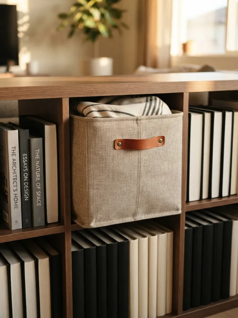
What it looks like: One quiet, textured square breaking up a grid of exposed spines hushed instead of busy.
Why it works: Not every cube needs to show books. Hiding advance copies, damaged paperbacks, or reading clutter behind fabric gives the eye a resting point negative space, functionally disguised as storage. The same bin-and-negative-space trick shows up in our Kallax craft room storage setups, just with different contents.
How to copy it: Measure your cube opening, roughly 13×13 inches, before buying. A bin sized even half an inch too large won’t slide flush, and that gap is the first thing visitors notice.
Best for: Fast readers with a backlog pile they’re tired of stacking on the floor.
Budget Version: Skip branded bins a $12 canvas tote with the handles tucked inside does the same job from three feet away.
Shop This Look
| Product |
|---|
| Woven fabric storage bin sized for 13-inch cube shelving |
| Linen storage cube with leather pull tab |
| Collapsible canvas storage basket, neutral tone |
The next idea takes two minutes and fixes the one thing every leaning stack of books has in common.
4. Anchor Every Open Row With a Real Bookend
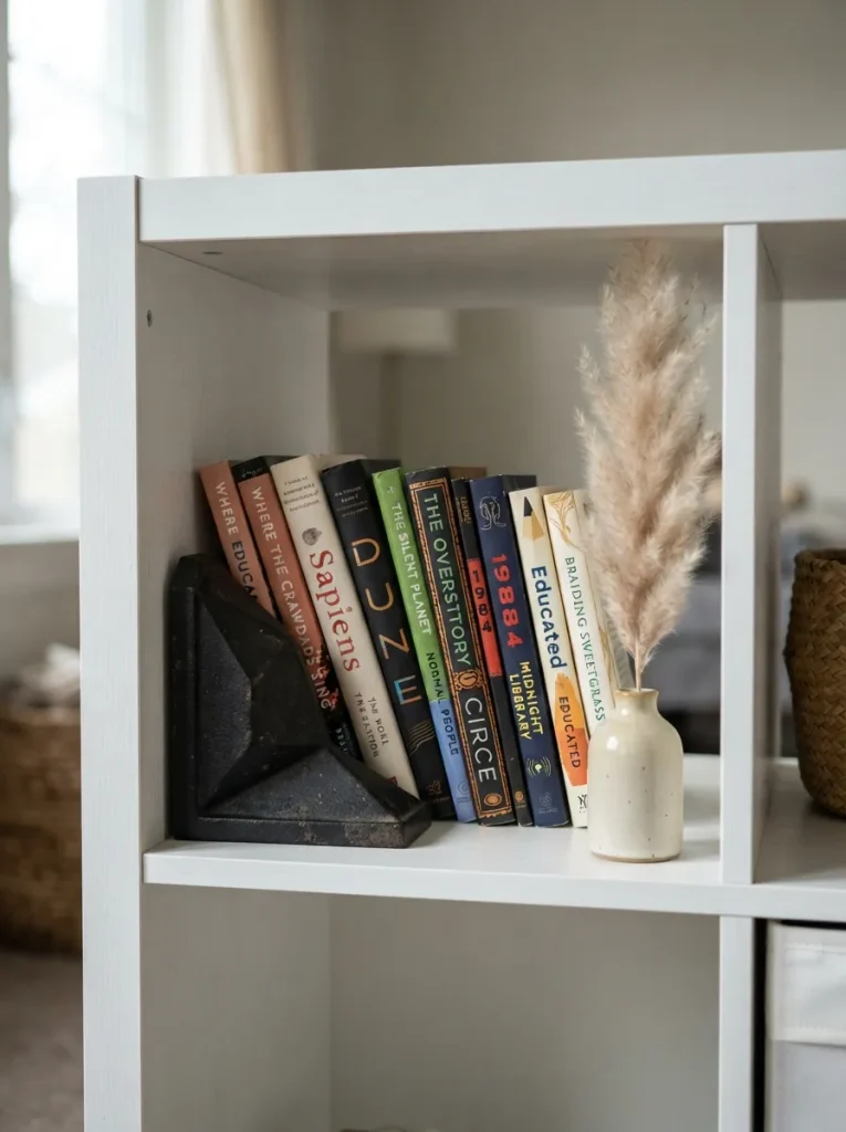
What it looks like: A short row of books leaning at a deliberate angle against a heavy, sculptural anchor.
Why it works: Books left to lean against the cube wall eventually slump and slide. A bookend adds visual weight at one end, which stops a row from reading as unfinished or accidental.
How to copy it: Choose a bookend heavier than it looks cast iron or solid marble, not hollow metal. Hollow ones get pushed over by a shelf’s worth of hardcovers within a week.
Best for: Renters who want one small object to instantly make a cube look finished.
Styling Note: Match the bookend’s finish to one other metal already in the room lamp base, door hardware so it reads as chosen, not leftover.
5. Line the Back of a Few Cubes With LED Strip Lights
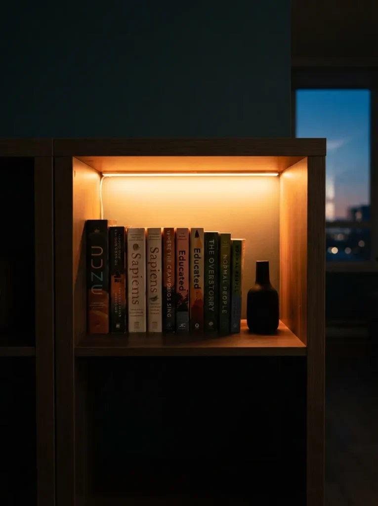
What it looks like: One cube glowing amber against the rest of the shelf sitting in shadow quiet contrast, not a full light show.
Why it works: Light direction changes how flat a shelf reads. Backlighting one or two cubes creates depth and a focal point, the same principle museums use to draw the eye to a single object instead of a whole wall.
How to copy it: Stick to warm white LEDs, around 2700K to 3000K, never cool white cool light on wood-tone veneer makes it look institutional instead of cozy. Run the strip along the back-top seam, not the front edge.
Best for: Evening readers who want their shelf to double as ambient lighting.
Warning: Cheap LED strips lose adhesion within months on melamine surfaces. Clean the panel with rubbing alcohol first, or the strip will sag within a cube by winter.
6. Turn a Sideways Kallax Into a Window Seat
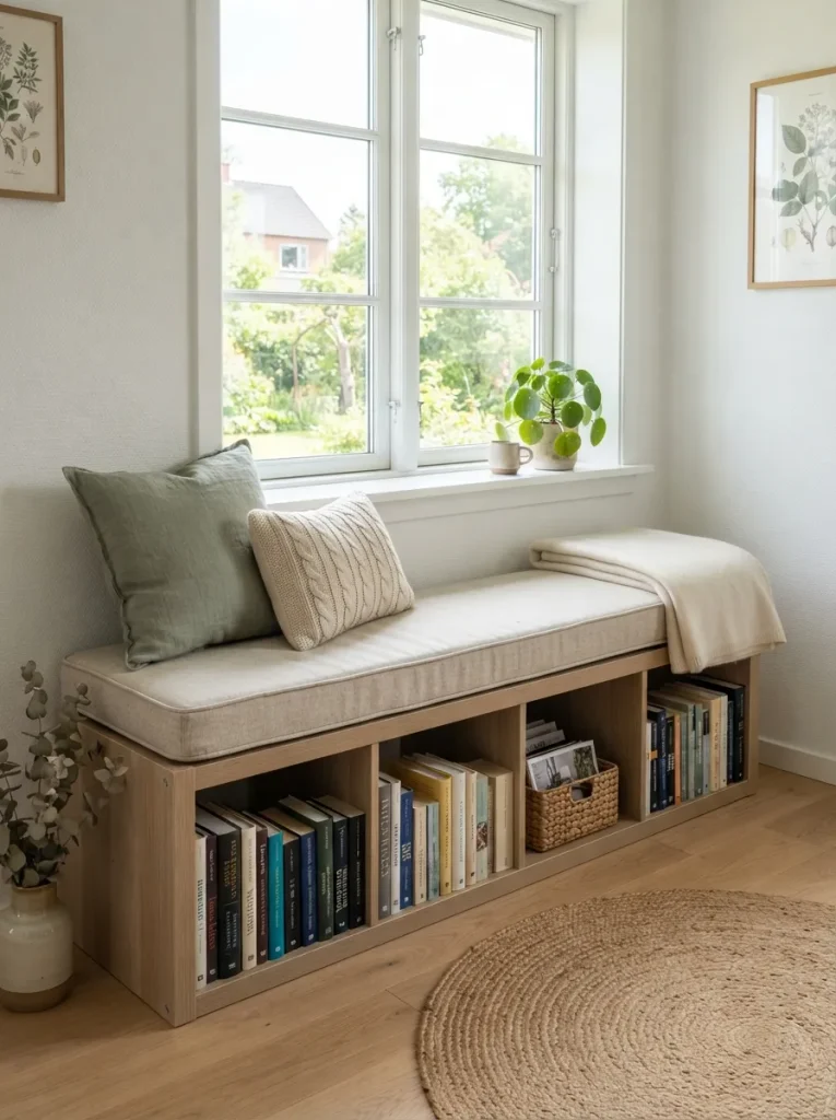
What it looks like: A low bench under a window, books visible where a bench back would normally be.
Why it works: Laying the unit on its side keeps the same storage volume but changes its function entirely reorienting furniture instead of buying new pieces is the core small-space design move.
How to copy it: Order a foam cushion cut to your Kallax’s exact side length, typically two-by-two or four-by-two units, and secure it with hook-and-loop tape at the corners so it doesn’t slide when someone sits down.
Best for: Small apartments with an underused window nook and no room for a separate bookshelf and bench.
Mistake to Avoid: Skipping cushion foam density under 1.8 lb soft foam flattens within a season under regular sitting, and you’ll be replacing it by next year.
Up next: the material choice that quietly makes the whole shelf look intentional instead of assembled.
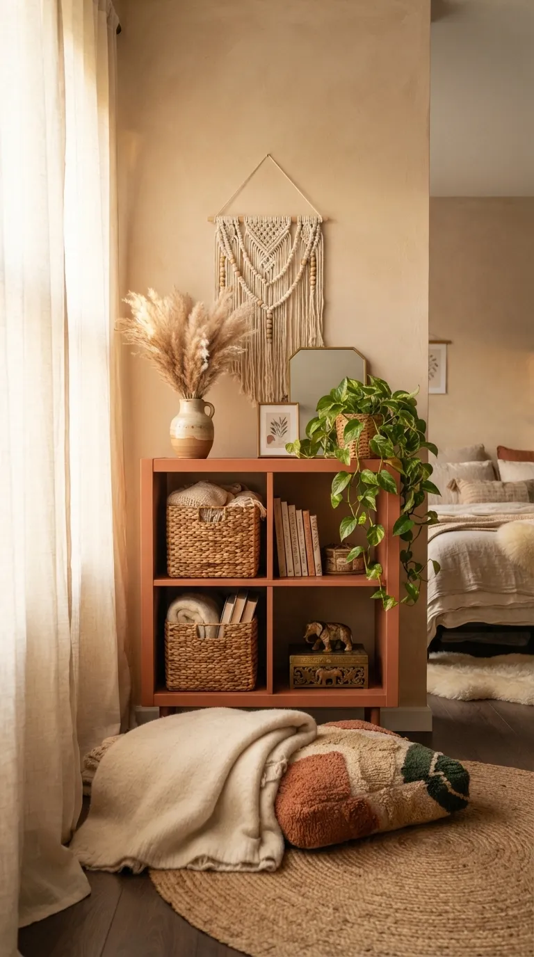
7. Add Woven Seagrass Baskets for Texture
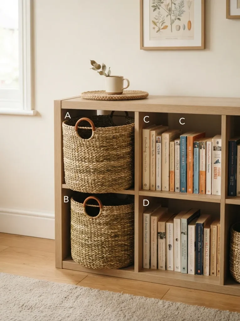
What it looks like: Rough, organic texture breaking up the smooth melamine grid raw against manufactured.
Why it works: Melamine and laminate are smooth, low-texture surfaces by design. Pairing them with a rough natural fiber creates contrast that reads as more expensive than either material alone.
How to copy it: Choose baskets with a slightly narrower base than the cube opening so they slide in and out without scraping the interior finish a snug fit chips the melamine edge over time.
Best for: Anyone styling a builder-basic white or black Kallax who wants warmth without repainting anything.
Shop This Look
| Product |
|---|
| Round-top woven seagrass storage basket, cube-fit size |
| Natural rattan storage bin with cutout handles |
| Water hyacinth storage basket, square base |
8. Wrap the Frame in Trim for a Faux Built-In Look
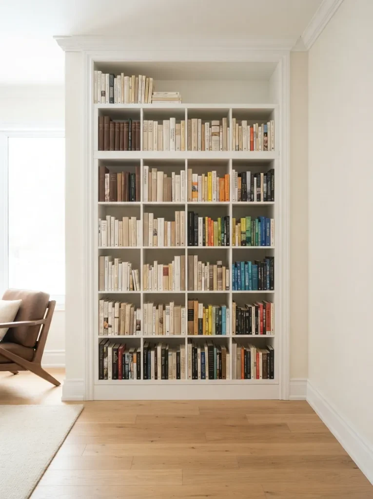
What it looks like: Boxy IKEA edges disappear under clean painted trim the unit stops looking like furniture and starts looking permanent.
Why it works: Visible mass-produced edges are what make flat-pack furniture read as flat-pack. Wrapping the top and sides in molding hides the seams and mimics custom millwork.
How to copy it: Use primed MDF trim, caulk every seam before painting, and paint the trim the same color as the wall behind it matching wall and trim color sells the built-in illusion, not the molding style itself.
Best for: Homeowners planning to keep the shelf in one spot for years, not renters.
Before You Start the Trim Wrap:
- [ ] Measure the exact width, depth, and height of your Kallax unit
- [ ] Buy primed MDF trim and wood filler for screw holes
- [ ] Caulk every seam before the first coat of paint
- [ ] Match the trim paint to your wall color, not a fresh white
9. Alternate Open Cubes With Closed Door Fronts
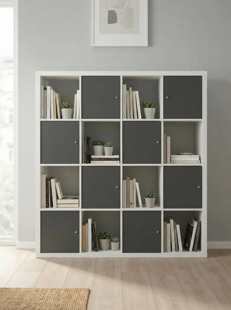
What it looks like: A checkerboard rhythm of visible books and closed panels instead of one uniform open grid.
Why it works: A full wall of open cubes reads busy no matter how tidy the books are. Alternating hidden and visible storage gives the eye planned breaks, the same rule used in kitchen cabinetry.
How to copy it: Fit doors on every other cube in a checkerboard, never in a straight row a full row of doors looks like a filing cabinet, not a bookshelf.
Best for: Shared living rooms where half the storage needs to stay presentable and half can stay messy.
Small-Space Tip: In tight rooms, put doors on the bottom row only hidden clutter stays low and out of sightline, while the top rows keep the shelf feeling open, not boxy.
This next one costs about the price of a coffee and changes the whole mood of the shelf.
10. Sort Bins and Books by One Genre Color Family
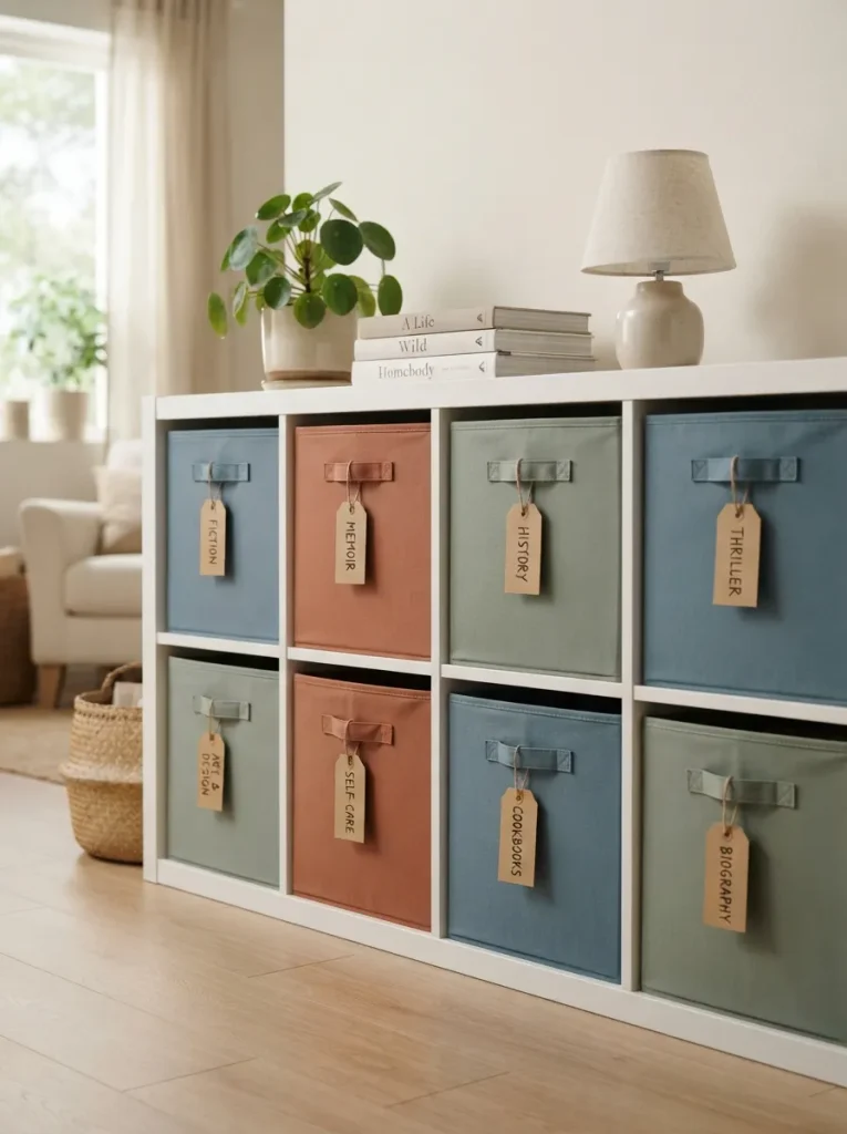
What it looks like: Three softly colored bins standing in for a labeling system no visible text needed to know what’s inside.
Why it works: Color-coding by category solves an organization problem and a design problem at once — one visual decision doing double duty, which is efficient use of visual weight.
How to copy it: Stick to muted, dusty tones mustard, terracotta, sage rather than primary colors. Saturated bins compete with book spines instead of framing them.
Best for: Households with more than one reader sharing the same shelf.
Quick Win: Already own mismatched bins? Group them by finish instead of color all matte together, all woven together for a coordinated look without buying anything new.
11. Let One Framed Print Lean Instead of Hang
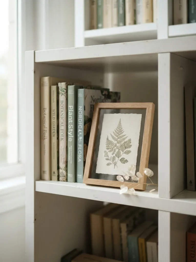
What it looks like: A small frame propped at a slight angle, half-covering the books behind it layered instead of centered.
Why it works: Leaning art breaks the shelf’s grid lines without adding another rigid rectangle to the composition, making a storage unit feel curated instead of gridded.
How to copy it: Choose a frame no taller than two-thirds of the cube’s height, and lean it against the back-left or back-right corner, never dead center centered leaning art looks accidental, not styled.
Best for: Anyone with one meaningful print and nowhere else to put it.
Important: A leaning frame needs at least one book behind it for support leaning glass directly against melamine risks scratching the panel over time.
12. Use a Single Kallax as an Open Room Divider
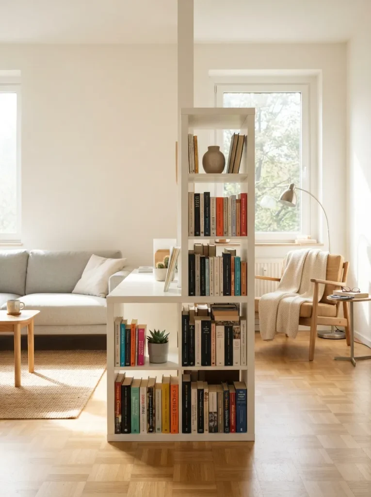
What it looks like: One shelf standing mid-room, books visible from both directions, quietly splitting one space into two.
Why it works: A studio or open-plan room rarely needs a full wall to feel divided. One freestanding unit at the right height creates a visual boundary without blocking light.
How to copy it: Position the unit perpendicular to the nearest wall, not flush against it, and leave at least 30 inches of walking space on the narrower side so the divider doesn’t create a bottleneck.
Best for: Studio apartments needing a reading corner without a construction project.
Budget Version: Anchor the unit to the wall with the included safety strap it’s a $6 hardware step that’s easy to skip and the one that actually matters in a divider setup like this.
Here’s the idea that surprises people who assume built-ins always cost thousands.
13. Extend the Look With a Floating Shelf Above
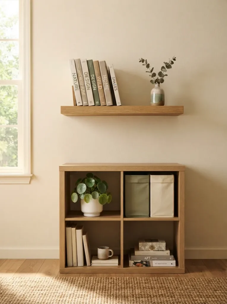
What it looks like: The shelf’s height keeps climbing past the top of the unit, as if it were always meant to go further.
Why it works: A floating shelf mounted directly above the Kallax extends its vertical line, tricking the eye into reading the two pieces as one taller, custom installation.
How to copy it: Match the floating shelf’s wood tone to the Kallax finish as closely as possible a mismatched tone breaks the illusion faster than a visible gap between the two pieces would.
Best for: Renters who’ve outgrown their Kallax’s storage but can’t add a second full unit.
Styling Note: Leave four to six inches of air between the top of the Kallax and the floating shelf stacking them flush reads as one bulky block instead of two intentional layers.
14. Paint the Frame Matte Black for a Moody Library Feel
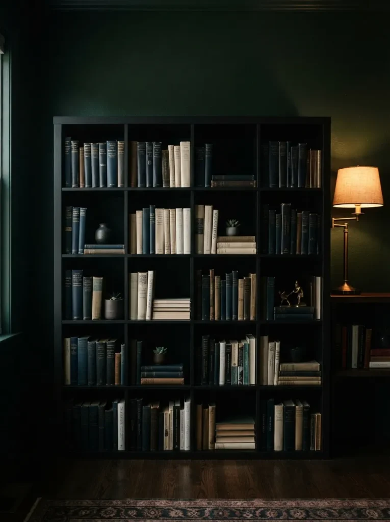
What it looks like: Dark, dense, almost disappearing into a moody wall color instead of standing out against it.
Why it works: Painting the frame black shifts the visual weight from the furniture to the books themselves dark furniture recedes, light-colored spines pop forward.
How to copy it: Sand the melamine surface lightly and use a bonding primer made for laminate before painting. Regular primer peels off Kallax’s factory finish within weeks.
Best for: Book lovers with a lot of dark-spined hardcovers who want a moody, library-style room.
Pro Tip: Two thin coats of paint dry harder and chip less than one thick coat rushing this step is the most common reason painted Kallax units look scuffed within a year.
15. Lean a Small Mirror Against One Cube’s Back Wall
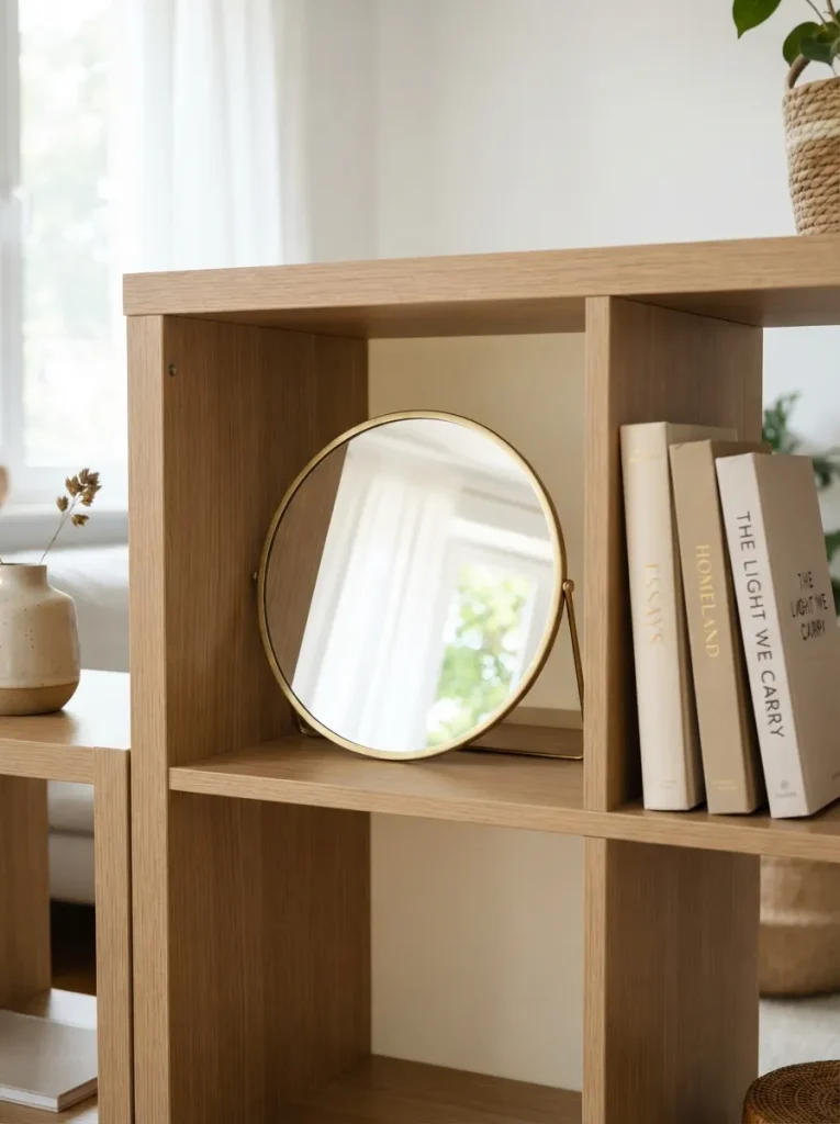
What it looks like: A small circle of reflected daylight sitting inside an otherwise ordinary cube.
Why it works: Mirrors bounce available light deeper into a room. Placing one inside a cube rather than on the wall adds brightness right at eye level, exactly where a dim shelf usually needs it most.
How to copy it: Choose a mirror no wider than half the cube’s opening, lean it at a slight backward angle, and position that cube near not directly across from a window so it catches light rather than glare.
Best for: North-facing rooms or shelves tucked into a dim hallway corner.
Next: the fix for shelves that look great by day and disappear at night.
My Views:
Here’s something most guides won’t tell you: fully alphabetized Kallax shelves almost always look worse in photos than slightly imperfect ones. I’ve styled the same collection two ways — strict A-to-Z, and loosely grouped by height and color — and the second version photographed better every time, even though it’s objectively less organized. A 13-inch cube only has so much visual room, and perfect order reads as sterile once a camera flattens the depth. Leave at least one row slightly uneven on purpose.
16. Clip a Brass Reading Lamp to the Shelf Edge
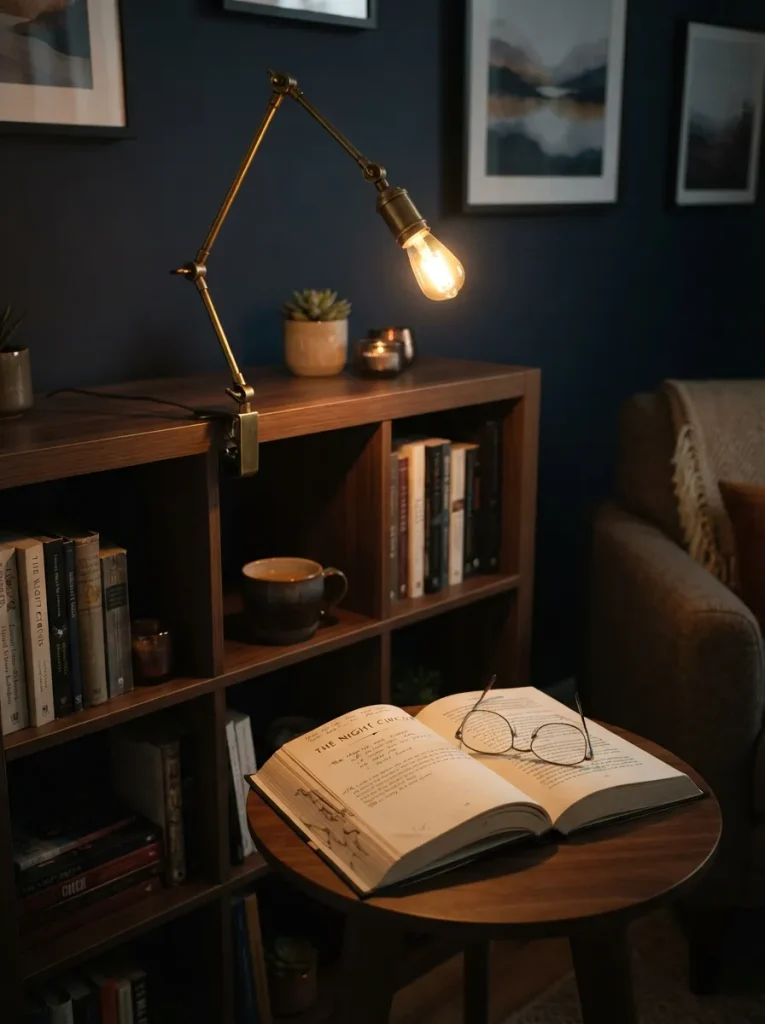
What it looks like: One small pool of warm light spilling from the top corner of the shelf onto the reading chair below.
Why it works: Task lighting positioned at the shelf, not the ceiling, puts light exactly where reading happens overhead light has to travel across the whole room and loses warmth by the time it reaches a page.
How to copy it: Clip the lamp to the top-front edge of the cube closest to your reading chair, angled down and slightly forward, so the light falls on the page instead of the shelf itself.
Best for: Anyone whose reading chair sits near, but not directly under, an existing light source.
Mistake to Avoid: Skipping a dimmable bulb a fixed-brightness clip lamp is either too dim for reading or too bright for evening ambiance, with no middle setting.
17. Wallpaper the Back Panels of a Few Cubes
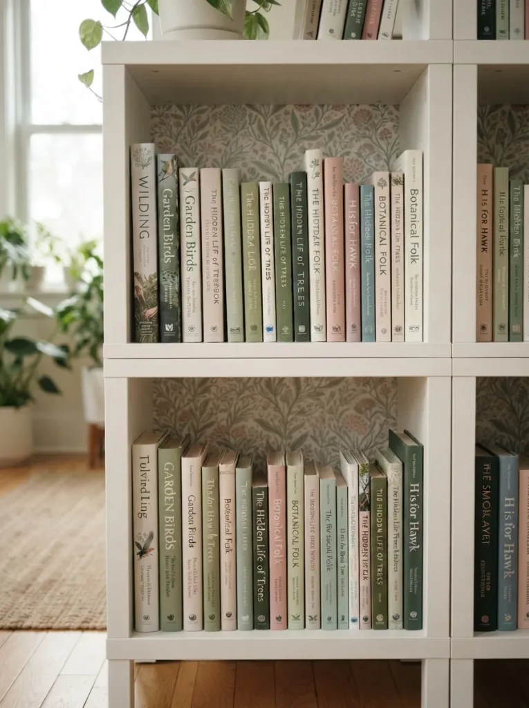
What it looks like: A hint of pattern peeking out behind the spines visible in slivers rather than all at once.
Why it works: Most of a cube’s back panel is hidden by books anyway, so wallpapering it adds pattern and personality with almost no visual overload.
How to copy it: Use peel-and-stick wallpaper cut slightly smaller than the panel, not flush to the edges flush cuts show white gaps once the paper contracts slightly over the first few weeks.
Best for: Renters who want pattern without a wall-sized commitment or a landlord conversation.
Warning: Applying wallpaper directly to unprimed melamine often fails to adhere. Wipe the panel with rubbing alcohol and let it fully dry first, or expect peeling corners within a month.
Shop This Look
| Product |
|---|
| Peel-and-stick wallpaper, small botanical or textured print |
| Craft-grade squeegee tool for smoothing panel wallpaper |
| Removable adhesive wallpaper, solid muted tone |
18. Label Bins With Kraft Paper Tags, Not Stickers
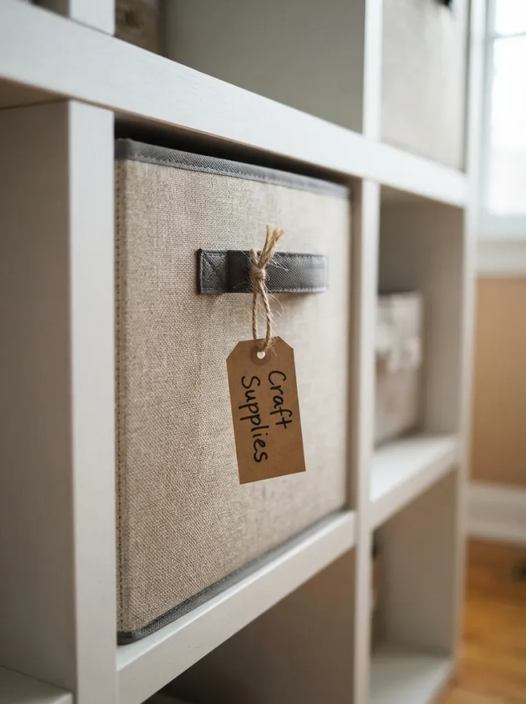
What it looks like: A small handwritten tag swinging slightly off a bin handle practical, a little imperfect.
Why it works: Printed labels read as retail signage. A handwritten kraft tag reads as a personal system same content, but the material choice changes whether the shelf feels like a store display or a home.
How to copy it: Write labels in black fine-tip marker, not a printed font, and tie the tag with jute twine rather than ribbon twine reads functional, which matches a storage system better.
Best for: Families organizing a shared shelf where more than one person needs to find things fast.
Small-Space Tip: In a shared or kids’ space, tag by activity “bedtime books,” “school books” instead of genre. It’s a faster system for anyone under age ten to use correctly.
Shop This Look
| Product |
|---|
| Kraft paper gift tags with pre-punched holes |
| Jute twine spool, natural |
| Fine-tip black permanent marker |
Two ideas left, and one of them takes ten minutes with a paintbrush.
19. Split the Frame Two-Tone, Light on Top and Dark Below
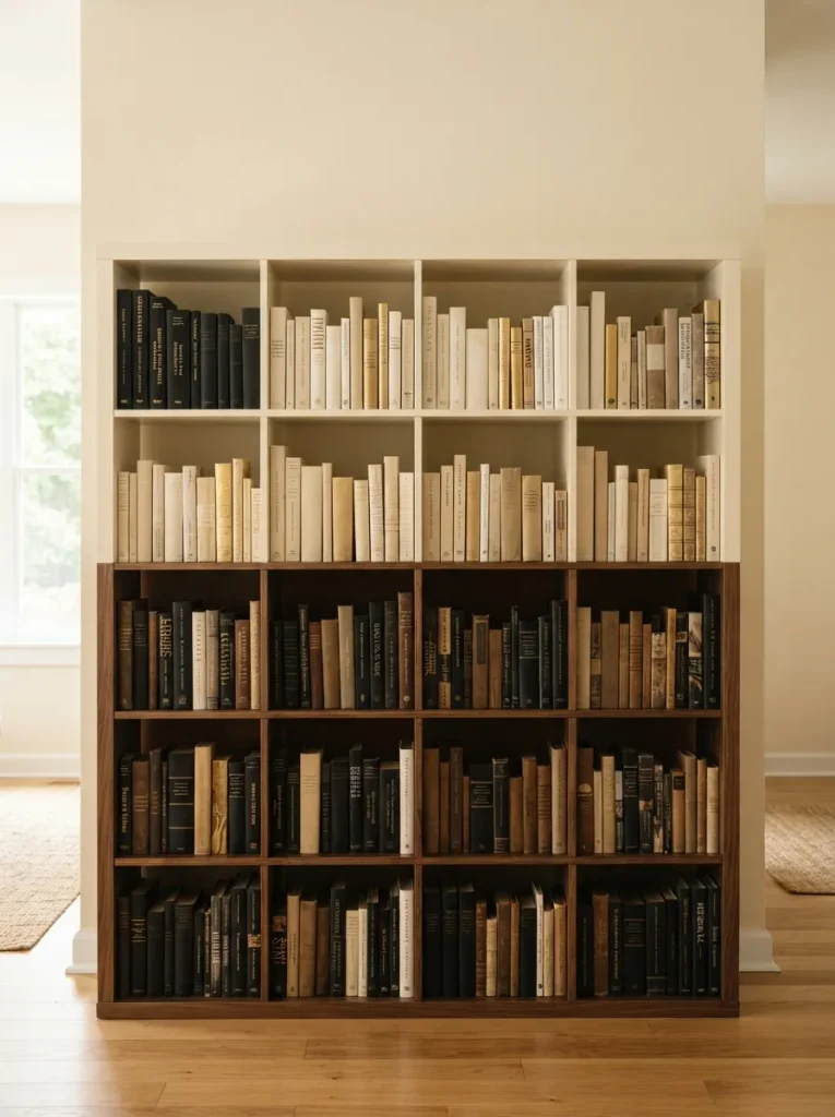
What it looks like: Light on top, dark on the bottom a base that makes the whole unit feel weighted to the floor.
Why it works: Darker tones read as heavier, so keeping the bottom rows dark and the top rows light grounds the piece visually, the same principle behind dark baseboards under light walls.
How to copy it: Split the color line at the halfway point of the unit, not at a random row, and tape off cleanly with painter’s tape left on for at least 24 hours before removal.
Best for: Anyone who finds an all-white or all-black Kallax visually flat.
Quick Win: No time to paint? Achieve the same effect by keeping darker-spined books on the bottom two rows and lighter ones up top zero paint required.
20. Configure Two Units Into an L-Shaped Reading Corner
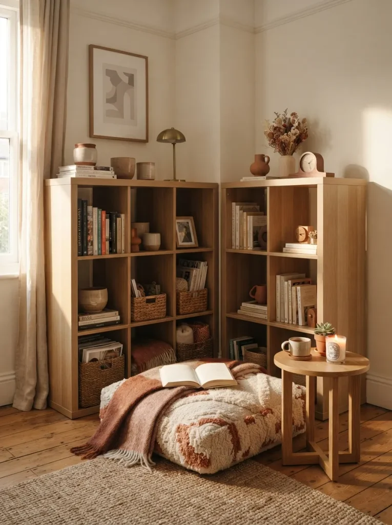
What it looks like: Two shelves meeting at a right angle, just enough to wrap around a cushion and make a corner feel like its own room.
Why it works: An L-shaped configuration uses two flat units to create an enclosed, three-dimensional space enclosure is what makes a reading nook feel like a nook instead of just a chair near a shelf.
How to copy it: Angle the two units so the open side faces the room’s main light source, and leave at least 24 inches of clearance inside the L for a cushion or small chair to actually fit.
Best for: Anyone with a spare room corner and two Kallax units already on hand.
Important: Two units pushed into a true 90-degree corner need to be secured to each other, not just to the wall an unsecured L-shape can shift apart over time with daily use.
21. Tuck Puck Lights Under the Top Row
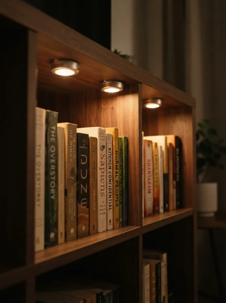
What it looks like: A soft wash of light falling from the top row down onto the row just below it subtle, not a spotlight.
Why it works: Downlighting from within the unit avoids the harsh, flat look of a single overhead bulb and instead creates gradual shadow across each row, which gives a flat shelf a sense of depth in photos.
How to copy it: Stick to battery-powered, tap-on puck lights rather than wired fixtures no electrician, no visible cord, and they mount with adhesive pads in under five minutes per light.
Best for: Renters who want shelf lighting without touching a single wire.
Styling Note: Warm-toned puck lights flatter both oak and walnut finishes; cool-toned ones wash out warm wood tones and make them look gray.
Last one and it’s the easiest reset on this whole list.
22. Pull a Low Bench or Pouf in Front for a Reading Perch
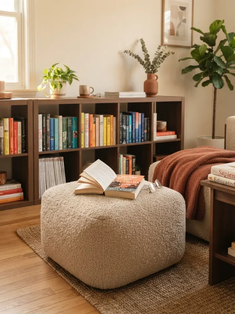
What it looks like: A low, soft seat pulled close enough to the shelf that reaching for a book takes zero steps.
Why it works: Proximity between storage and seating shortens the distance between deciding to read and actually doing it, and it visually anchors the shelf as the focal point of the corner rather than just a wall of storage.
How to copy it: Keep the pouf or bench low, under 18 inches, so it doesn’t block the bottom two rows of the shelf from view when someone’s sitting elsewhere in the room.
Best for: Small rooms without space for a full armchair near the shelf.
How to Start Your Kallax Bookshelf Transformation
In practice, sort books by height before you touch a single bin or bookend. Kallax cubes run about 13×13 inches, and mixing paperbacks with oversized art books in the same cube is what makes a shelf look chaotic. Group by height first, then decorate around that.
The most common fixable mistake is filling every cube edge-to-edge with no breathing room. A shelf packed solid front to back reads as storage, not styling. Leave two or three cubes intentionally sparse one object, a small stack, nothing more and the whole unit reads calmer.
Three items under $50 that make an immediate difference: a set of four matte black wire bookends, a single six-inch snake plant in a terracotta pot, and a roll of kraft shelf-liner paper for cube backs. All three are easy to find and install in under ten minutes each.
A quick styling pass sorting, bins, one bookend takes under an hour and costs next to nothing if you’re using items you already own. A full transformation with paint, trim, and lighting is realistically a weekend project, somewhere between $80 and $250 depending on how many of these 22 ideas you take on.
Ready to Create Your Dream Reading Space?
Twenty-two ideas is a lot to take in at once some of these lean on color, some on lighting, a few just rearrange what you already own. Nobody styles all of it in one afternoon, and that’s fine most of the shelves in this guide were built one small change at a time.
Tonight, start with the cheapest fix on this list: sort three cubes by height and add one bookend. A shelf that actually reflects how you read messy in the right places, organized in others tends to feel less like furniture and more like a room you want to sit in.
Save this one before you start pulling books off the shelf, so you’ve got all 22 Kallax bookshelf styling ideas on hand once you get going.
You Might Also Like
- 15 Genius IKEA Hacks for Small Apartment Storage
- 10 Reading Nook Ideas That Fit in Even the Smallest Corner
- 12 Budget-Friendly Ways to Organize Bookshelves Without Buying New Furniture
.