19 Home Color Combinations for Modern Style Homes That Actually Work
Modern color combinations aren’t about picking a trendy paint chip and hoping for the best they’re about pairing tones with real weight, warmth, and contrast so a room feels intentional the second you walk in. Here are 19 home color combinations for modern style homes, each one chosen for how it reads in real light, not just on a swatch.
There’s a particular quiet confidence to a well-paired modern palette deep charcoal against sun-bleached oak, or a wall the color of wet clay next to brushed brass catching the afternoon light just right. It feels grounded, not sterile. Considered, not cold. Good modern color work does something quieter: it lets the architecture breathe while the palette does the talking. Ready to find the pairing that’s yours?
Quick Navigation
- Why Modern Color Palettes Work
- 19 Modern Home Color Combinations to Try
- How to Start Your Modern Color Transformation
- Ready to Create Your Dream Modern Home?
Why Modern Color Palettes Work
Modern color palettes borrow their confidence from mid-century architecture and Scandinavian restraint tones like warm greige, charcoal, and soft white paired with honest materials such as white oak, blackened steel, and brushed brass.
The style leans on contrast instead of pattern: dark lower cabinets against a pale stone counter, or matte black window frames slicing through a bright room. It reads as calm in a noisy, over-decorated market, and it photographs well without much styling. It works in small spaces too, as long as you commit to one dominant neutral and let a single deep accent do the work.
Style at a Glance
| Element | Warm Neutrals | Bold Contrast |
|---|---|---|
| Philosophy | Calm, uncluttered backdrops | One confident dark or saturated moment per room |
| Materials | White oak, linen, brushed brass | Blackened steel, poured concrete, matte lacquer |
| Color palette | Warm greige, soft white, taupe | Charcoal, deep navy, forest green, terracotta |
19 Modern Home Color Combinations to Try
1. Charcoal, Warm White & Brushed Brass Kitchen
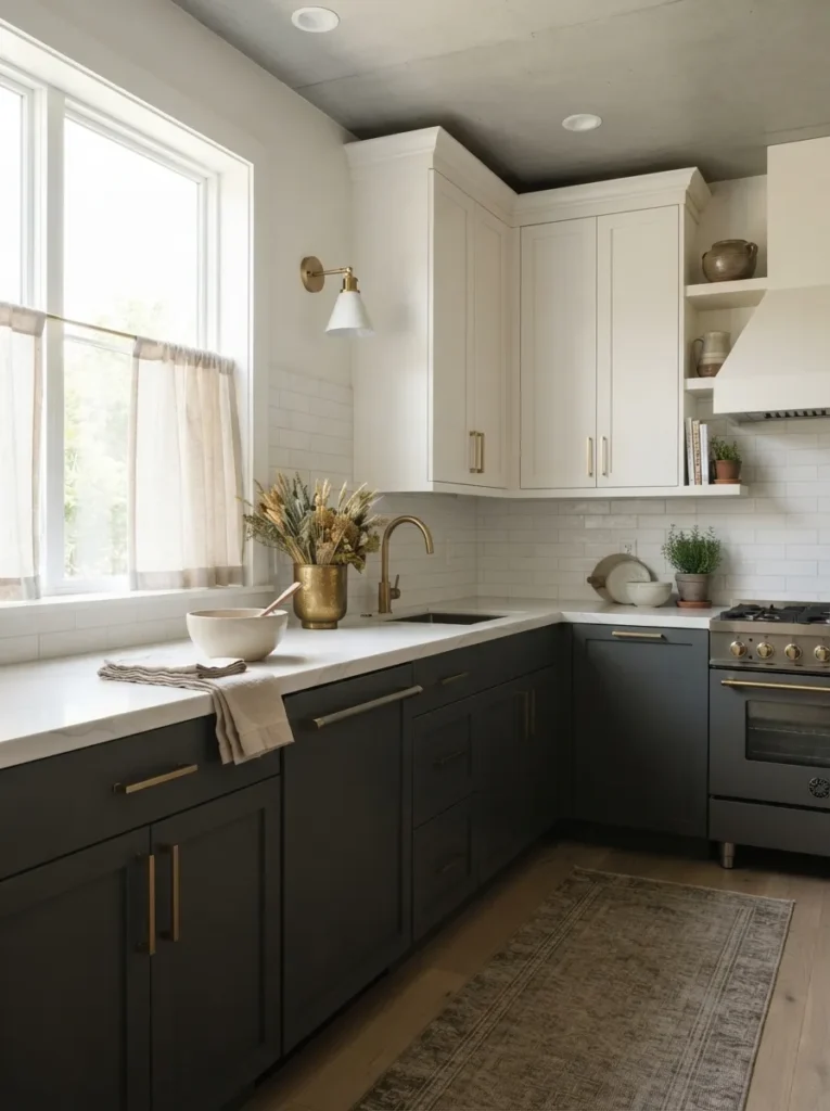
The lower half sits dense and grounded while the upper cabinets stay light and airy, brass hardware catching just enough light to feel warm instead of flashy. This is straightforward visual weight dark tones naturally belong low in a room while pale tones belong up high, and the brass keeps the contrast from feeling cold.
Paint or reface lower cabinets in a true charcoal like Benjamin Moore Kendall Charcoal, keep uppers in a warm white such as Simply White, and swap hardware for unlacquered or satin brass pulls with a low-profile silhouette.
Shop This Look
| Product |
|---|
| Unlacquered brass cabinet pulls |
| Honed quartz countertop sample kit |
| Brass bridge kitchen faucet |
| Charcoal cabinet paint sample set |
| Woven jute runner rug |
2. Warm Greige Walls with Black Steel-Frame Windows
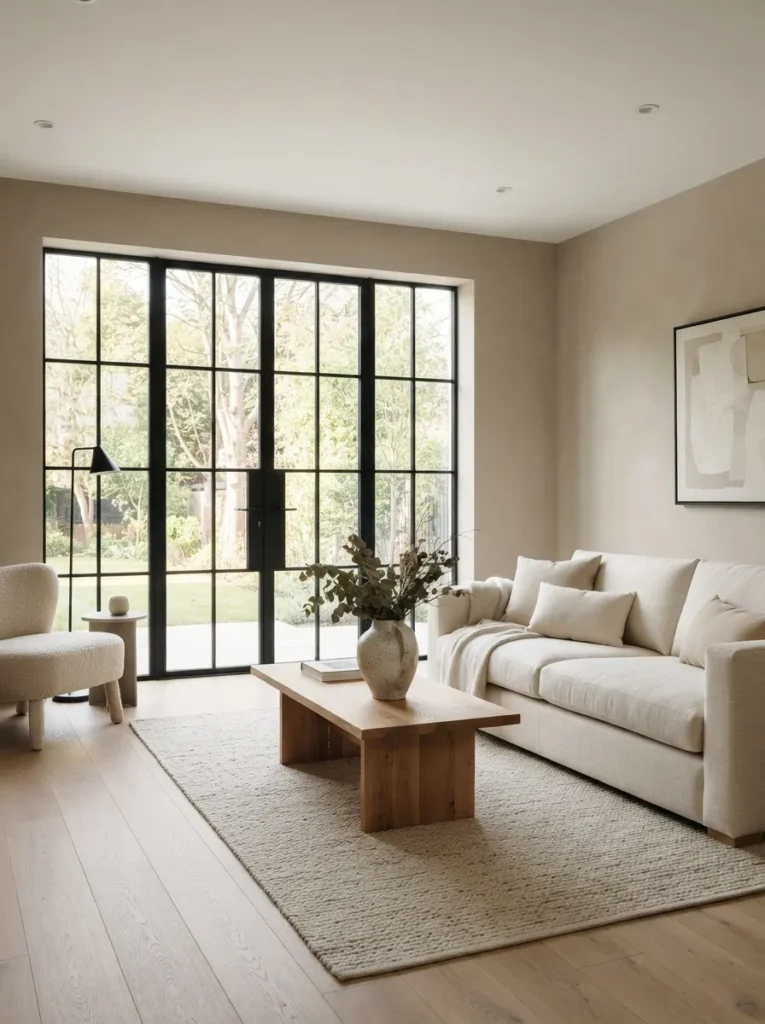
The wall recedes into a soft, sueded grey-beige while the black window grid reads sharp and architectural against it, like a pencil line on warm paper. Steel-look window frames create visual anchoring a strong, thin black line breaks up a large expanse of neutral wall and gives the eye somewhere to rest, a trick borrowed straight from mid-century architecture.
Paint walls in a warm greige such as Sherwin-Williams Perfect Greige, then either install true black steel-frame windows or apply matte black film in a grid pattern to existing white windows for a similar effect on a budget.
Pro Tip: If you can’t replace your windows, matte black window film applied in a grid pattern mimics steel-frame muntins convincingly from more than six feet away closer than that, the illusion breaks down.
3. Matte Black Pendants over Warm Walnut Tones
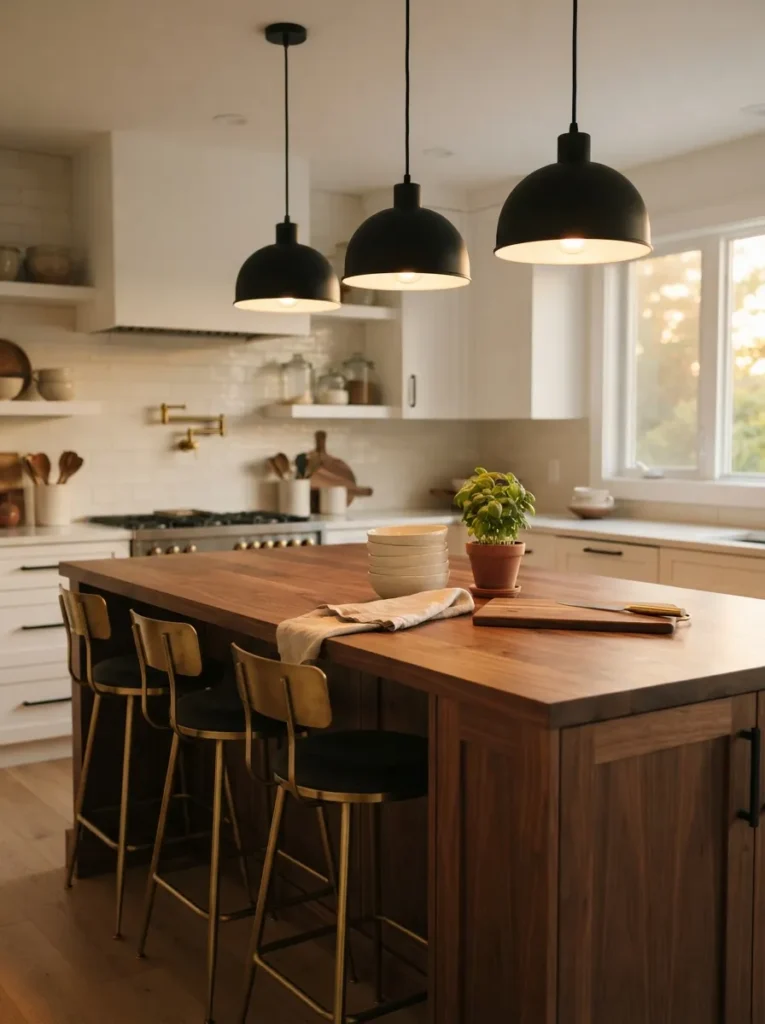
The fixtures hang low and matte, almost disappearing into shadow, while the walnut surface beneath them glows amber under the bulb. This pairs a light-absorbing finish with a light-reflecting one matte black pulls focus toward the bulb itself, and walnut’s natural chatoyance bounces warm light back into the room.
Choose a pendant with a dome or cylinder shade in true matte black, hang it 30 to 34 inches above a walnut table or island, and use a warm 2700K bulb rather than a cooler daylight one.
Quick Win: Swapping just the bulb temperature from 4000K daylight to 2700K warm white instantly makes existing black fixtures feel intentional instead of harsh no rewiring required.
Next up is the pairing most homeowners are afraid to commit to and the one that gets the most compliments once they do.
4. Terracotta and Sage Green Living Room Palette
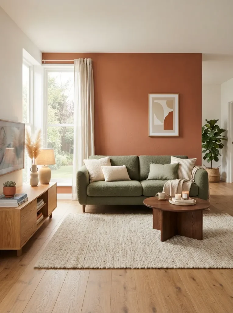
The terracotta wall sits warm and sun-baked while the sage furniture and textiles cool it back down, so the room never tips into either too hot or too muted. Terracotta and sage sit nearly opposite in undertone, which means they naturally balance each other’s temperature complementary tempering that keeps saturated colors from overwhelming a room.
Use terracotta as a single accent wall in a matte finish like Farrow & Ball Red Earth, then bring sage in through a boucle sofa, ceramic lamps, or a wool rug rather than more paint.
Warning: Painting all four walls in terracotta almost always backfires in rooms under 200 square feet the color absorbs so much light that the space reads dim and closed-in by early afternoon. Keep it to one wall.
5. Soft White Walls with Walnut and Brushed Nickel Dining Set
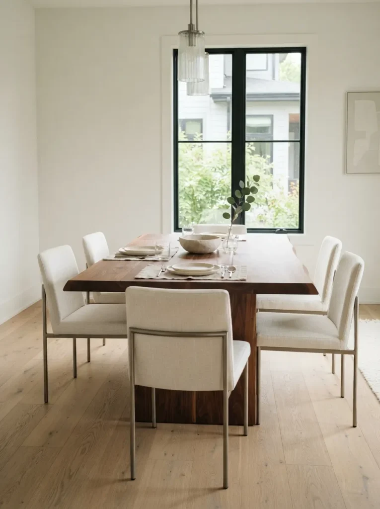
The room stays bright and quiet at the edges while the dining table sits solid and dark in the center, grounding the whole space. This is a classic figure-ground relationship a pale, low-contrast backdrop makes the furniture the clear visual subject, so the eye knows exactly where to land.
Keep walls in a true soft white like Benjamin Moore Simply White, choose a solid walnut table with visible grain, and pair it with brushed nickel or pewter chairs rather than matching wood chairs, which flattens the contrast.
Budget Version: A walnut-veneer table under $400 reads nearly identical to solid walnut in photos and in person from a few feet away, as long as the edges are finished, not raw particleboard.
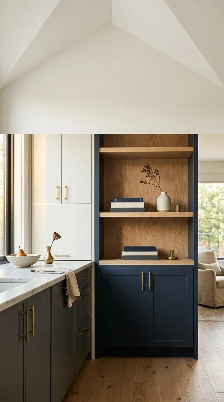
6. Deep Navy Cabinetry with Natural White Oak Built-Ins
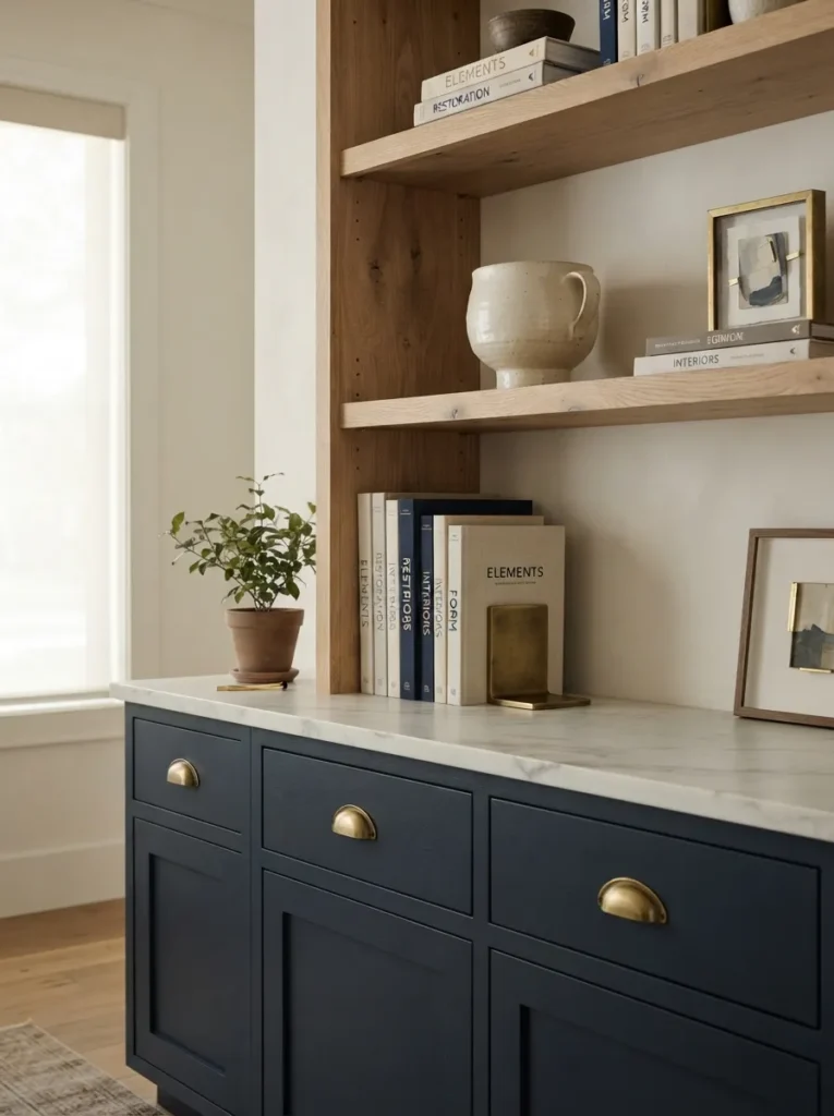
The navy joinery reads almost black in low light and inky blue in direct sun, while the raw oak shelving beside it stays consistently warm no matter the hour. Pairing a deep, saturated color with an unfinished natural material creates depth without a third color the oak’s visible grain keeps the navy from needing a pattern or metallic to stay interesting.
Use a navy like Farrow & Ball Hague Blue on cabinetry doors, then leave adjacent open shelving in raw or lightly oiled white oak with no stain, letting the two materials sit side by side unmatched.
Important: Most people assume navy cabinetry needs white walls to avoid feeling heavy, but pairing it with a warm greige wall softens the contrast and reads more current than stark white.
Shop This Look
| Product |
|---|
| Navy cabinet paint sample |
| Unlacquered brass cabinet knobs |
| White oak floating shelf brackets |
| Ceramic bookend set |
| Woven storage baskets |
The next idea costs almost nothing and does more for a room’s mood than a full repaint.
7. Olive Green Walls with Burnished Brass Hardware
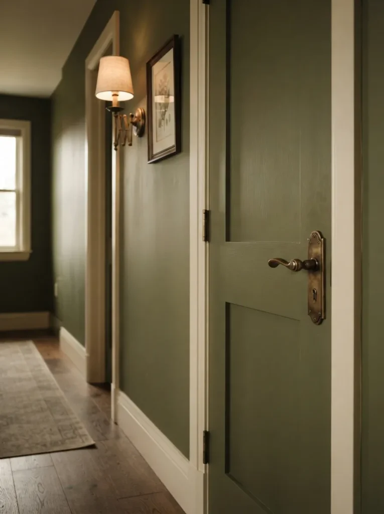
The wall holds a muted, almost dusty green that shifts warmer or cooler with the light, while the brass hardware sits slightly tarnished and soft instead of shiny. Burnished or unlacquered brass has lower reflectivity than polished brass, which keeps it from competing with a saturated wall color the hardware reads as a material choice, not a shiny accent.
Paint in a muted olive such as Sherwin-Williams Rock Bottom, then choose handles, pulls, and switch plates in unlacquered or antique brass rather than polished, letting them age naturally.
Styling Note: Unlacquered brass darkens and spots with fingerprints over months, which most people mistake for wear and tear it’s the exact patina the finish is designed to develop, and polishing it off undoes the whole look.
8. Clay Pink Accent Wall Against Poured Concrete Grey
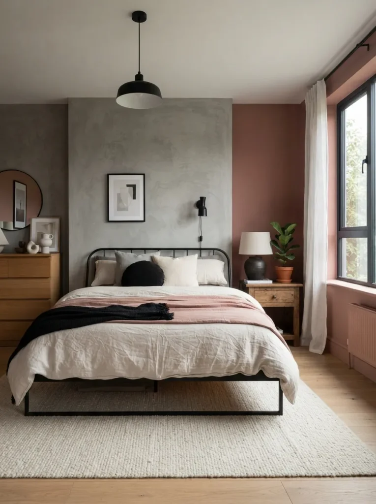
The clay pink sits dusty and warm rather than sweet, and the concrete-look wall beside it feels cool and industrial enough to keep the pairing from reading feminine. Clay pink has a high grey undertone rather than a true pink undertone, which is what lets it sit comfortably next to an industrial material like concrete without clashing in temperature.
Choose a true clay pink like Clare’s Girl Crush or a similarly muted dusty rose, apply it to one wall only, and pair it with a microcement finish or large-format concrete-look porcelain tile on an adjacent surface.
Mistake to Avoid: Choosing a pink with a blue undertone instead of a grey one is the most common error here it reads bubblegum next to concrete instead of grounded, so always test a swatch against the actual concrete material first.
9. Warm Greige Open-Concept Living with Black Grid Windows
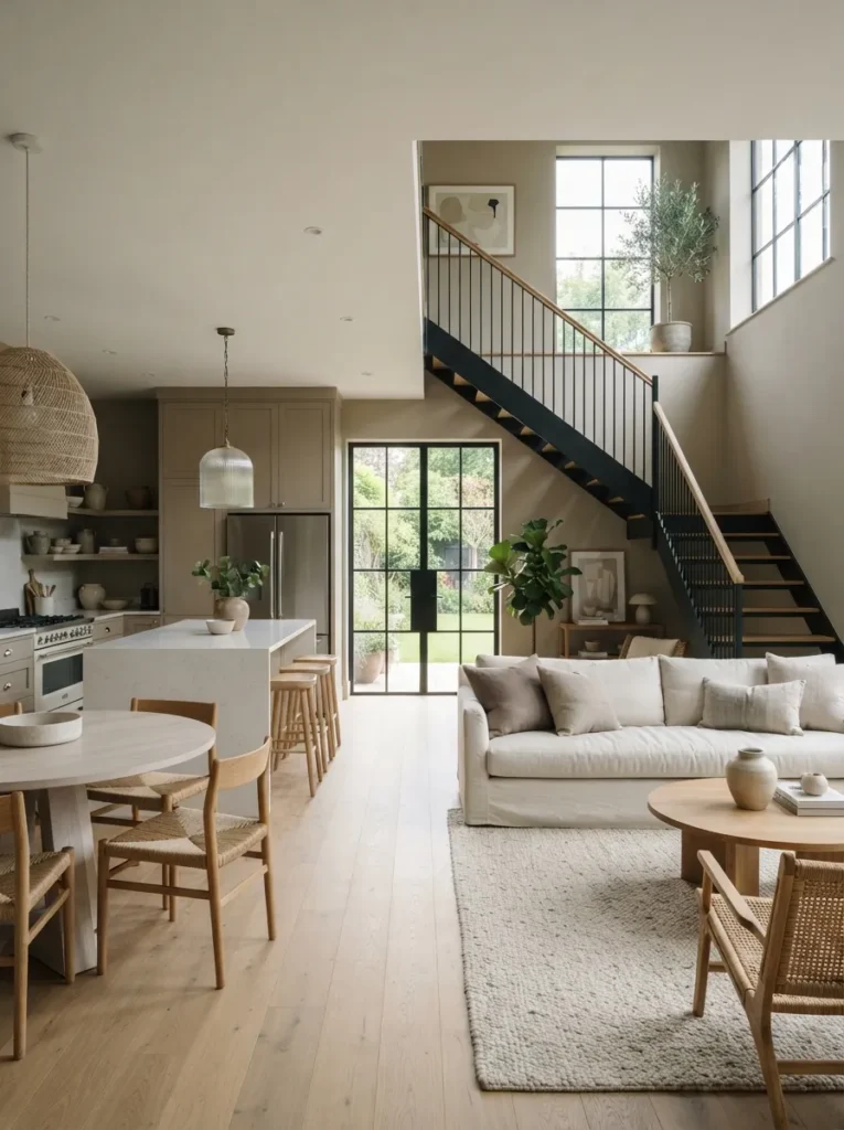
The greige walls run continuously through the kitchen, dining, and living zones, while black-framed windows and a matching stair rail give the eye consistent markers to follow room to room. In open floor plans, color consistency is what makes a large space feel cohesive instead of chopped up repeating one neutral throughout and using a single dark accent as the “thread” ties every zone together.
Use the same greige on every wall in the open area, then repeat one dark accent window frames, stair rails, door hardware at least three times across the space so it reads intentional rather than coincidental.
✅ Before You Repaint an Open-Concept Space:
- [ ] Test your greige swatch in the kitchen, living room, and stairwell separately — the same color reads differently under each light source
- [ ] Choose one dark accent color and identify at least three places to repeat it
- [ ] Paint the largest wall first and live with it for 48 hours before committing to the whole space
- [ ] Confirm trim and ceiling color before buying wall paint, since white trim reads differently against warm versus cool greige
Up next: the flooring pairing that quietly does more work than any paint color in the room.
10. Cool Dove Grey Walls with White Oak Flooring
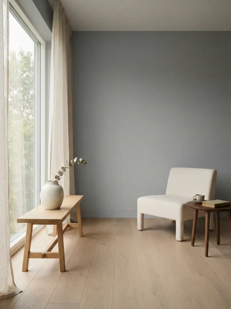
The grey stays cool and slightly blue-toned overhead while the floor below runs warm and golden, so the room never feels flat from ceiling to floor. Pairing a cool wall tone with a warm floor tone creates vertical contrast, keeping an all-neutral room from reading monotone the two temperatures balance each other.
Choose a true cool grey like Sherwin-Williams Repose Gray, avoiding purple or green undertones, and pair it with wide-plank white oak flooring finished in a natural or lightly whitewashed oil rather than a dark stain.
Small-Space Tip: In a small north-facing room, keep the grey slightly warmer than you think you need a true cool grey under weak daylight can read almost blue by late afternoon.
11. Taupe Walls with Black Steel Open Shelving
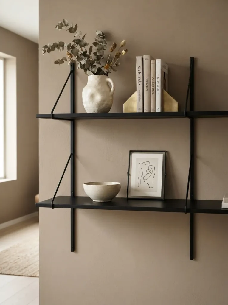
The taupe wall stays soft and matte in the background while the steel shelving sits thin, dark, and almost architectural in front of it, like scaffolding for the objects it holds. Open shelving in a thin, dark material creates negative space around each displayed object the black steel frame reads as a line drawing rather than a solid mass, keeping the room from feeling heavy.
Choose a warm taupe like Benjamin Moore Balboa Mist for the wall, then install black powder-coated steel shelving with thin brackets, and style each shelf with no more than three objects to preserve the negative space.
Pro Tip: Leave at least a third of every shelf empty open shelving styled at full capacity loses the exact architectural lightness that makes black steel shelving work in the first place.
Shop This Look
| Product |
|---|
| Black steel shelf brackets |
| Ceramic vase in matte cream |
| Linen-bound book set |
| Small brass bookend |
| Taupe wall paint sample |
12. Espresso Brown and Warm Cream Wainscoting
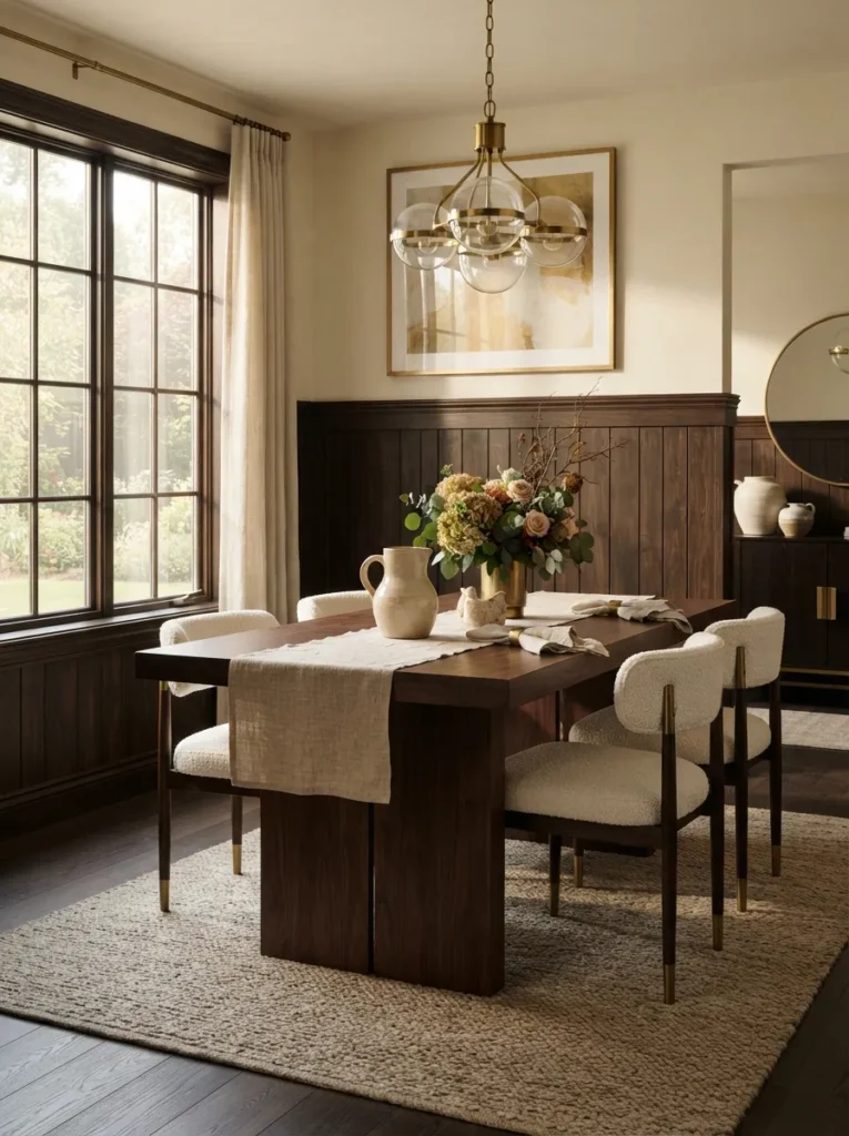
The lower wainscoting sits deep and coffee-dark while the cream upper wall stays soft and matte, meeting at a crisp painted rail line between them. This uses a classic proportion trick a dark lower third visually lowers the ceiling in a good way, making a tall room feel intimate, while the cream upper two-thirds keeps it from feeling boxed in.
Paint wainscoting or board-and-batten in a rich espresso like Farrow & Ball Bancha, keep the wall above in a warm cream such as Clare’s Almond Milk, and paint the rail cap in the cream tone too so the transition stays crisp.
Quick Win: No time or budget for actual wainscoting? Painting just the lowest 32 inches of a plain wall in the espresso tone and adding a single thin trim strip mimics the proportion trick almost as convincingly.
The next idea is the one most people overlook entirely and it costs almost nothing.
13. Deep Forest Green Powder Room with White Trim
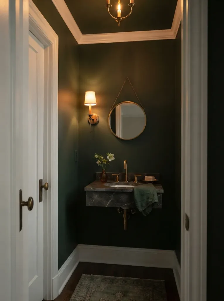
The green wraps the small room floor to ceiling, dense and enclosing, while crisp white trim around the mirror and door frame keeps it from feeling like a cave. Small, fully enclosed rooms are actually the best place for saturated dark colors, since there’s no large open sightline for the darkness to spread into the space reads jewel-box-like rather than shrinking.
Paint all four walls and the ceiling in a deep forest green like Benjamin Moore Forest Green, keep door and window trim crisp white, and add one unlacquered brass or nickel fixture to catch light against the dark backdrop.
Budget Version: Painting the ceiling the same forest green as the walls costs one extra can of paint but is what makes the jewel-box effect work stopping at the ceiling line breaks the enclosure and the room reads smaller instead of cozier.
14. Slate Blue Tile with Brushed Gold Bathroom Fixtures
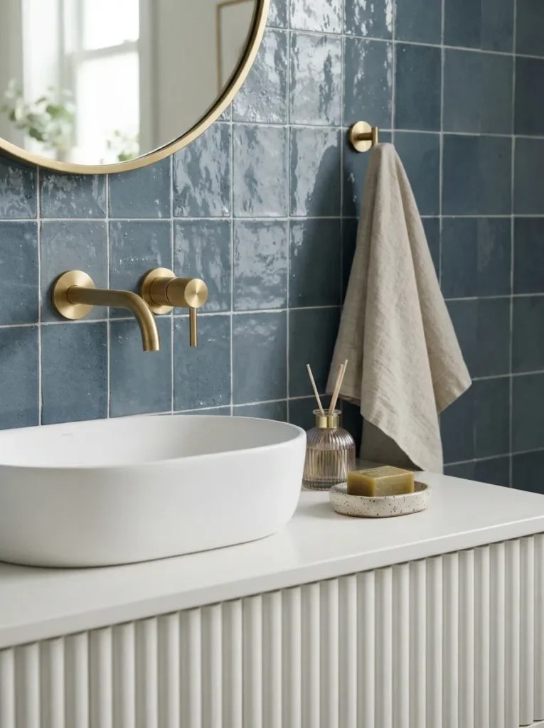
The tile holds a deep, stormy blue-grey that shifts with the light, while the brushed gold faucet and hardware sit warm and matte against it, never glinting too hard. Slate blue has enough grey in its undertone to read sophisticated rather than nautical, and brushed not polished gold keeps the metal from competing with the tile’s own subtle color shift.
Choose a slate blue zellige or subway tile for a shower surround or backsplash, and pair it exclusively with brushed, not polished, gold fixtures mixing finishes here tends to make one metal look like an afterthought.
Warning: Mixing brushed gold with any polished metal even a small towel bar reads as mismatched rather than intentional in a tiled bathroom. Commit to one gold finish throughout the entire room, fixtures included.
Shop This Look
| Product |
|---|
| Slate blue zellige tile sample |
| Brushed gold shower fixture set |
| Brushed gold towel bar |
| Matte black or gold framed mirror |
| Ribbed glass vanity tray |
15. Stone Grey Walls with Rich Walnut Staircase
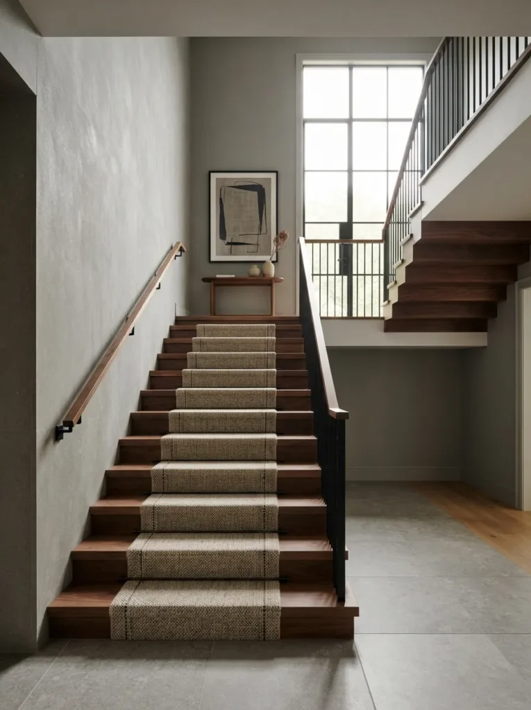
The stairwell walls sit flat and quiet in stone grey while the walnut treads and handrail run warm and glossy beneath your hand, pulling the eye straight up the run. A staircase is one of the few places where the eye naturally travels in a fixed direction, so a quiet wall color paired with a rich, high-contrast wood creates a built-in focal path without needing art to do the work.
Paint stairwell walls in a stone grey like Sherwin-Williams Agreeable Grey, refinish or install walnut treads with a satin not glossy sealant, and keep the handrail in the same walnut tone rather than painting it white, which breaks the visual line.
Styling Note: A satin sealant on walnut treads shows fewer scuffs than a high-gloss finish and still reads rich in photos glossy stairs look striking for about a month before wear starts to show.
In My Experience
In my experience, the biggest color mistake in modern homes isn’t the wall color at all it’s painting trim and doors the same stark white as the ceiling. Ceiling white almost always has a slightly warmer or cooler cast than door and trim white, and once you’re standing in the room instead of looking at swatches, that mismatch reads as dingy rather than clean. I’ve walked into more than one recently renovated space where the homeowner assumed their trim needed repainting, when the real fix was matching all the whites to the same base.
This next one surprised even experienced homeowners the first time they tried it.
16. Ivory Walls with Chocolate Brown Kitchen Island
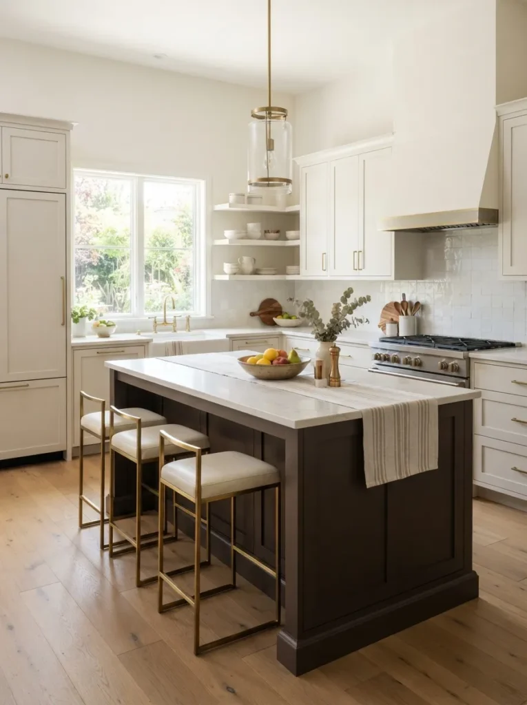
The perimeter cabinetry and walls stay pale and quiet in ivory, while the island sits like a dark anchor in the center of the room, almost furniture-like rather than built-in. Treating the island as a standalone dark object rather than matching it to the rest of the kitchen creates the same effect as a statement piece of furniture in a living room one clear focal point in an otherwise busy space.
Keep perimeter cabinets and walls in a warm ivory like Benjamin Moore White Dove, then paint the island alone in a deep chocolate brown, and top it with a lighter stone counter to keep the contrast crisp.
Important: A common assumption is that a dark island needs dark countertops to feel cohesive, but a pale stone or quartz top on a dark island base is what makes the contrast read intentional instead of accidental.
17. Off-White Walls with Warm Bronze Under-Cabinet Lighting
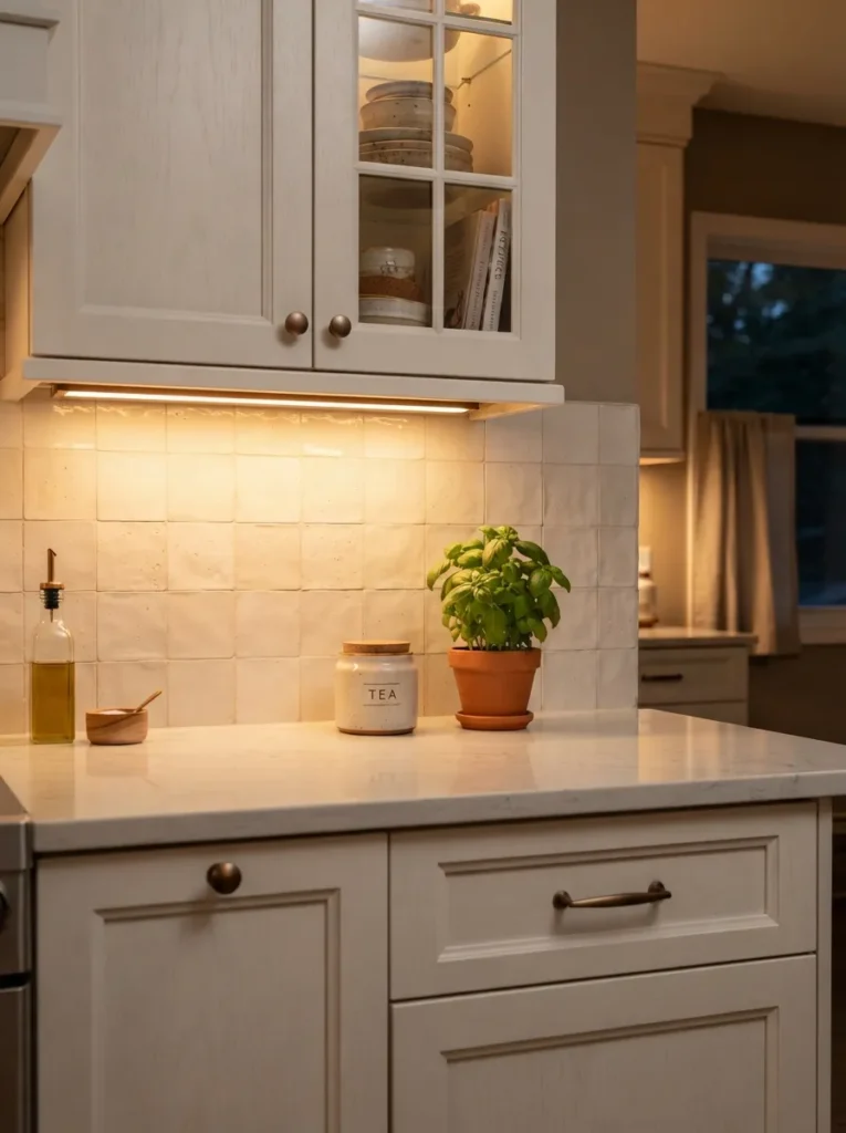
The kitchen stays bright and neutral at eye level, but a low, warm glow spills across the backsplash from underneath the cabinets, giving the room a second, softer light source after dark. Layered lighting not just wall color is what makes off-white kitchens feel warm instead of clinical at night, since a single overhead fixture in a pale room can read flat once the sun goes down.
Paint walls and cabinetry in a soft off-white like Benjamin Moore Swiss Coffee, install warm bronze LED strip lighting under the upper cabinets set to 2700K, and place it toward the front edge so it washes the backsplash rather than shining straight down.
Mistake to Avoid: Choosing a cool-white 5000K LED strip instead of warm 2700K is the most common error here it turns an intentionally warm palette cold the second the sun goes down, undoing the whole effect.
18. Blush Pink and Graphite Bedroom Textiles
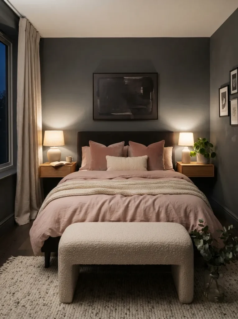
The bedding sits soft and dusty pink against graphite-grey walls, so the color feels grown-up and moody rather than sweet, especially once the sun goes down and the grey deepens toward black. Pairing a soft, low-saturation pink with a near-black neutral is a temperature-balancing trick the pink keeps the room from feeling cold, and the graphite keeps the pink from tipping into anything precious.
Paint walls in a graphite grey like Sherwin-Williams Peppercorn, bring in blush through bedding, a boucle bench, or velvet pillows rather than paint, and keep all other textiles in cream or oatmeal to avoid a third competing color.
Pro Tip: Stick to velvet, boucle, or wool for the blush accents rather than a shiny satin matte-textured pink reads sophisticated next to graphite, while satin pink can tip the room back toward feeling like a nursery.
Last on the list and it’s the one people tend to save for last in real life, too.
19. Warm White Walls with a Deep Bronze Statement Chandelier
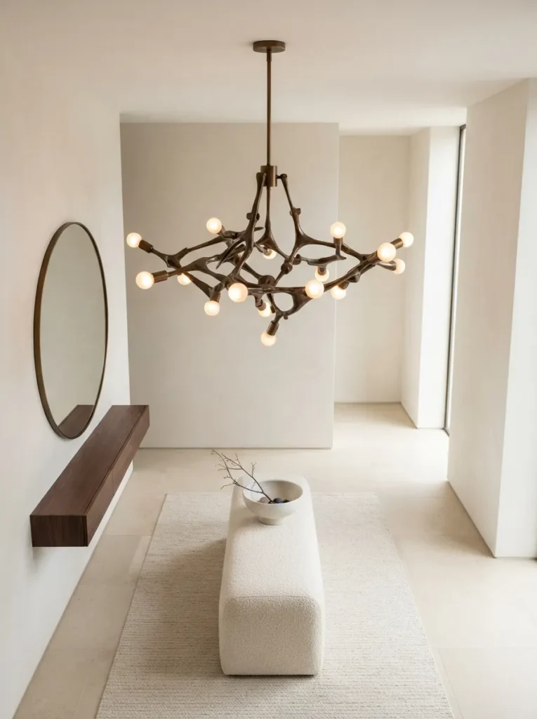
The room stays quiet and pale everywhere except one spot overhead, where a bronze fixture hangs dark, sculptural, and slightly oversized for the space it’s in. A single oversized dark fixture in an otherwise pale room works on scale contrast alone it doesn’t need a matching rug or accent wall to feel intentional, because its size and finish already do that job.
Keep walls in a warm white like Benjamin Moore White Dove, choose a chandelier in aged or deep bronze roughly one size larger than a standard sizing chart would recommend, and leave the rest of the lighting simple so the fixture stays the focal point.
Styling Note: Going one size up from what a sizing chart recommends is almost always the right call for a statement fixture the most common regret homeowners report is choosing one that reads too small once it’s actually installed.
Shop This Look
| Product |
|---|
| Deep bronze statement chandelier |
| Warm white ceiling paint sample |
| Dimmer switch kit |
| Bronze picture rail hooks |
| Ivory boucle bench |
Quick Guide: Which Idea Fits You
| Idea | Best for |
|---|---|
| Charcoal, Warm White & Brushed Brass Kitchen | Homeowners doing a kitchen refresh without a full renovation budget |
| Warm Greige Walls with Black Steel-Frame Windows | Anyone with a large, plain wall of windows that currently feels flat, especially if the room is already anchored by a neutral piece like a tan sofa |
| Matte Black Pendants over Warm Walnut Tones | Dining areas and kitchen islands that feel dim or flat under existing lighting |
| Terracotta and Sage Green Living Room Palette | People who want a bold modern palette without repainting the entire room |
| Soft White Walls with Walnut and Brushed Nickel Dining Set | Open-concept homes where the dining area needs to feel defined without walls |
| Deep Navy Cabinetry with Natural White Oak Built-Ins | Built-in bookcases, media consoles, and kitchen islands used as a focal point if the built-in doubles as a modern TV unit, this palette works especially well |
| Olive Green Walls with Burnished Brass Hardware | Hallways, home offices, and powder rooms where a bold color feels lower-stakes |
| Clay Pink Accent Wall Against Poured Concrete Grey | Bedrooms and home offices that want warmth without feeling overtly decorative |
| Warm Greige Open-Concept Living with Black Grid Windows | New builds or renovated homes with an open floor plan that currently feels disjointed |
| Cool Dove Grey Walls with White Oak Flooring | North-facing rooms that get cool, indirect daylight most of the day |
| Taupe Walls with Black Steel Open Shelving | Living rooms and home offices that need storage without visual bulk a similar effect works well if you’re already styling Kallax shelving in the space |
| Espresso Brown and Warm Cream Wainscoting | Dining rooms and entryways with ceilings over nine feet |
| Deep Forest Green Powder Room with White Trim | Powder rooms and small guest bathrooms under 25 square feet for more ways to work with the color, see our green bathroom decor ideas |
| Slate Blue Tile with Brushed Gold Bathroom Fixtures | Primary bathrooms and guest baths getting a full retile browse more blue bathroom decor pairings for additional inspiration |
| Stone Grey Walls with Rich Walnut Staircase | Two-story entryways and open stairwells that currently feel like an afterthought |
| Ivory Walls with Chocolate Brown Kitchen Island | Kitchens where the island is the largest single surface in the room |
| Off-White Walls with Warm Bronze Under-Cabinet Lighting | Kitchens used heavily in the evening for cooking or entertaining |
| Blush Pink and Graphite Bedroom Textiles | Primary bedrooms and guest rooms that want warmth without full commitment to a bold wall color |
| Warm White Walls with a Deep Bronze Statement Chandelier | Entryways, dining rooms, and primary bedrooms with a single obvious focal point above |
Common mistake to avoid: Choosing a colour from a small sample under shop lighting. Paint shifts with natural and artificial light, so put a large swatch on your own wall and look at it in the morning, afternoon and evening before you commit.
How to Start Your Modern Color Transformation
What I’ve found with real spaces is that paint always comes before anything else not furniture, not hardware. Start with a single greige or warm white on your largest wall and live with it in both morning and evening light for a few days before buying anything else. That one decision anchors every other color choice in the room, and repainting a wall is far cheaper than returning furniture that no longer matches it.
The most common mistake is mismatching whites using a stark, blue-based white on trim next to a warm greige or cream wall. It breaks the palette without the homeowner ever quite figuring out why the room feels off. Fix it by pulling trim white from the same paint family as your wall color, even if it’s several shades lighter.
Three items under $50 can shift a room fast: a set of unlacquered brass cabinet knobs, a warm 2700K LED bulb swap for any existing fixture, and a chunky ceramic vase in a matte cream or charcoal finish for an empty shelf corner.
A single-room refresh new paint, hardware, and lighting bulbs realistically takes one long weekend and runs $200 to $600 depending on room size. A fuller transformation involving flooring, cabinetry, or a chandelier swap is closer to two to six weeks and $1,500 to $6,000, depending on how much gets replaced versus refinished.
Ready to Create Your Dream Modern Home?
Between deep charcoal kitchens, dusty clay pink walls, and bronze statement lighting, these 19 ideas cover nearly every way color, material, and light can work together in a modern home. None of this needs to happen at once even one wall, repainted this weekend, changes how a whole room feels.
Start with the pairing that made you pause longest while reading, and take the smallest possible first step: order the paint sample, not the gallon. Modern color, done well, gives a room the kind of quiet confidence you feel before you can even explain why. Pin your favorites now, because half of these palettes look different once the light changes tomorrow.
You Might Also Like
- 12 Modern Kitchen Cabinet Color Ideas That Still Feel Warm
- 15 Small Bathroom Color Schemes for a Modern Home
- 10 Modern Living Room Layouts for Open-Concept Homes