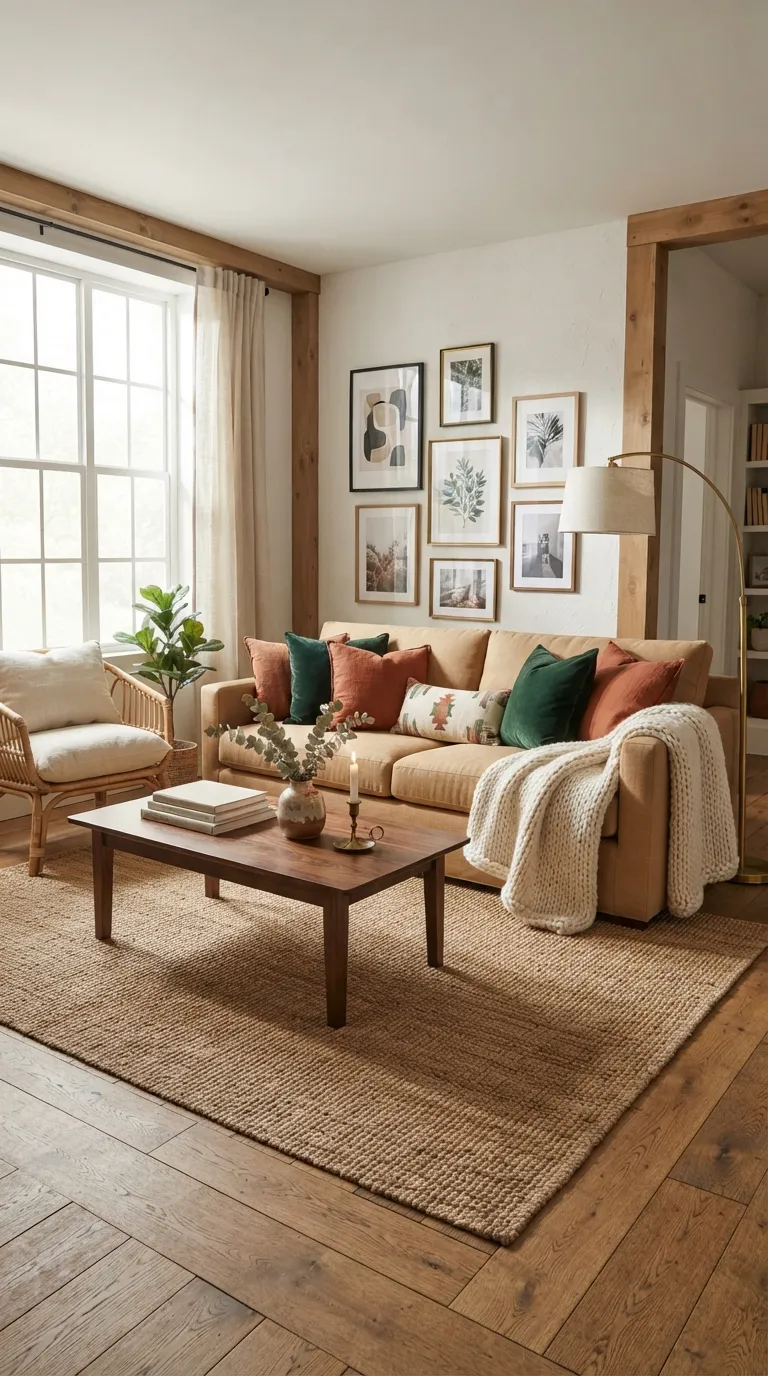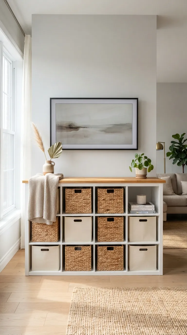
18 TV Unit Design Ideas That Feel Cozy Modern
A cozy modern TV unit is what happens when a media console stops looking like a big-box display piece and starts looking like furniture you actually chose. Here are 18 ideas that pull that off through wood tone, texture, lighting, and color, not just a bigger screen.
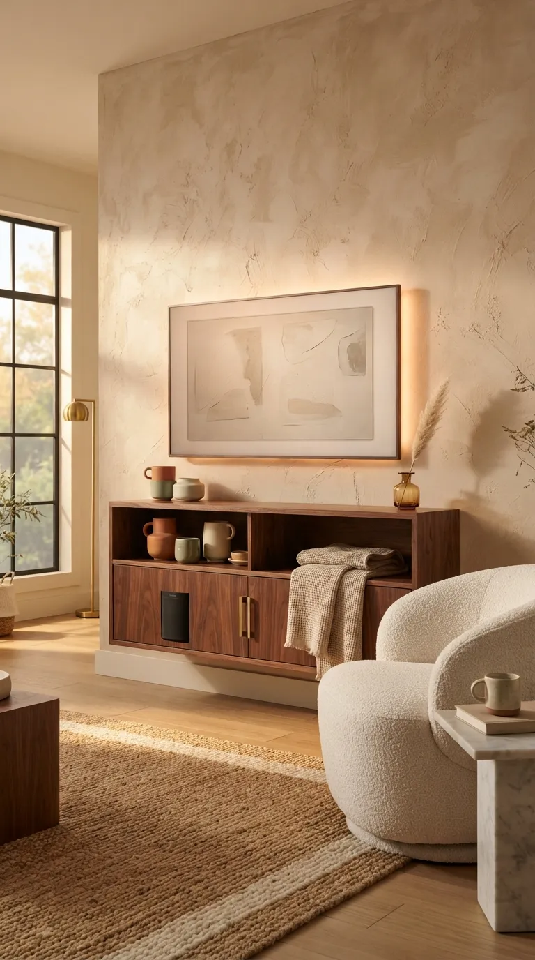
Picture a low walnut console holding its own against a plaster wall, warm light pooling behind the screen instead of glare bouncing off it. There’s a stillness to a room built this way nothing shouts, everything just settles. Cozy modern isn’t rustic and it isn’t sterile; it’s the handshake between the two. Let’s get into it.
Quick Navigation
- Why Cozy Modern TV Units Work So Well
- 18 Cozy Modern TV Unit Ideas
- How to Start Your Cozy Modern Transformation
- Ready to Create Your Dream Cozy Modern Living Room?
Why Cozy Modern Works So Well
Cozy modern grew out of Scandinavian and Japandi minimalism colliding with mid-century American furniture clean silhouettes softened by tactile materials. Exact tones to shop from: warm walnut, oat white, dusty terracotta, sage green, brushed brass. Materials that carry the style: white oak, bouclé, rattan, unfinished plaster, matte black steel.
It’s having a real moment because people are tired of stark minimalism but don’t want clutter back either. In small spaces, prioritize one hero material usually the wood tone of the console before adding anything else.
| Element | Warmth | Structure |
|---|---|---|
| Philosophy | Comfort-first, tactile | Clean lines, no clutter |
| Materials | White oak, bouclé, rattan | Matte black hardware, plaster |
| Color palette | Terracotta, sage, warm greige | Charcoal, cream, walnut brown |
18 Cozy Modern TV Unit Ideas
1. Low-Profile Walnut Floating Console
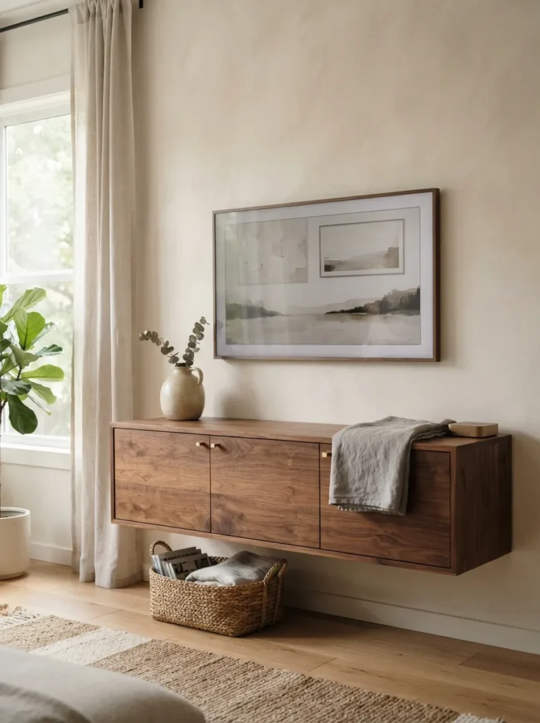
What it looks like: A slab of warm walnut appears to hover below the screen, weightless against the wall.
Why it works: Floating furniture reads as lighter and more architectural the visible baseboard behind it creates depth instead of a flat, boxed-in feel. Walnut’s reddish undertone keeps the piece from feeling cold.
How to copy it: Mount a French cleat rated for at least 150 lbs into wall studs, and keep the walnut console under 14 inches deep so it doesn’t visually compete with the screen. Choose a walnut finish with visible open grain rather than a painted or laminate look.
Best for: Renters and small-space decorators who want floor space to stay open.
Small-Space Tip: Skip the console entirely under 250 square feet and mount just a single 24-inch floating shelf instead it holds a soundbar and nothing else, which is often enough.
Shop This Look
| Product |
|---|
| Low-profile walnut floating TV console, 48–58 inch |
| French cleat wall mount hardware, heavy-duty |
| Brushed brass cabinet pulls, bar style |
| Handwoven ceramic vase, matte cream |
| Waffle-weave linen throw blanket |
2. Terracotta Accent Wall Behind the TV
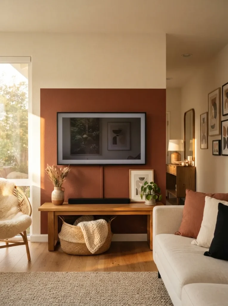
What it looks like: The wall behind the screen glows a dusty clay red, warm enough to feel lit even in daylight.
Why it works: A dark, saturated color block behind a TV camouflages the black frame and creates contrast that makes the rest of the room feel airier by comparison a trick real estate stagers use constantly.
How to copy it: Paint just the wall section behind the unit in a matte terracotta like Farrow & Ball’s Red Earth or a comparable clay tone, stopping at a clean edge rather than painting the full wall. Keep trim and ceiling white to hold the contrast.
Best for: Homeowners ready to commit to a bolder color statement.
Pro Tip: Test the terracotta on a large poster board and view it at night under lamp light before committing clay reds shift dramatically warmer under incandescent bulbs.
3. Bouclé-Upholstered Media Bench
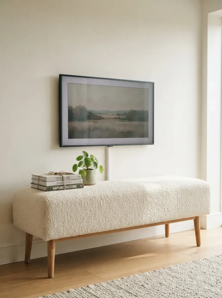
What it looks like: The console has texture you want to touch nubby, soft, almost furry from a distance.
Why it works: Bouclé introduces the one thing most modern media units lack: tactility. Pairing it with tapered wood legs keeps the shape structured so the softness doesn’t tip into sloppy.
How to copy it: Look for bouclé upholstery in undyed cream or oat tones rather than bright white, which shows wear faster. Pair it with slim oak or ash legs at a slight taper for a mid-century silhouette.
Best for: People who want their living room to feel like a hug, not a showroom.
Styling Note: Add one hard-edged object a black metal tray or a glass vase on top to keep the softness from feeling one-note.
Shop This Look
| Product |
|---|
| Bouclé-upholstered media bench, cream, 55 inch |
| Tapered solid oak furniture legs, set of 4 |
| Linen-bound hardcover book set (decorative) |
| Small terracotta planter with trailing pothos |
The next idea is one most people overlook entirely and it costs almost nothing.
4. Warm LED Backlighting Behind the Panel
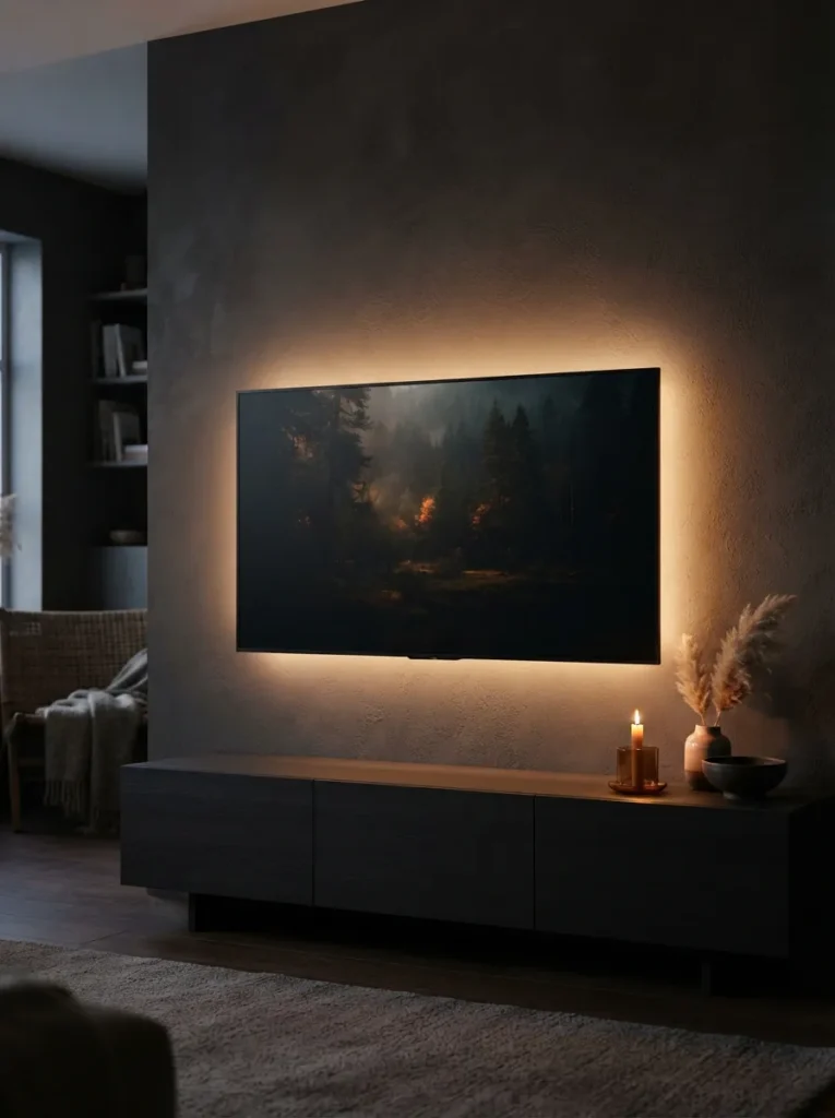
What it looks like: A soft amber halo bleeds out from behind the screen, turning a flat black rectangle into something that glows.
Why it works: Backlighting reduces the contrast between the bright screen and a dark wall, which is easier on the eyes and makes the TV feel intentional rather than like a hole in the room. Warm-white light (2700K) keeps it from reading clinical.
How to copy it: Buy a bias-lighting LED strip rated at 2700K–3000K, cut it to match the TV’s back panel dimensions, and run it on a small remote dimmer rather than full brightness.
Best for: Anyone who watches TV in the evening and hates the glare of a bright screen in a dark room.
✅ Checklist — Setting Up Bias Lighting:
- [ ] Measure the TV’s back panel width and height before ordering
- [ ] Choose a warm-white strip (2700K–3000K), not daylight white
- [ ] Clean the panel surface with alcohol wipes before applying adhesive
- [ ] Run the strip along all four edges, avoiding overlap at corners
- [ ] Test brightness with room lights off before finalizing placement
5. Layered Ceramics on Open Shelving
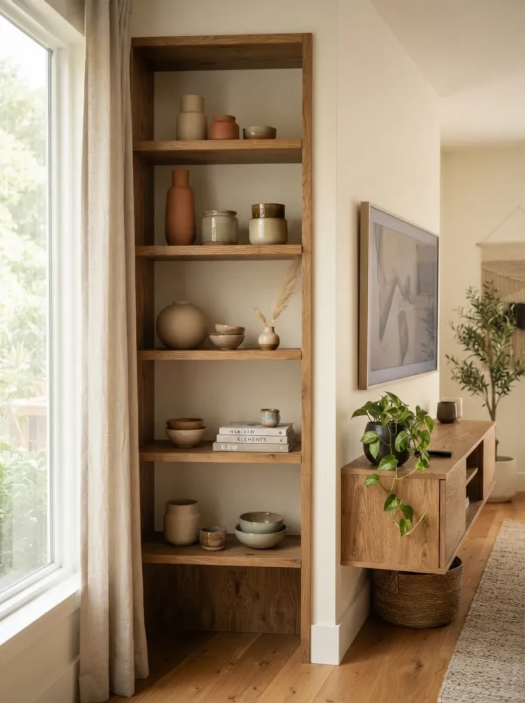
What it looks like: A shelf of ceramics in mismatched heights creates a quiet rhythm, like a skyline instead of a shopping display.
Why it works: Odd-numbered groupings and varied height create visual interest without symmetry, a principle stylists call triangulation the eye moves naturally across the arrangement instead of stopping flat.
How to copy it: Group ceramics in threes, mixing one tall matte vessel, one short glazed bowl, and one textured object like a dried branch. Leave at least 30% of the shelf empty most people overcrowd this and it reads as clutter, not curated.
Best for: Anyone styling open shelving for the first time.
Quick Win: Don’t buy new ceramics raid your kitchen cabinets first. Plain stoneware bowls and mugs in neutral tones work just as well as “decor” pieces.
6. Fluted Oak Wall Paneling
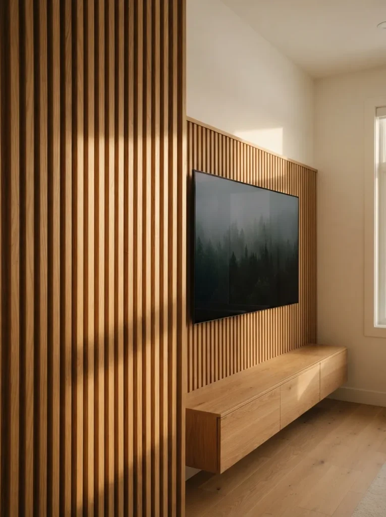
What it looks like: Vertical grooves catch light and shadow down the wall, giving a flat surface real dimension.
Why it works: Fluting adds texture without adding visual clutter the repetition of straight lines reads as calm rather than busy, and the shadow play changes throughout the day as light shifts.
How to copy it: Install fluted oak veneer MDF panels in a honey or natural oak finish, running them floor to just above the TV height rather than full wall. Mount the TV directly onto the paneling using a low-profile bracket so it sits flush.
Best for: Homeowners doing a semi-permanent renovation, not renters.
Important: Most people assume fluted panels need a professional installer but pre-finished veneer panels click together with basic construction adhesive and a level, no carpentry experience required.
Up next: the material choice that quietly anchors every room in this style.
7. Two-Tone Charcoal and Cream Cabinetry
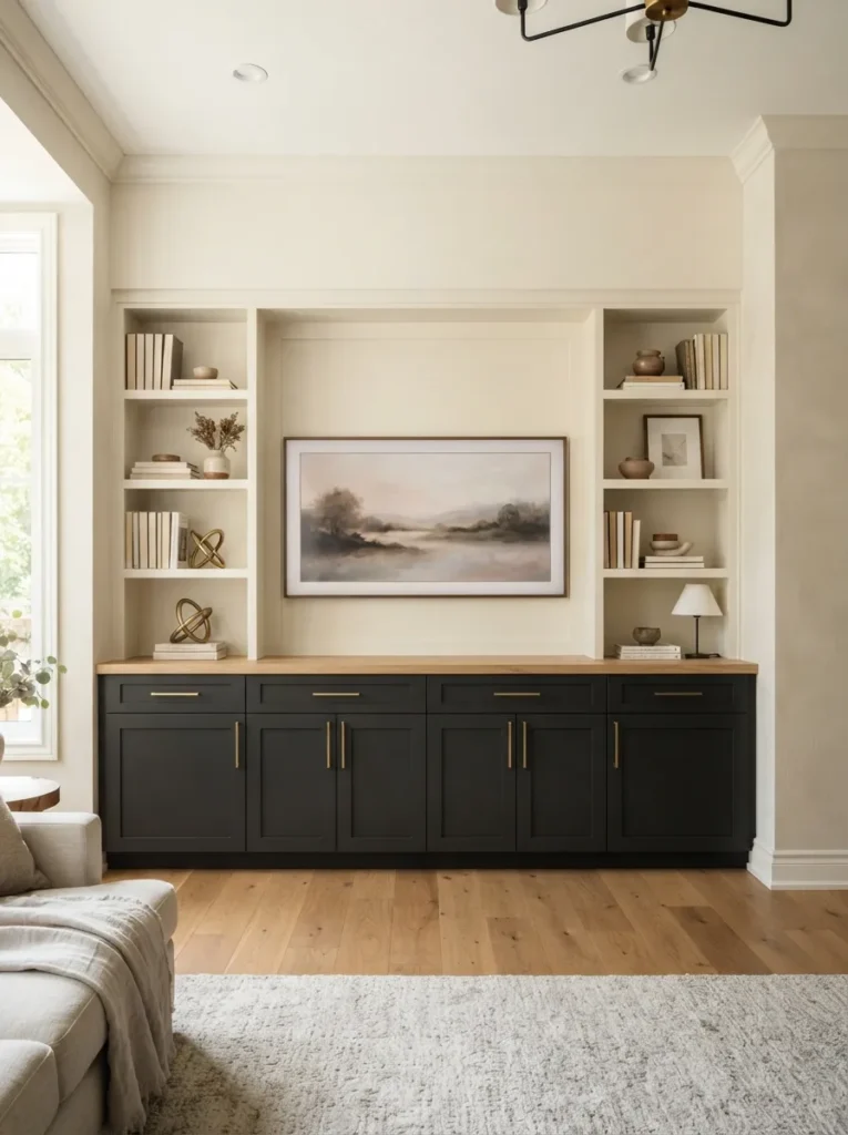
What it looks like: Dark, grounded cabinets sit below lighter, airier shelving heavy at the bottom, light at the top.
Why it works: This follows a basic design rule: darker tones read as visually heavier, so keeping them low grounds the whole wall and prevents the unit from feeling top-heavy or overwhelming a smaller room.
How to copy it: Paint or order lower cabinet doors in matte charcoal (something like Benjamin Moore’s Wrought Iron) and keep uppers in a warm cream, not stark white, to avoid too much contrast. Swap standard hardware for brass or brushed bronze pulls.
Best for: People who want storage-heavy furniture pieces that still look intentional.
Budget Version: Paint an existing two-tone-capable console with chalk paint on just the lower doors for under $40 instead of buying new cabinetry.
8. Symmetrical Built-Ins Flanking the TV
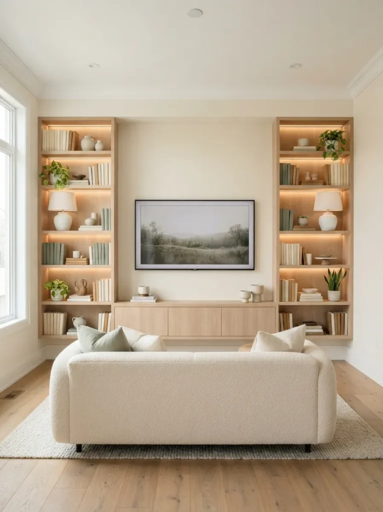
What it looks like: Matching bookshelves stand guard on either side of the screen, calm and deliberate.
Why it works: Symmetry is one of the fastest ways to make a room feel finished the eye doesn’t have to work to balance the composition because the composition balances itself.
How to copy it: Build or buy two matching narrow bookcases in white oak, positioning them equidistant from the TV’s center line. Style both sides with near-identical item counts and heights, though not identically perfect mirroring feels stiff.
Best for: Larger living rooms with a wide, blank feature wall.
Mistake to Avoid: People mirror everything down to the last object, which reads as staged rather than lived-in. Leave one shelf slightly different a stack of three books instead of a vase, for instance.
This next one surprised even experienced decorators the first time they tried it.
9. Wall-Mounted Floating Shelf Console
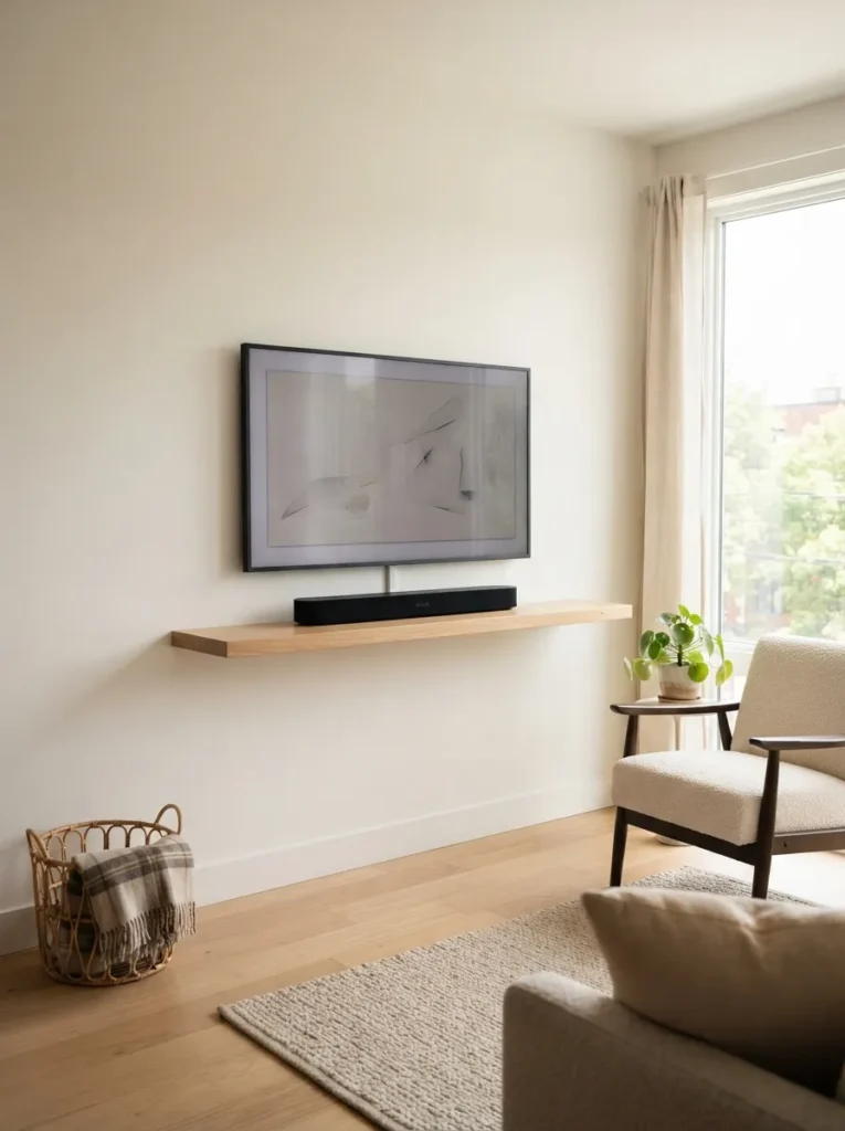
What it looks like: A single slim shelf holds just the essentials, leaving the wall below open and the floor completely clear.
Why it works: In tight rooms, floor space reads as more valuable than storage. A floating shelf removes visual bulk entirely, which makes a small room feel larger than a floor-standing console ever could.
How to copy it: Choose a shelf no deeper than 8–10 inches in a warm oak tone, and mount it using heavy-duty toggle anchors if you can’t hit a stud. Keep everything on it to two items maximum soundbar and nothing else.
Best for: Studio apartments and small bedrooms.
Warning: Don’t skip stud-finding or proper anchors here a shelf holding even a lightweight soundbar can pull straight out of drywall within weeks if it’s mounted with standard picture hooks instead of rated anchors.
10. Brass Picture Light Above Nearby Art
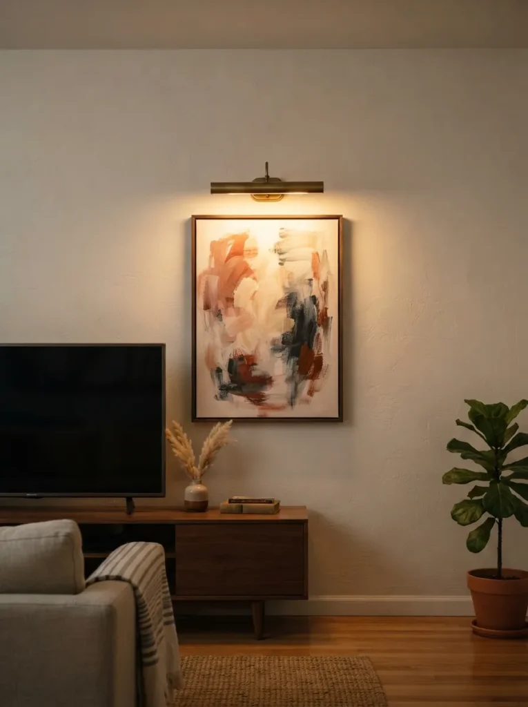
What it looks like: A narrow brass fixture throws a warm pool of light onto artwork beside the screen, like a tiny gallery moment.
Why it works: Positioning a light source near the TV rather than only on it draws the eye sideways and prevents the screen from becoming the only focal point in the room, even when it’s off.
How to copy it: Mount a brushed brass or antique bronze picture light directly above a framed piece hung at eye level beside the TV wall, wired to the same dimmer circuit if possible. Keep the bulb warm white, never cool daylight.
Best for: Rooms where the TV wall doubles as a gallery wall.
Styling Note: Choose art with texture a plaster relief or heavy brushstroke piece since raking light from a picture light shows texture off far better than flat prints.
Up next: the material choice that quietly anchors every room in this style.
11. Curved Bouclé Swivel Chairs Framing the Unit
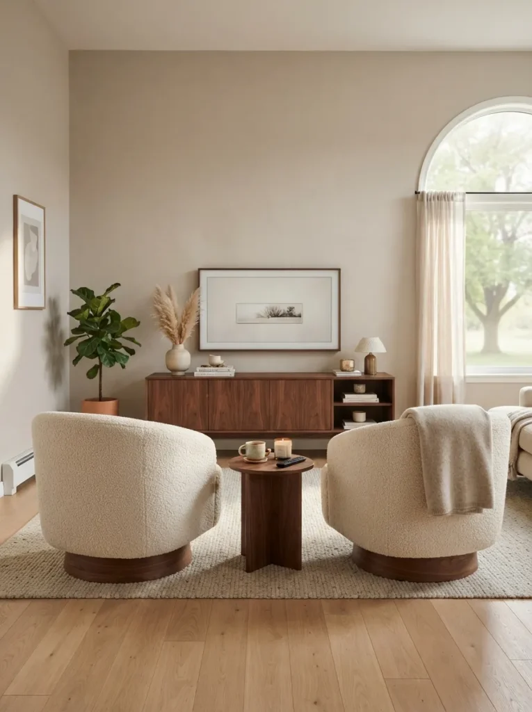
What it looks like: Two rounded chairs curve toward the screen like they’re mid-conversation, softening the whole seating arrangement.
Why it works: Curved furniture breaks up a room full of straight-edged consoles and sofas contrast in shape is as important as contrast in color, and rounded forms read as more relaxed and less formal.
How to copy it: Add a pair of swivel chairs with a rounded bouclé back and a walnut or black swivel base positioned at a slight angle toward the TV, not dead-on. Angling them by roughly 15 degrees keeps sightlines natural for conversation too.
Best for: Living rooms that double as a hangout space, not just a screen-watching room.
Pro Tip: Swivel bases matter more than the fabric test the swivel resistance in person if you can, since cheap mechanisms squeak within months.
Shop This Look
| Product |
|---|
| Curved bouclé swivel chair, cream, set of 2 |
| Round walnut side table, 16 inch |
| Chunky knit throw blanket, oat |
12. Woven Rattan Cabinet Fronts
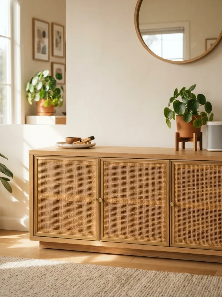
What it looks like: Woven rattan panels catch light in a basketweave pattern, breaking up what would otherwise be flat cabinet doors.
Why it works: Rattan introduces organic texture without adding visual weight light passes through the weave slightly, which keeps a large cabinet from feeling like a solid block against the wall.
How to copy it: Choose a console with rattan or cane webbing set into a light oak or ash frame, not a dark frame, which can make the weave disappear visually. Wipe rattan with a barely damp cloth only soaking it warps the weave over time.
Best for: Warm-climate homes and anyone leaning into a more relaxed, textural look.
Pro Tip: If you already own a plain console, swap flat cabinet doors for rattan cane inserts several furniture hardware brands sell drop-in panels that fit standard door frames.
This next one surprised even experienced decorators the first time they tried it.
13. Warm Greige Console Against a Sage Wall
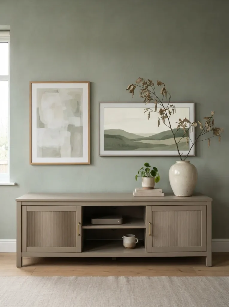
What it looks like: A soft grey-beige console nearly disappears into a muted sage wall behind it, calm rather than contrasting.
Why it works: Low-contrast color pairing two muted, similarly saturated tones creates a restful feeling instead of a focal point, letting the room feel settled even with a large screen mounted on the wall.
How to copy it: Paint the wall in a muted sage like Farrow & Ball’s Card Room Green and pair it with a console in warm greige, not cool grey, so the undertones don’t clash. Test both swatches side by side before buying either.
Best for: People who find bold accent walls too intense but still want color.
Quick Win: Can’t paint? A large sage-toned textile a rug or curtain panel behind the seating area creates a similar calming effect without touching the wall.
14. Stoneware Bookends and Dried Botanicals
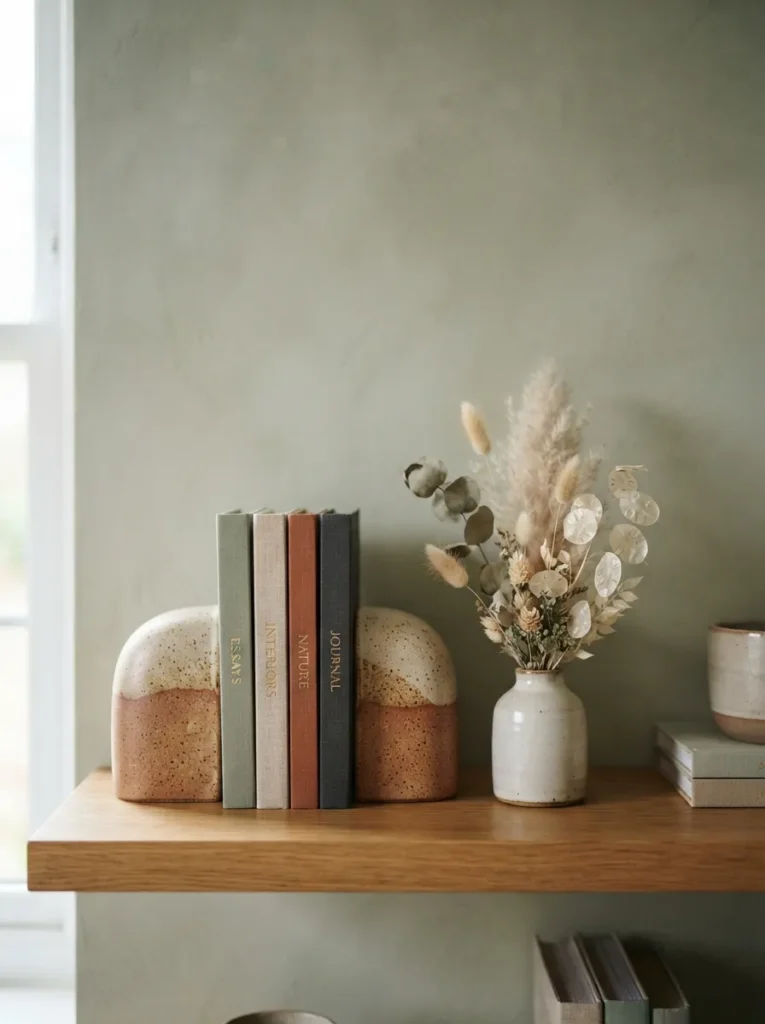
What it looks like: Chunky, hand-thrown bookends hold a short stack of books upright, with a few dried stems leaning beside them.
Why it works: Dried botanicals solve the maintenance problem fresh flowers create near electronics no water risk near cords while still softening the hard edges of a media unit with organic shape.
How to copy it: Choose stoneware bookends with a matte, slightly uneven glaze rather than a perfectly smooth finish, and pair with one or two dried stems like pampas grass or preserved eucalyptus in a small bud vase. Keep the stems shorter than the TV’s bottom edge so they don’t visually compete with the screen.
Best for: Anyone styling a shelf near cords and electronics.
Budget Version: Dried botanicals from a grocery store floral section cost under $10 and last over a year with zero care.
15. Turned Oak Leg Detail Console
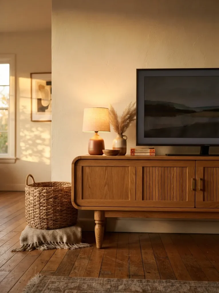
What it looks like: Slim, hand-turned legs lift the console off the floor, giving it an almost furniture-gallery presence.
Why it works: Exposed, sculptural legs add visual lightness the way floating consoles do, but with a more traditional silhouette the negative space underneath keeps the piece from reading heavy even in solid oak.
How to copy it: Look for turned or spindle-style legs in a honey oak finish rather than straight square legs, which read flatter and more generic. Keep at least 6 inches of clearance beneath the console so the leg detail stays visible and doesn’t get lost behind a rug.
Best for: Mid-century modern fans who want warmth over sharp minimalism.
Important: Most people assume turned-leg furniture is delicate solid oak versions rated for TV weight are just as sturdy as flat-panel consoles, the shape doesn’t compromise strength.
In my experience, console height gets ignored constantly. People default to centering the TV on the wall, but on a console under 16 inches tall, eye-level placement can leave nearly two feet of dead wall above the screen. Hang a single piece of art or a small sconce above it instead of leaving that space blank it reads intentional instead of like something’s missing.
16. Dimmable Floor Lamp for Evening Glow
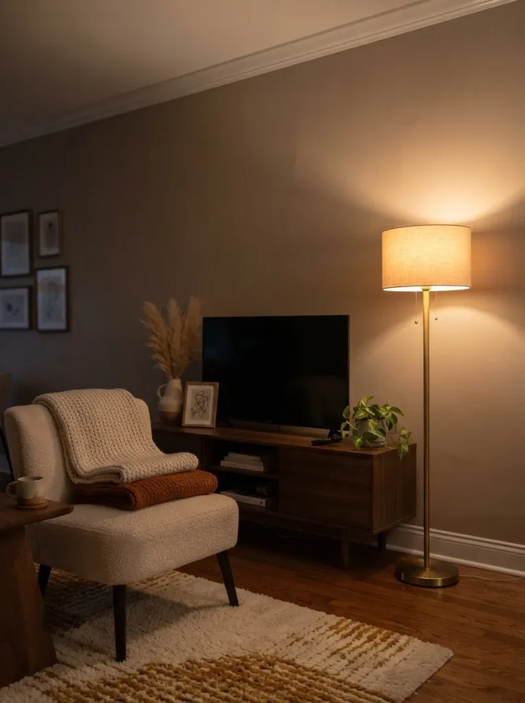
What it looks like: A soft linen-shaded lamp glows beside the console, the kind of light that makes a room feel later than it is.
Why it works: Overhead lighting flattens a room and competes with a TV screen’s brightness. A single dimmable floor lamp at seating height creates the layered lighting designers rely on, and it lets you drop the room’s brightness without touching the TV’s settings.
How to copy it: Choose a floor lamp with a linen or paper drum shade and a warm dimmable bulb (2700K), positioned just behind or beside the console rather than directly in front. Run it on a smart plug or in-line dimmer if the lamp itself doesn’t have one built in.
Best for: Evening TV watchers who want a softer glow than overhead lights allow.
Styling Note: Match the lamp base metal to your cabinet hardware brass with brass, black with black so the finishes feel chosen, not mismatched.
Shop This Look
| Product |
|---|
| Dimmable floor lamp, linen drum shade, brass base |
| Warm white dimmable smart bulb, 2700K |
| In-line dimmer switch or smart plug |
17. Matte Black Hardware Against Warm Wood
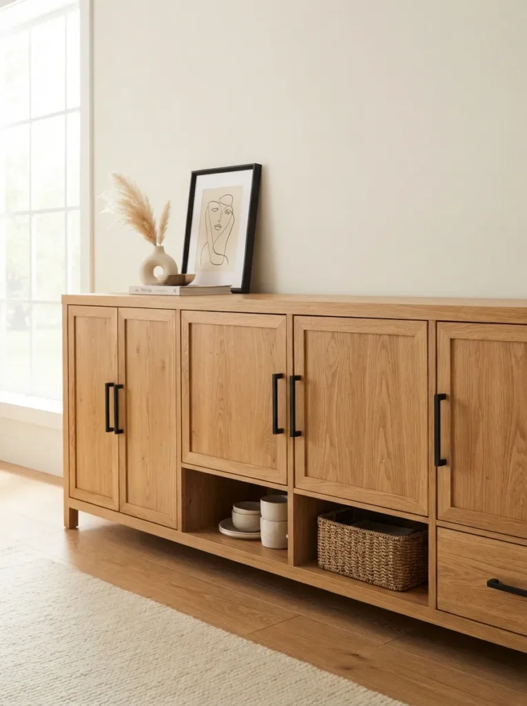
What it looks like: Slim black pulls stand out crisply against pale oak grain, like punctuation on a plain sentence.
Why it works: High-contrast hardware on a light wood console creates a focal detail without requiring any additional decor it’s a small, low-cost way to make a builder-basic piece look custom.
How to copy it: Swap standard hardware for matte black bar pulls in a slim profile, matching the screw spacing on your existing cabinet drilling to avoid new holes. Stick to one hardware finish throughout the piece rather than mixing black with brass.
Best for: Anyone upgrading a plain or secondhand console on a small budget.
Quick Win: Spray-paint existing brass hardware with a matte black metal spray for under $15 if you’re not ready to buy new pulls.
18. Textured Plaster Wall Framing the Screen
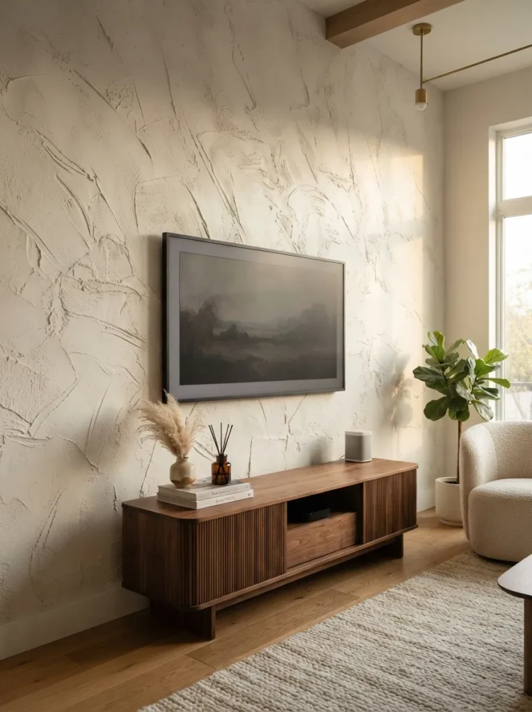
What it looks like: The wall behind the screen has a raw, hand-troweled texture that catches shadow instead of sitting flat.
Why it works: Textured plaster does what a flat painted wall can’t it creates depth and shadow play that shifts throughout the day, giving the TV wall visual interest even when the screen itself is off.
How to copy it: Apply a limewash or Venetian plaster finish in a warm off-white tone using a trowel in loose, uneven strokes rather than a perfectly smooth pass. Many brands now sell plaster-effect paint kits that mimic this without full plaster application.
Best for: Homeowners willing to take on a weekend wall project for a bigger visual payoff.
Pro Tip: Apply plaster in small sections and blend edges while still wet working in one continuous pass across the whole wall causes visible seam lines once it dries.
How to Start Your Cozy Modern Transformation
What I’ve found with real spaces is that the console itself should come first not paint, not lighting. A low walnut or white oak piece under 60 inches wide anchors the entire wall before you touch anything else, and every other decision (wall color, hardware, lighting) gets easier once that anchor piece is in the room.
The most common mistake is matching wood tones too precisely buying a console, coffee table, and shelving all in the exact same finish. It reads flat and showroom-like instead of collected. Mix at least two wood tones in the same room; a walnut console with white oak shelving, for example, feels intentional rather than matched from a catalog.
Three items under $50 that make an immediate difference: a warm white dimmable LED bulb for an existing lamp, a set of two matte stoneware bookends, and a single stem of dried pampas grass in a small ceramic bud vase.
A starter refresh new hardware, a lamp swap, some styling can happen in a weekend for under $150. A full transformation with a new console, accent wall, and lighting typically runs $800–$2,500 depending on whether you DIY the paint or plaster work, and takes two to four weekends spread out.
Ready to Create Your Dream Cozy Modern Living Room?
These 18 ideas cover a lot of ground wood tones and woven texture, warm color and layered lighting, furniture shape and small styling details so there’s no single “right” place to start. Transformation here is incremental; swapping one lamp or repainting one wall section counts just as much as a full built-in project.
Today, pick the one idea that felt easiest as you read for most people, that’s the LED backlighting or the hardware swap and do just that. The whole point of cozy modern is that the room should feel like somewhere you want to sit, not just somewhere you watch a screen. Save the ideas that fit your space so you can come back to them one weekend at a time.
You Might Also Like
- 12 Cozy Modern Living Room Color Palettes to Try This Year
- 15 Warm Minimalist Bedroom Ideas for a Softer Space
- 10 Small Living Room Layout Ideas That Don’t Sacrifice Comfort