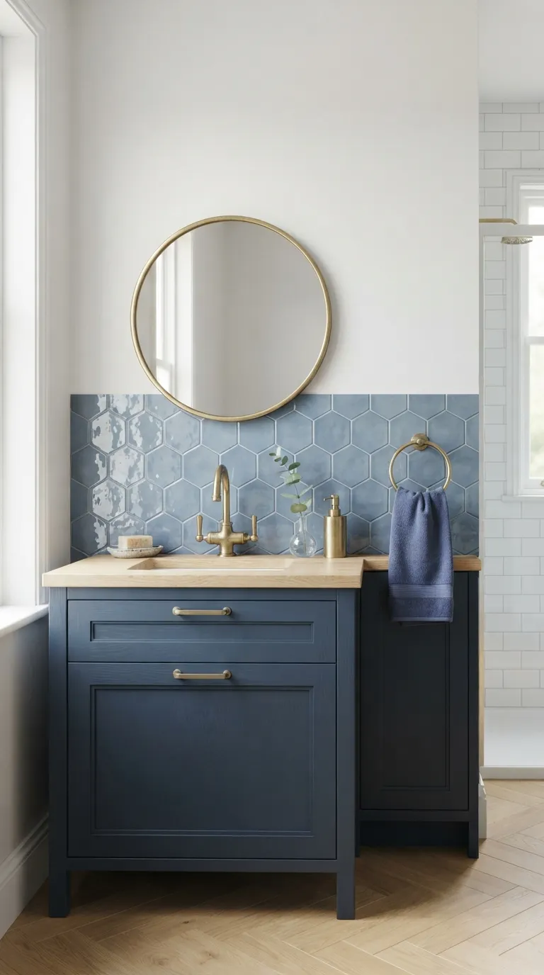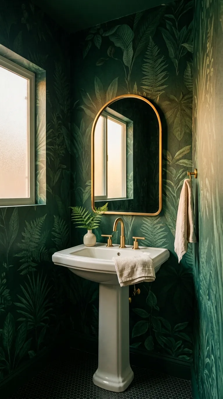
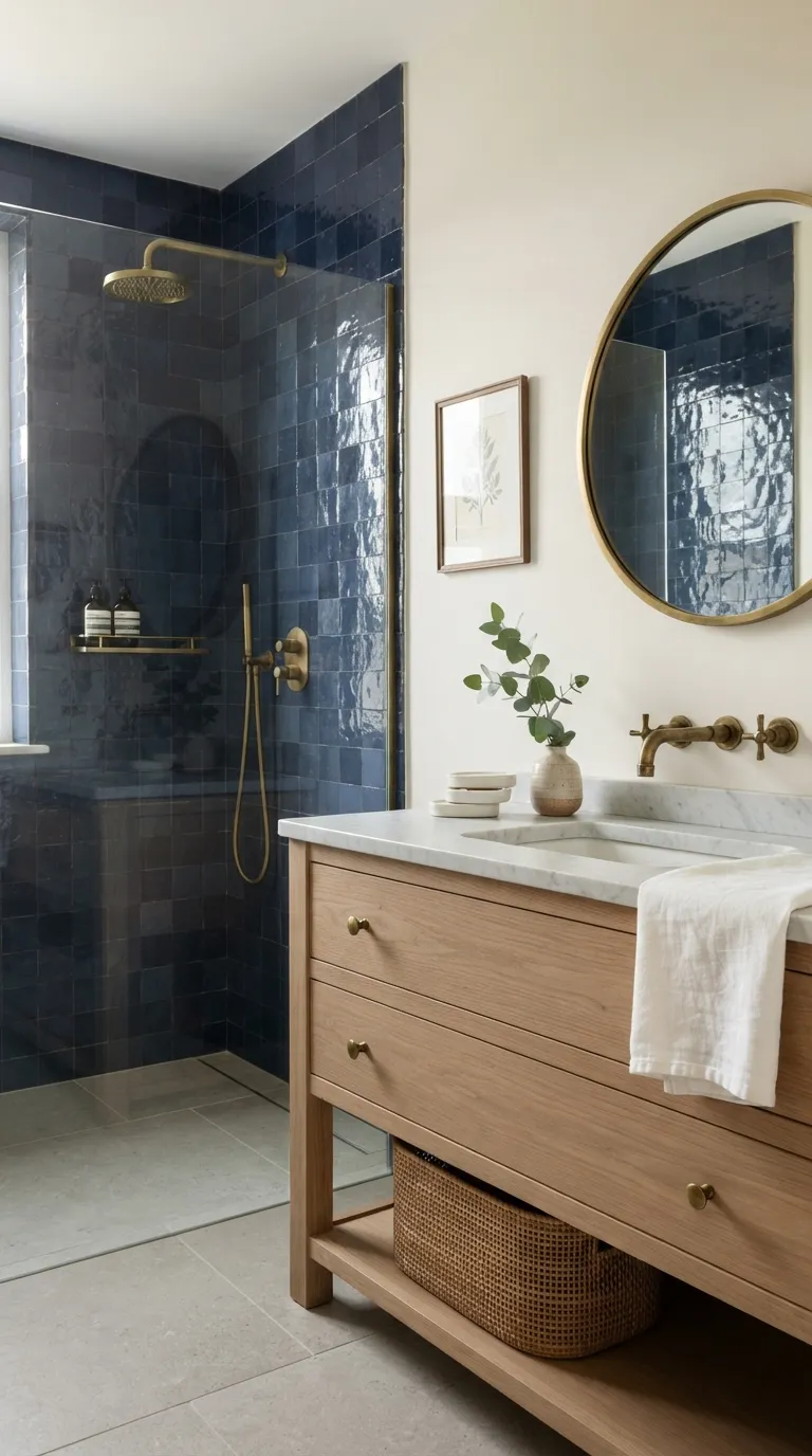
18 blue tile bathroom ideas for bold style looks
Blue tile bathrooms are what happens when you finally stop playing it safe with wall color and let one deep, saturated shade take over the whole room. Here are 18 blue tile bathroom ideas from moody navy showers to electric cobalt floors built for people who want their bathroom to say something.
There’s a particular kind of quiet confidence that comes from a room this saturated. Light hits glazed tile differently at 7am than it does at 7pm, so the space never looks the same twice. Steam rising against navy tile has the same effect as an old European hotel bathroom it turns a Tuesday shower into something closer to an event. Cobalt doesn’t ask for permission.
Jump To
- Why Bold Blue Tile Works So Well
- 18 Blue Tile Bathroom Ideas
- How to Start Your Blue Tile Bathroom Transformation
- Ready to Create Your Dream Blue Tile Bathroom?
Why Bold Blue Tile Works So Well
Blue tile bathrooms trace back to glazed Portuguese azulejos and Moroccan zellige tilework that’s always leaned into deep, saturated color instead of hiding from it. Right now the strongest versions lean into ink navy, electric cobalt, and dusty cerulean, paired against unlacquered brass, white oak, and Carrara-veined marble for contrast.
Saturated blue tile is having a real moment because neutral bathrooms started feeling interchangeable, and people want a room with an actual point of view. It works in small bathrooms too arguably gets more dramatic in a tight powder room as long as you commit to one surface first and keep everything else quiet.
| Element | Moody & Enveloping | Bright & Graphic |
|---|---|---|
| Philosophy | Deep, saturated color as the room’s main event | High-contrast pattern against crisp white |
| Materials | Zellige, glazed subway tile, unlacquered brass | Cement tile, penny tile, polished chrome |
| Color palette | Ink navy, indigo, deep teal | Cobalt, cerulean, sky blue with white |
18 Blue Tile Bathroom Ideas
1. A Cobalt Zellige Shower Wall That Owns the Room
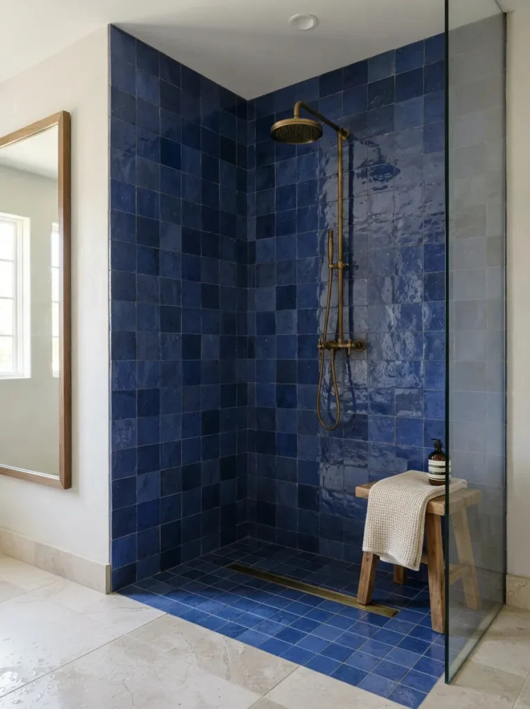
What it looks like: Uneven, glossy cobalt tiles that catch light differently in every square a little imperfect, the way handmade zellige always is.
Why it works: Zellige’s unglazed clay body and hand-cut edges create real texture layering, so the wall reads as depth instead of flat color. That irregularity is what separates it from a printed tile.
How to copy it: Order genuine Moroccan-style zellige in a single cobalt shade, keep the grout thin and color-matched, and pair it with brass fixtures for warmth against all that cool blue.
Best for: Homeowners ready to spend on a real material and willing to wait on a longer lead time if you’re still weighing color options broadly, our blue bathroom decor guide is a good place to browse first.
Pro Tip: Order at least 15% extra zellige. The handmade variation means your installer needs room to hand-select the most even pieces for visible corners and edges.
2. A Navy Vanity With Warm Brass Hardware
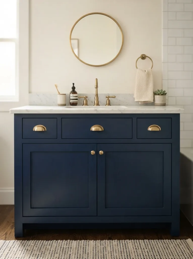
What it looks like: A single grounded cabinet in deep navy lacquer, brass pulls catching whatever light hits the room.
Why it works: Furniture-style vanities create visual weight low in the room, which balances a light ceiling and keeps a small bathroom from feeling top-heavy.
How to copy it: Paint an existing vanity in a satin (not matte) navy lacquer satin reflects just enough light to keep the cabinet from disappearing into shadow and swap hardware to unlacquered brass.
Best for: Renters and DIYers who want drama without retiling anything.
Styling Note: Swap the builder-grade mirror for an unlacquered brass one it’ll darken naturally over a few years and improve with age.
Shop This Look:
| Product |
|---|
| Satin navy cabinet paint, quart size |
| Unlacquered brass cup pulls, set of 4 |
| Brass gooseneck bathroom faucet |
| Round brass-framed vanity mirror |
| Honed white marble vanity tray |
3. A Graphic Blue-and-White Tile Accent Nook
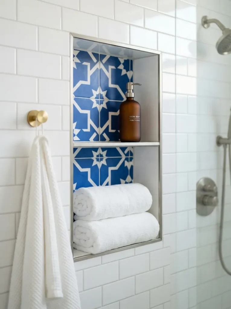
What it looks like: A small, tightly patterned pocket of color tucked into an otherwise plain white shower wall.
Why it works: Contained pattern uses negative space deliberately the surrounding white lets the eye rest, so the graphic tile reads as a design choice rather than visual noise.
How to copy it: Line just the niche or a single recessed shelf in patterned blue-and-white tile instead of committing an entire wall, keeping cost and installation time low.
Best for: People who love bold pattern but aren’t ready to commit a full wall to it.
Next up is the material choice that sets the tone for the whole room.
4. Deep Indigo Subway Tile With Bright White Grout
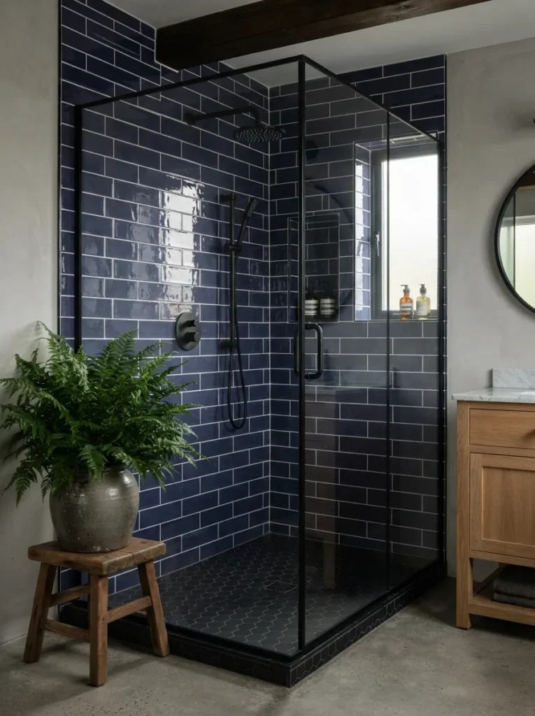
What it looks like: Classic subway proportions in a color that’s almost black in shadow and vividly blue under direct light.
Why it works: High-contrast grout defines each tile’s edge individually, which sharpens the whole wall’s geometry a principle that gets lost entirely with tone-on-tone grout.
How to copy it: Use a standard 3×6 subway tile in indigo, lay it in a classic running-bond pattern, and grout in bright white rather than gray to keep the lines crisp.
Best for: Anyone who wants a bold color without an unfamiliar tile shape or pattern.
Warning: Don’t match your grout too close to the tile color. Dark grout on dark tile reads almost black under evening light, and you lose the blue entirely go one to two shades lighter than the tile itself.
5. A Cerulean Scalloped Backsplash Behind the Vanity
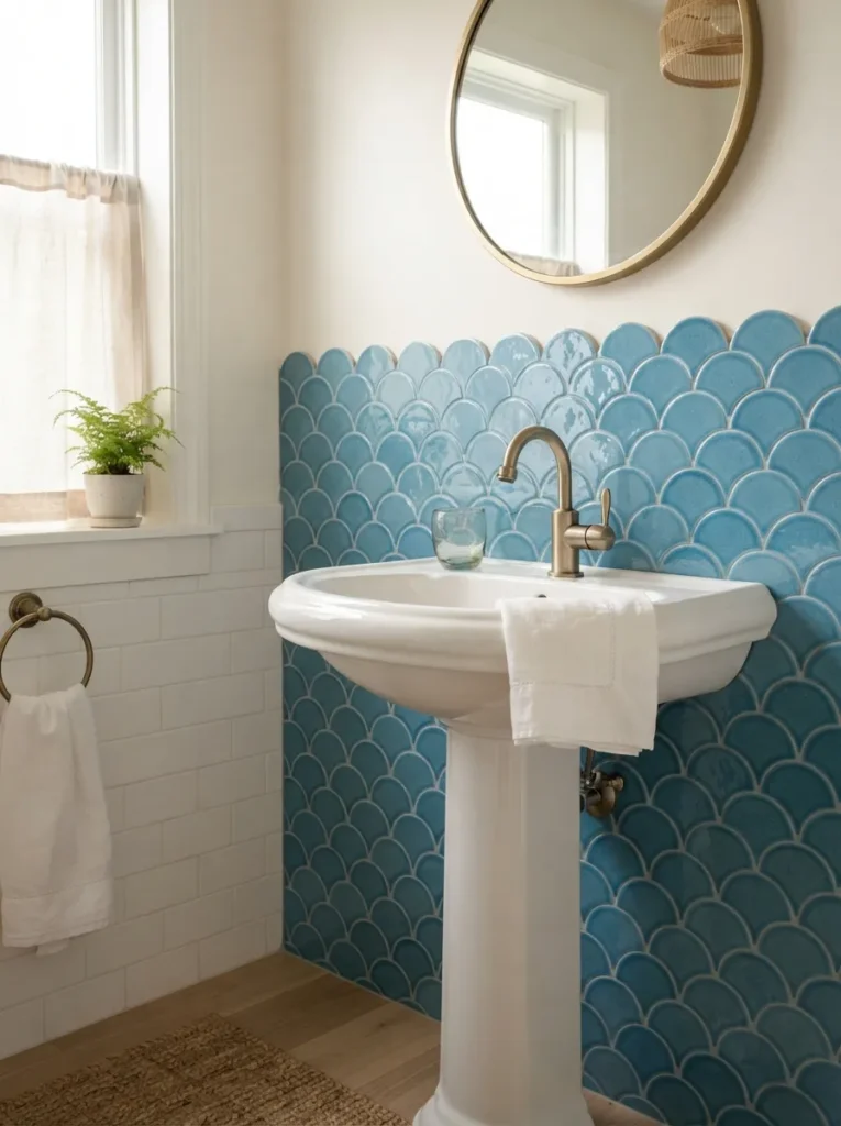
What it looks like: Rows of fan-shaped tile stacked like fish scales, softer and more feminine than a straight-edged tile ever reads.
Why it works: Curved tile edges break up the usually rigid grid of a bathroom wall, adding a second layer of texture on top of the color itself.
How to copy it: Tile only the backsplash zone behind the sink in scalloped cerulean, rather than the full wall, so the curved shape stays a focal point instead of a pattern that overwhelms.
Best for: Small powder rooms and pedestal-sink bathrooms without much wall space to work with. If cerulean isn’t quite right for your space, our green bathroom decor ideas cover a similarly bold alternate palette.
Budget Version: Scalloped tile decals (vinyl, removable) mimic the shape for under $60 and pull off entirely on move-out worth trying before committing to real tile.
6. A Statement Cobalt Penny Tile Floor
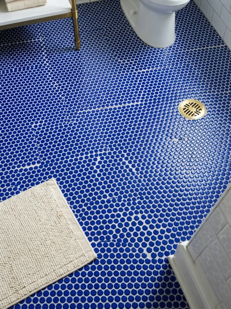
What it looks like: Thousands of tiny cobalt circles underfoot, almost textile-like from a distance.
Why it works: Small-format tile increases grout-line density, and more grout lines mean more slip resistance a functional bonus most people don’t realize when they pick penny tile.
How to copy it: Choose cobalt penny round mosaic sheets, keep the grout white for contrast, and reserve this treatment for the floor only so the color doesn’t compete with itself on multiple surfaces.
Best for: Bathrooms that get wet floors often kids’ baths, main-floor guest baths.
Pro Tip: Penny tile floors show water spots more than large-format tile. A quick squeegee after showers keeps the grout from developing a cloudy mineral film within the first year.
Here’s an idea that often gets skipped and it costs almost nothing.
7. A Half-Height Blue Tile Wainscoting Line
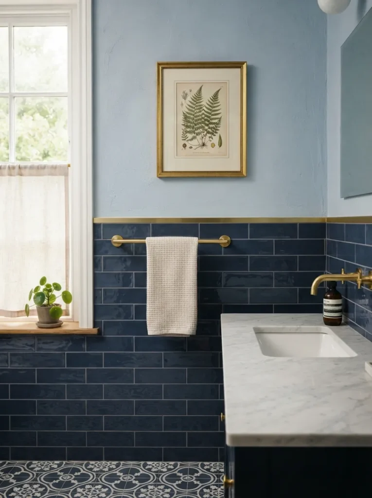
What it looks like: Tile stopping partway up the wall with paint continuing above it in a lighter, related blue two shades of one color instead of one flat wall.
Why it works: Splitting the wall visually lowers the room’s perceived ceiling height in a good way, making a small bathroom feel more intentionally proportioned instead of just tall and boxy.
How to copy it: Install navy subway tile to 42 inches, cap it with a brass or wood trim strip, and paint the wall above in a powder blue two to three shades lighter than the tile. For more panel-and-paint combinations like this, see our bathroom wall panel ideas.
Best for: Small powder rooms where full tile would feel like too much commitment or cost.
Small-Space Tip: Stop the tile line just below eye level, not at standard 36 inches the extra height reads more custom and stretches the wall visually.
8. A Freestanding Navy Clawfoot Tub
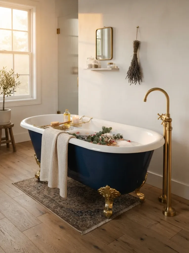
What it looks like: A classic tub silhouette painted in a color deep enough to double as the room’s main focal point, everything else kept white around it.
Why it works: Painting only the tub not the walls uses the principle of visual weight: one saturated object against a neutral backdrop reads as sculpture rather than clutter.
How to copy it: Paint the tub exterior in a glossy marine-grade enamel (needed for water exposure durability), leave the interior white, and keep walls and floor light so the tub stays the obvious focal point.
Best for: Larger bathrooms with room to let one piece stand alone.
Mistake to Avoid: Regular wall paint peels fast on a tub exterior. Marine or appliance-grade enamel costs more upfront but is the only finish that actually holds up to daily water contact.
Here’s a detail that’s easy to skip and worth a second look.
9. A Statement Pendant Light Over the Vanity
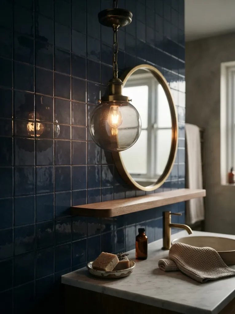
What it looks like: One low-hanging pendant replacing the usual double sconces, casting a warmer, more directional pool of light.
Why it works: A single pendant creates asymmetry and visual interest overhead a detail most bathrooms skip entirely in favor of flat, even lighting that flattens the tile’s color.
How to copy it: Hang a smoked-glass or amber pendant 30 to 34 inches above the counter, centered over the sink, and pair it with a dimmer so the mood shifts from bright grooming light to evening warmth.
Best for: Bathrooms with at least 8-foot ceilings lower ceilings make a hanging pendant feel cramped.
Important: Most pendants sold for kitchens aren’t rated for bathroom humidity. Check for a “damp-rated” listing specifically before buying one for a shower-adjacent vanity.
Shop This Look:
| Product |
|---|
| Damp-rated smoked glass pendant light |
| Brass ceiling canopy kit |
| In-line dimmer switch |
| Small ceramic soap dish |
| Brass wall-mounted toothbrush holder |
The next one is easy to pass over and it costs almost nothing.
10. A Graphic Cement Tile Floor in Blue and White
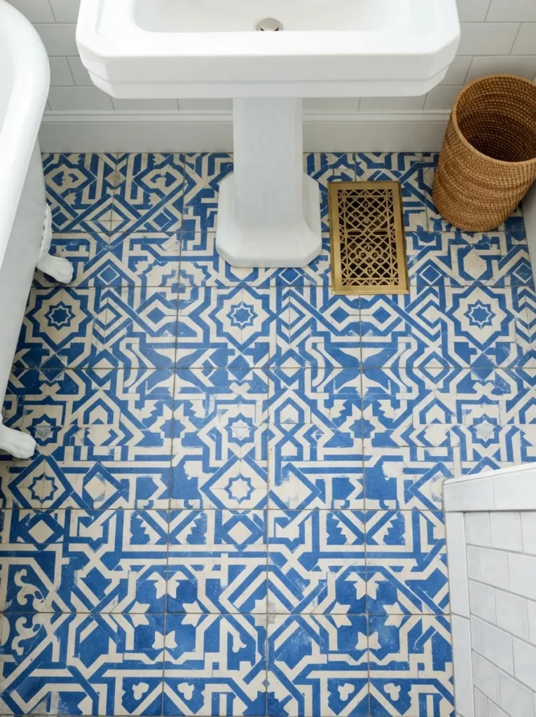
What it looks like: A busy, symmetrical pattern underfoot that does most of the room’s visual work on its own.
Why it works: Because the floor carries the pattern, the walls can stay completely plain a proportion principle where one loud surface needs at least two quiet ones to land.
How to copy it: Choose a two-tone cement tile pattern, keep walls white or off-white, and seal the tile with a penetrating sealer before grouting since cement tile is porous and stains easily.
Best for: Anyone renovating from scratch, since cement tile floors aren’t a weekend DIY project.
✅ Before You Order Cement Tile:
- [ ] Confirm subfloor is level within 1/8 inch cement tile cracks over uneven surfaces
- [ ] Order 10% overage for cuts and future repairs
- [ ] Seal tile with a penetrating sealer before grouting, not after
- [ ] Test grout color on a spare tile first cement tile is porous and can stain
- [ ] Reseal the finished floor annually to maintain stain resistance
Styling Note: Keep bath mats and towels in solid colors here a second pattern next to a graphic floor almost always fights for attention instead of complementing it.
11. A Half-Height Powder Blue Wainscoting for Tight Spaces
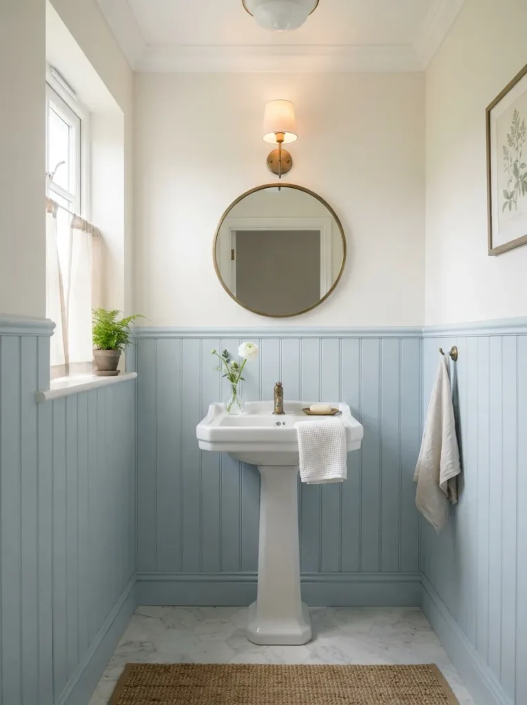
What it looks like: A lighter, softer blue applied to painted beadboard rather than tile, kept to the lower half of a small room.
Why it works: Lighter blue values reflect more light back into a windowless powder room, so the color reads bold without making the space feel smaller a real risk with navy in a room under 20 square feet.
How to copy it: Paint beadboard panels (real or MDF) in a powder blue with at least 60% light reflectance value, stop at 36 to 42 inches, and keep the upper wall bright white.
Best for: Powder rooms and half-baths with little to no natural light. For more ways to dress up a tiny powder room, our small powder room wallpaper ideas pair well with this approach.
Quick Win: Peel-and-stick beadboard panels exist now and install in an afternoon no carpentry required, and they’re fully removable for renters.
Here’s something most guides won’t tell you. In my experience, the single biggest thing people get wrong on a blue tile bathroom isn’t the tile it’s the mirror frame. A thin, unfinished aluminum-frame mirror against a saturated navy wall goes flat and disappears into the color; a 1.5-inch brass or black frame gives the eye a stopping point, and that one $80 swap does more visual work than an extra accent wall would.
12. Deep Teal-Blue Large-Format Slab Tile
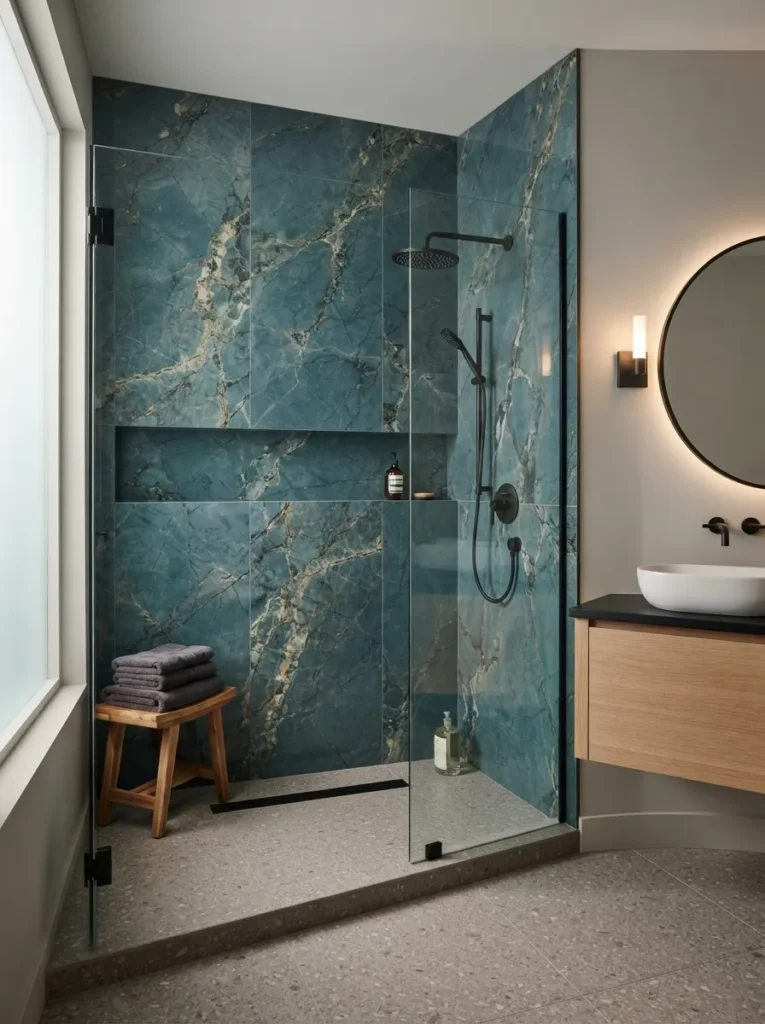
What it looks like: A shower wall with almost no visible grout lines, the color reading as one continuous, moody surface.
Why it works: Large-format tile minimizes grout lines by design, which reduces visual clutter and lets the color itself not the tile pattern carry the whole wall.
How to copy it: Order 24×48-inch (or larger) porcelain slabs in teal-blue with a subtle stone-look vein, and insist your installer use a rectified edge for the tightest possible grout lines.
Best for: People who want drama with a cleaner, more minimal edge than patterned tile gives.
Mistake to Avoid: Large-format tile shows lippage (uneven edges between tiles) far more visibly than small tile. Confirm your installer is using leveling clips before work begins, not after you notice uneven edges.
13. Blue Glass Shelving With Curated Glass Jars
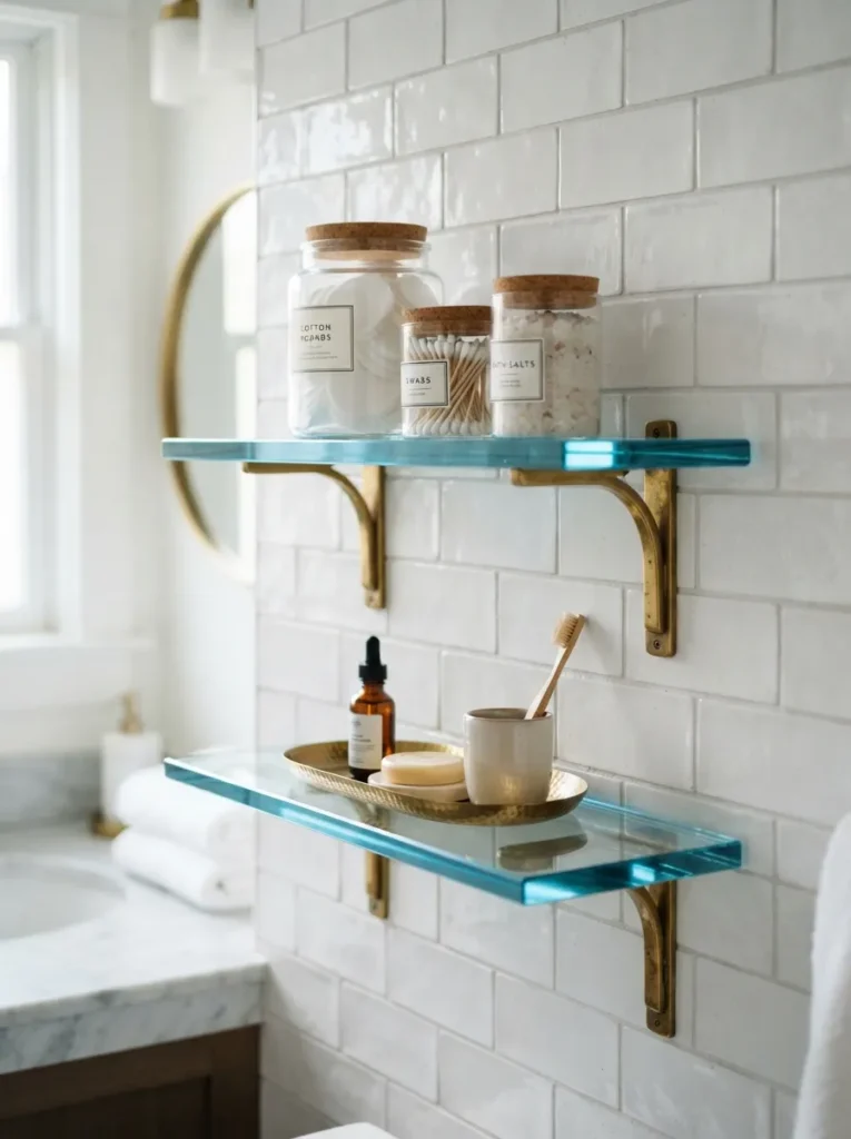
What it looks like: Thin glass shelves in a soft blue tint, holding a handful of jars instead of a cluttered shelf of bottles.
Why it works: Tinted glass introduces color without adding visual mass, so it works as an accent even in bathrooms too small for a full tile commitment.
How to copy it: Mount two blue-tinted glass shelves with brass brackets, and limit what goes on them to three or four matching glass jars restraint is what keeps this idea from turning into shelf clutter.
Best for: Renters, since glass shelving usually installs without any tile or plumbing work.
Budget Version: Tinted glass jars alone no shelving required deliver the same color hit for under $40 when grouped on an existing counter.
This one is all about the material that anchors the style.
14. An Ombre Blue Tile Gradient Wall
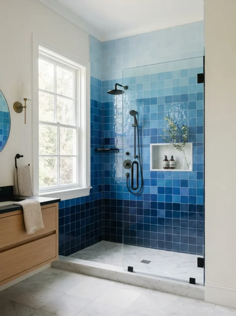
What it looks like: Color that shifts row by row from near-black navy at the floor to almost white-blue near the ceiling.
Why it works: A gradient tricks the eye into reading the wall as taller than it is darker tones at the base ground the room, lighter tones up top visually lift the ceiling.
How to copy it: Order five to six shades of the same tile line in a gradient run, and have your installer lay the darkest row at the floor, transitioning up in even bands.
Best for: Ambitious DIYers or anyone working with a tile-savvy contractor this one takes planning to get the transitions even.
Shop This Look:
| Product |
|---|
| Ombre-toned porcelain tile set (5-6 shades) |
| Matte black shower trim kit |
| Tile spacers, 1/16-inch |
| Rectified-edge tile trowel |
| Color-matched grout in mid-tone gray |
15. A Blue Upholstered Vanity Stool
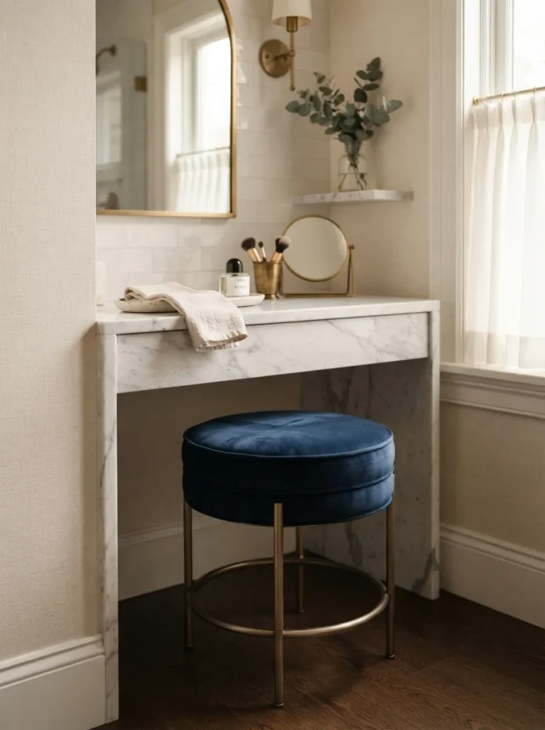
What it looks like: A single soft, tactile piece breaking up all the hard surfaces a bathroom usually has.
Why it works: Fabric introduces a texture no tile or stone can offer, and that contrast in material hard versus soft is what keeps an all-tile bathroom from feeling like a showroom.
How to copy it: Choose a velvet or performance-fabric stool in navy, stain-treated if your bathroom sees real daily use, and tuck it under the vanity rather than floating it in open floor space.
Best for: Primary bathrooms with room for a seating piece skip this in a true powder room.
Styling Note: Match the stool’s leg finish to your faucet, not your mirror frame that’s the metal pairing people notice first at eye level while seated.
This next one is easy to underestimate until you see it in a real room.
16. Blue-Tinted Glass Wall Sconces
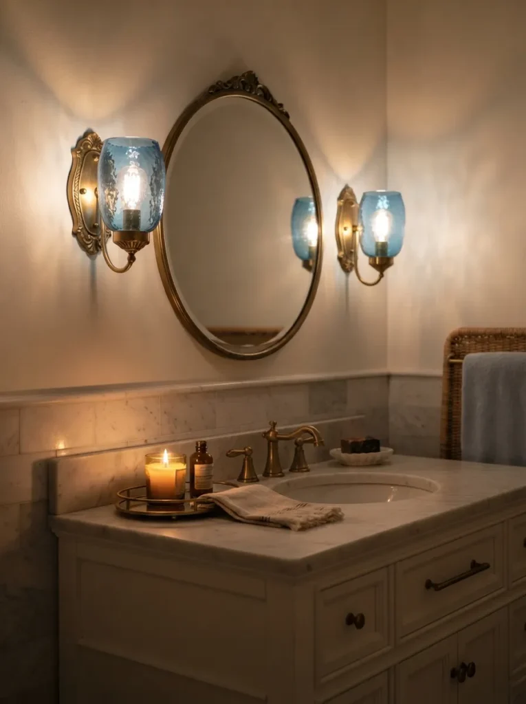
What it looks like: Warm light filtered through pale blue glass, casting a faint blue-white glow rather than the usual clear white light.
Why it works: Colored glass shifts how light behaves in the room, tinting everything nearby slightly cooler a subtler way to bring in blue for anyone not ready for a full tiled wall. Pair it with the right frame using our bathroom mirror ideas for more direction.
How to copy it: Mount two blue-tinted glass sconces at eye level flanking the mirror, and choose warm-white bulbs (2700K) so the glass tint softens rather than turns the whole room cold.
Best for: Anyone wanting the color story without touching tile, paint, or plumbing at all.
Important: Colored glass sconces cast noticeably less light than clear glass plan for a slightly higher wattage bulb than you’d normally use, or pair with a stronger overhead fixture.
17. Blue and White Graphic Roman Shade at the Window
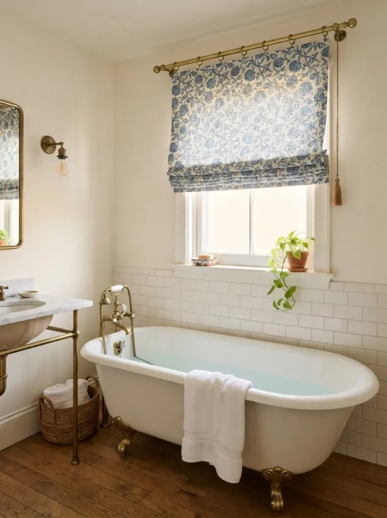
What it looks like: Soft, patterned fabric at the one window, doing the color work without a single tile involved.
Why it works: Fabric is the fastest way to introduce bold color and pattern into a rental or low-budget bathroom, since it requires zero permanent changes to walls or fixtures.
How to copy it: Choose a moisture-resistant or laminated fabric (standard cotton warps in humidity) in a blue block-print, and mount the shade inside the window frame for the cleanest look.
Best for: Renters and anyone testing bold blue before committing to tile.
18. A Glossy Navy Ceiling
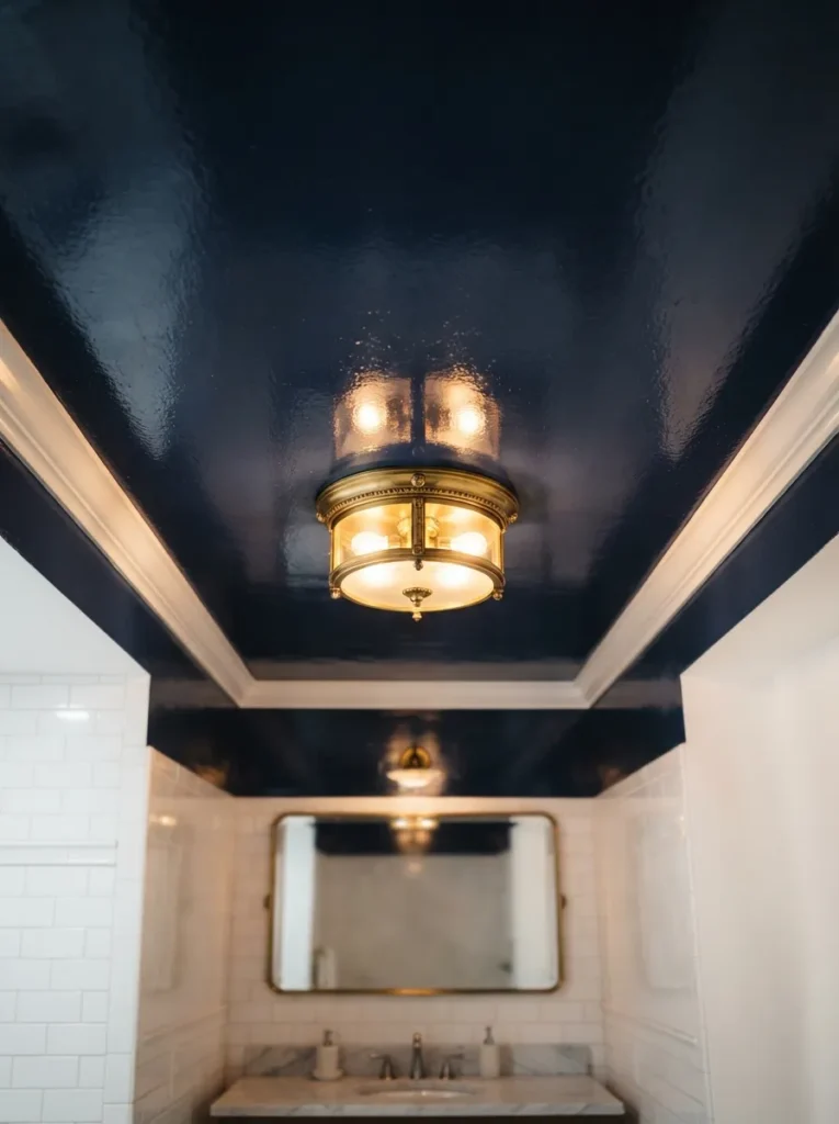
What it looks like: A ceiling dark and glossy enough to reflect the room’s light fixtures back down.
Why it works: Gloss paint bounces light rather than absorbing it the way matte does, which is the only reason a dark ceiling doesn’t just make the room feel like it has a low, heavy lid on it. If you’re mapping out a broader palette, our home color combinations guide can help you pick a complementary wall shade.
How to copy it: Paint the ceiling in a high-gloss navy enamel, keep walls white or pale to hold the contrast, and add a flush-mount fixture with visible brass or nickel trim for the reflection to catch.
Best for: Bathrooms with 9-foot or taller ceilings this one backfires in a low-ceilinged room.
How to Start Your Blue Tile Bathroom Transformation
What I’ve found with real spaces is that the shower wall or, in a powder room, the vanity is the one surface worth committing to first. Everything else follows its lead. Order actual tile samples or a cobalt zellige swatch and hold them against your existing floor before buying anything else; that single decision anchors your grout color, your brass finish, and even your towel palette, which saves you from three separate returns later.
In practice, the most common fixable mistake is grout that’s too close in tone to the tile matching cobalt with charcoal so closely that the whole wall reads black under evening light instead of blue. Go one to two shades lighter than the tile itself, and the color stays legible after dark, not just under morning sun.
Three items under $50 that shift the room fast: a set of unlacquered brass towel hooks, a ribbed ceramic soap dispenser in white, and a small woven bath mat in natural jute to balance all that saturated color underfoot.
A full retile realistically runs six to ten weeks once tile is ordered and a contractor is booked, with real cost starting around $4,000 for a standard shower wall in mid-range tile. The accent-only version a painted vanity, new hardware, one tiled niche is a genuine weekend project and can land under $600.
Ready to Create Your Dream Blue Tile Bathroom?
Between the color choices, the material swaps, and a handful of layout tricks, there’s a version of this list that fits almost any budget or lease situation. Nobody needs to do all eighteen at once pick the one surface that’s bothering you most and start there.
Order a zellige sample or a can of navy cabinet paint this week and just live with it on the wall for a few days before committing further. Bold blue tile has a way of making a bathroom feel less like a utility room and more like somewhere you’d want to linger. Save the ideas that hit hardest you’ll want them again once you’re standing in the tile aisle.
Keep Exploring
- 12 Navy Kitchen Cabinet Ideas That Still Feel Warm
- 15 Zellige Tile Ideas for Every Room in Your Home
- 9 Small Powder Room Ideas That Make a Big Statement